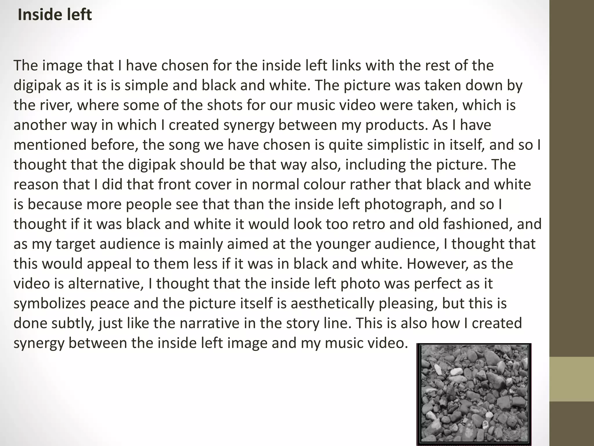
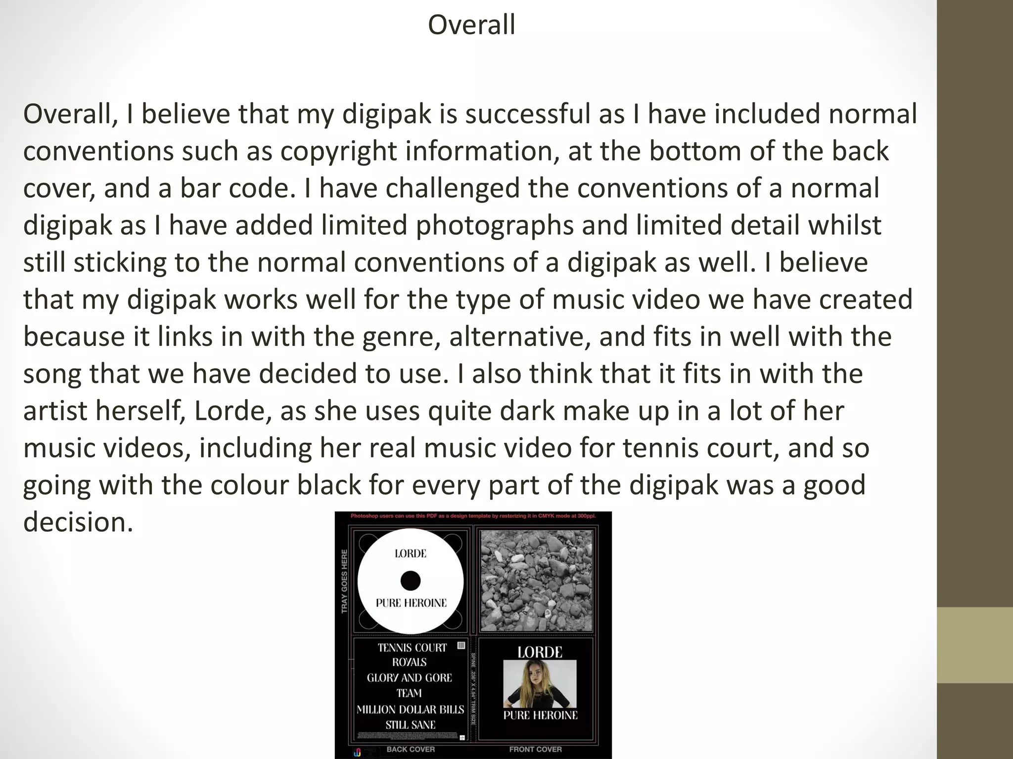
The document summarizes the design choices for a digipak, magazine advertisement, and music video created to promote an album. Key points:
- The digipak uses a simple black and white design with one photo to create synergy between the products and music video's alternative theme.
- The magazine ad follows conventions like central photo and reviews but challenges norms with limited text. It uses the same font and photo as the digipak.
- The music video includes conventions like lip syncing and camera eye contact but also challenges conventions through techniques like overlaying text on the artist's face.
- Synergy is created between the products through matching color schemes, fonts, images and tying into the