Download to read offline
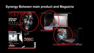
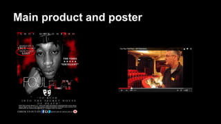
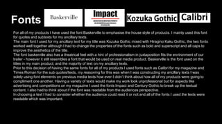
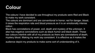
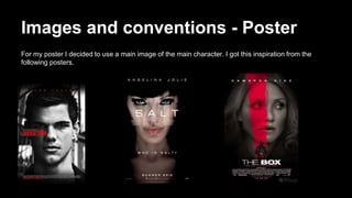
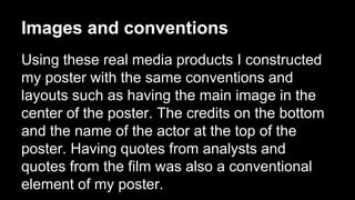
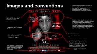
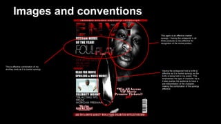
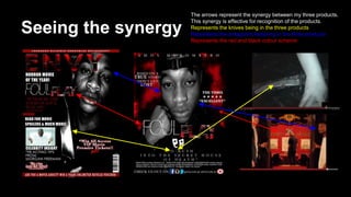

The document discusses the synergy between a main film product and ancillary texts like a magazine and poster. For the magazine, the antagonist featured on the cover to recognize them from the film trailer. For the poster, a script line is used to illustrate the plot. The same fonts are used across all products for consistency. Red and black colors are used to represent horror themes. Conventions from real movie posters, like credits and quotes, are applied. Images and elements like the antagonist and knives are repeated to emphasize characters and genre. Arrows show how the products reference each other, creating effective recognition through market synergy.


