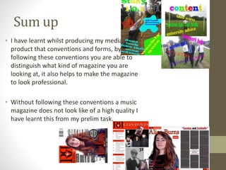
Intro
• When I started out creating my
prelim task of creating a school
magazine cover and contents page. I
didn't really know how to use
Photoshop at this stage as I had no
real experience of using this piece of
software.
Since then I have come a long way to
be able to produce a detailed and well
crafted music magazine cover
contents page and featured page for
my own music magazine.
My first cover
• When I first
started I had no
clue what kind of
colour scheme I
should use or how
to even keep to it
this is shown as I
used a variety of
bright colours
which made the
magazine look
extremely
unprofessional
and childish.
I used a single picture to
take up the whole of the
page, I did this because
before starting my prelim
task I had seen many
different music and sport
magazines that did exactly
this. I knew that this was a
popular thing to do in the
magazine world as it looks
stylish and shows exactly
what their magazine was
about. Unfortunately I was
unable to implement there
success as I did not know
how to do such a thing.
I choose the iconic image of
school life to be on my front
cover.
I used splash to make my magazine stand out from
the rest with bright and bold colours as the fill
colour this did make the magazine stand out but
without a good colour scheme to follow this made
the magazine look childish and unprofessional
My music magazine cover
• I realized that my prelim task was a very
poor effort as it had no direction and for the
most of the magazine I did not follow forms
or conventions to make the magazine look
chic. Neither did I make the magazine look
unique as I was a beginner to Photoshop
and did not have a firm grasp of things I
could do on Photoshop weather it be editing
an image or where to put things so I decided
to look at other successful magazines such
as Q Kerrang and Mojo. I even did I copy of
GQs magazine on Chris Evans to allow me to
get the hang of Photoshop and the skills
needed to produce a classy magazine
My music magazine RnR
From this process I have learnt how to add
different fonts from the internet that I
needed to create my niche rock magazine.
This font was a crucial part of my full
product as it is all over my work from the
title to the cover line’s.
I have learnt how air brush
peoples imperfections I
needed this in order to
make my music magazine
look professional as you
would not see a unedited
photo on a professional
magazine such as Q.
I also learnt how to
make a
professional
looking contents
page by making
the list of artists in
one neat column. I
did this by using
the rulers that
Photoshop
provides.
I kept to a lot of
conventions one of
the major ones of
them was putting a
screen shot of the
cover page onto the
cover page. I felt that
this helped my
magazine to have a
quality feel to it.
I have learnt that by following a colour scheme
throughout my three pages of my music magazine I
am able to give a feel of a quality magazine. A colour
scheme also gives a sense of the genre I have chosen
Sum up
• I have learnt whilst producing my media
product that conventions and forms, by
following these conventions you are able to
distinguish what kind of magazine you are
looking at, it also helps to make the magazine
to look professional.
• Without following these conventions a music
magazine does not look like of a high quality I
have learnt this from my prelim task.

Question 7

  • 2.
    Intro • When Istarted out creating my prelim task of creating a school magazine cover and contents page. I didn't really know how to use Photoshop at this stage as I had no real experience of using this piece of software. Since then I have come a long way to be able to produce a detailed and well crafted music magazine cover contents page and featured page for my own music magazine.
  • 3.
    My first cover •When I first started I had no clue what kind of colour scheme I should use or how to even keep to it this is shown as I used a variety of bright colours which made the magazine look extremely unprofessional and childish. I used a single picture to take up the whole of the page, I did this because before starting my prelim task I had seen many different music and sport magazines that did exactly this. I knew that this was a popular thing to do in the magazine world as it looks stylish and shows exactly what their magazine was about. Unfortunately I was unable to implement there success as I did not know how to do such a thing. I choose the iconic image of school life to be on my front cover. I used splash to make my magazine stand out from the rest with bright and bold colours as the fill colour this did make the magazine stand out but without a good colour scheme to follow this made the magazine look childish and unprofessional
  • 4.
    My music magazinecover • I realized that my prelim task was a very poor effort as it had no direction and for the most of the magazine I did not follow forms or conventions to make the magazine look chic. Neither did I make the magazine look unique as I was a beginner to Photoshop and did not have a firm grasp of things I could do on Photoshop weather it be editing an image or where to put things so I decided to look at other successful magazines such as Q Kerrang and Mojo. I even did I copy of GQs magazine on Chris Evans to allow me to get the hang of Photoshop and the skills needed to produce a classy magazine
  • 5.
    My music magazineRnR From this process I have learnt how to add different fonts from the internet that I needed to create my niche rock magazine. This font was a crucial part of my full product as it is all over my work from the title to the cover line’s. I have learnt how air brush peoples imperfections I needed this in order to make my music magazine look professional as you would not see a unedited photo on a professional magazine such as Q. I also learnt how to make a professional looking contents page by making the list of artists in one neat column. I did this by using the rulers that Photoshop provides. I kept to a lot of conventions one of the major ones of them was putting a screen shot of the cover page onto the cover page. I felt that this helped my magazine to have a quality feel to it. I have learnt that by following a colour scheme throughout my three pages of my music magazine I am able to give a feel of a quality magazine. A colour scheme also gives a sense of the genre I have chosen
  • 6.
    Sum up • Ihave learnt whilst producing my media product that conventions and forms, by following these conventions you are able to distinguish what kind of magazine you are looking at, it also helps to make the magazine to look professional. • Without following these conventions a music magazine does not look like of a high quality I have learnt this from my prelim task.