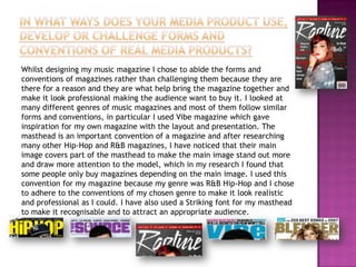
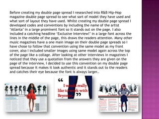
The document discusses the design choices made for a music magazine. Conventions from existing magazines in the genre of R&B and hip hop were followed to make the magazine look professional. This included using a striking masthead font, including the date and price, and using cover lines and headlines to attract readers. Layout choices like large prominent images and fonts for artist names and headlines also followed genre conventions. Researching existing magazines informed design elements like the placement of the masthead over the cover image and the use of quotations from interviews. Overall, conventions were adhered to make the magazine realistic and to attract the intended audience.