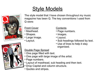
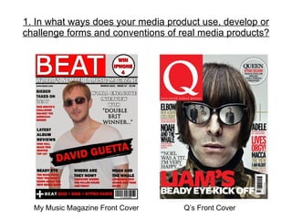
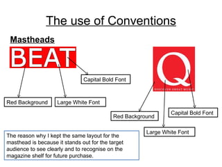
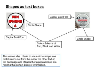
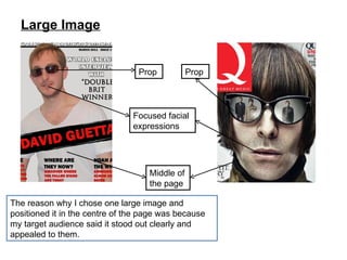
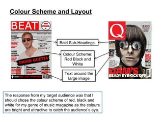
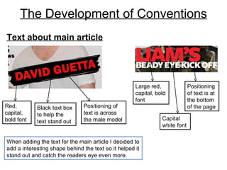
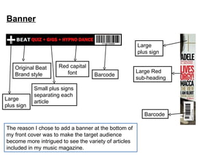
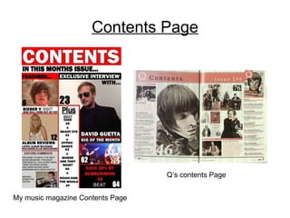
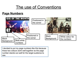
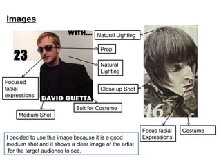
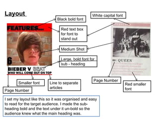
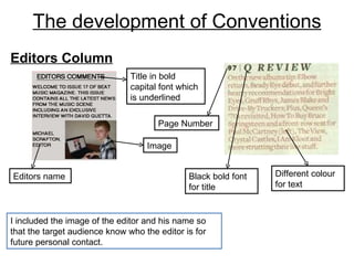
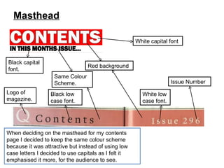
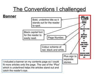
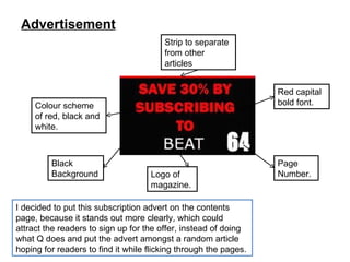
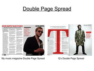
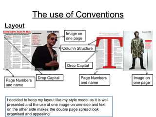
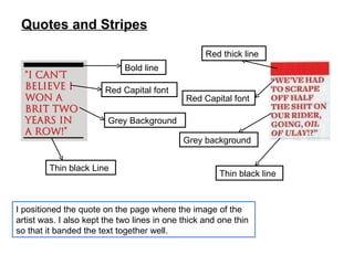
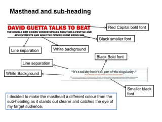
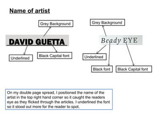
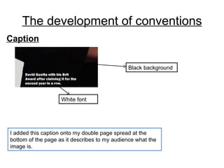
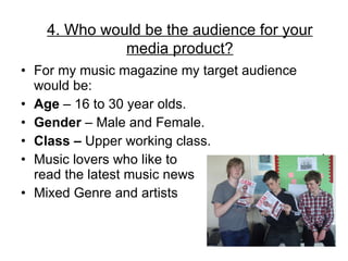
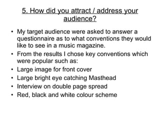
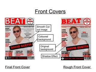
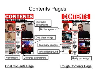
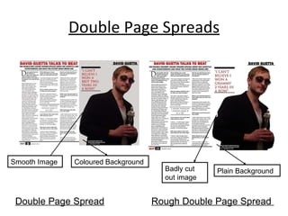
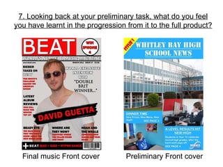
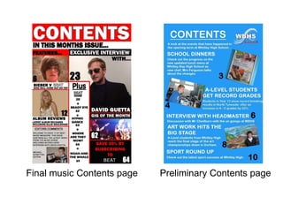
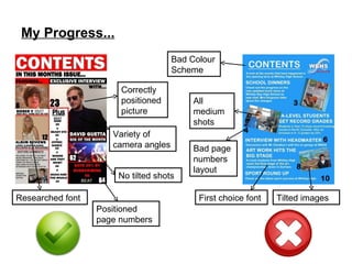
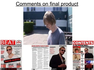
By  Michael Scrafton
Style Models The style model that I have chosen throughout my music magazine has been Q. The key conventions I used from Q were: Front Cover Masthead. Shapes. Large Image. Layout. Double Page Spread One page filled with text. One page with large image of the artist. Page numbers. Layout of masthead, sub heading and then text. Drop Capital and column structure. Quotes and stripes. Contents Page numbers. Images. Layout. Sub headings followed by text. Use of lines to help it stay organised.
1. In what ways does your media product use, develop or challenge forms and conventions of real media products? My Music Magazine Front Cover   Q’s Front Cover
The use of Conventions Mastheads Red Background Large White Font Capital Bold Font Capital Bold Font Large White Font Red Background The reason why I kept the same layout for the masthead is because it stands out for the target audience to see clearly and to recognise on the magazine shelf for future purchase.
Shapes as text boxes Colour Scheme of Red, Black and White Capital Bold Font Capital Bold Font Circle Shape Circle Shape The reason why I chose to use a circle shape was that it stands out from the rest of the other text on the front page and attracts the target audience into reading that certain piece of information.
Large Image Prop Prop Middle of the page The reason why I chose one large image and positioned it in the centre of the page was because my target audience said it stood out clearly and appealed to them. Focused facial expressions
Colour Scheme and Layout The response from my target audience was that I should chose the colour scheme of red, black and white for my genre of music magazine as the colours are bright and attractive to catch the audience’s eye. Colour Scheme: Red Black and White Text around the large image Bold Sub-Headings
The Development of Conventions When adding the text for the main article I decided to add a interesting shape behind the text so it helped it stand out and catch the readers eye even more. Positioning of text is across the male model Black text box  to help the text stand out Red, capital, bold font Text about main article Positioning of text is at the bottom of the page Large red, capital, bold font Capital white font
Banner Barcode Red capital font Small plus signs separating each article Original Beat Brand style The reason I chose to add a banner at the bottom of my front cover was to make the target audience become more intrigued to see the variety of articles included in my music magazine. Large  plus sign Large  plus sign Barcode Large Red sub-heading
Contents Page My music magazine Contents Page Q’s contents Page
The use of Conventions Page Numbers I decided to put my page numbers like this because these two colours work well together as the page number stands out well for the target audience to see. Black Background Positioned in the corner Black Background White colour for the numbers Bold white numbers Positioned in the corner
Images I decided to use this image because it is a good medium shot and it shows a clear image of the artist  for the target audience to see. Natural Lighting Focus facial Expressions Costume Suit for Costume Focused facial expressions Natural Lighting Prop Medium Shot Close up Shot
Layout  I set my layout like this so it was organised and easy to read for the target audience. I made the sub-heading bold and the text under it un-bold so the audience knew what the main heading was. Smaller font Page Number Line to separate articles Large, bold font for  sub - heading Medium Shot Red text box for font to stand out  Black bold font Page Number Red smaller font White capital font
The development of Conventions I included the image of the editor and his name so that the target audience know who the editor is for future personal contact.  Black bold font for title Page Number Different colour for text Editors name Image Title in bold capital font which is underlined Editors Column
Masthead When deciding on the masthead for my contents page I decided to keep the same colour scheme because it was attractive but instead of using low case letters I decided to use capitals as I felt it emphasised it more, for the audience to see. Same Colour Scheme. Red background Black capital font. Black low case font. Logo of magazine. Issue Number White low case font. White capital font
The Conventions I challenged I included a banner on my contents page so I could fit more articles onto the page. The use of the “Plus” which is underlined helps the articles stand out and catch the reader’s eye. Banner Page Number. Colour scheme of red, black and white. Plus sign to separate stories. Black capital font for the reader to easily read. Bold, underline title so it stands out for the reader to spot.
Advertisement I decided to put this subscription advert on the contents page, because it stands out more clearly, which could attract the readers to sign up for the offer, instead of doing what Q does and put the advert amongst a random article hoping for readers to find it while flicking through the pages. Black Background Red capital bold font. Strip to separate from other articles Colour scheme of red, black and white. Page Number. Logo of magazine.
Double Page Spread My music magazine Double Page Spread Q’s Double Page Spread
The use of Conventions Layout I decided to keep my layout like my style model as it is well presented and the use of one image on one side and text on the other side makes the double page spread look organised and appealing Page Numbers and name  Page Numbers and name Drop Capital Drop Capital Column Structure Image on one page Image on one page
Quotes and Stripes I positioned the quote on the page where the image of the artist was. I also kept the two lines in one thick and one thin so that it banded the text together well. Red thick line Red Capital font Grey background Thin black line Thin black Line Grey Background Red Capital font Bold line
Masthead and sub-heading I decided to make the masthead a different colour from the sub-heading as it stands out clearer and catches the eye of my target audience. Red Capital bold font Smaller black font Black Bold font Line separation White Background Line separation White background Black smaller font
Name of artist On my double page spread, I positioned the name of the artist in the top right hand corner so it caught the readers eye as they flicked through the articles. I underlined the font so it stood out more for the reader to spot. Black Capital font Grey Background Underlined Black Capital font Underlined  Grey Background Black font
The development of conventions Caption I added this caption onto my double page spread at the bottom of the page as it describes to my audience what the image is. White font Black background
Colour Scheme Throughout my music magazine I stuck with the eye catching colour scheme: BLACK, RED. This is because it is an attractive colour scheme which stands my specific target audience had requested was the most striking.
Age  – my age band for my magazine is between 16 – 30 year olds because this age group like to know the latest gossip on new artists. Ethnic minority groups  – My magazine is aimed at all cultures as there is a variety of artists and genre included. Gender  – Both male and females are equally represented.  Class and Status  – My magazine is aimed at multiple classes as the articles are written in a relaxed and informative dialogue. 2. How does your media product represent particular social groups?
3. What kind of media institution might distribute your media product and why? I would advertise my music magazine by: Billboards  – in key city locations. Radio  – on certain genre radio programs.  Internet  – In adverts on Facebook and YouTube. TV  – In adverts between key genre programs.
I would initially distribute my music magazine Nationally around the UK. I would try to establish my music magazine in the market place before expanding it Internationally. How would you distribute your music magazine?
Which company do you think could take on the distribution of your music magazine? I have decided Frontline Ltd should distribute my music magazine. This is because Frontline is the UK’s leading magazine sales and distribution company. Frontline distributes top consumer magazines from key publishers BBC Magazines, Bauer and Haymarket.
For my music magazine my target audience would be: Age  – 16 to 30 year olds. Gender  – Male and Female. Class –  Upper working class. Music lovers who like to  read read the latest music news Mixed Genre and artists  4. Who would be the audience for your media product?
My target audience were asked to answer a questionnaire as to what conventions they would like to see in a music magazine. From the results I chose key conventions which were popular such as: Large image for front cover Large bright eye catching Masthead Interview on double page spread Red, black and white colour scheme 5. How did you attract / address your audience?
Feedback from Target Audience from rough cuts The main feedback I received from my target audience was to try and improve the following: The Contents page was to white. The Double Page Spread was not cut out very well. The editor’s image needs to be cut out neater. The Photos of the week were too crammed and unclear. The background of some images could be improved.
Front Covers Final Front Cover Rough Front Cover  Smooth Cut out image Coloured background Original background Shadow Effect
Contents Pages Final Contents Page Rough Contents Page Improved background No background One clear Image Too many images Coloured background New image Badly cut image White background
Double Page Spreads Double Page Spread Rough Double Page Spread  Smooth Image Badly cut out image Coloured Background Plain Background
How do the images attract your target audience My images attracted my target audience by: Large Images Bright Colour Scheme Organised Layout Key Conventions Large Masthead Free gifts to encourage audience Variety of artists on front cover
What my magazine sets out to do The general message my music magazine sets out is: This is a modern cool music magazine, full of the latest music news, including easy read articles novel features and latest up to date music gossip.  That's why BEAT music magazine is currently the world’s number one music magazine in the World.
Language used in double page spread The language I used in my double page spread is easy to read, relaxed and informative. It does not contain any strong or offensive language. It is a straight forward interview of interesting questions and answers with an introduction at the start about the music artist.
I have learnt a vast amount of knowledge from using the following technology : Photography Photoshop Blogger Power Point 6. What have you learnt about technologies from the process of constructing the product?
From producing my music magazine I have learnt how to use a SLR camera.  Varying shutter speed and focus Applying artificial lighting Changing shot distance Framing shots and angles Photography
Photoshop These following tools I used on Photoshop to enhance my images and layout. This tool positioned my pictures and layout. This tool cropped my images to the size I wanted. This tool cut out certain pieces of the images that I didn't want. This tool enabled me to cut out my images very precisely This tool made my images look smother and rubbed bits of the image out I didn’t require. The spot tool made my pictures look more professional.
Blogger enabled me to keep all my coursework together and well organised. Blogger set my work out in the correct order by date so people could view my blog and see my recent uploads. I could post text, images, podcast and videos onto the blog. Blogger
I used PowerPoint to present my media evaluation. I found it easy to use and enabled me include a variety of information on numerous slides. I could add text boxes, shapes, images and different fonts to make my PowerPoint look professional and interesting. Microsoft PowerPoint
7. Looking back at your preliminary task, what do you feel you have learnt in the progression from it to the full product? Final music Front cover Preliminary Front cover
Final music Contents page Preliminary Contents page
My Progress... Correctly positioned picture Variety of camera angles No tilted shots Positioned page numbers Bad Colour Scheme Tilted images First choice font Bad page numbers layout Researched font All medium shots
During my project I have learnt the following: To keep up to date with deadlines and stay organised. Research key conventions, such as the colour scheme. How to layout and structure a front cover and contents page. Position images accurately. Remember to add all key conventions to make my music magazine look as  professional  as possible. Try a variety of examples, such as font, try different fonts and see which one suits the style model the best.
Comments on final product
The End

New media evaluation

  • 1.
    By MichaelScrafton
  • 2.
    Style Models Thestyle model that I have chosen throughout my music magazine has been Q. The key conventions I used from Q were: Front Cover Masthead. Shapes. Large Image. Layout. Double Page Spread One page filled with text. One page with large image of the artist. Page numbers. Layout of masthead, sub heading and then text. Drop Capital and column structure. Quotes and stripes. Contents Page numbers. Images. Layout. Sub headings followed by text. Use of lines to help it stay organised.
  • 3.
    1. In whatways does your media product use, develop or challenge forms and conventions of real media products? My Music Magazine Front Cover Q’s Front Cover
  • 4.
    The use ofConventions Mastheads Red Background Large White Font Capital Bold Font Capital Bold Font Large White Font Red Background The reason why I kept the same layout for the masthead is because it stands out for the target audience to see clearly and to recognise on the magazine shelf for future purchase.
  • 5.
    Shapes as textboxes Colour Scheme of Red, Black and White Capital Bold Font Capital Bold Font Circle Shape Circle Shape The reason why I chose to use a circle shape was that it stands out from the rest of the other text on the front page and attracts the target audience into reading that certain piece of information.
  • 6.
    Large Image PropProp Middle of the page The reason why I chose one large image and positioned it in the centre of the page was because my target audience said it stood out clearly and appealed to them. Focused facial expressions
  • 7.
    Colour Scheme andLayout The response from my target audience was that I should chose the colour scheme of red, black and white for my genre of music magazine as the colours are bright and attractive to catch the audience’s eye. Colour Scheme: Red Black and White Text around the large image Bold Sub-Headings
  • 8.
    The Development ofConventions When adding the text for the main article I decided to add a interesting shape behind the text so it helped it stand out and catch the readers eye even more. Positioning of text is across the male model Black text box to help the text stand out Red, capital, bold font Text about main article Positioning of text is at the bottom of the page Large red, capital, bold font Capital white font
  • 9.
    Banner Barcode Redcapital font Small plus signs separating each article Original Beat Brand style The reason I chose to add a banner at the bottom of my front cover was to make the target audience become more intrigued to see the variety of articles included in my music magazine. Large plus sign Large plus sign Barcode Large Red sub-heading
  • 10.
    Contents Page Mymusic magazine Contents Page Q’s contents Page
  • 11.
    The use ofConventions Page Numbers I decided to put my page numbers like this because these two colours work well together as the page number stands out well for the target audience to see. Black Background Positioned in the corner Black Background White colour for the numbers Bold white numbers Positioned in the corner
  • 12.
    Images I decidedto use this image because it is a good medium shot and it shows a clear image of the artist for the target audience to see. Natural Lighting Focus facial Expressions Costume Suit for Costume Focused facial expressions Natural Lighting Prop Medium Shot Close up Shot
  • 13.
    Layout Iset my layout like this so it was organised and easy to read for the target audience. I made the sub-heading bold and the text under it un-bold so the audience knew what the main heading was. Smaller font Page Number Line to separate articles Large, bold font for sub - heading Medium Shot Red text box for font to stand out Black bold font Page Number Red smaller font White capital font
  • 14.
    The development ofConventions I included the image of the editor and his name so that the target audience know who the editor is for future personal contact. Black bold font for title Page Number Different colour for text Editors name Image Title in bold capital font which is underlined Editors Column
  • 15.
    Masthead When decidingon the masthead for my contents page I decided to keep the same colour scheme because it was attractive but instead of using low case letters I decided to use capitals as I felt it emphasised it more, for the audience to see. Same Colour Scheme. Red background Black capital font. Black low case font. Logo of magazine. Issue Number White low case font. White capital font
  • 16.
    The Conventions Ichallenged I included a banner on my contents page so I could fit more articles onto the page. The use of the “Plus” which is underlined helps the articles stand out and catch the reader’s eye. Banner Page Number. Colour scheme of red, black and white. Plus sign to separate stories. Black capital font for the reader to easily read. Bold, underline title so it stands out for the reader to spot.
  • 17.
    Advertisement I decidedto put this subscription advert on the contents page, because it stands out more clearly, which could attract the readers to sign up for the offer, instead of doing what Q does and put the advert amongst a random article hoping for readers to find it while flicking through the pages. Black Background Red capital bold font. Strip to separate from other articles Colour scheme of red, black and white. Page Number. Logo of magazine.
  • 18.
    Double Page SpreadMy music magazine Double Page Spread Q’s Double Page Spread
  • 19.
    The use ofConventions Layout I decided to keep my layout like my style model as it is well presented and the use of one image on one side and text on the other side makes the double page spread look organised and appealing Page Numbers and name Page Numbers and name Drop Capital Drop Capital Column Structure Image on one page Image on one page
  • 20.
    Quotes and StripesI positioned the quote on the page where the image of the artist was. I also kept the two lines in one thick and one thin so that it banded the text together well. Red thick line Red Capital font Grey background Thin black line Thin black Line Grey Background Red Capital font Bold line
  • 21.
    Masthead and sub-headingI decided to make the masthead a different colour from the sub-heading as it stands out clearer and catches the eye of my target audience. Red Capital bold font Smaller black font Black Bold font Line separation White Background Line separation White background Black smaller font
  • 22.
    Name of artistOn my double page spread, I positioned the name of the artist in the top right hand corner so it caught the readers eye as they flicked through the articles. I underlined the font so it stood out more for the reader to spot. Black Capital font Grey Background Underlined Black Capital font Underlined Grey Background Black font
  • 23.
    The development ofconventions Caption I added this caption onto my double page spread at the bottom of the page as it describes to my audience what the image is. White font Black background
  • 24.
    Colour Scheme Throughoutmy music magazine I stuck with the eye catching colour scheme: BLACK, RED. This is because it is an attractive colour scheme which stands my specific target audience had requested was the most striking.
  • 25.
    Age –my age band for my magazine is between 16 – 30 year olds because this age group like to know the latest gossip on new artists. Ethnic minority groups – My magazine is aimed at all cultures as there is a variety of artists and genre included. Gender – Both male and females are equally represented. Class and Status – My magazine is aimed at multiple classes as the articles are written in a relaxed and informative dialogue. 2. How does your media product represent particular social groups?
  • 26.
    3. What kindof media institution might distribute your media product and why? I would advertise my music magazine by: Billboards – in key city locations. Radio – on certain genre radio programs. Internet – In adverts on Facebook and YouTube. TV – In adverts between key genre programs.
  • 27.
    I would initiallydistribute my music magazine Nationally around the UK. I would try to establish my music magazine in the market place before expanding it Internationally. How would you distribute your music magazine?
  • 28.
    Which company doyou think could take on the distribution of your music magazine? I have decided Frontline Ltd should distribute my music magazine. This is because Frontline is the UK’s leading magazine sales and distribution company. Frontline distributes top consumer magazines from key publishers BBC Magazines, Bauer and Haymarket.
  • 29.
    For my musicmagazine my target audience would be: Age – 16 to 30 year olds. Gender – Male and Female. Class – Upper working class. Music lovers who like to read read the latest music news Mixed Genre and artists 4. Who would be the audience for your media product?
  • 30.
    My target audiencewere asked to answer a questionnaire as to what conventions they would like to see in a music magazine. From the results I chose key conventions which were popular such as: Large image for front cover Large bright eye catching Masthead Interview on double page spread Red, black and white colour scheme 5. How did you attract / address your audience?
  • 31.
    Feedback from TargetAudience from rough cuts The main feedback I received from my target audience was to try and improve the following: The Contents page was to white. The Double Page Spread was not cut out very well. The editor’s image needs to be cut out neater. The Photos of the week were too crammed and unclear. The background of some images could be improved.
  • 32.
    Front Covers FinalFront Cover Rough Front Cover Smooth Cut out image Coloured background Original background Shadow Effect
  • 33.
    Contents Pages FinalContents Page Rough Contents Page Improved background No background One clear Image Too many images Coloured background New image Badly cut image White background
  • 34.
    Double Page SpreadsDouble Page Spread Rough Double Page Spread Smooth Image Badly cut out image Coloured Background Plain Background
  • 35.
    How do theimages attract your target audience My images attracted my target audience by: Large Images Bright Colour Scheme Organised Layout Key Conventions Large Masthead Free gifts to encourage audience Variety of artists on front cover
  • 36.
    What my magazinesets out to do The general message my music magazine sets out is: This is a modern cool music magazine, full of the latest music news, including easy read articles novel features and latest up to date music gossip. That's why BEAT music magazine is currently the world’s number one music magazine in the World.
  • 37.
    Language used indouble page spread The language I used in my double page spread is easy to read, relaxed and informative. It does not contain any strong or offensive language. It is a straight forward interview of interesting questions and answers with an introduction at the start about the music artist.
  • 38.
    I have learnta vast amount of knowledge from using the following technology : Photography Photoshop Blogger Power Point 6. What have you learnt about technologies from the process of constructing the product?
  • 39.
    From producing mymusic magazine I have learnt how to use a SLR camera. Varying shutter speed and focus Applying artificial lighting Changing shot distance Framing shots and angles Photography
  • 40.
    Photoshop These followingtools I used on Photoshop to enhance my images and layout. This tool positioned my pictures and layout. This tool cropped my images to the size I wanted. This tool cut out certain pieces of the images that I didn't want. This tool enabled me to cut out my images very precisely This tool made my images look smother and rubbed bits of the image out I didn’t require. The spot tool made my pictures look more professional.
  • 41.
    Blogger enabled meto keep all my coursework together and well organised. Blogger set my work out in the correct order by date so people could view my blog and see my recent uploads. I could post text, images, podcast and videos onto the blog. Blogger
  • 42.
    I used PowerPointto present my media evaluation. I found it easy to use and enabled me include a variety of information on numerous slides. I could add text boxes, shapes, images and different fonts to make my PowerPoint look professional and interesting. Microsoft PowerPoint
  • 43.
    7. Looking backat your preliminary task, what do you feel you have learnt in the progression from it to the full product? Final music Front cover Preliminary Front cover
  • 44.
    Final music Contentspage Preliminary Contents page
  • 45.
    My Progress... Correctlypositioned picture Variety of camera angles No tilted shots Positioned page numbers Bad Colour Scheme Tilted images First choice font Bad page numbers layout Researched font All medium shots
  • 46.
    During my projectI have learnt the following: To keep up to date with deadlines and stay organised. Research key conventions, such as the colour scheme. How to layout and structure a front cover and contents page. Position images accurately. Remember to add all key conventions to make my music magazine look as professional as possible. Try a variety of examples, such as font, try different fonts and see which one suits the style model the best.
  • 47.
  • 48.