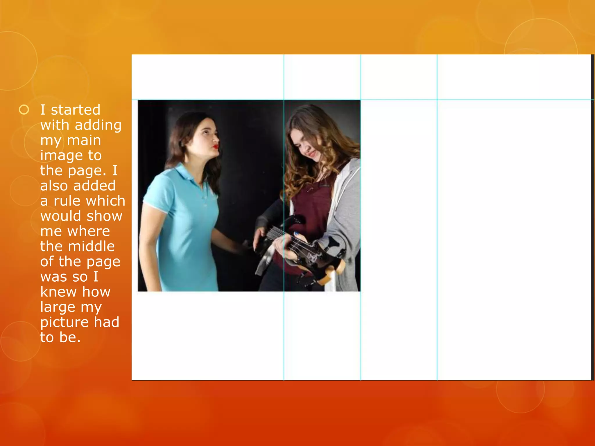
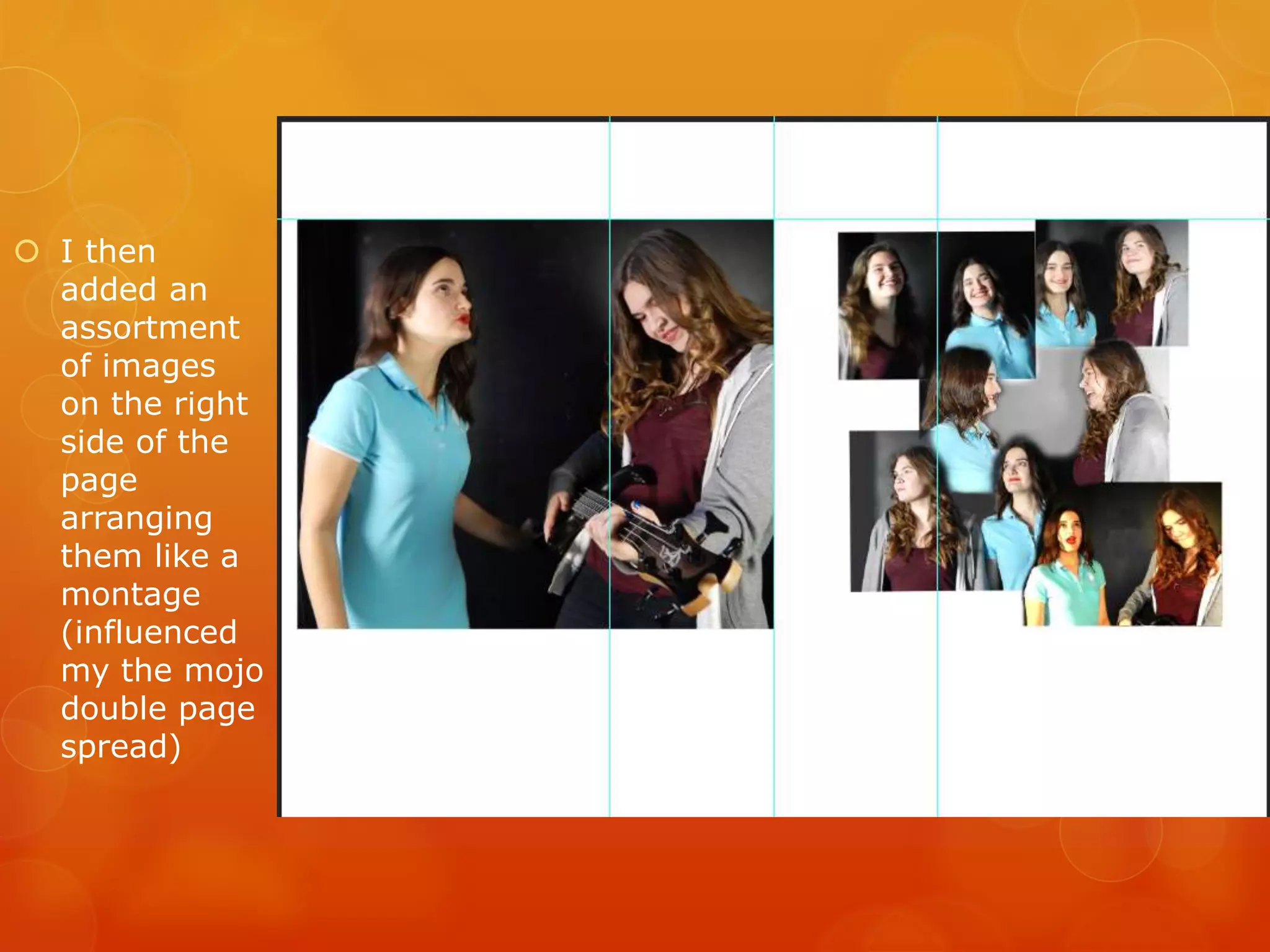
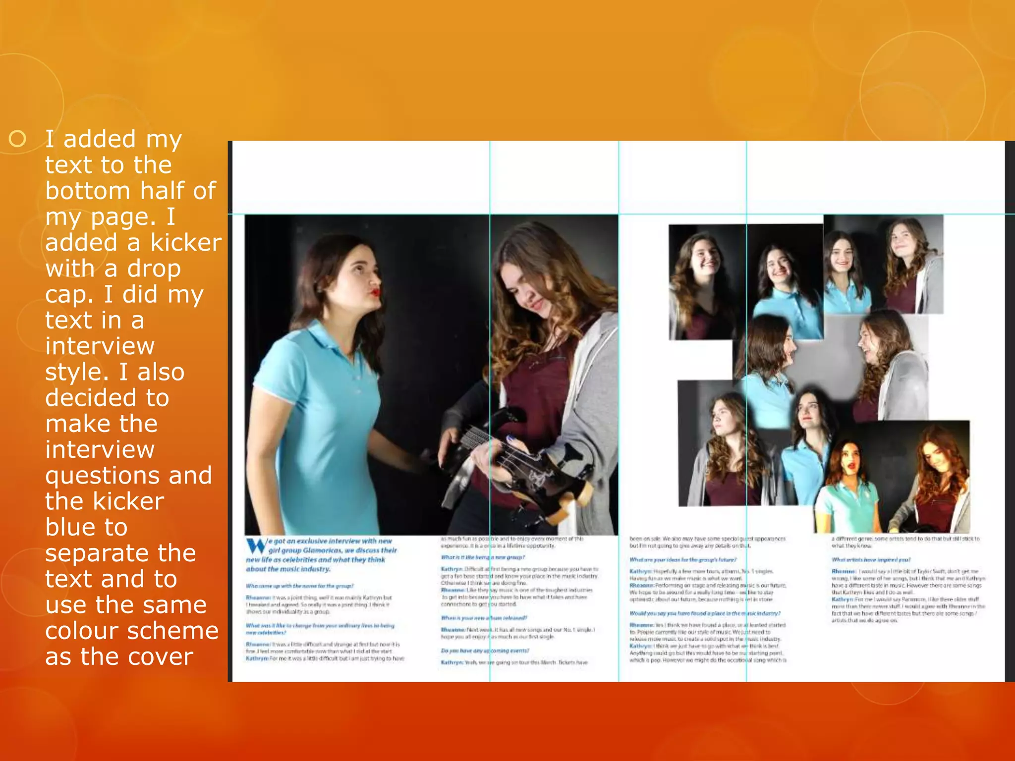
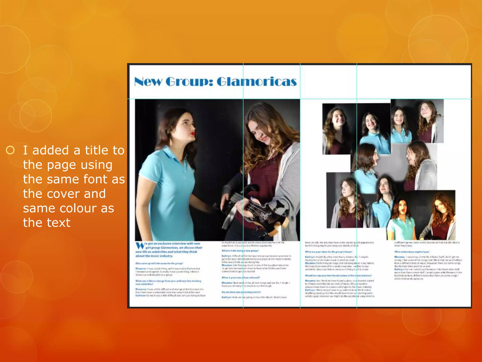
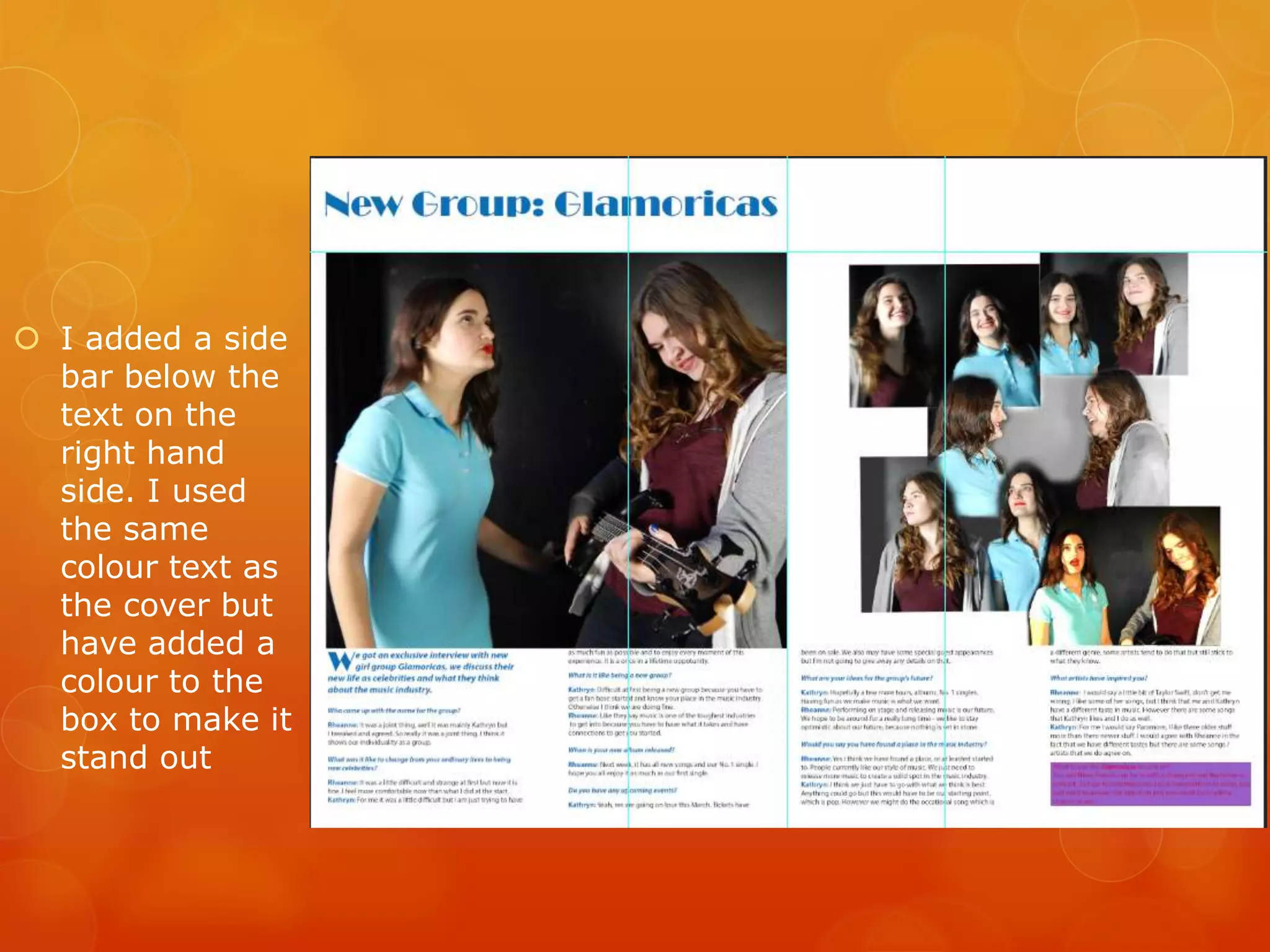
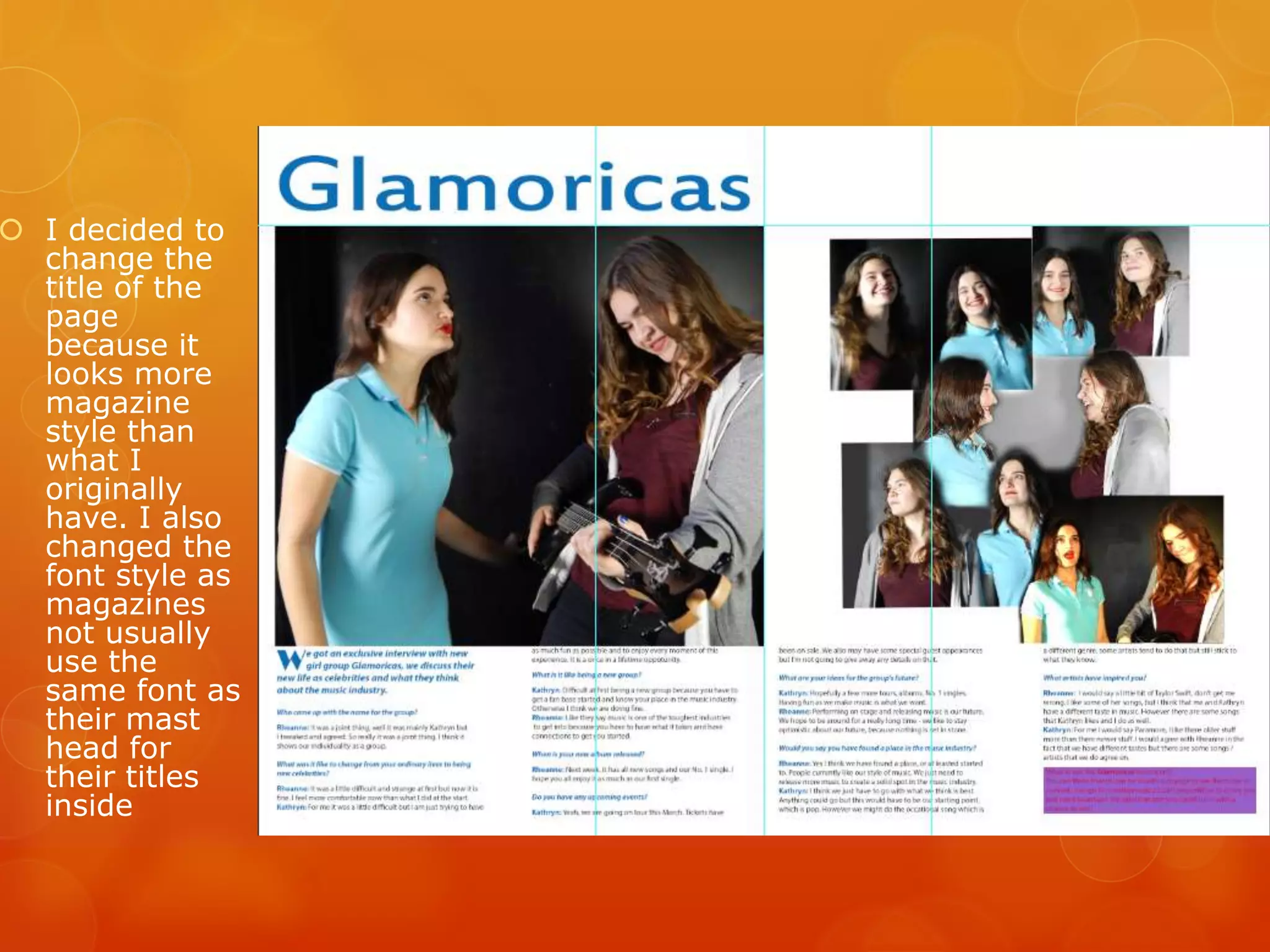
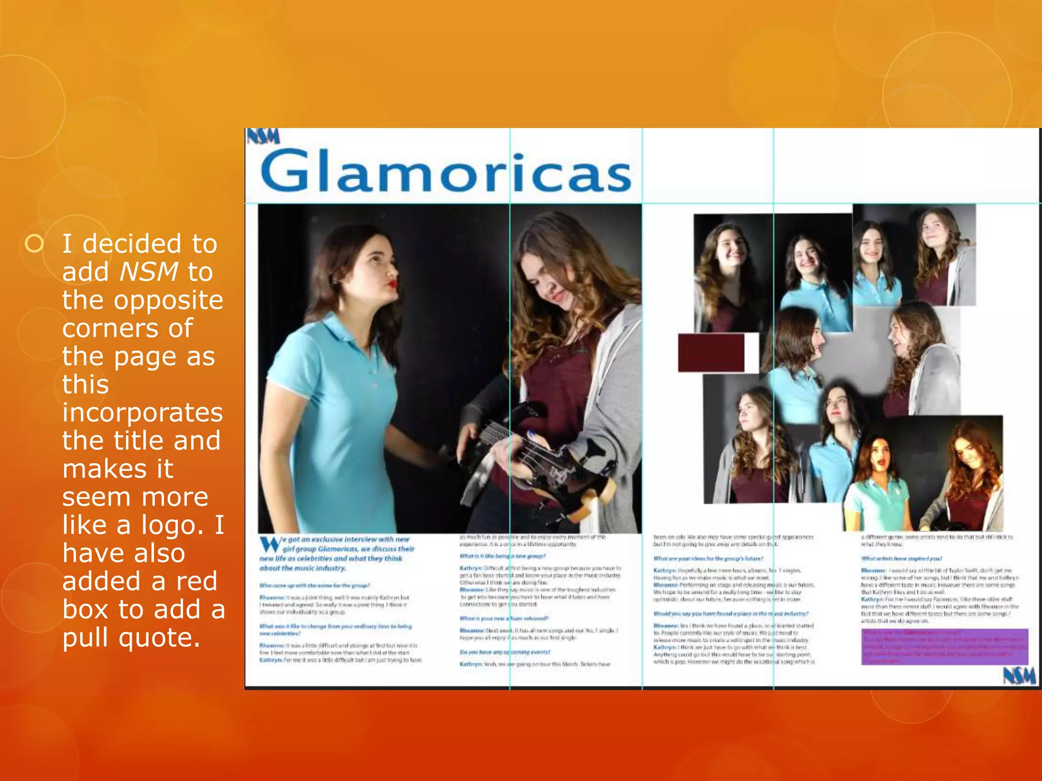
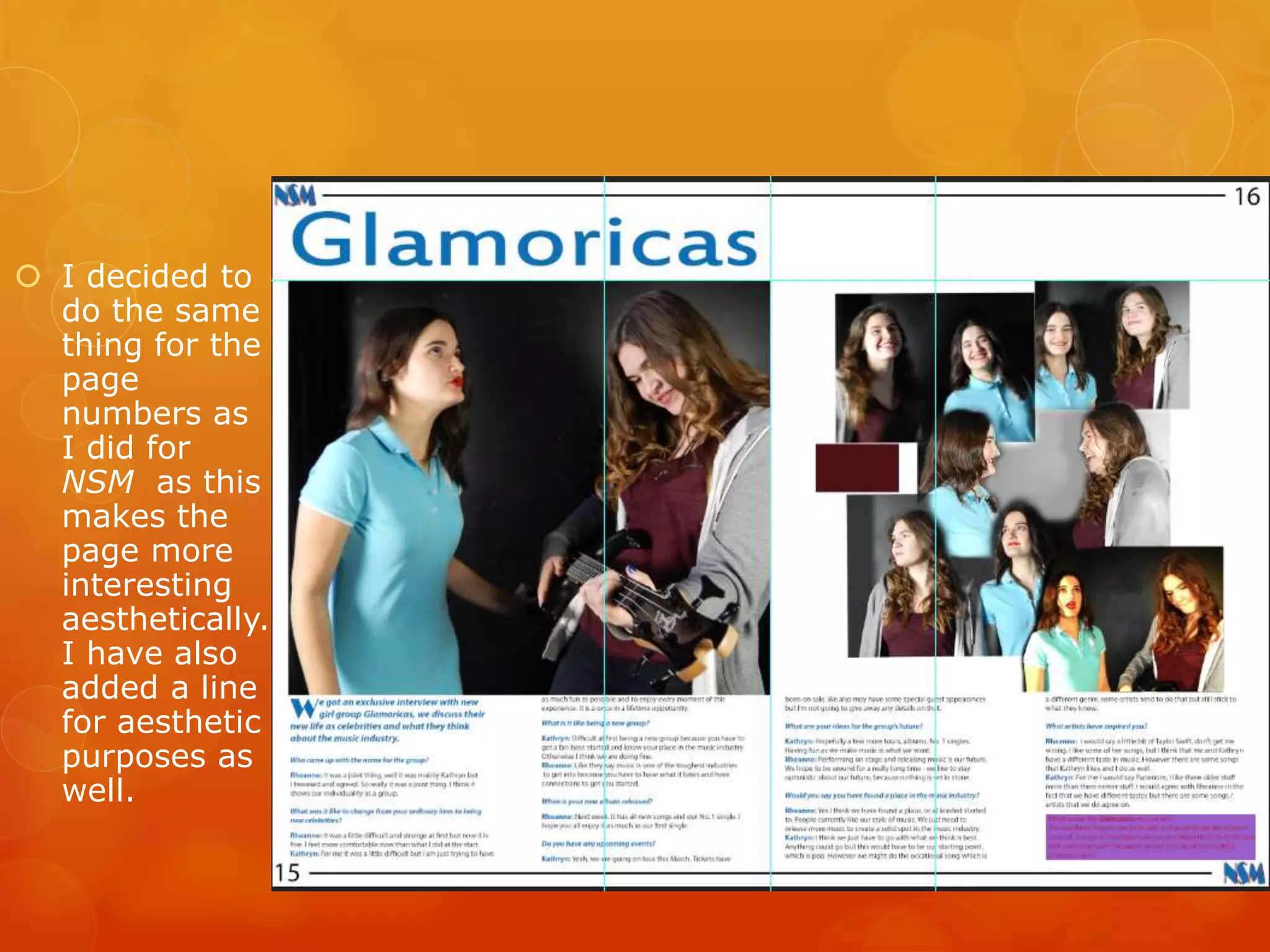
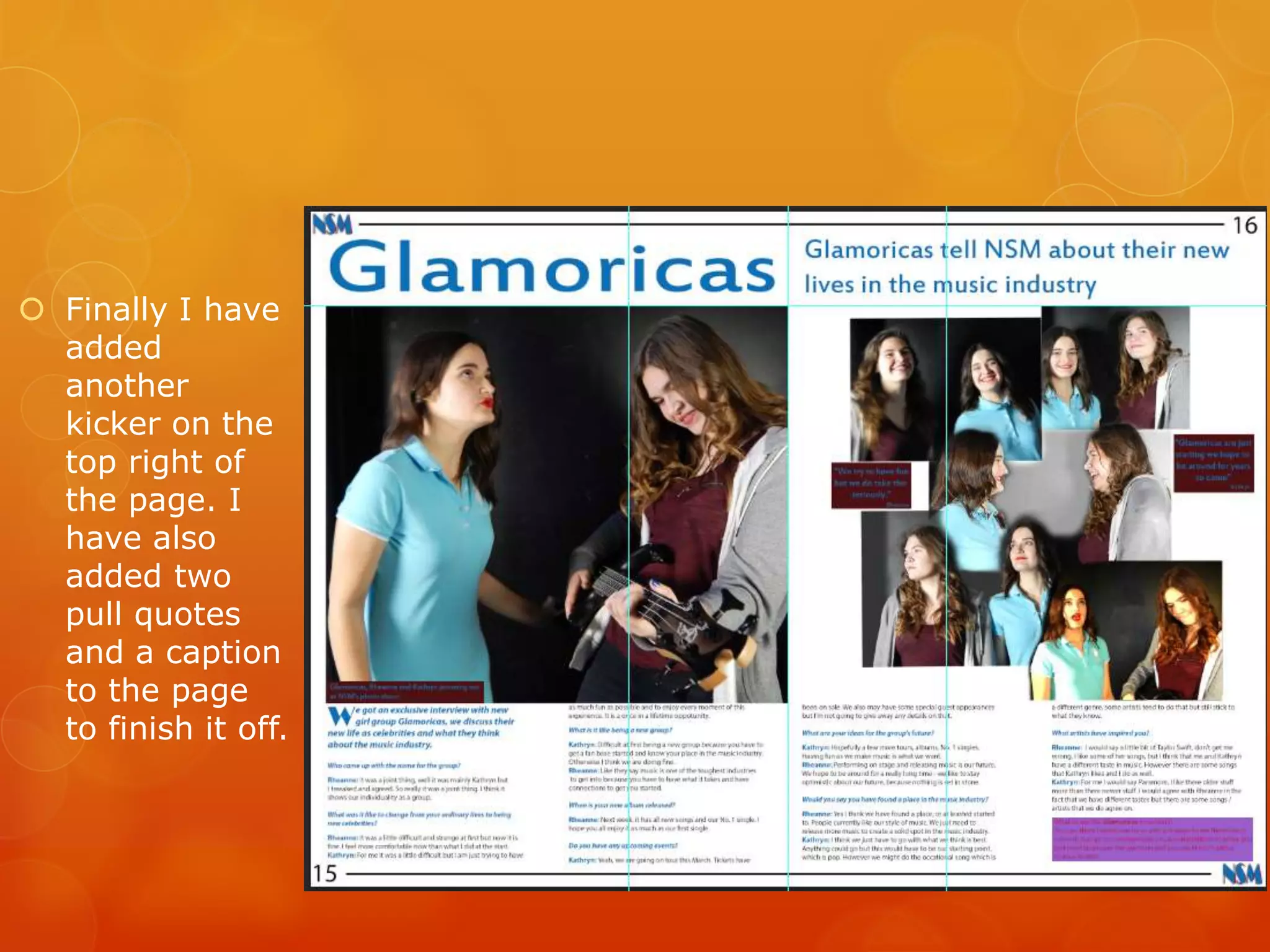
Development of Double
Page Spread
 I started
with adding
my main
image to
the page. I
also added
a rule which
would show
me where
the middle
of the page
was so I
knew how
large my
picture had
to be.
 I then
added an
assortment
of images
on the right
side of the
page
arranging
them like a
montage
(influenced
my the mojo
double page
spread)
 I added my
text to the
bottom half of
my page. I
added a kicker
with a drop
cap. I did my
text in a
interview
style. I also
decided to
make the
interview
questions and
the kicker
blue to
separate the
text and to
use the same
colour scheme
as the cover
 I added a title to
the page using
the same font as
the cover and
same colour as
the text
 I added a side
bar below the
text on the
right hand
side. I used
the same
colour text as
the cover but
have added a
colour to the
box to make it
stand out
 I decided to
change the
title of the
page
because it
looks more
magazine
style than
what I
originally
have. I also
changed the
font style as
magazines
not usually
use the
same font as
their mast
head for
their titles
inside
 I decided to
add NSM to
the opposite
corners of
the page as
this
incorporates
the title and
makes it
seem more
like a logo. I
have also
added a red
box to add a
pull quote.
 I decided to
do the same
thing for the
page
numbers as
I did for
NSM as this
makes the
page more
interesting
aesthetically.
I have also
added a line
for aesthetic
purposes as
well.
 Finally I have
added
another
kicker on the
top right of
the page. I
have also
added two
pull quotes
and a caption
to the page
to finish it off.

Development of Double Page Spread

  • 1.
  • 2.
     I started withadding my main image to the page. I also added a rule which would show me where the middle of the page was so I knew how large my picture had to be.
  • 3.
     I then addedan assortment of images on the right side of the page arranging them like a montage (influenced my the mojo double page spread)
  • 4.
     I addedmy text to the bottom half of my page. I added a kicker with a drop cap. I did my text in a interview style. I also decided to make the interview questions and the kicker blue to separate the text and to use the same colour scheme as the cover
  • 5.
     I addeda title to the page using the same font as the cover and same colour as the text
  • 6.
     I addeda side bar below the text on the right hand side. I used the same colour text as the cover but have added a colour to the box to make it stand out
  • 7.
     I decidedto change the title of the page because it looks more magazine style than what I originally have. I also changed the font style as magazines not usually use the same font as their mast head for their titles inside
  • 8.
     I decidedto add NSM to the opposite corners of the page as this incorporates the title and makes it seem more like a logo. I have also added a red box to add a pull quote.
  • 9.
     I decidedto do the same thing for the page numbers as I did for NSM as this makes the page more interesting aesthetically. I have also added a line for aesthetic purposes as well.
  • 10.
     Finally Ihave added another kicker on the top right of the page. I have also added two pull quotes and a caption to the page to finish it off.