Download to read offline
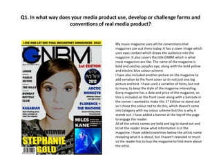


The magazine uses conventions of real magazines such as a colorful cover with the magazine title, date, artist images and coverlines to entice readers. Inside, it includes contents listing artist features, subscription details, editorials, page numbers and bold text for easy reading. However, it challenges some conventions by placing the artist name below rather than beside the image on double page spreads, and arranging content differently with pictures above text. The goal is to engage readers while experimenting with traditional magazine design.


![Movie-Collection-Database.pptx[2].pptx for biotech](https://cdn.slidesharecdn.com/ss_thumbnails/movie-collection-database-260110184349-6042841d-thumbnail.jpg?width=640&height=640&fit=bounds)

