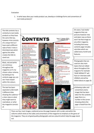
The media product challenges conventions of real magazines in some ways but also follows many conventions:
1) It uses a unique font for the title but keeps the title at the top like real magazines.
2) Photos and layout of sections are like real magazines but with original photos.
3) Elements like page numbers, author credits and three-column text layout match magazine conventions.
Codes and conventions of a magazines contents page
Evaluation question 1
1. Evaluation
1. In what ways does your media product use, develop or challenge forms and conventions of
real media products?
The title contents has a On every ‘real media’
similarity to real media magazine they use
products as they have pictures however new
the same title too, and taken new so there
however mine consists won’t be that image on
of a unique font as I any other magazine.
have used a different Including that every
style of text. It also is contents page includes
thick black text which sub-titles which are
against the white called every month and
creates the title to features.
stand out.
Photographs that are
Black, red and white
used are also main
are continous
topics that are talked
throughout the
about throughout the
magazine as it’s my
magazine for example
chosen colour scheme,
‘DUKE MCNULTY’ will
by looking at my
have an interview with
contents page you can
UNIQUE and will be
see I have stayed
talked about on page 20.
within the colours.
The text has been Following codes and
separated underneath conventions every
3 different titles image that has been
showing the audience taken for the contents
a clear view on what page there is a
they might want to number in the corner
read about, or what showing where the
the magazine consists page is listed from the
of. text.
There are four main images, scattered across the page however still in order and within the
collumns which sticks to the codes and conventions of the magazine to emphasis es the genre of
the magazine. They are all good quality photographs and are colourful which help the page stand
out.
2. The title ‘The moment that ...The Fools
A drop capital was went on parade!’ It represents what the
used on the first article is about that Craig a member of
The colour scheme
line of the article the band is on a journey through life I followed the codes and
throughout the
so the reader letting the audience know this attracts conventions by putting the
magazine has
knew where to the reader to want to read more as they article in three columns.
stayed black white
begin reading. become engaged.
and red.
The main image spills onto the
My stand first is short but is a In the bottom right hand corner there is a page
second page and by the image is of
short introductory to what the number so when you read the contents page
Craig holding a guitar help show
article is about. you know where the article is. Including that it
what the article is going to be
states who created the article and who took
about.
the picture.
3. The title has codes
and conventions of a For my main image I
magazine front cover have used my camera
as it is on the top left angle, looking at him
hand side of the to the right side
page. instead of standing
completely opposite,
also he is crouching
My positioning to show that he is
statement relates to the calm and comfortable
title ‘UNIQUE’ this also this makes my work
follows the codes and unique and different
conventions of a to other peoples. My
magazine front cover. model is also using
direct address to
engage the audience
as if it makes it look
I have used a like he’s looking at
barcode as on them.
every music
magazine that has
a price on it Having the cover
consists of it lines in red makes
having a bar code them stand out
this follows the more and make the
codes and words more
conventions of a vibrant.
music magazine.