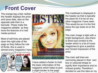
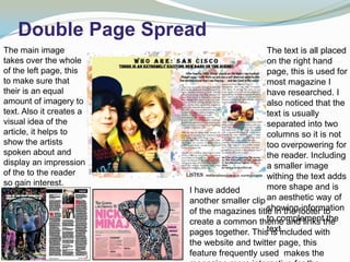
In what ways does your media
     product use, develop or
      challenge forms and
    conventions of real media
           products?
Front Cover
The orange tag under neither                                    The masthead is displayed in
the header displays the price                                   the header as that is typically
and issue date, also on the                                     the place for it to be on any
opposite side their is a                                        other magazine I have seen.
barcode. These make the                                         This would be as it is the first
magazine sellable as they                                       place the eye looks at on the
have the features of a real                                     page.
media product.
                                                                The main image is light with a
Most of sell lines are placed                                   bright background, also there
down the right side of the                                      is direct eye contact to the
page so they follow the rule                                    reader which is a lot of music
of thirds, this is used in                                      magazines to give a positive
almost every magazine I have                                    and honest impression of the
researched. They are also                                       artist.
commonly placed around the
face/image so blend on the                                      The main sell lines are
cover.                                                          commonly placed in their own
                                I have added a footer to hold   box or coloured shape to
                                the basic information of the    signify their importance and so
                                magazine which helps to give    noticed quickly. Therefore I
                                a slight border to the page     decided to use this idea on my
Contents Page
The idea of there being an                                          The header holds the title of
editors message on the                                              the page which is written using
contents page is something I                                        the same font type and colour
found to be interesting and                                         of the magazine title, this
useful for my music                                                 created a theme within the
magazine.                                                           magazine which is a common
This piece of writing is the                                        conversion found.
linked with an image to
balance out the amount of                                           Underneath the header is
text on the page.                                                   placed a smaller version of the
                                                                    magazine title so it is repeated
Sections of the contents page                                       and then becomes more
have been put in boxes with                                         rememorable to the reader.
patterned borders to separate
the information and add more                                        Down the right hand side of
colour and interesting display                                      the page is a list of the topics
to the page. This is found in                                       and features which will be
other popular magazines.                                            found in the magazine, this
                                 I added smaller images to the page to used in every
                                                                    idea is
                                 make it more aesthetically pleasing,
                                                                    magazine on the contents
                                 this helps to give a visual idea topagetextgive an introduction
                                                                     the to and adds more
                                 informal personality to the magazine summary the what it is
                                                                    and to create into
Double Page Spread
The main image                                 The text is all placed
takes over the whole                           on the right hand
of the left page, this                         page, this is used for
to make sure that                              most magazine I
their is an equal                              have researched. I
amount of imagery to                           also noticed that the
text. Also it creates a                        text is usually
visual idea of the                             separated into two
article, it helps to                           columns so it is not
show the artists                               too overpowering for
spoken about and                               the reader. Including
display an impression                          a smaller image
of the to the reader                           withing the text adds
so gain interest.                              more shape and is
Using eye contact         I have added
makes a direct link       another smaller clip an aesthetic way of
                                               showing information
                          of the magazines title in the footer to
and friendly feel to
                                               to complement the
                          create a common theme and links the
the reader such as
                                               text.
                          pages together. This is included with
others do.
                          the website and twitter page, this
                          feature frequently used makes the

Evalutation

  • 1.
    In what waysdoes your media product use, develop or challenge forms and conventions of real media products?
  • 2.
    Front Cover The orangetag under neither The masthead is displayed in the header displays the price the header as that is typically and issue date, also on the the place for it to be on any opposite side their is a other magazine I have seen. barcode. These make the This would be as it is the first magazine sellable as they place the eye looks at on the have the features of a real page. media product. The main image is light with a Most of sell lines are placed bright background, also there down the right side of the is direct eye contact to the page so they follow the rule reader which is a lot of music of thirds, this is used in magazines to give a positive almost every magazine I have and honest impression of the researched. They are also artist. commonly placed around the face/image so blend on the The main sell lines are cover. commonly placed in their own I have added a footer to hold box or coloured shape to the basic information of the signify their importance and so magazine which helps to give noticed quickly. Therefore I a slight border to the page decided to use this idea on my
  • 3.
    Contents Page The ideaof there being an The header holds the title of editors message on the the page which is written using contents page is something I the same font type and colour found to be interesting and of the magazine title, this useful for my music created a theme within the magazine. magazine which is a common This piece of writing is the conversion found. linked with an image to balance out the amount of Underneath the header is text on the page. placed a smaller version of the magazine title so it is repeated Sections of the contents page and then becomes more have been put in boxes with rememorable to the reader. patterned borders to separate the information and add more Down the right hand side of colour and interesting display the page is a list of the topics to the page. This is found in and features which will be other popular magazines. found in the magazine, this I added smaller images to the page to used in every idea is make it more aesthetically pleasing, magazine on the contents this helps to give a visual idea topagetextgive an introduction the to and adds more informal personality to the magazine summary the what it is and to create into
  • 4.
    Double Page Spread Themain image The text is all placed takes over the whole on the right hand of the left page, this page, this is used for to make sure that most magazine I their is an equal have researched. I amount of imagery to also noticed that the text. Also it creates a text is usually visual idea of the separated into two article, it helps to columns so it is not show the artists too overpowering for spoken about and the reader. Including display an impression a smaller image of the to the reader withing the text adds so gain interest. more shape and is Using eye contact I have added makes a direct link another smaller clip an aesthetic way of showing information of the magazines title in the footer to and friendly feel to to complement the create a common theme and links the the reader such as text. pages together. This is included with others do. the website and twitter page, this feature frequently used makes the