
Recommended
Recommended
More Related Content
What's hot
What's hot (20)
Viewers also liked
Viewers also liked (16)
Similar to Evaluation Q1
Similar to Evaluation Q1 (20)
Recently uploaded
Recently uploaded (19)
Evaluation Q1
- 1. Evaluation
- 2. In what ways does your media product use, develop or challenge forms and conventions of real media products? I used the convention of a masthead on my cover page. Nearly all magazines utilise this convention. I took inspiration for the style of my masthead from the magazines Q and NME as they focus on similar topics and target audiences and have a similar style to my magazine. I incorporated a sans-serif font similar to the NME masthead to convey an eye-catching simplicity. The masthead was positioned in the top-left corner of the cover page, as it is in Q and NME. This consistent positions helps the reader recognise the magazine as they know where to look to find the masthead. It also avoids being too in-your-face for the reader by not taking up too much of the page, which it might if it was placed in the centre. However my masthead challenges the convention of colourful mastheads by being entirely black-and-white. I chose to do this as I wanted the masthead to look professional and simplistic: eye-catching enough to get readers’ attention but not colourful so that it blends in with the page and matches the black- and-white cover.
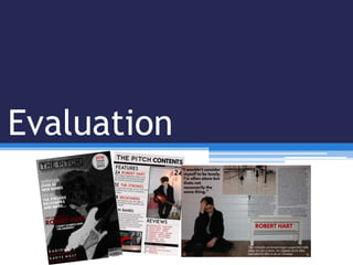
- 3. In what ways does your media product use, develop or challenge forms and conventions of real media products? For the contents page header, I again utilised common conventions from other publications. I used the common format of using the masthead text without borders next to the “Contents” text, which is used in both Q and Kerrang magazines. This convention was used as it clearly presents to the reader that this is the contents page using textual imagery that they are familiar with (the masthead font). The lack of border makes the font look cleaner and blend in better with the page while stile retaining recognisability. Another convention I utilised was using the issue date in the header. This informs the reader of the date of the magazine and ensures they know they are up- to-date. However, I also partially challenged this convention. In Q magazine, the date is positioned directly above the masthead, whereas in my magazine, the date is positioned in a black bar that stretches across the width of the page, below the masthead. This separates the header from the contents page distinctly and draws attention to the date.
- 4. In what ways does your media product use, develop or challenge forms and conventions of real media products? I used a colour scheme of black, white, and red in my production, which is seen in numerous publications that focus on similar music. I utilized these three colours most prominently on my cover page. The black and white cover picture creates a professional, iconic look. The red adds flair and visual appeal to the cover, preventing it from looking dreary or plain. This convention is employed in some issues of NME and Q: a greyscale image with red and black/white text, to emphasise the picture. I used contrasting text colours for heading and subheadings to create visual appeal by using red for the heading and white for the subheading text. This is a convention visible in the NME clipping on the right. This creates a certain distinction between heading and subheading. The use of the simple colour scheme convention allows the reader to focus on the textual content rather than be distracted by the visual aspects of the magazine.