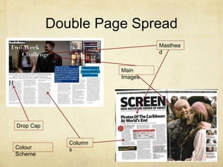
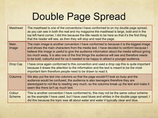
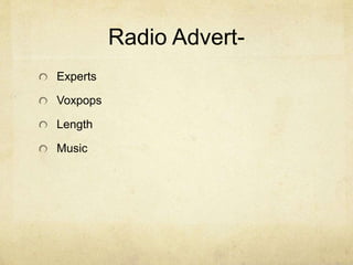
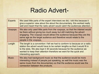
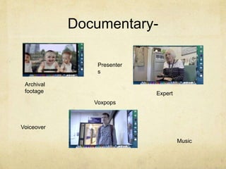
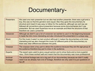
In what ways does
your media product
use, develop or
challenge forms and
conventions of real
media products?
By Lorna Yates
Double Page Spread
Masthea
d
Column
s
Main
Images
Drop Cap
Colour
Scheme
Double Page Spread
Masthead The masthead is one of the conventions I have conformed to on my double page spread,
as you can see in both the real and my magazine the masthead is large, bold and in the
top left hand corner. I did this because the title needs to be here so that it’s the first thing
that the reader will see, as then they will stop and read the page.
Main
Image
The main image is another convention I have conformed to because it is the biggest image
and shows the main characters from the media text. I have decided to conform because I
believe this image is useful to give the audience information about the media without giving
too much away. It is also one of the first things the audience will see and therefore needs
to be bold, colourful and for us it needed to be happy to attract a younger audience.
Drop Cap I have once again conformed to this convention and used a drop cap this is quite important
because it draws the attention to the information and the text is meant to be the most
important item therefore people need to be drawn to read it.
Columns We also put the text into columns so that the page wouldn't’t look so busy and the
audience would be confused, the audience is also teenagers therefore they are
stereotyped to not like to reading very much, so the columns break up the text and make it
seem like there isn't as much text.
Colour
Scheme
This is another convention I have conformed to, this may not be the same colour scheme
as the example I have used, but I have used blues and whites in the double page spread; I
did this because the topic was all about water and water it typically clear and blue.
Radio Advert-
Experts
Voxpops
Length
Music
Radio Advert-
Experts We used little parts of the expert interviews we did, I did this because it
give a superior view about the about the documentary, this worked really
well and meant that the radio advert would catch the audiences attention.
Voxpops We also only used little parts from the voxpops, so that the interest would
be there without giving too much away but still matching the advert
engaging. The voxpops would attract the audience because they are the
same age as the target audience and therefore would relate to the
people in the voxpops.
Length The length is a convention I felt we had to conform to because on a radio
station the advert would have to be certain lengths so that it would fit in
to the slots. We also kept it 30 seconds because for the audience we
wanted to keep their attention therefore we went for the quick and
interesting approach.
Music We also had background music so that the audience would be more
interesting instead of people just speaking, as well the music was the
same music from the documentary so that the audience would see the
connection between the products.
Documentary-
Archival
footage Expert
Voxpops
Voiceover
Music
Presenter
s
Documentary-
Presenters We used one main presenter but we also had another presenter, there was a girl and a
boy, this was so that the genders were equal. Also they gave the documentary its
structure and meant it was easy to follow for the audience, although we cant say we
followed all conventions about presenters because some documentaries don’t use
presenters. But we used Supersize me as an example and liked the structure of that
therefore we used a presenter.
Voiceover Although we didn't’t use a lot of voiceover we wanted to use it in the beginning because
it made the intro more interesting and also introduced the presenters in a unique way.
Music For the music it wasn’t a main product although it makes the documentary a lot more
interesting and we also changed the music for different parts of the documentary so
there was clear differences between the parts.
Voxpops The voxpops were a key part to attract the audience because they are the age group of
the audience therefore key part to draw in the audience.
Experts The expert were used to give a equal opinion and to show facts and a more superior
view, I think these worked well and meant that the documentary was more professional.
Archival
Footage
The archival footage was not a big part of our documentary because we didn't’t really
need it as we already had a lot of footage, therefore we only used it to put questions on
top off.

Evaluation 1

  • 1.
    In what waysdoes your media product use, develop or challenge forms and conventions of real media products? By Lorna Yates
  • 2.
  • 3.
    Double Page Spread MastheadThe masthead is one of the conventions I have conformed to on my double page spread, as you can see in both the real and my magazine the masthead is large, bold and in the top left hand corner. I did this because the title needs to be here so that it’s the first thing that the reader will see, as then they will stop and read the page. Main Image The main image is another convention I have conformed to because it is the biggest image and shows the main characters from the media text. I have decided to conform because I believe this image is useful to give the audience information about the media without giving too much away. It is also one of the first things the audience will see and therefore needs to be bold, colourful and for us it needed to be happy to attract a younger audience. Drop Cap I have once again conformed to this convention and used a drop cap this is quite important because it draws the attention to the information and the text is meant to be the most important item therefore people need to be drawn to read it. Columns We also put the text into columns so that the page wouldn't’t look so busy and the audience would be confused, the audience is also teenagers therefore they are stereotyped to not like to reading very much, so the columns break up the text and make it seem like there isn't as much text. Colour Scheme This is another convention I have conformed to, this may not be the same colour scheme as the example I have used, but I have used blues and whites in the double page spread; I did this because the topic was all about water and water it typically clear and blue.
  • 4.
  • 5.
    Radio Advert- Experts Weused little parts of the expert interviews we did, I did this because it give a superior view about the about the documentary, this worked really well and meant that the radio advert would catch the audiences attention. Voxpops We also only used little parts from the voxpops, so that the interest would be there without giving too much away but still matching the advert engaging. The voxpops would attract the audience because they are the same age as the target audience and therefore would relate to the people in the voxpops. Length The length is a convention I felt we had to conform to because on a radio station the advert would have to be certain lengths so that it would fit in to the slots. We also kept it 30 seconds because for the audience we wanted to keep their attention therefore we went for the quick and interesting approach. Music We also had background music so that the audience would be more interesting instead of people just speaking, as well the music was the same music from the documentary so that the audience would see the connection between the products.
  • 6.
  • 7.
    Documentary- Presenters We usedone main presenter but we also had another presenter, there was a girl and a boy, this was so that the genders were equal. Also they gave the documentary its structure and meant it was easy to follow for the audience, although we cant say we followed all conventions about presenters because some documentaries don’t use presenters. But we used Supersize me as an example and liked the structure of that therefore we used a presenter. Voiceover Although we didn't’t use a lot of voiceover we wanted to use it in the beginning because it made the intro more interesting and also introduced the presenters in a unique way. Music For the music it wasn’t a main product although it makes the documentary a lot more interesting and we also changed the music for different parts of the documentary so there was clear differences between the parts. Voxpops The voxpops were a key part to attract the audience because they are the age group of the audience therefore key part to draw in the audience. Experts The expert were used to give a equal opinion and to show facts and a more superior view, I think these worked well and meant that the documentary was more professional. Archival Footage The archival footage was not a big part of our documentary because we didn't’t really need it as we already had a lot of footage, therefore we only used it to put questions on top off.