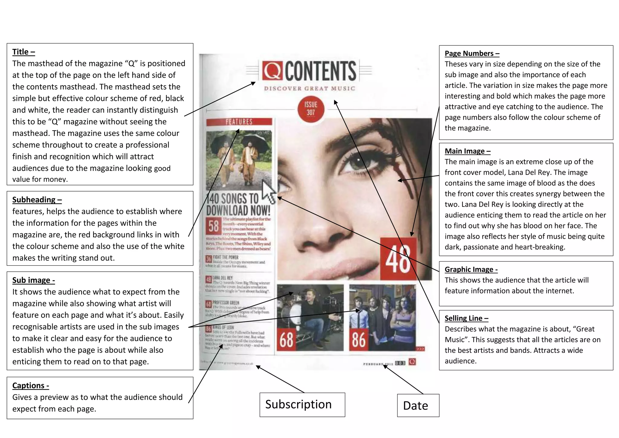
Title –
The masthead of the magazine “Q” is positioned
at the top of the page on the left hand side of
the contents masthead. The masthead sets the
simple but effective colour scheme of red, black
and white, the reader can instantly distinguish
this to be “Q” magazine without seeing the
masthead. The magazine uses the same colour
scheme throughout to create a professional
finish and recognition which will attract
audiences due to the magazine looking good
value for money.
Subheading –
features, helps the audience to establish where
the information for the pages within the
magazine are, the red background links in with
the colour scheme and also the use of the white
makes the writing stand out.
Sub image -
It shows the audience what to expect from the
magazine while also showing what artist will
feature on each page and what it’s about. Easily
recognisable artists are used in the sub images
to make it clear and easy for the audience to
establish who the page is about while also
enticing them to read on to that page.
Page Numbers –
Theses vary in size depending on the size of the
sub image and also the importance of each
article. The variation in size makes the page more
interesting and bold which makes the page more
attractive and eye catching to the audience. The
page numbers also follow the colour scheme of
the magazine.
Main Image –
The main image is an extreme close up of the
front cover model, Lana Del Rey. The image
contains the same image of blood as the does
the front cover this creates synergy between the
two. Lana Del Rey is looking directly at the
audience enticing them to read the article on her
to find out why she has blood on her face. The
image also reflects her style of music being quite
dark, passionate and heart-breaking.
Graphic Image -
This shows the audience that the article will
feature information about the internet.
Selling Line –
Describes what the magazine is about, “Great
Music”. This suggests that all the articles are on
the best artists and bands. Attracts a wide
audience.
Captions -
Gives a preview as to what the audience should
expect from each page. Subscription Date

Q Contents Page Analysis

  • 1.
    Title – The mastheadof the magazine “Q” is positioned at the top of the page on the left hand side of the contents masthead. The masthead sets the simple but effective colour scheme of red, black and white, the reader can instantly distinguish this to be “Q” magazine without seeing the masthead. The magazine uses the same colour scheme throughout to create a professional finish and recognition which will attract audiences due to the magazine looking good value for money. Subheading – features, helps the audience to establish where the information for the pages within the magazine are, the red background links in with the colour scheme and also the use of the white makes the writing stand out. Sub image - It shows the audience what to expect from the magazine while also showing what artist will feature on each page and what it’s about. Easily recognisable artists are used in the sub images to make it clear and easy for the audience to establish who the page is about while also enticing them to read on to that page. Page Numbers – Theses vary in size depending on the size of the sub image and also the importance of each article. The variation in size makes the page more interesting and bold which makes the page more attractive and eye catching to the audience. The page numbers also follow the colour scheme of the magazine. Main Image – The main image is an extreme close up of the front cover model, Lana Del Rey. The image contains the same image of blood as the does the front cover this creates synergy between the two. Lana Del Rey is looking directly at the audience enticing them to read the article on her to find out why she has blood on her face. The image also reflects her style of music being quite dark, passionate and heart-breaking. Graphic Image - This shows the audience that the article will feature information about the internet. Selling Line – Describes what the magazine is about, “Great Music”. This suggests that all the articles are on the best artists and bands. Attracts a wide audience. Captions - Gives a preview as to what the audience should expect from each page. Subscription Date