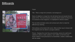
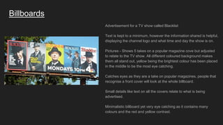
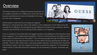
Codes and Conventions
Billboards
Billboards
The Resident
Title - Largest wording on the billboard to give the audience instant
recognition to the brand and what is being advertised. Stands out against
the rest of display, showing its importance. Serif font gives an older
presentation possibly reflecting an older target audience.
Slogan - ‘Your magazine, your London’, direct mode of address connects
to the reader making it feel more personal.
Web address at the bottom, allows audience to interact directly with the
magazine. App store logo encourages the younger audience to interact.
Background is a bright orange colour - grabs attention and eye catching.
Pictures - Display different ways of how to read the magazine
displayings flexibility and accessibility. Attracts a wider range of readers
because of the technological way of reading and may seem more
appealing.
Billboards
Elle
Title - Big lettering and a bright colour to contrast against the black
background to make it stand out.
Date is shown to keep the readers informed and up to date if they are
interested.
Pictures of different magazines, attract a wider audience as they show
many different front covers. Because of all the different colours in all the
front covers it makes it stand out.
Text is quite to a minimum as people who look at the billboard don’t have
time to read a lot of writing therefore the main objective of the billboard is
to attract attention and stand out. However it is informative and too the
point, so for the people who are quickly viewing the billboard it is still
informative.
Billboards
Vogue
Title - Title is a large font contrasts a red background.
Name of celebrity in a large font, this will attract fans and people that are
aware of her. The word exclusive could also attract readers as they know
it is exclusive to that magazine, it is highlighted to attracts readers.
The red white and black colours all contrast each other to make the
billboard eye catching.
Web address at the bottom left corner, offers another way to interact with
the magazine and can attract a younger audience.
Picture - Displays the cover they are promoting, picture of a well known
celebrity to attract a wider audience. ‘Icon’ written on the front cover
shown makes it more personal as it is handwritten, creates a relationship
with the reader.
Billboards
Advertisement for a TV show called Blacklist
Text is kept to a minimum, however the information shared is helpful,
displaying the channel logo and what time and day the show is on.
Pictures - Shows 5 takes on a popular magazine cove but adjusted
to relate to the TV show. All different coloured background makes
them all stand out, yellow being the brightest colour has been placed
in the middle to be the most eye catching.
Catches eyes as they are a take on popular magazines, people that
recognise a front cover will look at the whole billboard.
Small details like text on all the covers relate to what is being
advertised.
Minimalistic billboard yet very eye catching as it contains many
colours and the red and yellow contrast.
Overview
The bottom picture isn’t a billboard however the picture on
it is suitable inspiration for a billboard as I think this would
be good advertisement to show the flexibility of the ways
you can view a magazine.
Unfortunately I could only find one regional magazine
billboard so I researched into others that related to other magazines or that I liked and could
recreate for my billboard, for example the guess billboard is simple yet eye catching, I like the
simplicity and would like to do something similar related to my magazine.
From my research I found that often the biggest wording on the billboard is the brand/the name
of the magazine. This creates brand recognition. There is minimal writing on the billboard and if
there is text it is kept short and informative. This is because people who see the billboards only
look at them for a very short amount of time, so they need to be eye catching and as clear as
possible. There is often bright colour used grab people's attention. Sometimes they include the
web address, ways to view the magazine and ways to access the magazine. For example the
bottom picture on the right shows the magazine can be accessed on phones, computers and
ipads.

Codes and Conventions - Billboards

  • 1.
  • 2.
    Billboards The Resident Title -Largest wording on the billboard to give the audience instant recognition to the brand and what is being advertised. Stands out against the rest of display, showing its importance. Serif font gives an older presentation possibly reflecting an older target audience. Slogan - ‘Your magazine, your London’, direct mode of address connects to the reader making it feel more personal. Web address at the bottom, allows audience to interact directly with the magazine. App store logo encourages the younger audience to interact. Background is a bright orange colour - grabs attention and eye catching. Pictures - Display different ways of how to read the magazine displayings flexibility and accessibility. Attracts a wider range of readers because of the technological way of reading and may seem more appealing.
  • 3.
    Billboards Elle Title - Biglettering and a bright colour to contrast against the black background to make it stand out. Date is shown to keep the readers informed and up to date if they are interested. Pictures of different magazines, attract a wider audience as they show many different front covers. Because of all the different colours in all the front covers it makes it stand out. Text is quite to a minimum as people who look at the billboard don’t have time to read a lot of writing therefore the main objective of the billboard is to attract attention and stand out. However it is informative and too the point, so for the people who are quickly viewing the billboard it is still informative.
  • 4.
    Billboards Vogue Title - Titleis a large font contrasts a red background. Name of celebrity in a large font, this will attract fans and people that are aware of her. The word exclusive could also attract readers as they know it is exclusive to that magazine, it is highlighted to attracts readers. The red white and black colours all contrast each other to make the billboard eye catching. Web address at the bottom left corner, offers another way to interact with the magazine and can attract a younger audience. Picture - Displays the cover they are promoting, picture of a well known celebrity to attract a wider audience. ‘Icon’ written on the front cover shown makes it more personal as it is handwritten, creates a relationship with the reader.
  • 5.
    Billboards Advertisement for aTV show called Blacklist Text is kept to a minimum, however the information shared is helpful, displaying the channel logo and what time and day the show is on. Pictures - Shows 5 takes on a popular magazine cove but adjusted to relate to the TV show. All different coloured background makes them all stand out, yellow being the brightest colour has been placed in the middle to be the most eye catching. Catches eyes as they are a take on popular magazines, people that recognise a front cover will look at the whole billboard. Small details like text on all the covers relate to what is being advertised. Minimalistic billboard yet very eye catching as it contains many colours and the red and yellow contrast.
  • 6.
    Overview The bottom pictureisn’t a billboard however the picture on it is suitable inspiration for a billboard as I think this would be good advertisement to show the flexibility of the ways you can view a magazine. Unfortunately I could only find one regional magazine billboard so I researched into others that related to other magazines or that I liked and could recreate for my billboard, for example the guess billboard is simple yet eye catching, I like the simplicity and would like to do something similar related to my magazine. From my research I found that often the biggest wording on the billboard is the brand/the name of the magazine. This creates brand recognition. There is minimal writing on the billboard and if there is text it is kept short and informative. This is because people who see the billboards only look at them for a very short amount of time, so they need to be eye catching and as clear as possible. There is often bright colour used grab people's attention. Sometimes they include the web address, ways to view the magazine and ways to access the magazine. For example the bottom picture on the right shows the magazine can be accessed on phones, computers and ipads.