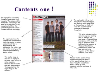
This document analyzes the layout, design elements, and house style of three different magazine covers from the music magazine Q. Some key points made in the analysis include:
- The masthead is consistently placed in the top left corner for recognition purposes.
- Cover shots are usually medium close-ups that frame the celebrity's face and draw the reader in.
- A limited color palette, consistent fonts, and framing of cover shots with subheadings helps maintain a clean, professional style.
- Additional images, colors, and text sizes are used strategically to draw attention to important elements or stories within the magazine.


