Downloaded 11 times


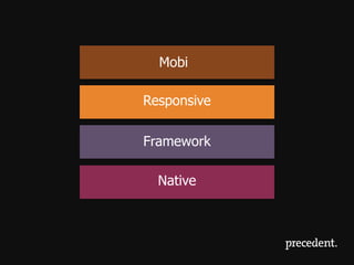

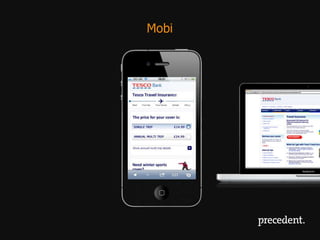
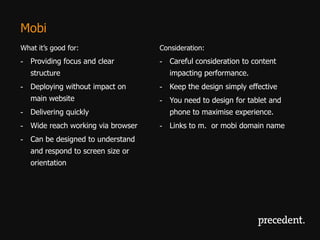

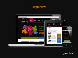

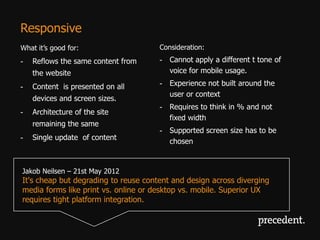
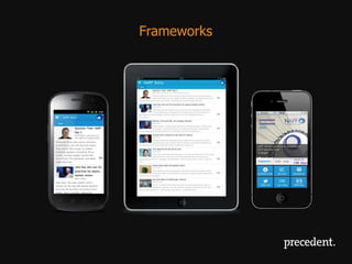

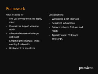
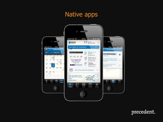
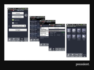
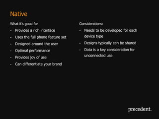


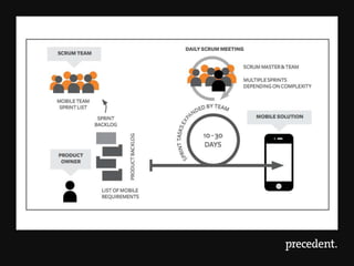


The document discusses different approaches to developing mobile experiences: 1. Mobi - focuses on providing clear structure and navigation for mobile, without impacting the main website. Content is designed specifically for phones. 2. Responsive - uses the same content across devices by reflowing content based on screen size. Requires designing for all screen sizes. 3. Framework - balances rich design and wide reach by simplifying interfaces while enabling key functionality. Develop once and deploy across devices. 4. Native - provides optimal performance and rich interfaces through platform-specific development, but requires separate development for each device/platform. It analyzes the pros and cons of each approach and when each is most suitable.


