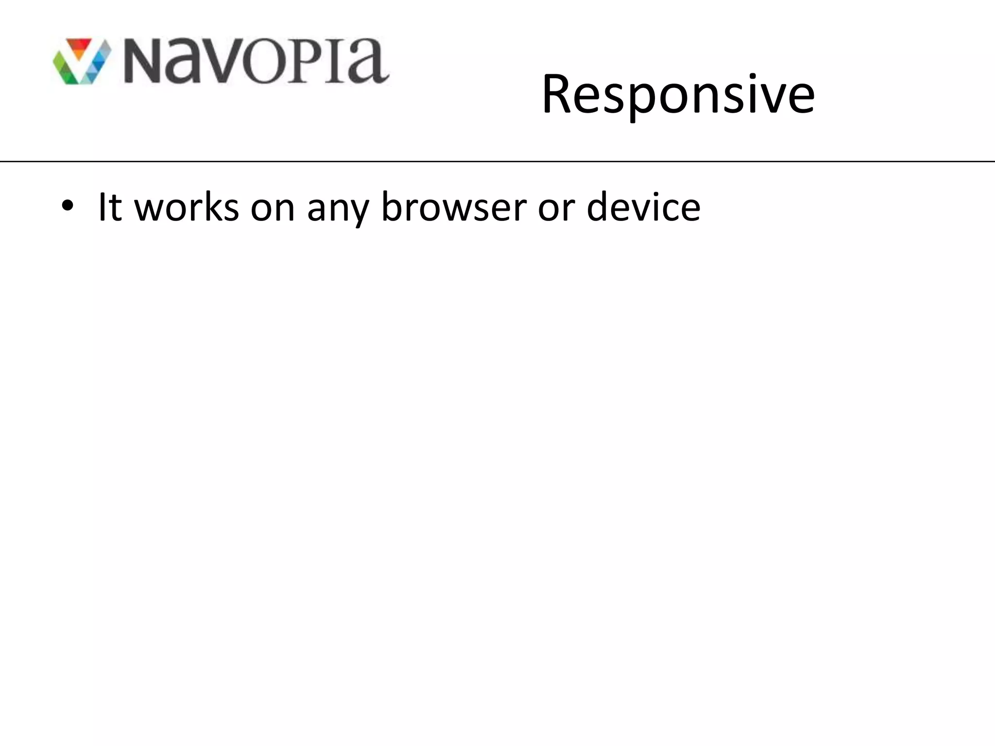
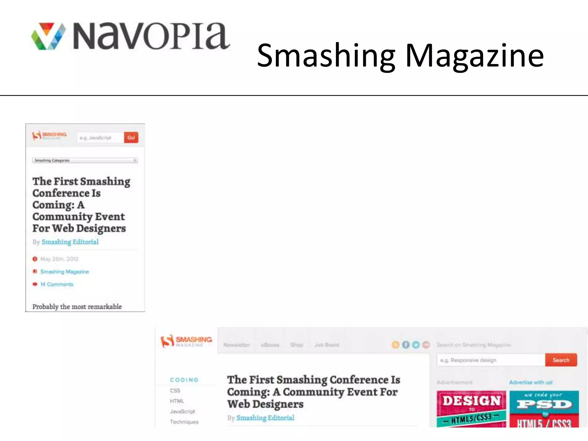
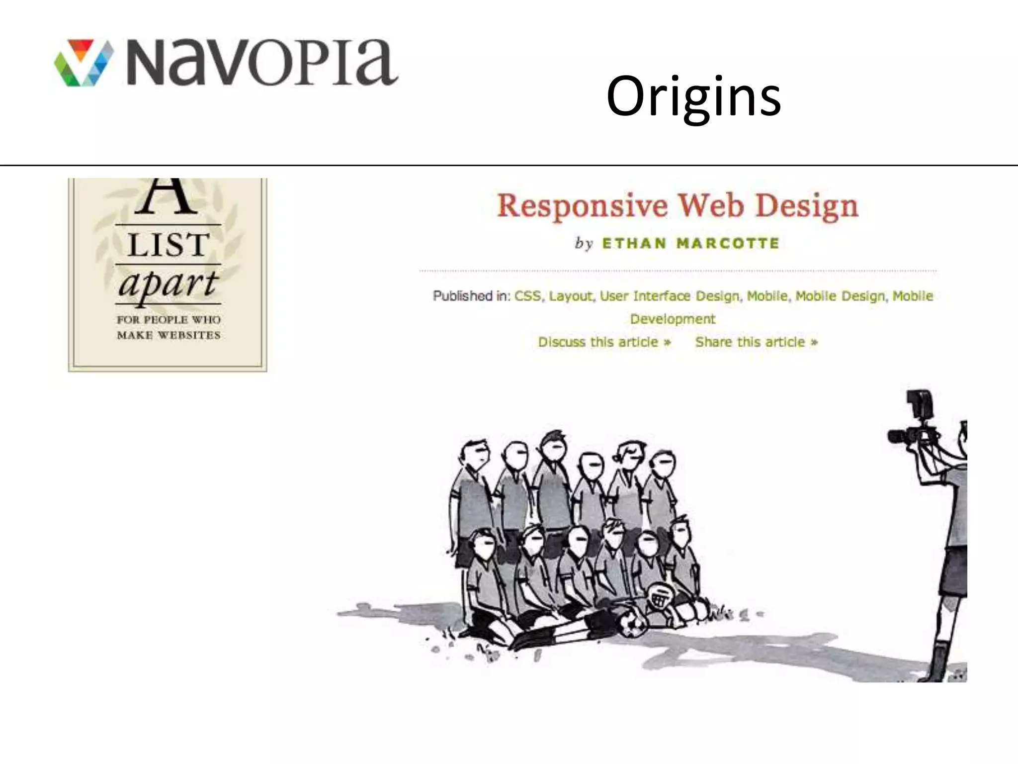
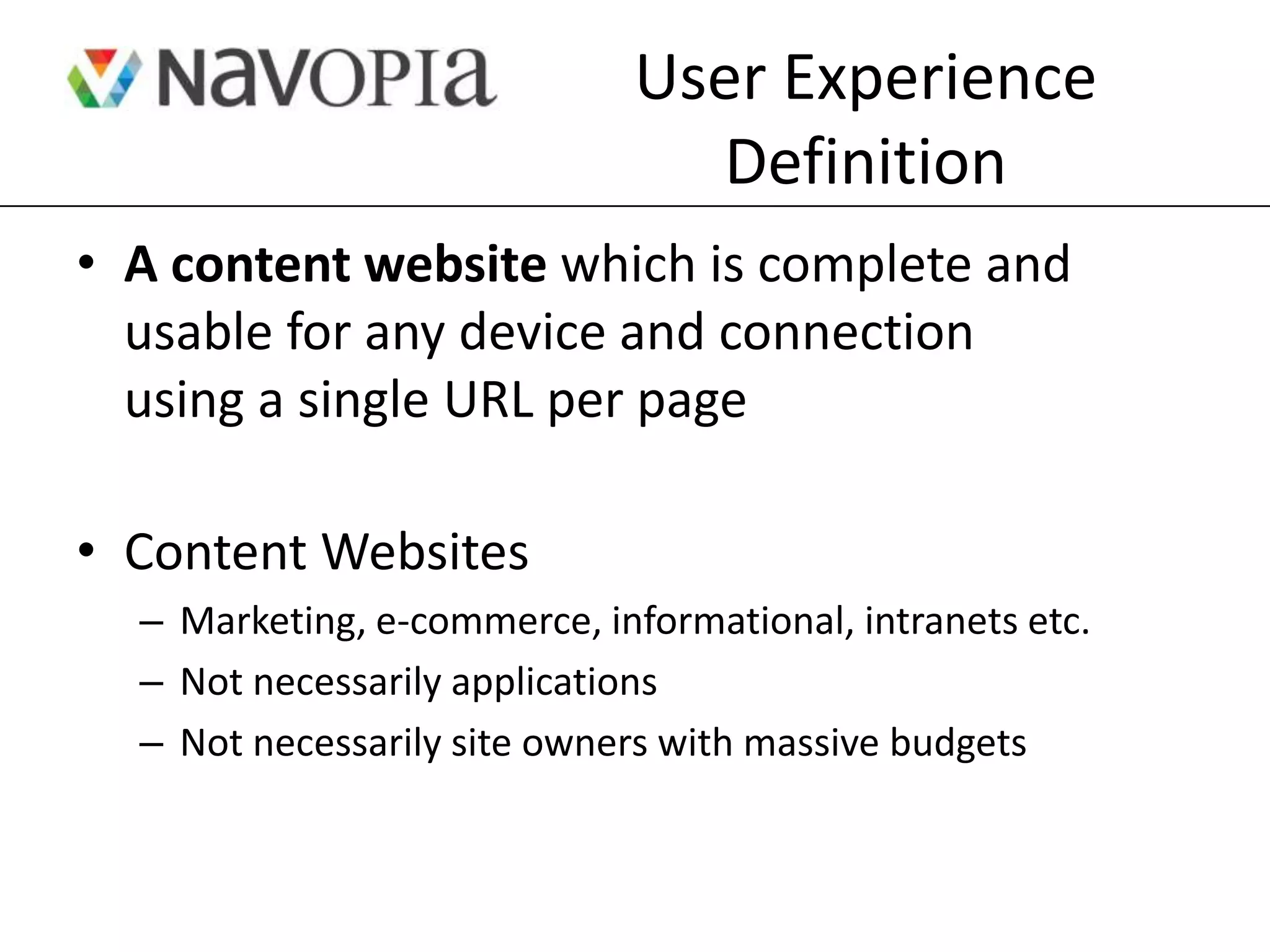
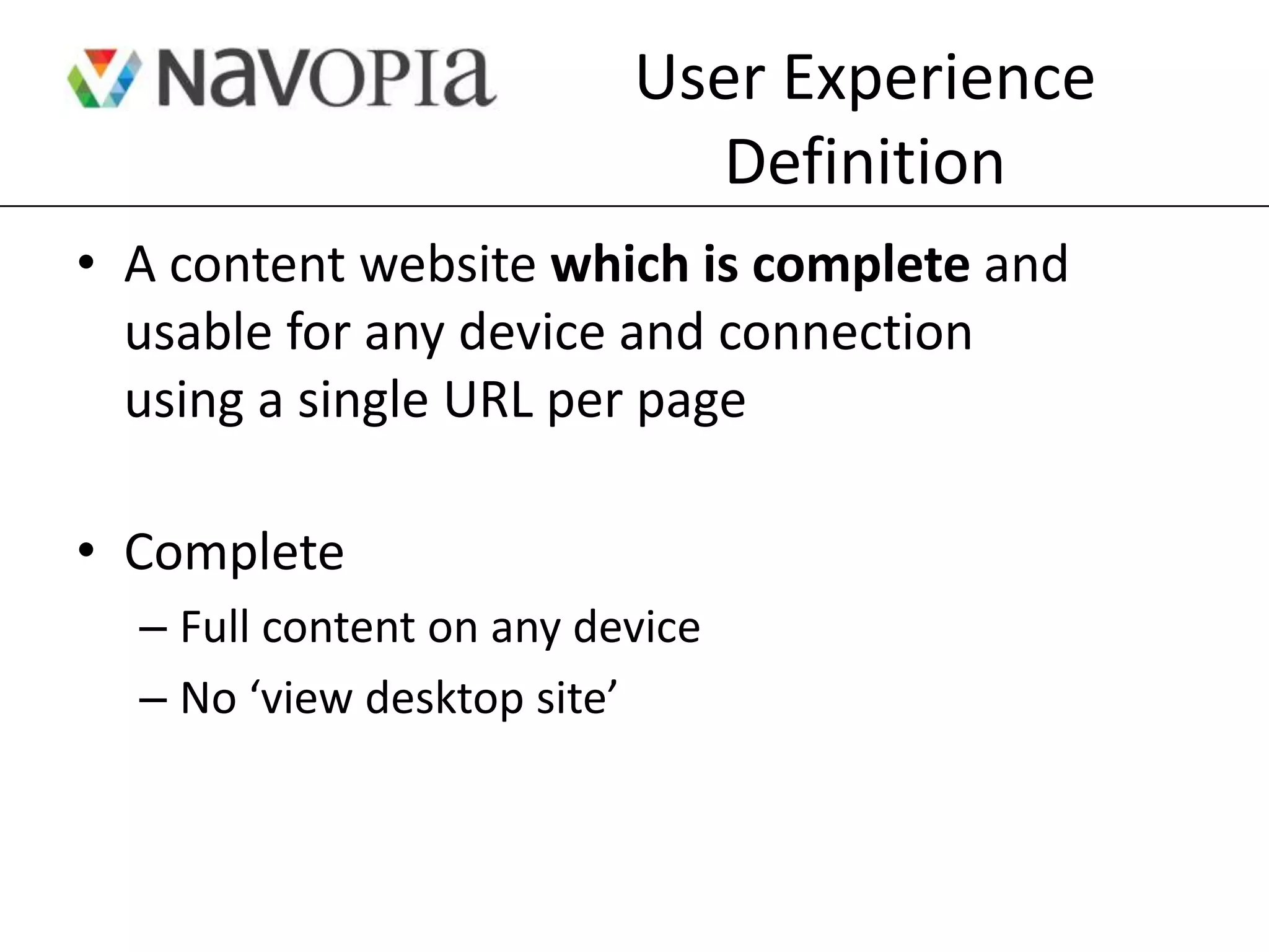
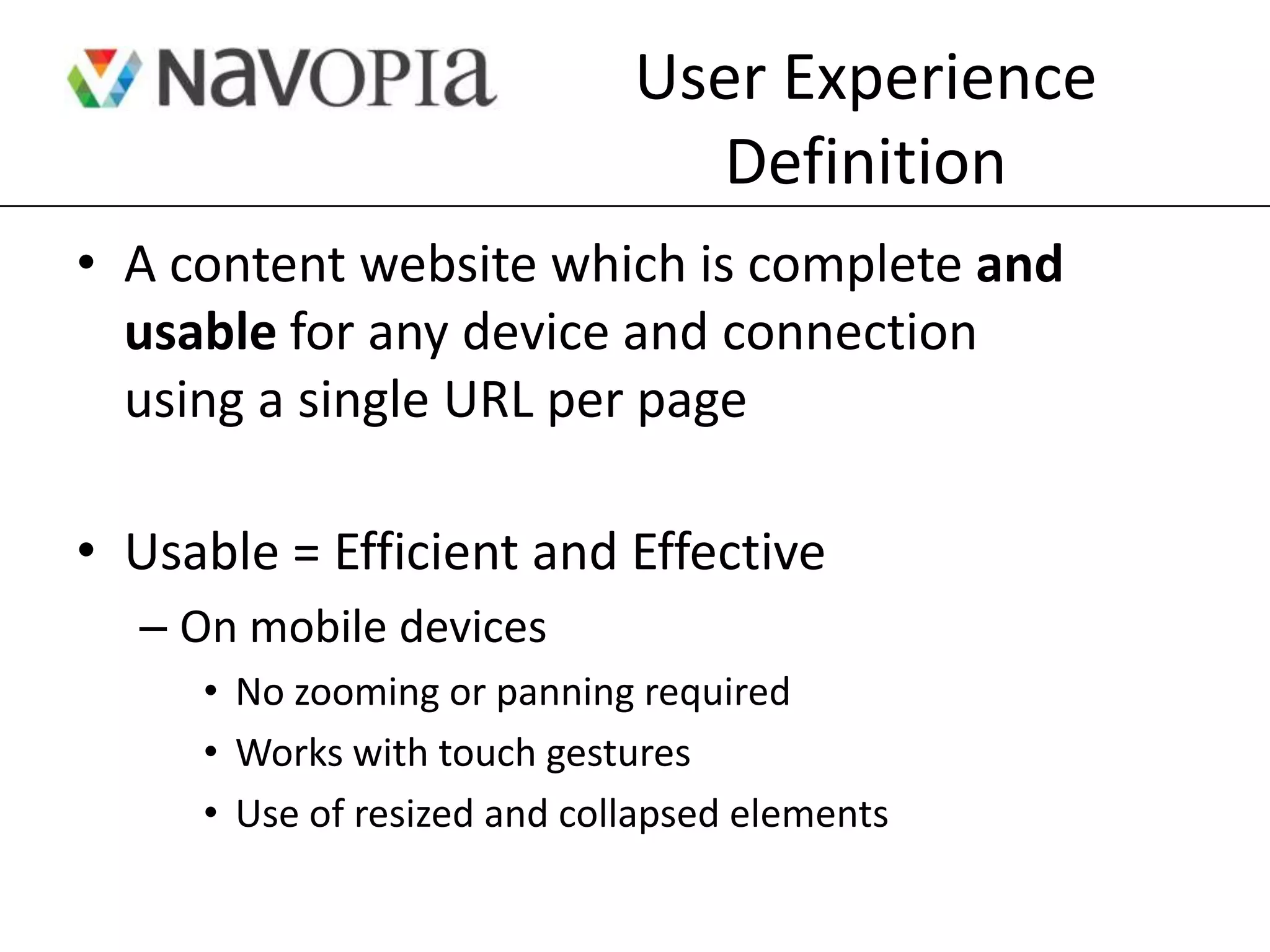
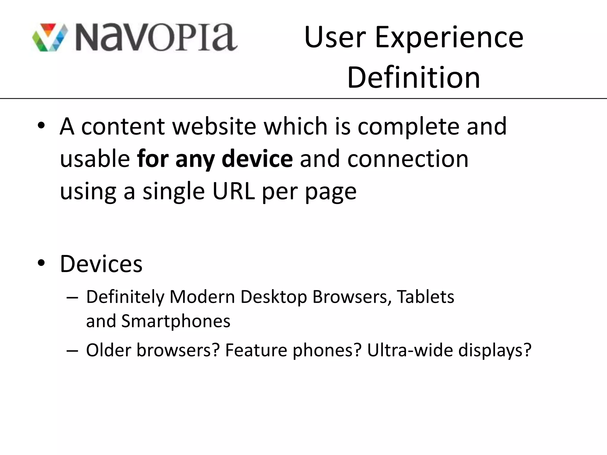
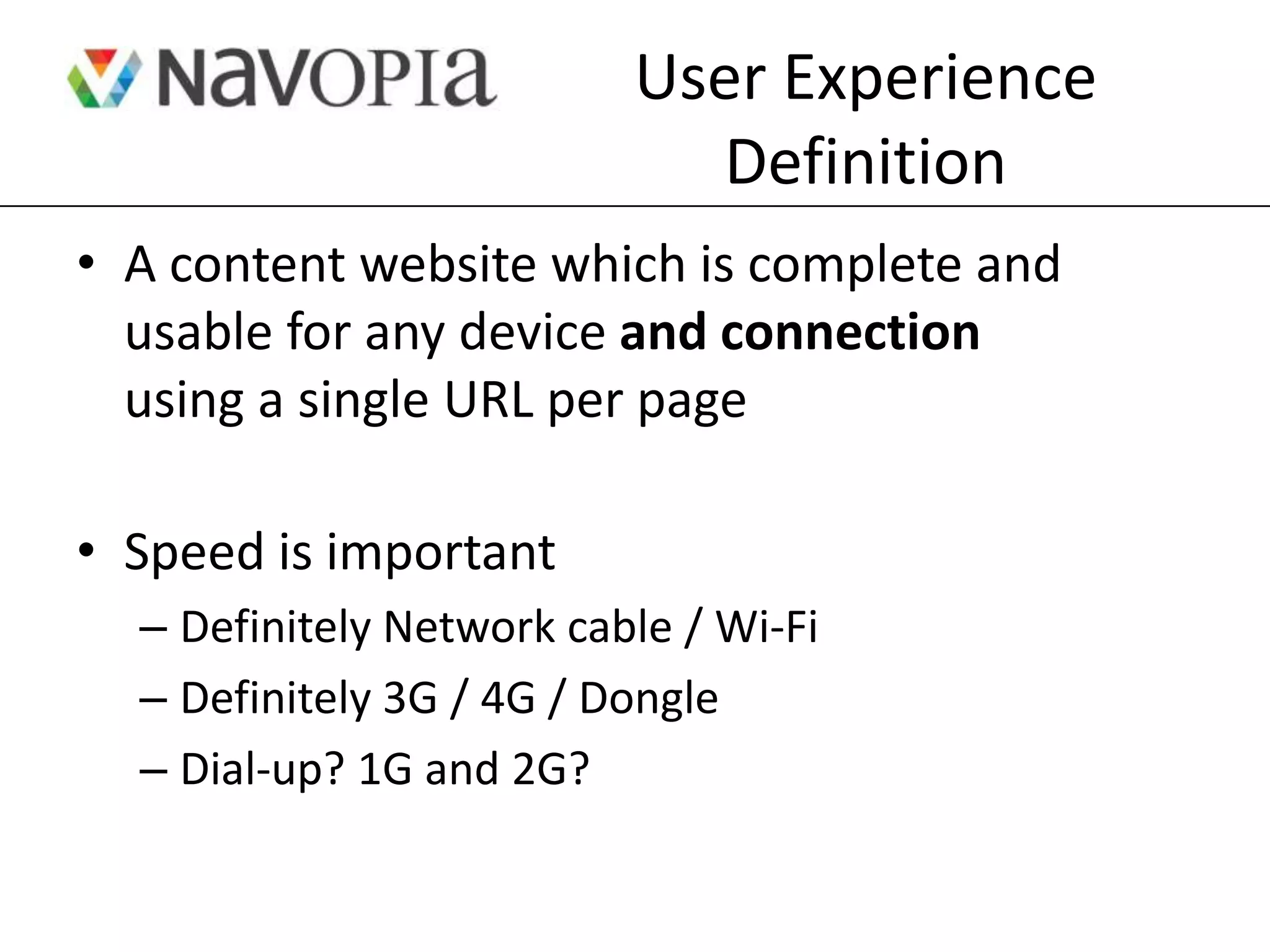
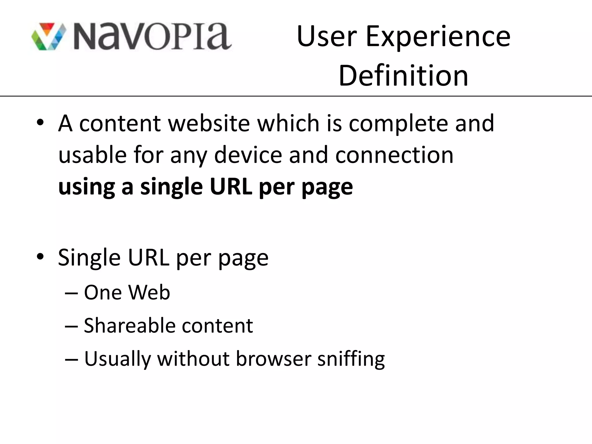
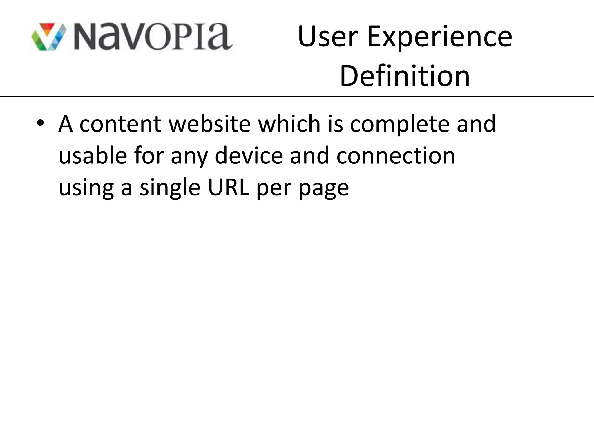
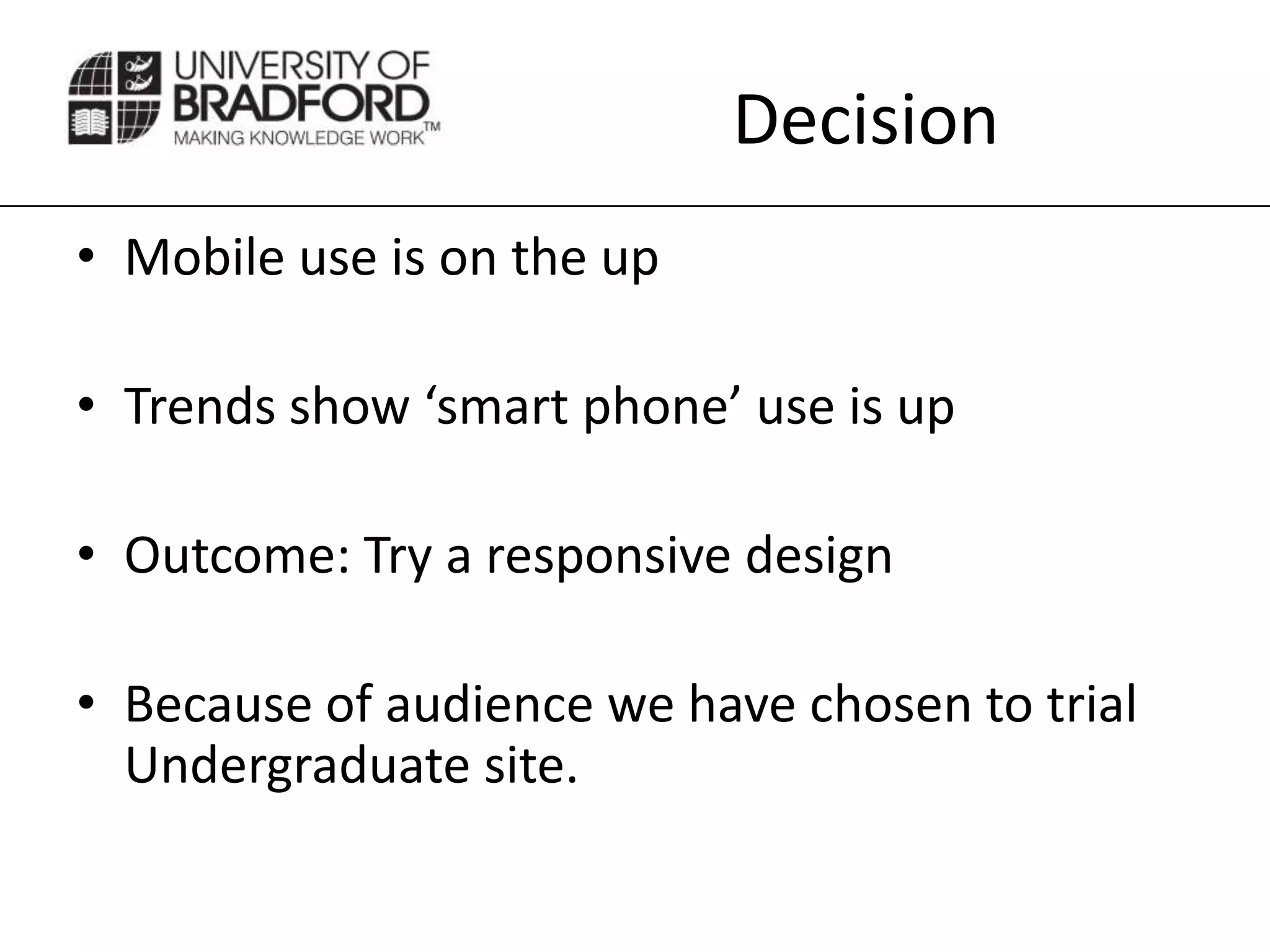
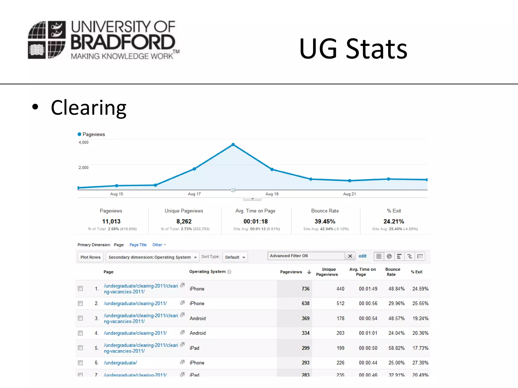
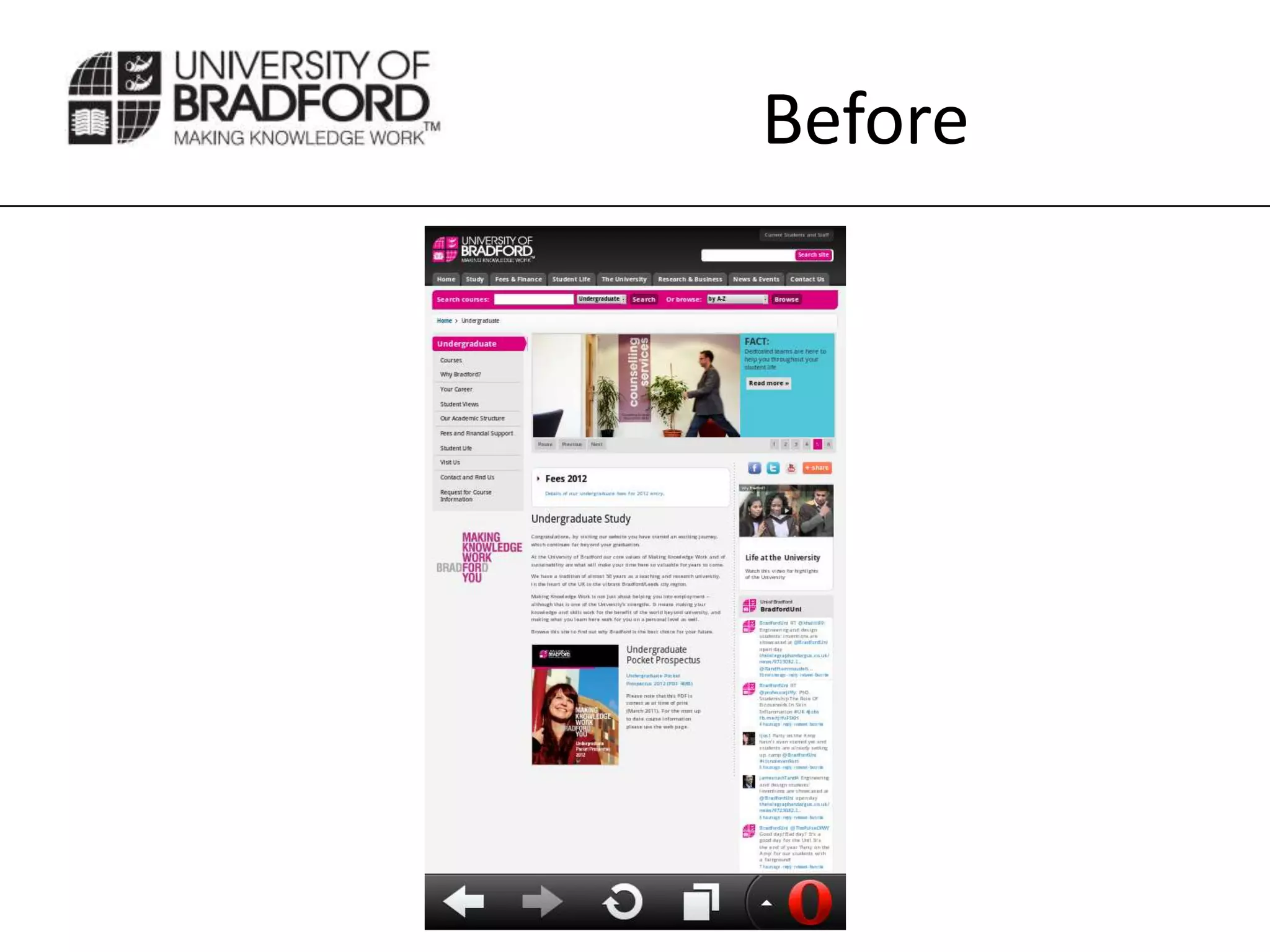
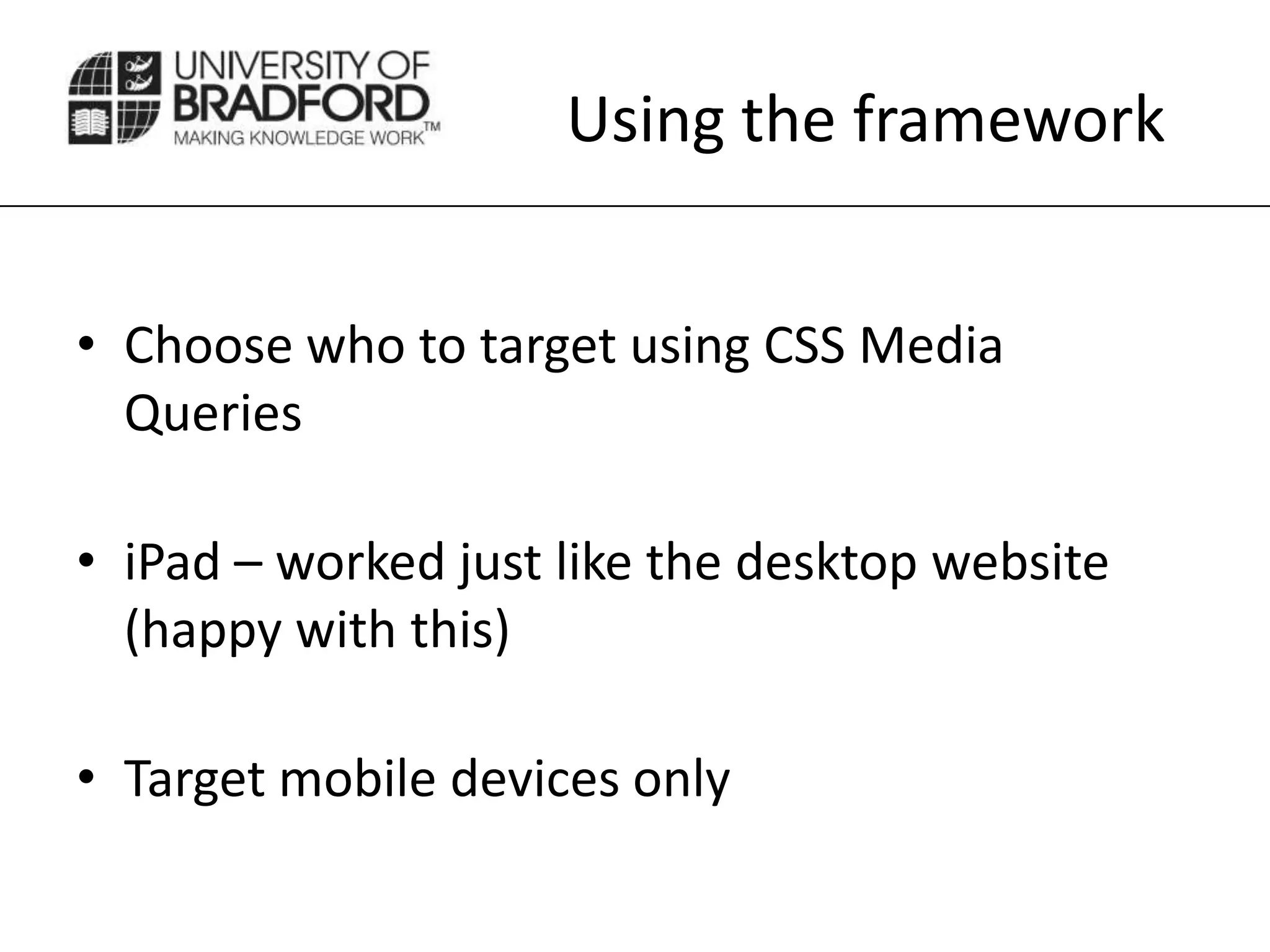
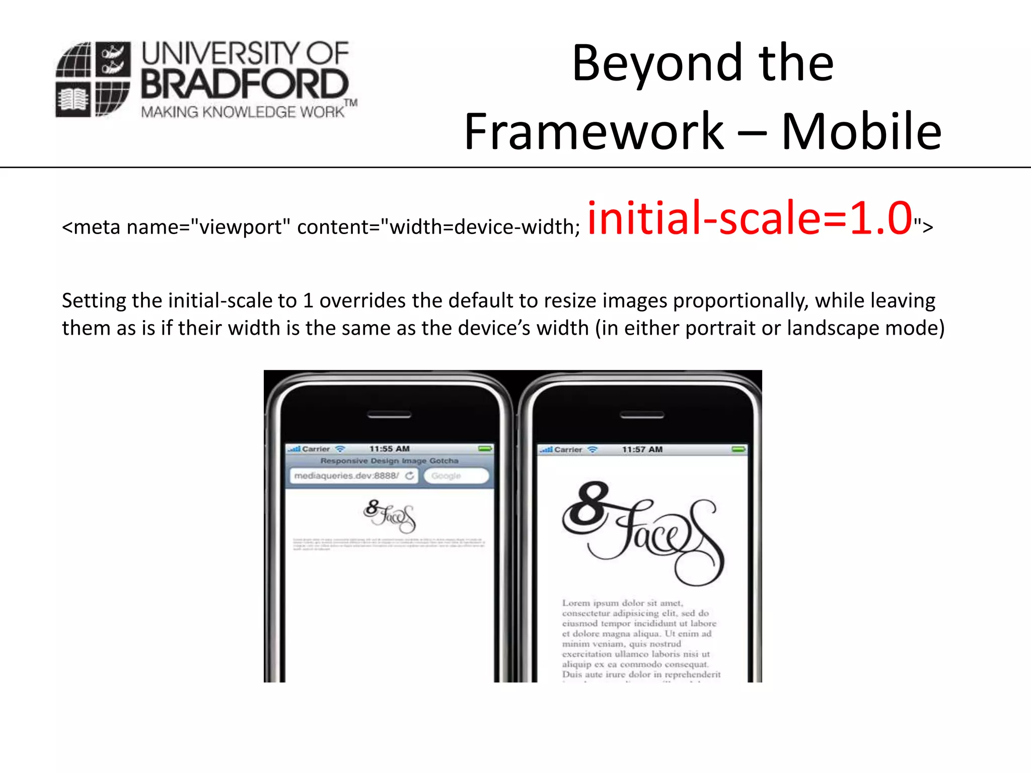
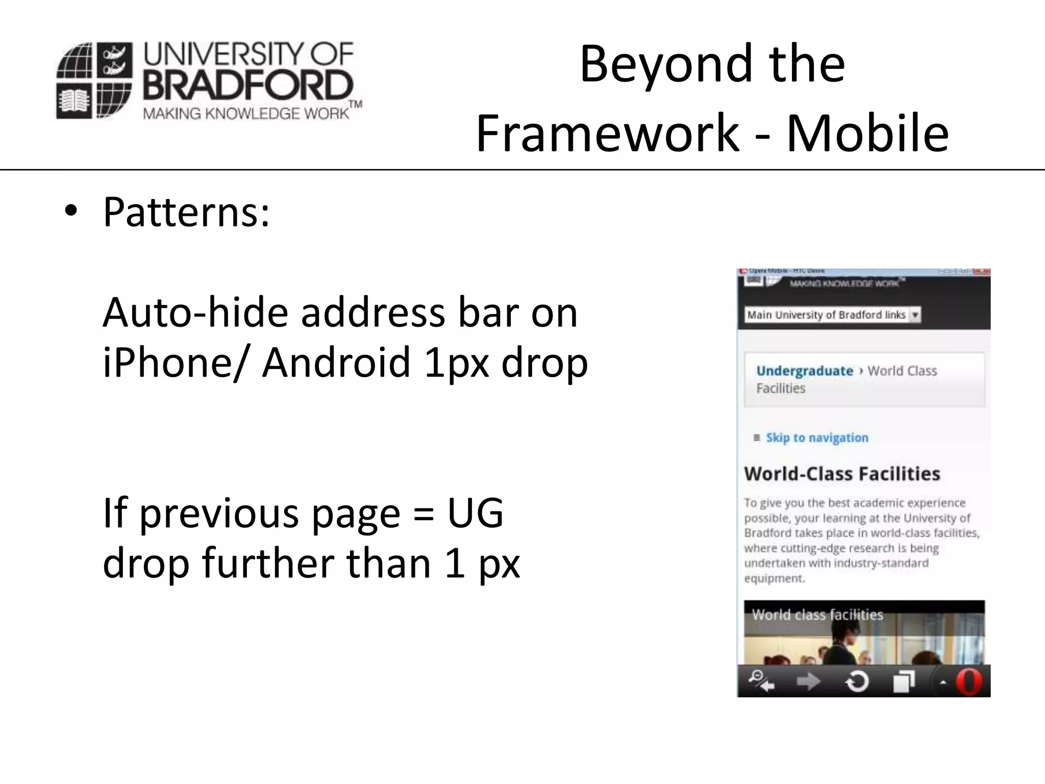
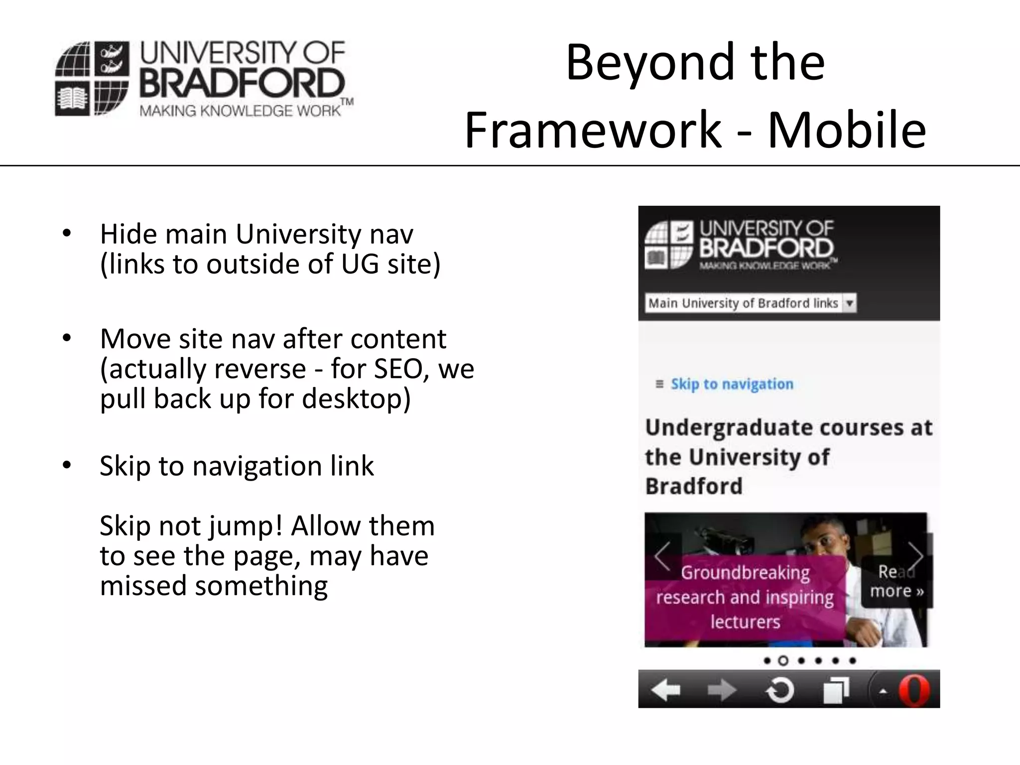
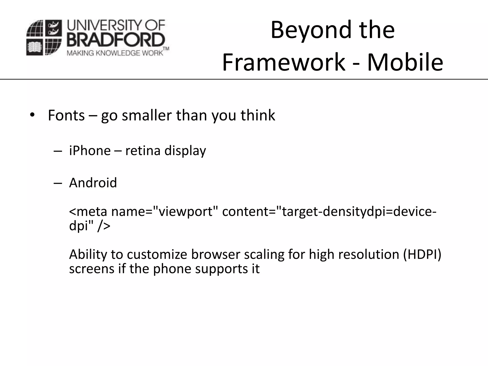
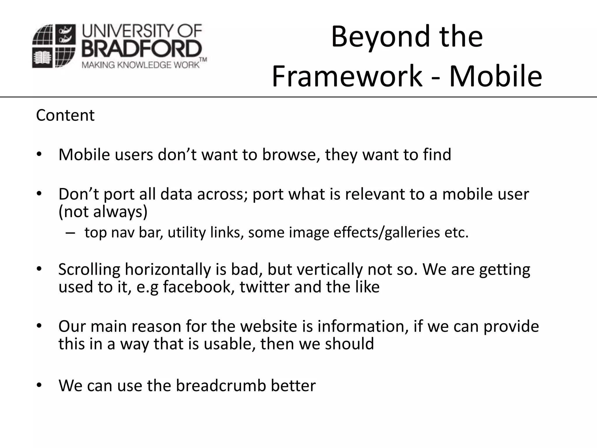
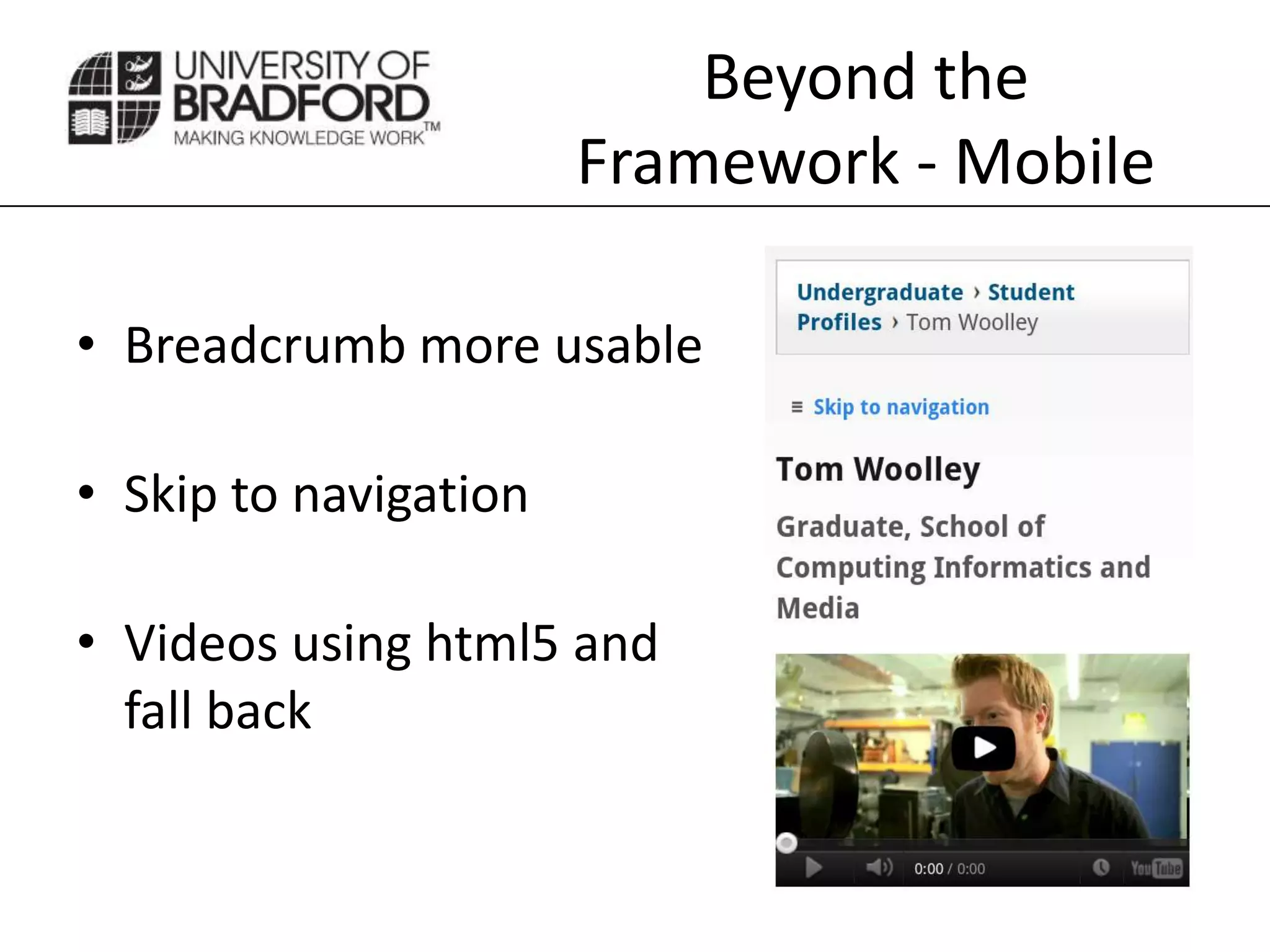
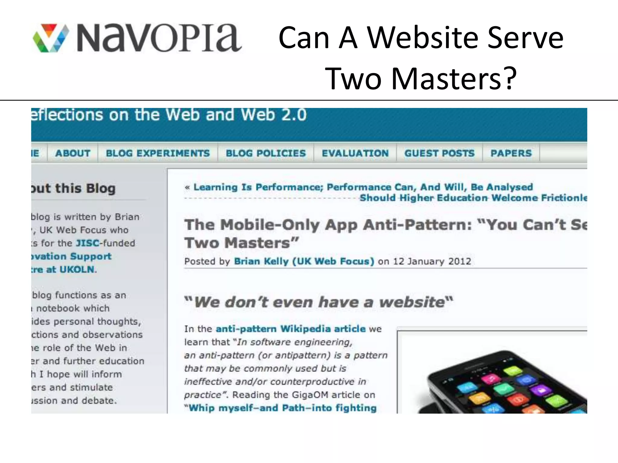
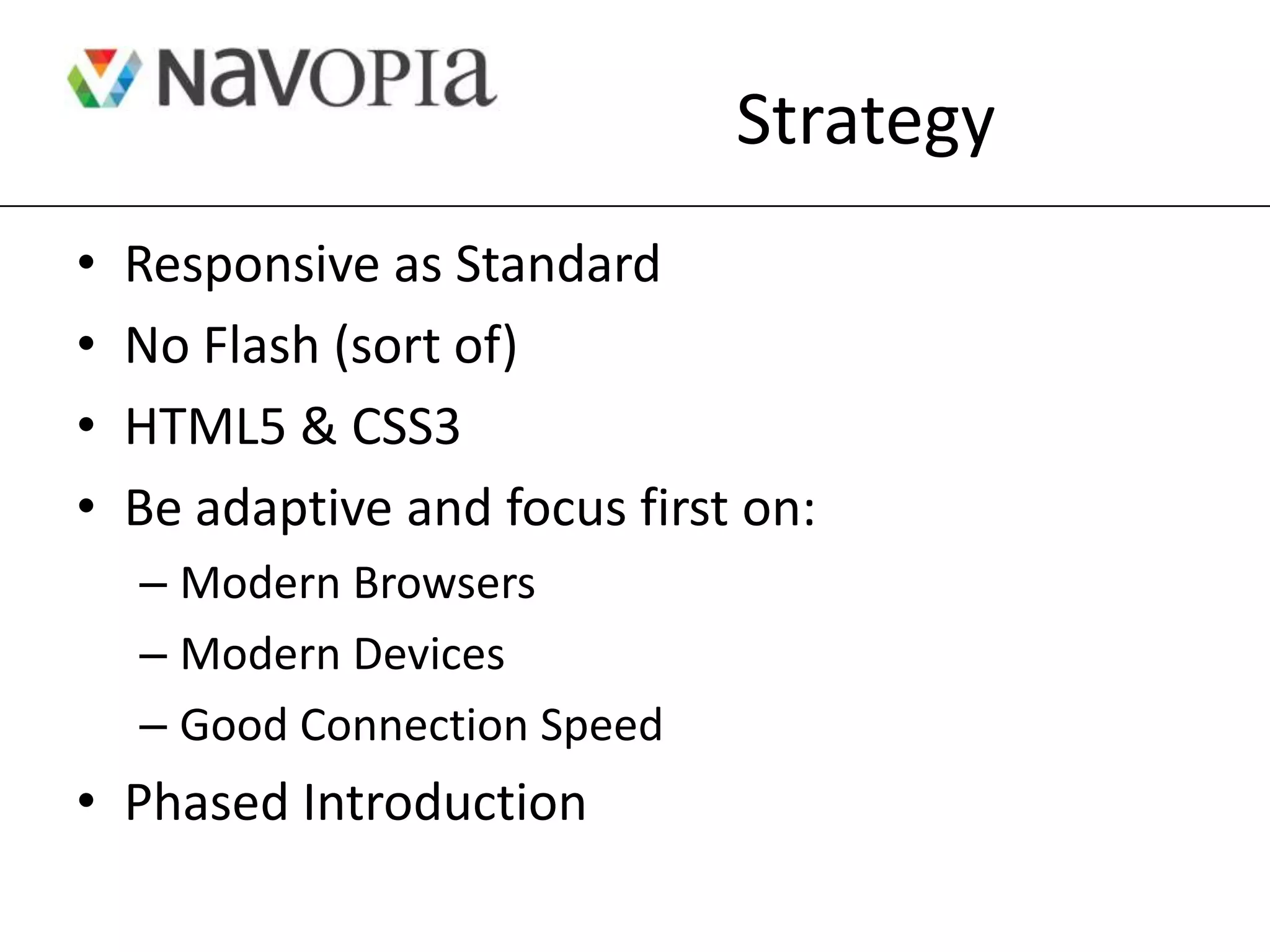
Responsive design allows websites to be viewed on any device by automatically adjusting layouts. The document discusses creating large-scale responsive websites that serve both desktop and mobile users well. It defines responsive design as providing complete content across all devices and connections using a single URL. While technical aspects like fluid grids and media queries are important, usability must be a top priority through efficient and effective layouts on mobile. The strategy discussed is to make responsive design the standard, focus on modern browsers and devices first, and introduce changes in phases.
Talk at the Institutional Web Manager's Workshop (IWMW) 2012.
This presentation looks at what led to the writing of the JISC Observatory report: Delivering Web to Mobile (http://blog.observatory.jisc.ac.uk/techwatch-reports/delivering-web-to-mobile/)
This document discusses options for making WordPress websites mobile-friendly. It outlines the growth of mobile browsing and user expectations of tailored mobile content. Free plugins like WPtouch can help deliver mobile versions of sites, while responsive design is also an option but requires more development. The key is choosing a solution based on the site type and priorities around device support, customization, and maintenance.
Going mobile edu web presentation - 2011Nathan Gerber
This document summarizes Nathan Gerber's presentation on mobile web strategies for higher education institutions. It discusses how mobile usage is growing rapidly, especially among students. It emphasizes that institutions need to shift from just making their sites work on mobile to designing for the unique needs of mobile users. The presentation provides recommendations on starting small with high priority content, using responsive design, leveraging content management systems, and testing on various devices. It also highlights tools like QR codes, analytics, and emulators to help institutions begin developing their mobile web presence.
Posternak gabriel presentation_mobile_tablet_deisgnrelaityntatt
The document discusses mobile and tablet usage trends and web design for mobile devices. It provides statistics showing massive growth in mobile phone usage compared to internet access. Current technologies that can make websites accessible across devices include HTML5, HTML, jQuery, JavaScript, CSS/CSS3. Good mobile design priorities include prioritizing content, vertical navigation, and faster load times. Examples are provided of both good mobile websites like Yelp and areas for improvement on other sites. The presentation recommends redesigning websites for mobile, prioritizing content, optimizing frameworks, and setting up mobile landing pages.
This document discusses the complex mobile platform world. It describes the layers ("stack") of a mobile device as the browser, operating system, and physical device. It notes the variety of mobile browsers and operating systems that exist, including differences between browsers that are based on WebKit. The document also discusses proxy browsers and tips for setting up a diverse mobile device lab for testing purposes.
Communication Design for the Mobile ExperienceDavid Drucker
Presented to the Vancouver Chapter of the Society for Technical Communication at their May 2011 meeting. This is a discussion of issues, and strategies for creating usable, navigable, relevant content for mobile computing devices like smartphones. Included many examples and a case study.
Pre-Conference Course: Wearables Workshop: UX Essentials - Phillip LikensUXPA International
Let's go zero to wireframe with wearables!
Wearables can be tough to understand and design for, especially if you don’t have experience with the hardware. In one evening we’ll get you up to speed on wearable technology. We’ll talk about two trends, context and continuity, and focus on how those trends will impact the user experience of screen-based wearables. Then we’ll spend the rest of our time getting hands-on by wire framing a smart watch app.
In this workshop we will:
Explore the world of wearables, and hone in on smart watches.
Explore the challenges that come along with screen-based wearables - specifically context and continuity.
Get hands-on with smart watches - wireframing a smart watch app with feedback and discussion.
You’ll leave this workshop with the skill and knowledge you need to get started designing the UX for smart watches.
Small computing involves the use of portable computers, wearable devices, and mobile technologies. It allows users to access information from anywhere through devices like laptops, smartphones, and smartwatches. Some benefits of small computing include increased productivity, improved customer relations, and better decision making through mobile access to data. Challenges include limited bandwidth, security issues, transmission interference, and potential health hazards of devices. Future advances may include hologram phones, more powerful smart watches and glasses.
The document discusses mobile services and their technical implementation. It defines mobile services as any service that can be operated on a mobile device, such as voice, data, location-based services, and more. When designing mobile applications and services, there are constraints to consider like small screens, limited navigation options, and variable connectivity. A common reference architecture uses a three-tier structure with separate presentation, business logic, and data layers to address these constraints. The layers are specialized for mobile with some data and logic accessed remotely via services.
Smartphones and tablets … constant connectivity and mobility … these devices and trends have a massive impact on the lives of every business and leisure traveler.
But what has the industry learned since the idea of the always-connected traveler became the norm?
Where are the next opportunities for the travel industry in the mobile space?
And, perhaps most important of all, what are the rapidly evolving expectations of on-the-go customers as they interact more with travel brands via mobile devices?
Panellists:
Bill Loller, vice president of mobile product management, Tealeaf, an IBM Company
Julie Ask, vice president and principal analyst, eBusiness and channel strategy professionals, Forrester Research Inc.
The document discusses strategies for developing a mobile website or apps for a library. It covers identifying key content and tasks, designing for different devices with a focus on accessibility, deciding between building mobile sites versus apps, testing on emulators and devices, and promoting the mobile services. Vendors that can help with mobile development are also reviewed.
Embracing mobile platforms | nascent at carmel venturesnascent
This document summarizes a presentation about embracing mobile platforms. It discusses trends in mobile devices and platforms, and provides an overview of iOS technologies and strengths. The key points are: Mobile devices are now more powerful and less controlled by carriers, opening opportunities for direct sales and monetization models like app stores. A great mobile product should do one thing exceptionally well through simplification and focus on the core idea. The presentation focuses on the iOS platform and its defining technologies like touch interfaces, personal devices, and standards that drive intuitive apps.
The document discusses accessible web design for people with intellectual disabilities. It defines intellectual disabilities and provides statistics on their prevalence. It describes different types of intellectual disabilities and how they can impact web use. The document recommends strategies like consistent navigation, plain language, and multiple formats to support users. It compares text-to-speech tools and demonstrates their use. Tips are provided on optimizing content for reading tools.
The Perils of Taking Great UX Commerce Mobile :: MoDevUX - 2014Dara Pressley
CustomInk initially struggled with mobile experiences, providing only an error page for mobile users. However, as mobile traffic increased due to marketing efforts, CustomInk realized it needed a dedicated mobile strategy. It started by optimizing key tasks like designing t-shirts on mobile. This led to doubling of mobile traffic and increased sharing across devices. CustomInk learned mobile users want the same experiences as desktop. Its mobile-first approach now provides convenient access to the full feature set regardless of device.
Mobile Culture - Natural History MuseumJames Cameron
Ivan Teage discusses how mobile opportunities have changed from 2002 to 2012, moving from operator logos and ringtones to apps, mobile web, and HTML5. A feasibility study was conducted to determine the best mobile opportunities, concluding to build a mobile website, ticketing platform, focus on evergreen content, and avoid apps without sound business models. Lessons from building the mobile web in 2011 included designing responsively, considering multimedia compatibility, understanding existing processes, and constantly evaluating mobile efforts.
The document discusses how mobile technology is revolutionizing business and provides an overview of key aspects of mobile marketing and operations. It notes that mobile devices, networks, and operating systems are rapidly changing. It then discusses how mobile technology can be leveraged for marketing through websites optimized for mobile, mobile advertising, and text message campaigns. It also outlines how mobile apps and tools can help manage business operations through inventory tracking, expense reporting, and payment processing on mobile devices.
The document discusses responsive design and content strategies for mobile websites. It covers the mobile landscape trends, implementation options like native apps or responsive design, and considerations for content strategies on mobile. The key takeaways are to start small with content strategy, gather resources, and ensure the current content management system can support responsive design and content choreography across devices.
Mobile content-centric applications are coming to an enterprise near you! Why do you need them? What are the constraints and opportunities of mobile ECM development? What technologies are available and what solutions will Nuxeo propose to help developers create these applications?
This document discusses leveraging technology in learning environments. It argues that conference centers need to move beyond traditional equipment like flipcharts and instead focus on mobile solutions that enhance the attendee experience and drive returns. Mobile apps can make events paper-light, facilitate interaction and customer service, and save costs. Effective adoption requires promotion, training, and connectivity support. Core features for apps include schedules, messaging, and reporting. QR codes and technologies like NFC can also be utilized to engage attendees. The document advocates supporting discussion-enabling tools, video, polling, and personalization/social media integration to maximize learning.
The document discusses the growth of mobile and how apps are driving that growth, noting that 2 billion apps have been downloaded. It notes the challenges of developing for different mobile platforms like iPhone, Android, and Blackberry which use different languages. It advocates for using web technologies like JavaScript to build cross-platform apps that can support different devices and OSes. It provides information on Appcelerator which uses these approaches to mobile development.
A brief exploration of proposed Level 4 Media Queries and some thoughts about the future of the web. Presented at Responsive Day Out in Brighton on June 27 2014.
Speed and Simplicity: Design and Usability for Multi-device WebsitesDoug Gapinski
We’ve entered the age of sequential and simultaneous browsing. According to Google, 90% of consumers now use multiple screens to accomplish tasks on the web. Tablets and mobile remain hot topics for sales, use, and design. In an age where most users are accessing sites via multiple devices, top companies are focusing on fast and clean delivery of information.
This webinar focused on how new realities are changing web design, web design process, and usability standards.
Session Outline
• Ubiquitous computing, ubiquitous internet
• Sequential and simultaneous browsing
• The rise of the tablet
• Flat design for a lumpy web
• Speed matters
• Usability strategies
The document discusses getting started with mobile web app design. It provides resources for building apps, including frameworks like iUI and jQTouch. It emphasizes designing for specific mobile platforms, testing apps across browsers and devices, and following accessibility and usability guidelines. It also suggests building a staff app as a way to get feedback and test design concepts.
Are you missing opportunities because your website is difficult to navigate on a mobile device? This presentation looks at:
-Should you optimize your website for mobile
-What are the main approaches to creating a mobile-optimized site
-What are some best practices for mobile design
This presentation is aimed at anyone from a nonprofit, social enterprise or small business with a non-techy background. It focuses on the various options for mobile-friendly sites and the pros/cons to consider to make a decision, rather than discuss the technical details of how mobile-friendly websites are implemented.
For more information: http://www.techsoupcanada.ca/learning_centre/articles/optimizing-your-nonprofit-website-for-mobile
SharePoint 2013 Mobile Strategy and Responsive Web DesignJoel Oleson
Microsoft’s mobile device and tablet strategy are only the beginning. You can’t begin to understand the mobile world without looking at the enterprise bring your own (BYOD) strategy. Touch is revolutionizing our interfaces, and you can’t develop to a minimum resolution size. The world of design has dramatically changed with Responsive Web Design and Adaptive strategies. In this session we’ll look at the best and the worst of mobile web design. In addition, you’ll come away with a good understanding of what to do for your SharePoint 2010 and SharePoint 2013 mobile device strategy.
Dr Scott Hollier presents a demonstration on how the vast world of online content is experienced for people with disabilities, as well as tools and techniques to help understand the need and importance of web accessibility. This presentation covers a brief history of access, information on user experience, accessibility features available in Windows, Mac, iOS and Android devices and resources for ICT professionals including social media tools, document accessibility advice and WCAG 2.0 at a glance.
JASA PEMBUATAN BIKIN PEREDAM SUARA DI JAKARTA BOGOR BEKASI TANGERANG DAN BANDUNGabrahamhandoyo
Perusahaan ini menawarkan jasa pembuatan peredam suara di beberapa kota di Jawa Barat dan sekitarnya, seperti Jakarta, Depok, Bogor, Tangerang, dan Bekasi. Mereka menyediakan berbagai jenis peredam suara untuk ruangan seperti studio rekaman, ruang rapat, rumah sakit, dan bioskop.
JASA PEMBUATAN PEREDAM SUARA RUANGAN DI JAKARTA BOGOR BANDUNG TANGERANG BEKASIabrahamhandoyo
Perusahaan ini menawarkan jasa pembuatan peredam suara di beberapa kota di Jawa Barat dan sekitarnya, seperti Jakarta, Depok, Bogor, Tangerang, dan Bekasi. Mereka menyediakan berbagai jenis peredam suara untuk ruangan seperti studio rekaman, ruang rapat, kafe, dan bioskop.
Este documento presenta dos listas de las 10 mejores canciones de artistas femeninas populares. La primera lista incluye canciones como "Skyscraper", "Remember December" y "La La Land", mientras que la segunda lista presenta canciones como "Smile", "Complicated" y "What The Hell".
The Center for Brain, Biology, & Behavior is an interdisciplinary research center at the University of Nebraska-Lincoln directed by Dennis L. Molfese. The center fosters collaborations across disciplines and provides access to brain imaging and other equipment and training. It aims to shift neuroscience paradigms by understanding brain connectivity and characteristics of processing between brain regions. The center houses various labs for research in areas like cognition, development, genetics, and sports concussion using technologies like fMRI, EEG, eye tracking, and more. It also leads collaborations like one between the Big Ten and Ivy League on concussion research.
Jasa pembuatan video interaktif, multimedia presentasi, multimedia video prom...abrahamhandoyo
JASA PEMBUATAN VIDEO INTERAKTIF, MULTIMEDIA PRESENTASI, MULTIMEDIA VIDEO PROMOSI. HUBUNGI REKO HANDOYO, 08156882731, 085319906869
http://jasavideoshootingtermurah.blogspot.com
Video interaktif atau multimedia presentasi diserta video promosi merupakan hal yang penting di era sekarang ini karena perkembangan teknologi dan perkembangan informasi yang membutuhkan media promosi lebih interaktif, lebih animasi dan lebih dimengerti sehingga orang bisa mengenal dan bisa tahu apa yang akan disampaikan.
Kami adalah professional bidang jasa pembuatan video interaktif, multimedia presentasi atau multimedia promosi untuk perusahaan dan perorangan dengan berbagai macam tujuan.
Multimedia interaktif banyak digunakan dalam media penyampaian informasi seperti dalam iklan televisi, iklan di website, cd presentasi sekolah, media pembelajaran di kelas kursus, media training di perusahaan dan sebagainya.
Layanan Jasa Pembuatan Video Interaktif kami meliputi:
1. Video Company Profile Perusahaan
2. Video Animasi Corporate Profile
3. Video Animasi Multimedia Promosi Produk
4. Video Animasi Muiltimedia Tutorial/ Cara Pemakaian Produk
5. Video Animasi Tutorial Informasi Produk
6. Video Animasi Multimedia Pembelajaran di Sekolah/Lembaga Kursus
7. Video Pembuatan multimedia Skripsi, Thesis dan Disertasi
8. Video Pembuatan Profile Sekolah, Perusahaan, Instansi dan lainnya.
Hubungi kami sekarang juga untuk mendapatkan presentasi dan penawaran menarik dengan kualitas terbaik. Kami menggunakan kamera terbaru dan terbaik yang pernah ada dan tim teknis kami memiliki pengalaman dalam bidang grafis design yang mampu menciptakan multimedia animasi interaktif yang menarik dan berkualitas.
Hubungi sekarang juga untuk multimedia company profile, multimedia profile, multimedia presentasi, multimedia presentation, promotion tool, multimedia video promosi, video production company, video production house, video production services, film video production, video animasi, multimedia promosi, multimedia promotion, multimedia interaktif, promotional video, video presentasi, video promosi, video portfolio, video profile, video company profile REKO HANDOYO, 08156882731 ; 085319906869
http://jasavideoshootingtermurah.blogspot.com
MetraTech’s MetraNet® billing and settlement platform offers a flexible and configurable data model that users can adapt to all of their unique business requirements.
Since the business models it automates, can be modified, extended or discarded at any time, MetraNet has proven capable of successfully supporting market leaders across industries.
Guayaquil celebrates its foundation on July 25th each year with many social events like parties, concerts, parades and more. Residents, known as Guayacos, enjoy eating typical foods in restaurants and socializing. Some common Guayaquileño Spanish phrases include "Chevere pana" meaning "Cool man" and "Vacilemos unas chelas" meaning "Let's drink some beers". Guayacos have played an important role in shaping Guayaquil's unique culture and language.
Neurons have four main regions - the cell body, dendrites, axon, and presynaptic terminals. The cell body contains the nucleus. Dendrites receive signals from other neurons and conduct them toward the cell body. The axon conducts signals away from the cell body, and ends in presynaptic terminals which transmit signals to other neurons. Neurons can be sensory/afferent which receive stimuli, or motor/efferent which transmit signals from the central nervous system. The axon is covered by a myelin sheath which protects, insulates, and increases signal transmission speed.
Los órganos de los sentidos son los ojos (vista), nariz (olfato), piel (tacto), lengua (gusto) y oídos (oído). Estos órganos nos permiten percibir el mundo que nos rodea a través de los sentidos de la vista, el olfato, el tacto, el gusto y el oído.
La presentazione di Stefano Portu, consigliere di IAB Italia, nell'ambito della XIV Edizione del Convegno Annuale dell'Osservatorio Fedeltà UniPR dal titolo "Dalla carta al digitale: cosa cambia per la loyalty".
The document discusses the benefits of exercise for mental health. Regular physical activity can help reduce anxiety and depression and improve mood and cognitive function. Exercise causes chemical changes in the brain that may help protect against mental illness and improve symptoms.
The document discusses the present simple tense in English. It explains that the present simple is formed using auxiliary verbs like "to be" and "to have". It provides examples of affirmative, negative, and interrogative sentences in the present simple for these auxiliary verbs as well as for other main verbs. It also includes an exercise for students to practice forming sentences in the present simple tense based on examples provided.
Everybody has bad eating habits like snacking excessively at work or drinking beer at night. Some common midnight snacks include devil's food cake, cheese, and salami. Poor nutrition can stem from diseases or conditions like celiac disease and lead to deficiencies. Iron deficiency is the most widespread form of malnutrition globally. Deficiencies can cause health issues depending on which nutrients are missing, like vitamin D deficiency drawing calcium from bones and causing fractures. The best way to ensure good nutrition is eating a varied diet with plenty of fruits and vegetables, whole grains, and lean meats prepared in healthy ways like baking instead of frying.
If You Build It, They Will Come: Institutional implementation of MaharaDaniel Clark
This document discusses the University of Kent's implementation of Mahara as an institutional personal development planning (PDP) tool. [1] It describes how Mahara was chosen after a successful pilot of PebblePad and outlines key features such as customizability and scalability. [2] Feedback from pilot users found Mahara intuitive and flexible for recording reflections and development. [3] Future plans include further integration with other systems and pre-registration access.
Lito devyniasdešimtmečio proga nacionalinis M.K.Čiurlionio dailės muziejus kartu su žymiausių pasaulio monetų kalyklų atstove ir oficialia kolekcinių monetų ir medalių platintoja Lietuvoje UAB „Monetų namai“ pristatė skulptoriaus Juozo Zikaro dar 1926 metais sukurtos ir iki šiol neemituotos auksinės 50-ies litų monetos repliką. Jai nukaldinti buvo panaudotos Nacionaliniame M.K.Čiurlionio dailės muziejuje saugomi monetos modeliai.
The document discusses the present simple tense in English. It explains that the present simple is formed using auxiliary verbs like "to be" and "to have". It provides examples of affirmative, negative, and interrogative sentences in the present simple for these auxiliary verbs as well as for other main verbs. It also includes an exercise for students to practice forming present simple sentences.
This document summarizes a trip taken by students from Vancouver Island University to Paris for professional baking competitions and learning experiences. The trip was made possible through generous donations from various baking industry organizations, companies, and individuals. Key events of the trip included traveling by ferry, bus, plane, visiting bakeries and chocolate factories, participating in competitions, sightseeing in Paris and Brussels, and enjoying the food. The students thanked all the donors who helped make the amazing experience possible.
This document discusses different approaches to developing mobile content and applications, including mobile-first (custom), adaptation, responsive design, frameworks, and native apps. The mobile-first approach designs content and interfaces specifically for mobile context and usage, while adaptation reworks existing desktop content for mobile. Responsive design reflows the same content across devices using percentages. Frameworks allow developing once and deploying across devices, balancing features and reach. Native apps provide rich interfaces optimized for each device type but must be developed for each platform. The document considers the pros and cons of each approach and how to optimize content, images, data and processes for a good mobile experience.
The document discusses different approaches to developing mobile experiences:
1. Mobi - focuses on providing clear structure and navigation for mobile, without impacting the main website. Content is designed specifically for phones.
2. Responsive - uses the same content across devices by reflowing content based on screen size. Requires designing for all screen sizes.
3. Framework - balances rich design and wide reach by simplifying interfaces while enabling key functionality. Develop once and deploy across devices.
4. Native - provides optimal performance and rich interfaces through platform-specific development, but requires separate development for each device/platform.
It analyzes the pros and cons of each approach and when each is most suitable.
Designing and delivering elearning in a multi-device worldKineo
Kineo Pacific’s eLearning Solutions Manager Souraya Khoury led a breakout session on Day 1 of AITD 2013 about the new challenges that L&D departments face: What can be achieved with HTML5 and how responsive eLearning design can assist in achieving greater levels of accessibility across multiple devices.
Find out more at www.kineo.com
This is the Responsive Web Design presentation given to the CIDD, Chicago Interactive Design & Development Meetup group, (sponsored by the WunderLand Group) on 3-13-14 by Ryan Dodd, Design Director for Siteworx in Chicago.
Embracing the mobile frontier and reaching the digital nativesEktron
Jonathan Wall, Director of Product Marketing at Ektron and Jay Burling, Director of Web Application at Hendrix College, discuss:
- 9 tips and best practices for mobile engagement
- How to use mobile to enrich the student experience
- How Hendrix College created a mobile presence in 3 months
How to create a mobile version of your websiteMahmoud Farrag
This document provides guidance on creating a mobile version of a website. It discusses considerations for mobile design including speed, dimensions, behavior, and designing. It emphasizes the importance of speed for mobile and provides tips for fluid layouts, CSS media queries, touch interfaces, short pages, and mobile development tools.
This document discusses designing for mobile devices. It begins by noting that design is shifting from desktop to mobile, with billions of apps now downloaded daily and mobile browsing expected to surpass desktop browsing by 2014. It then provides an overview of different mobile platforms, devices, and types of mobile delivery including native apps, hybrid apps, mobile web apps, mobile websites, and responsive websites. The document concludes by discussing considerations for mobile design such as research, planning, visual design, delivery, and responsive web design.
Designing and Theming Drupal for Mobile DevicesDavid Lanier
Have you noticed how a site can look great on your computer, but when viewing it on a mobile device it's unreadable, ugly, and takes forever to load?
Maybe you're designing a site, or you already have one or more sites. Now is the time to make it friendlier for mobile devices such as iPhone, Android, and others.
This session covers design considerations if you are still in the design phase, as well as demonstrate techniques for adding a mobile interface for your existing sites.
Web Apps and Responsive Design for LibrariesMatt Machell
This document discusses responsive web design for libraries. It argues that responsive web design, which creates a single website that adapts to different screen sizes through flexible grids and media queries, is the best approach for libraries to take for their mobile presence. Native apps, separate mobile sites, and other approaches each have drawbacks, as they require more maintenance and do not allow for a unified experience across all devices. The document advocates for a responsive design that can provide a quality experience on any device using existing web skills.
This chapter discusses mobile user interface design. It covers using screen real estate efficiently, understanding how users perceive design elements, the social aspect of mobile interfaces, accessibility considerations, and designing for specific mobile platforms. Key points include using minimalism and a visual hierarchy; understanding Gestalt principles of perception; ensuring usability and reaching the intended audience; and following platform-specific design patterns and guidelines.
This document discusses responsive design and its benefits over separate mobile and desktop websites. Responsive design allows a single website to automatically adapt its layout and content presentation based on the screen size and orientation of the device used to access it. The key benefits of responsive design are that it provides access to content across different devices using a single URL, is easier to maintain than separate sites, and helps future-proof a site for emerging technologies and various screen sizes. The document outlines some of the technical and content challenges of implementing a responsive design, such as testing across devices and determining what information should appear or be hidden at different screen widths. It also provides examples of how local government websites have benefited from a responsive design approach.
This document discusses key differences between developing applications for mobile versus desktop. It notes that mobile applications have more limited resources like screen size, memory, and bandwidth. As a result, mobile app design must prioritize essential content and navigation over extensive graphics. Interactions also differ as mobile apps are optimized for touchscreens. Developers must consider these constraints and user expectations of mobility when designing mobile applications.
PSEWEB 2013 - Make it responsive - TERMINALFOURTerminalfour
This document discusses responsive design and its importance for websites. It defines responsive design as a website that automatically adjusts based on the device being used. The document outlines the benefits of responsive design such as cost savings, improved user experience, and scalability. It provides tips for adopting responsive design including starting with the smallest device and focusing on key content. Examples of responsive design implementations at universities are also presented.
Karrie McLellan presented on her library's transition to being more mobile-friendly. She discussed the challenges their original website faced on mobile screens and their choices to implement a separate mobile site or apps. She outlined their decision to create a mobile-optimized separate site with only essential information. Juan Denzer then discussed responsive design and mobile resources for libraries. They provided their contact information and links to further resources.
To remain viable in the publishing environment it is important for publishers stay current with evolving technology. To help publishers prepare for this new reality, SSP, in collaboration with the World Bank, presents an important full-day seminar on Digital Opportunities and Challenges. This two-part seminar explores the choices that choices publishers will have to make early in the process to enhance their return on investment as they transition to an evolving digital landscape, and presents practical examples of strategies for packaging & delivering content to different channels (not just mobile devices).
The morning session will provide an overview of the current market for electronic publishing with specific examples of business models used by a university press, a commercial publisher, and an association. The afternoon session will cover the various electronic readers, emerging mobile applications relevant to publishers, and digital rights management to include discussions on piracy and intellectual property. Together, both sessions will give a comprehensive overview of what is happening in the new digital arena.
Join us if you want to:
-Catch-up on the current state of digital transition
-Discuss emerging business models
-Examine the evolving digital devices and mobile applications used to disseminate content
-Gain insight on emerging piracy issues
This full day seminar will be invaluable to anyone interested in understanding the opportunities and challenges involved in delivering and marketing your content in a digital environment. This includes marketing coordinators, production managers, acquisitions editors, and senior management at small to medium-sized publishers of scholarly content currently in both book and journal form.
Rise of the responsive single page applicationOren Shatken
The document discusses the rise of responsive single page applications. It defines responsive design as building websites that detect users' device and screen size and dynamically adjust the layout accordingly. It advocates for responsive design over separate mobile sites because it provides a better user experience across devices, improves SEO through a single URL structure, and streamlines development and maintenance with one codebase. The document also outlines best practices for developing responsive applications using technologies like AngularJS, Grunt, and Yeoman to automate testing and improve workflow efficiency.
Designing for the web is no longer what it used to be.
The number of devices with web-browsing capabilities is
growing at an increasing speed.
RWD is an approach aimed to provide a solid viewing
experience for a multiple of screens with one set of code.
Are Websites Optimized for Mobile Devices and Smart TVs ?Manos Perakakis
Full text: http://bit.do/optimizedwebtv
The purpose of this study is to evaluate the adaptation of some of the world’s most popular websites to the “post-pc era” of using multiple devices for accessing the web. Up till recently the PC used to be the only device used for accessing the WWW. This has changed dramatically over the past few years with the introduction of many powerful Internet-connected devices such as Smart Phones, Tablets and Smart TVs. Due to the many differences between these devices in terms of screen size,
hardware power, input methods etc. in most cases a PC-optimized website is not optimally viewed in these devices,
resulting in poor usability and User Experience. In this survey 49
of the world’s most visited websites, according to Alexa.com, are
being examined to see if they offer optimized versions for
Internet-connected mobile devices and Smart TVs. Results show
wide support for mobile devices in contrast to very limited
support for Smart TVs.
The document discusses the changing landscape of mobile web design. It argues that the concepts of "mobile" and "desktop" are becoming blurred as more content is optimized for all contexts and devices. It recommends establishing design principles focused on business goals, audiences, and content rather than assumptions about devices. Finally, it evaluates solutions like native apps, responsive design, and adaptive processes to provide the best experience across different platforms.
Similar to Creating Large-Scale Responsive Websites (20)
Pushing the limits of ePRTC: 100ns holdover for 100 daysAdtran
At WSTS 2024, Alon Stern explored the topic of parametric holdover and explained how recent research findings can be implemented in real-world PNT networks to achieve 100 nanoseconds of accuracy for up to 100 days.
Climate Impact of Software Testing at Nordic Testing DaysKari Kakkonen
My slides at Nordic Testing Days 6.6.2024
Climate impact / sustainability of software testing discussed on the talk. ICT and testing must carry their part of global responsibility to help with the climat warming. We can minimize the carbon footprint but we can also have a carbon handprint, a positive impact on the climate. Quality characteristics can be added with sustainability, and then measured continuously. Test environments can be used less, and in smaller scale and on demand. Test techniques can be used in optimizing or minimizing number of tests. Test automation can be used to speed up testing.
Alt. GDG Cloud Southlake #33: Boule & Rebala: Effective AppSec in SDLC using ...James Anderson
Effective Application Security in Software Delivery lifecycle using Deployment Firewall and DBOM
The modern software delivery process (or the CI/CD process) includes many tools, distributed teams, open-source code, and cloud platforms. Constant focus on speed to release software to market, along with the traditional slow and manual security checks has caused gaps in continuous security as an important piece in the software supply chain. Today organizations feel more susceptible to external and internal cyber threats due to the vast attack surface in their applications supply chain and the lack of end-to-end governance and risk management.
The software team must secure its software delivery process to avoid vulnerability and security breaches. This needs to be achieved with existing tool chains and without extensive rework of the delivery processes. This talk will present strategies and techniques for providing visibility into the true risk of the existing vulnerabilities, preventing the introduction of security issues in the software, resolving vulnerabilities in production environments quickly, and capturing the deployment bill of materials (DBOM).
Speakers:
Bob Boule
Robert Boule is a technology enthusiast with PASSION for technology and making things work along with a knack for helping others understand how things work. He comes with around 20 years of solution engineering experience in application security, software continuous delivery, and SaaS platforms. He is known for his dynamic presentations in CI/CD and application security integrated in software delivery lifecycle.
Gopinath Rebala
Gopinath Rebala is the CTO of OpsMx, where he has overall responsibility for the machine learning and data processing architectures for Secure Software Delivery. Gopi also has a strong connection with our customers, leading design and architecture for strategic implementations. Gopi is a frequent speaker and well-known leader in continuous delivery and integrating security into software delivery.
Dr. Sean Tan, Head of Data Science, Changi Airport Group
Discover how Changi Airport Group (CAG) leverages graph technologies and generative AI to revolutionize their search capabilities. This session delves into the unique search needs of CAG’s diverse passengers and customers, showcasing how graph data structures enhance the accuracy and relevance of AI-generated search results, mitigating the risk of “hallucinations” and improving the overall customer journey.
Communications Mining Series - Zero to Hero - Session 1DianaGray10
This session provides introduction to UiPath Communication Mining, importance and platform overview. You will acquire a good understand of the phases in Communication Mining as we go over the platform with you. Topics covered:
• Communication Mining Overview
• Why is it important?
• How can it help today’s business and the benefits
• Phases in Communication Mining
• Demo on Platform overview
• Q/A
Maruthi Prithivirajan, Head of ASEAN & IN Solution Architecture, Neo4j
Get an inside look at the latest Neo4j innovations that enable relationship-driven intelligence at scale. Learn more about the newest cloud integrations and product enhancements that make Neo4j an essential choice for developers building apps with interconnected data and generative AI.
Sudheer Mechineni, Head of Application Frameworks, Standard Chartered Bank
Discover how Standard Chartered Bank harnessed the power of Neo4j to transform complex data access challenges into a dynamic, scalable graph database solution. This keynote will cover their journey from initial adoption to deploying a fully automated, enterprise-grade causal cluster, highlighting key strategies for modelling organisational changes and ensuring robust disaster recovery. Learn how these innovations have not only enhanced Standard Chartered Bank’s data infrastructure but also positioned them as pioneers in the banking sector’s adoption of graph technology.
Unlock the Future of Search with MongoDB Atlas_ Vector Search Unleashed.pdfMalak Abu Hammad
Discover how MongoDB Atlas and vector search technology can revolutionize your application's search capabilities. This comprehensive presentation covers:
* What is Vector Search?
* Importance and benefits of vector search
* Practical use cases across various industries
* Step-by-step implementation guide
* Live demos with code snippets
* Enhancing LLM capabilities with vector search
* Best practices and optimization strategies
Perfect for developers, AI enthusiasts, and tech leaders. Learn how to leverage MongoDB Atlas to deliver highly relevant, context-aware search results, transforming your data retrieval process. Stay ahead in tech innovation and maximize the potential of your applications.
#MongoDB #VectorSearch #AI #SemanticSearch #TechInnovation #DataScience #LLM #MachineLearning #SearchTechnology
UiPath Test Automation using UiPath Test Suite series, part 6DianaGray10
Welcome to UiPath Test Automation using UiPath Test Suite series part 6. In this session, we will cover Test Automation with generative AI and Open AI.
UiPath Test Automation with generative AI and Open AI webinar offers an in-depth exploration of leveraging cutting-edge technologies for test automation within the UiPath platform. Attendees will delve into the integration of generative AI, a test automation solution, with Open AI advanced natural language processing capabilities.
Throughout the session, participants will discover how this synergy empowers testers to automate repetitive tasks, enhance testing accuracy, and expedite the software testing life cycle. Topics covered include the seamless integration process, practical use cases, and the benefits of harnessing AI-driven automation for UiPath testing initiatives. By attending this webinar, testers, and automation professionals can gain valuable insights into harnessing the power of AI to optimize their test automation workflows within the UiPath ecosystem, ultimately driving efficiency and quality in software development processes.
What will you get from this session?
1. Insights into integrating generative AI.
2. Understanding how this integration enhances test automation within the UiPath platform
3. Practical demonstrations
4. Exploration of real-world use cases illustrating the benefits of AI-driven test automation for UiPath
Topics covered:
What is generative AI
Test Automation with generative AI and Open AI.
UiPath integration with generative AI
Speaker:
Deepak Rai, Automation Practice Lead, Boundaryless Group and UiPath MVP
In his public lecture, Christian Timmerer provides insights into the fascinating history of video streaming, starting from its humble beginnings before YouTube to the groundbreaking technologies that now dominate platforms like Netflix and ORF ON. Timmerer also presents provocative contributions of his own that have significantly influenced the industry. He concludes by looking at future challenges and invites the audience to join in a discussion.
UiPath Test Automation using UiPath Test Suite series, part 5DianaGray10
Welcome to UiPath Test Automation using UiPath Test Suite series part 5. In this session, we will cover CI/CD with devops.
Topics covered:
CI/CD with in UiPath
End-to-end overview of CI/CD pipeline with Azure devops
Speaker:
Lyndsey Byblow, Test Suite Sales Engineer @ UiPath, Inc.
How to Get CNIC Information System with Paksim Ga.pptxdanishmna97
Pakdata Cf is a groundbreaking system designed to streamline and facilitate access to CNIC information. This innovative platform leverages advanced technology to provide users with efficient and secure access to their CNIC details.
Removing Uninteresting Bytes in Software FuzzingAftab Hussain
Imagine a world where software fuzzing, the process of mutating bytes in test seeds to uncover hidden and erroneous program behaviors, becomes faster and more effective. A lot depends on the initial seeds, which can significantly dictate the trajectory of a fuzzing campaign, particularly in terms of how long it takes to uncover interesting behaviour in your code. We introduce DIAR, a technique designed to speedup fuzzing campaigns by pinpointing and eliminating those uninteresting bytes in the seeds. Picture this: instead of wasting valuable resources on meaningless mutations in large, bloated seeds, DIAR removes the unnecessary bytes, streamlining the entire process.
In this work, we equipped AFL, a popular fuzzer, with DIAR and examined two critical Linux libraries -- Libxml's xmllint, a tool for parsing xml documents, and Binutil's readelf, an essential debugging and security analysis command-line tool used to display detailed information about ELF (Executable and Linkable Format). Our preliminary results show that AFL+DIAR does not only discover new paths more quickly but also achieves higher coverage overall. This work thus showcases how starting with lean and optimized seeds can lead to faster, more comprehensive fuzzing campaigns -- and DIAR helps you find such seeds.
- These are slides of the talk given at IEEE International Conference on Software Testing Verification and Validation Workshop, ICSTW 2022.
2. Paddy Callaghan Keith Doyle
University of Bradford Navopia
@paddycallaghan @keithdoyle
ABOUT US
3. The Good Old Days
• Best viewed on Netscape
• Best viewed on Internet Explorer
4. Web 2.0
• Best used with a mouse or by people with tiny
little fingers on a Flash-enabled desktop or
laptop web browser at least 1024 (or 1080)
pixels wide on a broadband internet
connection.
7. Who Is Responsive?
• Aberystwyth University
• University of Bedfordshire
• University of Bradford Undergraduate Study
• University of Glamorgan
• University of Lancaster
• University of Sussex IT Services
navopia.co.uk/acuk
10. User Experience
Definition
• A content website which is complete and
usable for any device and connection
using a single URL per page
11. User Experience
Definition
• A content website which is complete and
usable for any device and connection
using a single URL per page
• Content Websites
– Marketing, e-commerce, informational, intranets etc.
– Not necessarily applications
– Not necessarily site owners with massive budgets
12. User Experience
Definition
• A content website which is complete and
usable for any device and connection
using a single URL per page
• Complete
– Full content on any device
– No ‘view desktop site’
13. User Experience
Definition
• A content website which is complete and
usable for any device and connection
using a single URL per page
• Usable = Efficient and Effective
– On mobile devices
• No zooming or panning required
• Works with touch gestures
• Use of resized and collapsed elements
14. User Experience
Definition
• A content website which is complete and
usable for any device and connection
using a single URL per page
• Devices
– Definitely Modern Desktop Browsers, Tablets
and Smartphones
– Older browsers? Feature phones? Ultra-wide displays?
15. User Experience
Definition
• A content website which is complete and
usable for any device and connection
using a single URL per page
• Speed is important
– Definitely Network cable / Wi-Fi
– Definitely 3G / 4G / Dongle
– Dial-up? 1G and 2G?
16. User Experience
Definition
• A content website which is complete and
usable for any device and connection
using a single URL per page
• Single URL per page
– One Web
– Shareable content
– Usually without browser sniffing
17. User Experience
Definition
• A content website which is complete and
usable for any device and connection
using a single URL per page
18. Responsive Design
University of Bradford
http://www.bradford.ac.uk
@paddycallaghan
m.callaghan1@bradford.ac.uk
20. Approaches
for mobile
• Do nothing – my desktop site works
• App – for specific data this works, not for website
• Mobile website
– Two separate designs must be maintained and updated. They can easily fall
out of sync or out of date.
– Often, two distinct sets of content must be maintained.
– Not all content is generally available to mobile users compared to
desktop users.
– User-agent detection doesn’t always work, so the wrong site gets delivered
• Responsive website
– Same content
– Design maintained in same place
21. State of Mobile
HEERA Mobile Workshop
(Higher Education External Relations
Association)
The Mobile Web: What does it really mean?
(7th December 2011)
22. The global market
• There are 5.3bn global phone subscribers, 77% of the world
population
[source: econsultancy, 2011]
• Growth is led by China and India
[source: econsultancy, 2011]
• Feature phone sales still outnumber smartphone sales by 4:1
[source: econsultancy, 2011]
• Smartphones are the fastest growing segment with Nokia
expected to be replaced as the top OS by Android in 2011
[source: econsultancy, 2011]
23.
24. UK Market
• Smartphone usage is growing faster in the UK than in Europe (with the iPhone and
Android dominant)
• Nearly half of UK adults now own a smartphone
[source: Kantar World Panel via the Guardian, November 2011]
• In October 2011, Apple’s iPhone took a 42.8% share of smartphone sales due to
the launch of the newest model, the iPhone 4S
[source: Kantar World Panel via the Guardian, November 2011]
• Over the last three months, Android dominated with a 46% share of the market
[source: Kantar World Panel via the Guardian, November 2011]
• Blackberry is the third player in the UK smartphone sector. Microsoft & Nokia are
hoping an alliance reverses their fortunes
25. However…
• These figures are dominated by apps, social
networking and mobile gaming.
What about the web sites?
26. HEERA Study – 21 HE’s
took part
Mobile visits: Aug 10 - Sep 2011
27. HE v’s Commercial
Blackberry issue, not being detected in Google analytics. Graph has been adjusted below.
We as an institution were average
28. What about the UoB
Analytics
•
Screen resolution showed small to tablet size
29. Decision
• Mobile use is on the up
• Trends show ‘smart phone’ use is up
• Outcome: Try a responsive design
• Because of audience we have chosen to trial
Undergraduate site.
34. What we did
• Keith at Navopia
• New IA and design patterns
• Designs/grids mocked up for mobile first
35. How do we achieve
this
• Framework(s) Foundation:
– Less Framework 4 • Allowed easy mobile &
– Foundation non mobile classes
– MQ Framework • Built in image carousel
– Golden Grid • Ability to push and pull
content to reorder very
– 320 and up easily
– Amazium • Would fit the designs!
– ….
36. Using the framework
• Choose who to target using CSS Media
Queries
• iPad – worked just like the desktop website
(happy with this)
• Target mobile devices only
37. Beyond the
Framework – Mobile
<meta name="viewport" content="width=device-width; initial-scale=1.0">
Setting the initial-scale to 1 overrides the default to resize images proportionally, while leaving
them as is if their width is the same as the device’s width (in either portrait or landscape mode)
38. Beyond the
Framework - Mobile
• Patterns:
Auto-hide address bar on
iPhone/ Android 1px drop
If previous page = UG
drop further than 1 px
39. Beyond the
Framework - Mobile
• Hide main University nav
(links to outside of UG site)
• Move site nav after content
(actually reverse - for SEO, we
pull back up for desktop)
• Skip to navigation link
Skip not jump! Allow them
to see the page, may have
missed something
40. Beyond the
Framework - Mobile
• Fonts – go smaller than you think
– iPhone – retina display
– Android
<meta name="viewport" content="target-densitydpi=device-
dpi" />
Ability to customize browser scaling for high resolution (HDPI)
screens if the phone supports it
41. Beyond the
Framework - Mobile
Content
• Mobile users don’t want to browse, they want to find
• Don’t port all data across; port what is relevant to a mobile user
(not always)
– top nav bar, utility links, some image effects/galleries etc.
• Scrolling horizontally is bad, but vertically not so. We are getting
used to it, e.g facebook, twitter and the like
• Our main reason for the website is information, if we can provide
this in a way that is usable, then we should
• We can use the breadcrumb better
42. Beyond the
Framework - Mobile
• Breadcrumb more usable
• Skip to navigation
• Videos using html5 and
fall back
43. Whatusersdo –
usability testing
• Fortunate to get some usability testing done
by Whatusersdo
• Tested on
– Desktop
– iPhone
– iPad
– Samsung Galaxy
46. Thanks
"...very attractive as a student to see it working
on my iPhone, and it’s an institution that
relates to me as it can work in
my format and does appreciate what
I want out of a university and how it can benefit
me."
49. Anti-Patterns
• A desktop-first mentality
• On a smartphone
– Large text on a mobile device
– Navigation filling the screen
– Excessive branding
– Excessive scrolling
– Missing content
– Reduced content / graphics
• A Responsive site is not a mobile site
50. Strategy
• Responsive as Standard
• No Flash (sort of)
• HTML5 & CSS3
• Be adaptive and focus first on:
– Modern Browsers
– Modern Devices
– Good Connection Speed
• Phased Introduction
51. Paddy Callaghan Keith Doyle
University of Bradford Navopia
@paddycallaghan @keithdoyle
THANK YOU
Editor's Notes
Ask who has got a responsive site?Who is planning a responsive site?
May 25 2010The original: http://www.alistapart.com/articles/putyourcontentinmypocket/ August 28 2007
Full Content - Does not include branding - Does not include navigation elements - Does include images
Touch Gestures - hover - proximity
Older Browsers: - e.g. IE6 - May rely on adaptive techniques (Progressive enhancement)Ultra-wide displays - May have more padding
Dial-up: - what do they do now?1G and 2G: - e.g. Edge - what is the use case?
Browser sniffing: - not really responsive
Hi everyone, My name is Paddy Callaghan and I’m going to tell you a little about making one of our sites responsive.The site is by no means finished, we are always looking to improve so if you have any feedback please do let me know.I’m basically going to cover our investigation stage and what we did as an outcome from that.
Ok, so here is basically my take on what you can do for mobile usersNothingAn appA mobile specific websiteOr build a responsive one.
HEERA who are the Higher Education External Relations AssociationConducted some research last year to see what the current state was for mobile usage and in particular how HE fits in with this.Around 21 HE institutions submitted data of which we were one.
As expected, the global market is showing a lot of mobile use.But for me the most important part here is that even though feature phones still outsell smart phones (at the time of this research) It is smart phones that is the fastest growth area.
And as this shows, mobile internet users are predicted to be more than desktop some time near 2014.
And here are some more numbers showing the UK market and as expected it is a swing between Apple and Android platforms.
Majority of them figures though take into account apps, social networking and gaming, so what about websites?
This graph shows the mobile visits for the 21 HE websitesThe trend is rising as you can see
But we are still a lot off of commercial sites but you can see both following the same trendAlso, for all of you looking into your own stats, there was an issue with Blackberry during this time where the browser was not identified by Google properly and was sometimes classed as (not set)This has since been fixed by Blackberry
Smart phone OS’s are on the up with the expected increase being various apple products and AndroidSymbian OS is the only one showing any real declineThe screen sizes ranged from small to tablet
Armed with these numbers and trends we decided that we needed to think about tackling mobile, and because of rise in smart phone use in particular, we decided to try a responsive approach, and then that we try this on our Undergraduate site thinking of all the prospective students using the smart phones.
So in the year before we did our new design, we see roughly one and a half million page views, a million unique with average time on page of just over a minute
If I removed Windows, Mac, Linux (and of course Playstation 3 – this surprised me) you can see the number of those visitors using a Mobile OS is quite high, much less than the whole picture (roughly 5%)but still too great to ignore by far, and also that the average time on page is slightly greater at 1.20 this is I think the commuters on the bus (to refer back to a previous talk) or at home on the sofa???
In fact, over clearing week we had 8 thousand unique page views alone.
Ok, so before the redesign we did nothingThe site worked fine, but needed to be constantly zoomed in and out.User experience suffered.
We decided to work with Keith to plan developing a responsive website.We both agreed on his idea that one site can serve multiple devices which for us would mean not developing a new version of a site and only having to maintain oneHe designed some ideas, layouts and IAs, using the mobile first principal and gave us ideas on some ‘patterns’ for better usability
There were many ways to achieve this, however as a lot of work has been done in the web community on frameworksSo we decided to pick one that met our needs and develop that furtherBased on the mock ups, structure and what we wanted to achieve the Foundation Framework fitted the bill.
When we tested our site on Ipads, the desktop version almost worked perfectly as is.So we decided not to put time in effort making changes for change sake, so with the exception of a few navigation css tweaks it was left pretty much the same as the desktop version.So then in our media queries, we could just target mobile screen sizes
There are some extra things that will need to be done as our site is unique to us, as is yours to you and so we built patterns and features onto the frameworkAlso, there are things that the framework didn’t automatically come with.For example, my download of foundation did not have the viewport setting of initial scale = 1 to override the default image sizing. This combined with percentages in the css will allow the images to scale per device
There is also techniques to make better use of the visible viewing area, in particular iphones that keep the address bar on page loadSimply by doing an auto scroll of 1px the phone will detect movement and the address bar will vanish.I have tried a subtle extra trick also. Seeing as the top is made up of the banner, logo and university links it is taking up space that is not always needed. So I have made tried to make it auto scroll further if the previous page was an undergraduate page. But not taking them straight to the content. I wanted the users not to miss anything in its entirety so they can see the bottom of the logo and have no need to scroll up unless they wanted to.Which brings me to the ....
... The navigation options.The top main nav for the university is not necessary to be always visible, we are after all trying to keep the visitors within the UG site. And only link them to other university areas when the need is there so we serve the menu as a select field.One of the quick easy features for the Foundation framework is that it allows you to very easily switch the order of content in css. So we displayed the navigation at the bottom after the page content.We didn’t actually do this switch so to speak for mobile, we actually applied it for desktop and tablet. Having the ‘copy’ as close to the top of the html document is better for SEO so in our html it comes first anyway. We added to the mobile version a skip to nav link. I opted for it to scroll, again so that the copy of the page was always visible. A user may have thought they were on the wrong page only to see the content and realise they weren’t, or perhaps just may simply see something that they then decide they did want to see, perhaps a video.
What we also found was that the default framework didn’t make all the fonts as small as they can be.Devices like the iPhone with the retina display will allow you to go smaller than you thought and be very readable.And with android devices you could also allow the phones that support higher resolution screens to customise scaling also
One of the big ones for us though was what to do around content.A lot of people think that you need different shorter version and/or a specific mobile site with mobile content.We disagreed with that, and as the main point of our site is information we decided to not really hide or replace any content. After all, if it is too much content then there is too much content for the desktop also. This all came about when building our site structure so that we can leave the content the same.Although, if there is a bit of scrolling, it is not that strange these days, the day of the page fold for content I think is gone. Just look at the amount of scrolling we do on twitter and facebookAlso we can make better use of the breadcrumb, which sometimes gets overlooked on desktop browsers.....
Here is an example of a page.The breadcrumb now frames the page almost acting as a header and title area, plus allowing the user to quickly go back, or to skip straight to navigation for other areas.We are also currently finishing off a new video template based on a combination of geoIP location and html5 with video fallback. This will hopefully mean that when it is done our videos should work across all mobile browsers, and also give us the option to serve them in places such as China as we predominantly use YouTube which is blocked.
We were very lucky thanks to Keith and Lee from whatusersdo to get some remote usability testingThe site was tested on desktop, Iphone, Ipad and a Samsung
First thing, the overall response and comments were very positive much to my reliefDesktop – won’t say too much about this as this is about responsive and the feedback was generally positive – however there are things we are going to change based on the results so that is greatIpad – the user that tested this was also one of the iphone testers, and so he knew already that the mobile was responsive. His comments regarding the Ipad were positive saying that there was no need not to serve the desktop version as it fit and worked perfectly – although it was only one review, I felt a little glad about my choice to leave it like that.Phones – Noticed that the site was responsive, liked this and on the occasion when the links went to a none responsive site outside of the UG area they felt a little disappointed.I would seriously get these tests done if you can, they were very eye opening.
The tests did highlight some things to look at, some minor concerns.The image carousel loads quite slow and stacked on top of each other at first. Although, some users did use this area as a navigation object which surprised me I think we will look at serving something different there.Tables, we actually made the table slightly smaller so that it fits on the display better – there is also css tricks you can do to allow horizontal scrolling for tables which will allow you to keep all the data in place and not shrink the table text any more than you want to. However, based on one particular feedback, about having to scroll back up to see the column header I am thinking of flipping it on its axis for mobile and repeating the headings with each cell.Also, we noticed that on mobiles, the menu items need to be better named. For example we asked the users to find out about research, and they didn’t seem to find the correct page as it said ‘researchers’. On the desktop you’re happy enough to try a page, but on a mobile you could see and hear the users feeling a little lost with this particular task.
And to finish off with, this was a quote from one user that I think really validates the effortThanks
Responsive as standard - Not applications - Not people with huge budgets - May involve a mobile-first redesign (BBC Sport home page)Adaptive - Mostly about modern desktop browsers, tablets and smartphones - But not blackberrys - If speed is an issue, maybe it’s an application and should have a separate mobile site, e.g. About UoB