Color psychology explores how colors impact human emotion and behavior. Each color has common associations, such as red with energy and danger. Color schemes like complementary, analogous, and triadic use color theory principles to create visual harmony. Proper use of color can influence decisions, enhance performance, and create desired emotional responses.
Colours affect our mood, behaviour and actions. No matter where the colour is, your bedroom, office or even a swimming pool, it has to be right; right for you - to make you feel the way you want to. http://poolandspawarehouse.com.au/
Colours affect our mood, behaviour and actions. No matter where the colour is, your bedroom, office or even a swimming pool, it has to be right; right for you - to make you feel the way you want to. http://poolandspawarehouse.com.au/
Physics and biological Influence
Whether we are aware of it or not, plays an important part in all of our lives.
It affects all of our senses; sight, sound, smell, taste and feelings
Seeing can change our moods very effectively.
All can have a positive or negative effect. Can sway thinking, change actions and cause reactions.
Color is one of the most expressive elements because
its quality affects our emotions directly and immediately.
This presentation has all about the colors & it's theory includes about the colors, history, Physiological Principles of Color etc.
Color is the visual perceptual property corresponding in humans to the categories called red, green, blue, and others.
Psychology is the science of the mind. The human mind is the most complex machine on earth. It is the source of all thought and behavior.
Color psychology is the study of the effect that colors have on human behavior particularly the natural instinctive feelings that each color evokes.
colors can have both positive and negative effects on our moods and feelings..
You may find thousands of different interpretations of "Design Principles" online... but this is purely my understanding of it. Browse through it and leave a comment if you like it or have something to say about it.
* This presentation has been compiled from references available from the Internet. This is meant purely for educational purposes and the presenter does not claim to hold any ownership whatsoever; of the content (textual or graphical) included in this presentation. The ownership and copyrights of the following content belong to the respective brands /agencies / artists showcased in this presentation.
Color or colour is the visual perceptual property deriving from the spectrum of light interacting with the photoreceptor cells of the eyes. Color categories and physical specifications of color are associated with objects or materials based on their physical properties such as light absorption, reflection, or emission spectra.
2137ad - Characters that live in Merindol and are at the center of main storiesluforfor
Kurgan is a russian expatriate that is secretly in love with Sonia Contado. Henry is a british soldier that took refuge in Merindol Colony in 2137ad. He is the lover of Sonia Contado.
Explore the multifaceted world of Muntadher Saleh, an Iraqi polymath renowned for his expertise in visual art, writing, design, and pharmacy. This SlideShare delves into his innovative contributions across various disciplines, showcasing his unique ability to blend traditional themes with modern aesthetics. Learn about his impactful artworks, thought-provoking literary pieces, and his vision as a Neo-Pop artist dedicated to raising awareness about Iraq's cultural heritage. Discover why Muntadher Saleh is celebrated as "The Last Polymath" and how his multidisciplinary talents continue to inspire and influence.
2137ad Merindol Colony Interiors where refugee try to build a seemengly norm...luforfor
This are the interiors of the Merindol Colony in 2137ad after the Climate Change Collapse and the Apocalipse Wars. Merindol is a small Colony in the Italian Alps where there are around 4000 humans. The Colony values mainly around meritocracy and selection by effort.
Hadj Ounis's most notable work is his sculpture titled "Metamorphosis." This piece showcases Ounis's mastery of form and texture, as he seamlessly combines metal and wood to create a dynamic and visually striking composition. The juxtaposition of the two materials creates a sense of tension and harmony, inviting viewers to contemplate the relationship between nature and industry.
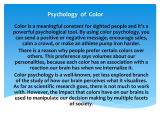
1. Psychology of Color
Color is a meaningful constant for sighted people and it's a
powerful psychological tool. By using color psychology, you
can send a positive or negative message, encourage sales,
calm a crowd, or make an athlete pump iron harder.
There is a reason why people prefer certain colors over
others. This preference says volumes about our
personalities, because each color has an association with a
reaction our brain has when we internalize it.
Color psychology is a well-known, yet less explored branch
of the study of how our brain perceives what it visualizes.
As far as scientific research goes, there is not much to work
with. However, the impact that colors have on our brains is
used to manipulate our decision making by multiple facets
of society.
2. Red - Associated with energy, war, danger, strength, power, determination as
well as passion, desire, and love.
- Enhances human metabolism, increases respiration rate, and raises blood
pressure
- It attracts attention more than any other color, at times signifying danger.
Orange - Combines the energy of red and the happiness of yellow
- Associated with joy, sunshine, and the tropics.
- Represents enthusiasm, fascination, happiness, creativity, determination,
attraction, success,
encouragement, and stimulation.
Meaning of Color
3. Yellow - Associated with joy, happiness, intellect, and energy.
- Produces a warming effect, arouses cheerfulness, stimulates
mental activity.
- Yellow indicates honor and loyalty.
Green - Color of nature. It symbolizes growth, harmony, freshness, and
fertility.
- Strong emotional correspondence with safety.
- Has great healing power.
- Green suggests stability and endurance.
- Color of the sea. It is often associated with depth and stability.
- Symbolizes trust, loyalty, wisdom, confidence, intelligence, faith,
truth.
- Considered beneficial to the mind and body.
- Strongly associated with tranquility and calmness.
4. Purple - Combines the stability of blue and the energy of red.
- Associated with royalty. It symbolizes power, nobility, luxury, and
ambition.
- Conveys wealth and extravagance.
- Associated with wisdom, dignity, independence, creativity,
mystery, and magic.
White - Associated with light, goodness, innocence, purity, and virginity.
- Considered to be the color of perfection.
- Signifies safety, purity, and cleanliness.
- Can represent a successful beginning.
- Depicts faith and purity.
5. Black - Associated with power, elegance, formality, death, evil,
and mystery.
- A mysterious color associated with fear and the unknown
(black holes).
- Usually has a negative connotation (blacklist, black humor,
‘black death’).
- Denotes strength and authority; it is considered to be a
very formal, elegant, and prestigious color.
- The symbol of grief.
6. What is Color Harmony?
Harmony is nature’s way of saying that two or more things together
make sense. Color harmony represents a satisfying balance or unity of
colors. Combinations of colors that exist in harmony are pleasing to the
eye.
Color Harmonies
7. Complementary
-Colors that are opposite each other
on the color wheel are considered to
be complementary colors (example:
red and green).
-The high contrast of
complementary colors creates a
vibrant look especially when used at
full saturation. This color scheme
must be managed well so it is not
jarring.
-Complementary colors are tricky to
use in large doses, but work well
when you want something to stand
out.
-Complementary colors are really
bad for text.
8. Analogous
-Analogous color schemes use colors
that are next to each other on the
color wheel. They usually match well
and create serene and comfortable
designs.
-Analogous color schemes are often
found in nature and are harmonious
and pleasing to the eye.
-Make sure you have enough
contrast when choosing an
analogous color scheme.
-Choose one color to dominate, a
second to support. The third color is
used (along with black, white or
gray) as an accent.
9. Triad
-A triadic color scheme uses colors
that are evenly spaced around the
color wheel.
-Triadic color harmonies tend to be
quite vibrant, even if you use pale or
unsaturated versions of your hues.
-To use a triadic harmony
successfully, the colors should be
carefully balanced - let one color
dominate and use the two others for
accent.
10. Split-Complementary
-The split-complementary color
scheme is a variation of the
complementary color scheme. In
addition to the base color, it uses the
two colors adjacent to its
complement.
-This color scheme has the same
strong visual contrast as the
complementary color scheme, but
has less tension.
-The split-complimentary color
scheme is often a good choice for
beginners, because it is difficult to
mess up.
11. Rectangle (tetradic)
-The rectangle or tetradic color
scheme uses four colors arranged
into two complementary pairs.
-This rich color scheme offers plenty
of possibilities for variation.
-The tetradic color scheme works
best if you let one color be
dominant.
-You should also pay attention to the
balance between warm and cool
colors in your design.
12. Square
-The square color scheme is similar
to the rectangle, but with all four
colors spaced evenly around the
color circle.
-The square color scheme works best
if you let one color be dominant.
-You should also pay attention to the
balance between warm and cool
colors in your design.