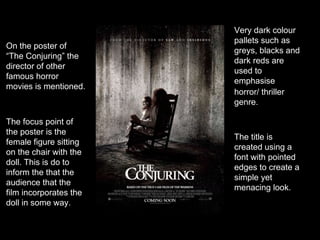
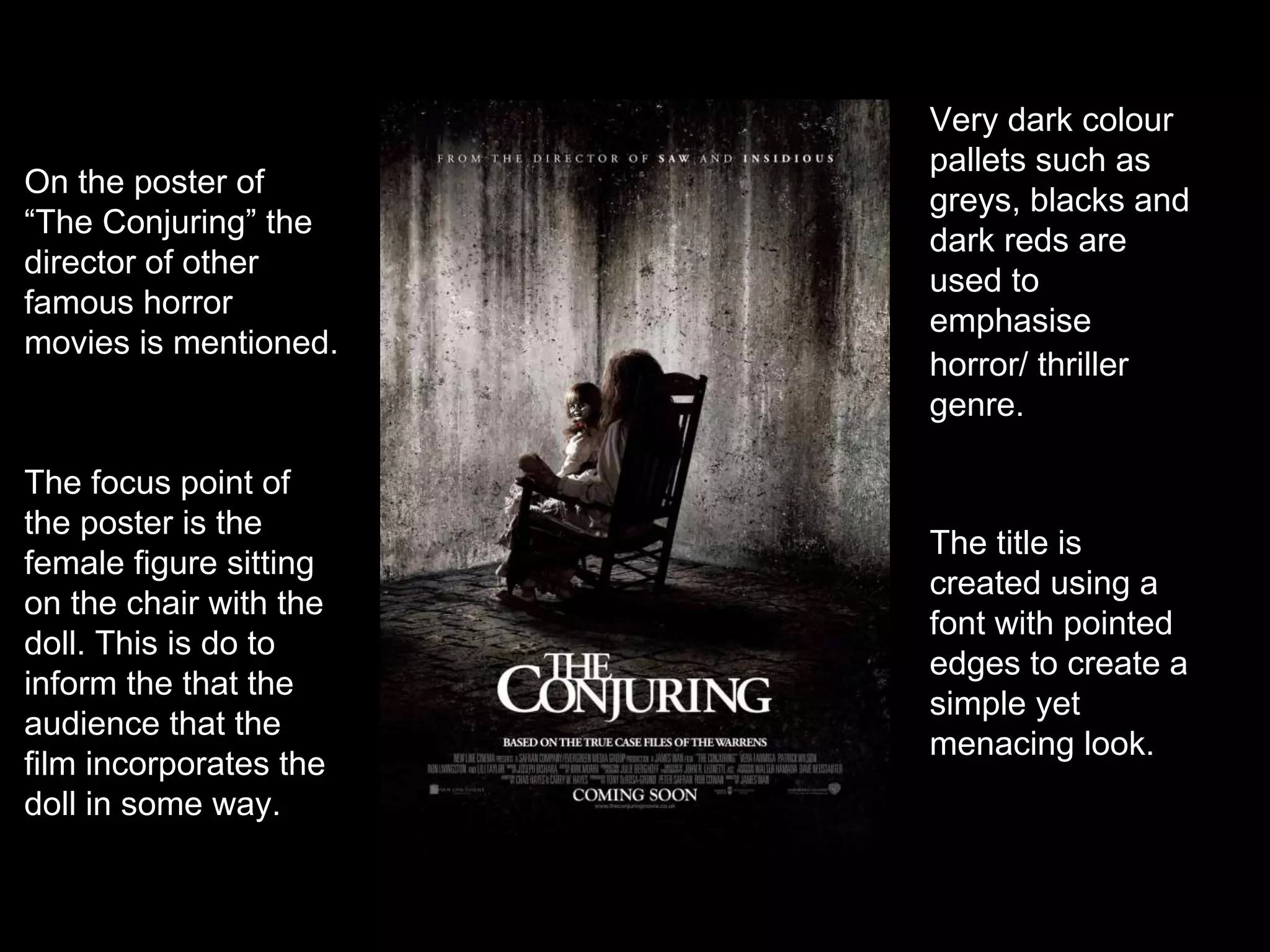
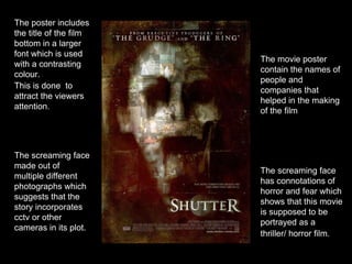
The focus point of
the poster is the
female figure sitting
on the chair with the
doll. This is do to
inform the that the
audience that the
film incorporates the
doll in some way.
Very dark colour
pallets such as
greys, blacks and
dark reds are
used to
emphasise
horror/ thriller
genre.
On the poster of
“The Conjuring” the
director of other
famous horror
movies is mentioned.
The title is
created using a
font with pointed
edges to create a
simple yet
menacing look.
The screaming face
has connotations of
horror and fear which
shows that this movie
is supposed to be
portrayed as a
thriller/ horror film.
The movie poster
contain the names of
people and
companies that
helped in the making
of the film
The poster includes
the title of the film
bottom in a larger
font which is used
with a contrasting
colour.
This is done to
attract the viewers
attention.
The screaming face
made out of
multiple different
photographs which
suggests that the
story incorporates
cctv or other
cameras in its plot.
The scratched filter has
been added to the
poster to show that
distress and violence in
the film.
The tag line used the
poster emphasises the
movies genre and tell
the audience what the
film is about.
The image of a
screaming/ distressed
woman with a tiara
suggests that this movie
is linked with the
horror/thriller genre and
is likely to be set at a
school prom.
The red title connotes
blood and danger
which further enforces
the thriller genre
It is also written in a
sharp pointy font to
emphasise the horror
and simplicity of the
film.
The release date is
important to let the
audience known when
the movie is coming
out and make them
remember the date.

Analysing Horror/ thriller posters

  • 1.
    The focus pointof the poster is the female figure sitting on the chair with the doll. This is do to inform the that the audience that the film incorporates the doll in some way. Very dark colour pallets such as greys, blacks and dark reds are used to emphasise horror/ thriller genre. On the poster of “The Conjuring” the director of other famous horror movies is mentioned. The title is created using a font with pointed edges to create a simple yet menacing look.
  • 2.
    The screaming face hasconnotations of horror and fear which shows that this movie is supposed to be portrayed as a thriller/ horror film. The movie poster contain the names of people and companies that helped in the making of the film The poster includes the title of the film bottom in a larger font which is used with a contrasting colour. This is done to attract the viewers attention. The screaming face made out of multiple different photographs which suggests that the story incorporates cctv or other cameras in its plot.
  • 3.
    The scratched filterhas been added to the poster to show that distress and violence in the film. The tag line used the poster emphasises the movies genre and tell the audience what the film is about. The image of a screaming/ distressed woman with a tiara suggests that this movie is linked with the horror/thriller genre and is likely to be set at a school prom. The red title connotes blood and danger which further enforces the thriller genre It is also written in a sharp pointy font to emphasise the horror and simplicity of the film. The release date is important to let the audience known when the movie is coming out and make them remember the date.