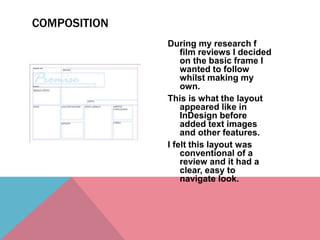
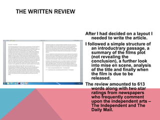
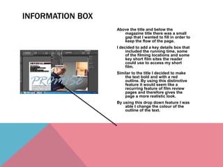
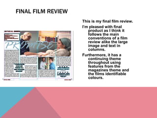
The document describes the process of creating a film review layout and article. It discusses deciding on a conventional layout, writing the review following a simple structure, and placing the text and images in InDesign. Images were edited in Photoshop and added to emphasize themes. A pull quote was extracted and styled. An information box was added at the bottom to provide key details. The final review follows conventions with a large image, text in columns, and continuing visual themes.
The French Revolution, which began in 1789, was a period of radical social and political upheaval in France. It marked the decline of absolute monarchies, the rise of secular and democratic republics, and the eventual rise of Napoleon Bonaparte. This revolutionary period is crucial in understanding the transition from feudalism to modernity in Europe.
For more information, visit-www.vavaclasses.com
Unit 8 - Information and Communication Technology (Paper I).pdfThiyagu K
This slides describes the basic concepts of ICT, basics of Email, Emerging Technology and Digital Initiatives in Education. This presentations aligns with the UGC Paper I syllabus.
Welcome to TechSoup New Member Orientation and Q&A (May 2024).pdfTechSoup
In this webinar you will learn how your organization can access TechSoup's wide variety of product discount and donation programs. From hardware to software, we'll give you a tour of the tools available to help your nonprofit with productivity, collaboration, financial management, donor tracking, security, and more.
Synthetic Fiber Construction in lab .pptxPavel ( NSTU)
Synthetic fiber production is a fascinating and complex field that blends chemistry, engineering, and environmental science. By understanding these aspects, students can gain a comprehensive view of synthetic fiber production, its impact on society and the environment, and the potential for future innovations. Synthetic fibers play a crucial role in modern society, impacting various aspects of daily life, industry, and the environment. ynthetic fibers are integral to modern life, offering a range of benefits from cost-effectiveness and versatility to innovative applications and performance characteristics. While they pose environmental challenges, ongoing research and development aim to create more sustainable and eco-friendly alternatives. Understanding the importance of synthetic fibers helps in appreciating their role in the economy, industry, and daily life, while also emphasizing the need for sustainable practices and innovation.
How to Make a Field invisible in Odoo 17Celine George
It is possible to hide or invisible some fields in odoo. Commonly using “invisible” attribute in the field definition to invisible the fields. This slide will show how to make a field invisible in odoo 17.
The Indian economy is classified into different sectors to simplify the analysis and understanding of economic activities. For Class 10, it's essential to grasp the sectors of the Indian economy, understand their characteristics, and recognize their importance. This guide will provide detailed notes on the Sectors of the Indian Economy Class 10, using specific long-tail keywords to enhance comprehension.
For more information, visit-www.vavaclasses.com
How to Split Bills in the Odoo 17 POS ModuleCeline George
Bills have a main role in point of sale procedure. It will help to track sales, handling payments and giving receipts to customers. Bill splitting also has an important role in POS. For example, If some friends come together for dinner and if they want to divide the bill then it is possible by POS bill splitting. This slide will show how to split bills in odoo 17 POS.
Ethnobotany and Ethnopharmacology:
Ethnobotany in herbal drug evaluation,
Impact of Ethnobotany in traditional medicine,
New development in herbals,
Bio-prospecting tools for drug discovery,
Role of Ethnopharmacology in drug evaluation,
Reverse Pharmacology.
Read| The latest issue of The Challenger is here! We are thrilled to announce that our school paper has qualified for the NATIONAL SCHOOLS PRESS CONFERENCE (NSPC) 2024. Thank you for your unwavering support and trust. Dive into the stories that made us stand out!
The Art Pastor's Guide to Sabbath | Steve ThomasonSteve Thomason
What is the purpose of the Sabbath Law in the Torah. It is interesting to compare how the context of the law shifts from Exodus to Deuteronomy. Who gets to rest, and why?
The Art Pastor's Guide to Sabbath | Steve Thomason
Producing a film review
1.
2. During my research f
film reviews I decided
on the basic frame I
wanted to follow
whilst making my
own.
This is what the layout
appeared like in
InDesign before
added text images
and other features.
I felt this layout was
conventional of a
review and it had a
clear, easy to
navigate look.
COMPOSITION
3. After I had decided on a layout I
needed to write the article.
I followed a simple structure of
an introductrary passage, a
summary of the films plot
(not revealing the
conclusion), a further look
into mise en scene, analysis
of the title and finally when
the film is due to be
released.
The review amounted to 613
words along with two star
ratings from newspapers
who frequently comment
upon the independent arts –
The Independent and The
Daily Mail.
THE WRITTEN REVIEW
4. Once I was happy with the layout
and the read of the review I
decided to place the two
together to see how this
would look in an A5
pamphlet.
I was concerned that the font
being 12 may look too big on
an A3 spread so I decided
the best place for my review
would be in a small A5
informative booklet.
I found having the text all on one
level looked smart and
sophisticated, however I
knew it would be beneficial
to alter the text composition
once I had placed images
down.
ADDING THE TEXT
5. This was one of the images I decided I wanted to appear on the
review.
I found the facial expressions of Dave representative of his role
in the film- worried, concerned.
As well as this I found the framing of the image effective as it is a
medium shot of both Ellie and her father, showing the film
is mainly about their relationship.
Here I am editing the colour in the image in Photoshop before
placing it on InDesign, I added a warm tone as I felt this
would represent a theme of home.
After seeing the image in the size I needed it in InDesign I felt it
lacked substance and so found another image to work
with.
This image of Sandy and Ellie I felt was a powerful one as it gave
the connotation of illness- a main theme in the film.
Also the way Ellie is looking up to Sandy, an elder character,
would show the significance of age in short film and how
often it is an older wiser female character that resolves
situations.
In Photoshop I am here editing the contrast of the image as I felt
there were some vibrant colours not being brought out as
well as they could be.
By moving the contrast I was able to emphasise certain colours
like the blue and grey without adding yellow tints to the
characters skin which would change if I altered the
saturation.
ADDING IMAGES
6. Now with the text and images in
place I decided to add a pull
quote.
A pull quote is a small quote from a
large piece of text that draws
the audience in by its opinion or
information.
I created a new text box and typed
in my quote, then by making it
two sizes larger It made the
quote stand out above the
smaller text, finally I added a
blue lining around the text
which was the same colour as
the title of the film.
Then I used this tool to wrap the
surrounding text around the
new text box to create a pull
quote effect.
PULL QUOTES
7. Above the title and below the
magazine title there was a small
gap that I wanted to fill in order to
keep the flow of the page.
I decided to add a key details box that
included the running time, some
of the filming locations and some
key short film sites the reader
could use to access my short
film.
Similar to the title I decided to make
the text bold and with a red
outline. By using this distinctive
feature it would seem like a
recurring feature of film review
pages and therefore gives the
page a more realistic look.
By using this drop down feature I was
able t change the colour of the
outline of the text.
INFORMATION BOX
8. This is my final film review.
I’m pleased with final
product as I think it
follows the main
conventions of a film
review alike the large
image and text in
columns.
Furthermore, it has a
continuing theme
throughout using
features from the
magazines theme and
the films identifiable
colours.
FINAL FILM REVIEW