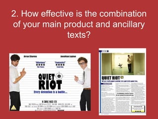
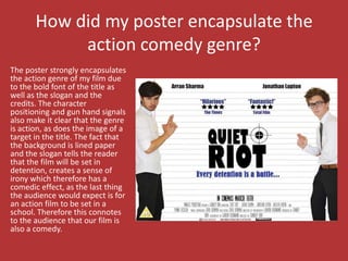
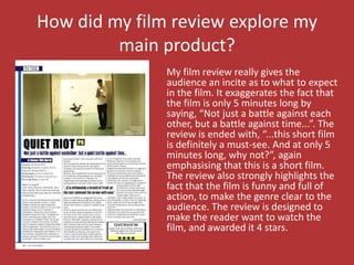
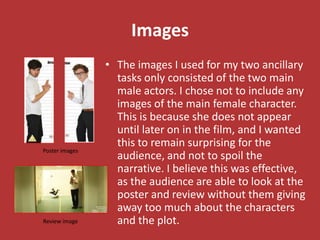
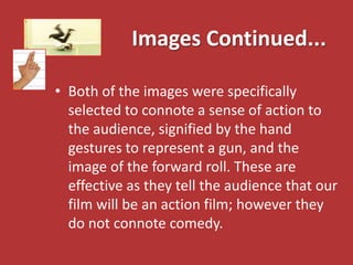
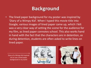
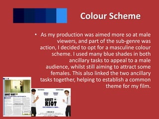
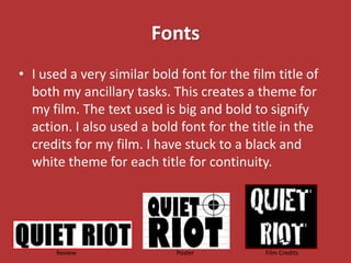
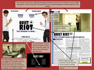
2. How effective is the combination
of your main product and ancillary
               texts?
The Brief
My main task was to create a short, five minute
                       film.
I then had to produce a poster and a film review
               for my ancillary tasks.
Both ancillary tasks were meant to promote our
product in different ways, verbally in the review and
 visually in the poster. I tried to make sure that the
 audience would want to watch our film based on
  what they saw on my ancillary tasks through the
 use of creativity and text. I represented the film in
    the most positive light possible, not only to
    promote, but to also establish a connection
between the light heartedness of the ancillary tasks
     and the light heartedness of the film itself.
How did my poster encapsulate the
            action comedy genre?
The poster strongly encapsulates
the action genre of my film due
to the bold font of the title as
well as the slogan and the
credits. The character
positioning and gun hand signals
also make it clear that the genre
is action, as does the image of a
target in the title. The fact that
the background is lined paper
and the slogan tells the reader
that the film will be set in
detention, creates a sense of
irony which therefore has a
comedic effect, as the last thing
the audience would expect is for
an action film to be set in a
school. Therefore this connotes
to the audience that our film is
also a comedy.
How did my film review explore my
         main product?
               My film review really gives the
               audience an incite as to what to expect
               in the film. It exaggerates the fact that
               the film is only 5 minutes long by
               saying, “Not just a battle against each
               other, but a battle against time...”. The
               review is ended with, “...this short film
               is definitely a must-see. And at only 5
               minutes long, why not?”, again
               emphasising that this is a short film.
               The review also strongly highlights the
               fact that the film is funny and full of
               action, to make the genre clear to the
               audience. The review is designed to
               make the reader want to watch the
               film, and awarded it 4 stars.
Images
                • The images I used for my two ancillary
                  tasks only consisted of the two main
                  male actors. I chose not to include any
                  images of the main female character.
                  This is because she does not appear
                  until later on in the film, and I wanted
                  this to remain surprising for the
Poster images
                  audience, and not to spoil the
                  narrative. I believe this was effective,
                  as the audience are able to look at the
                  poster and review without them giving
                  away too much about the characters
Review image      and the plot.
Images Continued...

• Both of the images were specifically
  selected to connote a sense of action to
  the audience, signified by the hand
  gestures to represent a gun, and the
  image of the forward roll. These are
  effective as they tell the audience that our
  film will be an action film; however they
  do not connote comedy.
Background
• The lined paper background for my poster was inspired by
  ‘Diary of a Wimpy Kid’. When I typed this movie title into
  Google, various images of lined paper came up, which I felt
  was a very clear way of setting the scene for the audience for
  my film, as lined paper connotes school. This also works hand
  in hand with the fact that the characters are in detention, as
  during detention, students are often asked to write lines on
  lined paper.


 Diary of a Wimpy Kid inspired
    me to use a lined paper
   background in my work!
Colour Scheme
• As my production was aimed more so at male
          viewers, and part of the sub-genre was
  action, I decided to opt for a masculine colour
        scheme. I used many blue shades in both
               ancillary tasks to appeal to a male
    audience, whilst still aiming to attract some
       females. This also linked the two ancillary
  tasks together, helping to establish a common
                                theme for my film.
Fonts
• I used a very similar bold font for the film title of
  both my ancillary tasks. This creates a theme for
  my film. The text used is big and bold to signify
  action. I also used a bold font for the title in the
  credits for my film. I have stuck to a black and
  white theme for each title for continuity.


      Review                Poster           Film Credits
Web Address
• Looking at existing posters and short films I
  found that they include a web address to
  promote the film. Therefore I decided to
  include one on my poster and credits of the
  film. This provides the viewer with another
  source so that they can go and seek further
  information about the film.
Both ancillary tasks have a bright white background which conveys to the audience a sense of light
                        heartedness. This also links the film which was shot in high key lighting and made brighter during
                                                                      editing.


                                                                          The blue colour
                                                                          scheme is used
                                                                          in both
                                                                          ancillary tasks.


                                                                                  A very similar bold font
                                                                                  is used to connote
                                                                                  action.


                                                The web address is shown
                                                in both the poster and the
                                                film so that the viewer can
                                                seek further information
                                                about the film.


The paper background was used not
only suggests to the audience that the                                                       Both images strongly
film will be set in school, but also                                                         connote a sense of action
directly links to the scene in which Ty                                                      to the audience, letting
screws up his lined paper and throws it                                                      them know what the genre
at Freddie, who initiates the battle.                                                        will be.
Summary
  Overall, I believe that the combination of my
   main product and ancillary tasks has been
 effective. I have ensured that each one links to
 another in some way, be it through the use of
images, background, colour scheme, fonts or the
                   web address.

Q2pptx

  • 1.
    2. How effectiveis the combination of your main product and ancillary texts?
  • 2.
    The Brief My maintask was to create a short, five minute film. I then had to produce a poster and a film review for my ancillary tasks.
  • 3.
    Both ancillary taskswere meant to promote our product in different ways, verbally in the review and visually in the poster. I tried to make sure that the audience would want to watch our film based on what they saw on my ancillary tasks through the use of creativity and text. I represented the film in the most positive light possible, not only to promote, but to also establish a connection between the light heartedness of the ancillary tasks and the light heartedness of the film itself.
  • 4.
    How did myposter encapsulate the action comedy genre? The poster strongly encapsulates the action genre of my film due to the bold font of the title as well as the slogan and the credits. The character positioning and gun hand signals also make it clear that the genre is action, as does the image of a target in the title. The fact that the background is lined paper and the slogan tells the reader that the film will be set in detention, creates a sense of irony which therefore has a comedic effect, as the last thing the audience would expect is for an action film to be set in a school. Therefore this connotes to the audience that our film is also a comedy.
  • 5.
    How did myfilm review explore my main product? My film review really gives the audience an incite as to what to expect in the film. It exaggerates the fact that the film is only 5 minutes long by saying, “Not just a battle against each other, but a battle against time...”. The review is ended with, “...this short film is definitely a must-see. And at only 5 minutes long, why not?”, again emphasising that this is a short film. The review also strongly highlights the fact that the film is funny and full of action, to make the genre clear to the audience. The review is designed to make the reader want to watch the film, and awarded it 4 stars.
  • 6.
    Images • The images I used for my two ancillary tasks only consisted of the two main male actors. I chose not to include any images of the main female character. This is because she does not appear until later on in the film, and I wanted this to remain surprising for the Poster images audience, and not to spoil the narrative. I believe this was effective, as the audience are able to look at the poster and review without them giving away too much about the characters Review image and the plot.
  • 7.
    Images Continued... • Bothof the images were specifically selected to connote a sense of action to the audience, signified by the hand gestures to represent a gun, and the image of the forward roll. These are effective as they tell the audience that our film will be an action film; however they do not connote comedy.
  • 8.
    Background • The linedpaper background for my poster was inspired by ‘Diary of a Wimpy Kid’. When I typed this movie title into Google, various images of lined paper came up, which I felt was a very clear way of setting the scene for the audience for my film, as lined paper connotes school. This also works hand in hand with the fact that the characters are in detention, as during detention, students are often asked to write lines on lined paper. Diary of a Wimpy Kid inspired me to use a lined paper background in my work!
  • 9.
    Colour Scheme • Asmy production was aimed more so at male viewers, and part of the sub-genre was action, I decided to opt for a masculine colour scheme. I used many blue shades in both ancillary tasks to appeal to a male audience, whilst still aiming to attract some females. This also linked the two ancillary tasks together, helping to establish a common theme for my film.
  • 10.
    Fonts • I useda very similar bold font for the film title of both my ancillary tasks. This creates a theme for my film. The text used is big and bold to signify action. I also used a bold font for the title in the credits for my film. I have stuck to a black and white theme for each title for continuity. Review Poster Film Credits
  • 11.
    Web Address • Lookingat existing posters and short films I found that they include a web address to promote the film. Therefore I decided to include one on my poster and credits of the film. This provides the viewer with another source so that they can go and seek further information about the film.
  • 12.
    Both ancillary taskshave a bright white background which conveys to the audience a sense of light heartedness. This also links the film which was shot in high key lighting and made brighter during editing. The blue colour scheme is used in both ancillary tasks. A very similar bold font is used to connote action. The web address is shown in both the poster and the film so that the viewer can seek further information about the film. The paper background was used not only suggests to the audience that the Both images strongly film will be set in school, but also connote a sense of action directly links to the scene in which Ty to the audience, letting screws up his lined paper and throws it them know what the genre at Freddie, who initiates the battle. will be.
  • 13.
    Summary Overall,I believe that the combination of my main product and ancillary tasks has been effective. I have ensured that each one links to another in some way, be it through the use of images, background, colour scheme, fonts or the web address.