Q2. HOW EFFECTIVE IS THE
COMBINATION OF YOUR MAIN
PRODUCT AND YOUR ANCILLARY
TEXTS?

SUNRAJ BOLINA
THE BRIEF FOR OUR ASSIGNMENT
o The main task for our coursework was to create a short film,
roughly about 5 minutes long.
o We then had to create a film poster and review based on our short
film for our ancillary task. The point of the ancillary task was to
promote our short film.
o A film poster is a simple but yet effective way of promoting a film.
When placed around key areas, the film poster increases the
awareness of new film releases in the hope of increasing
popularity and ticket sales.
o The film review is based on a critiques opinion on the film, reviews
for (short) films are likely to be in media/film magazines such as
Empire magazine. Directors hope that reviews of their films are
good, in order to increase the popularity of the film, to make it a
success in cinemas and later stages of the cycle (e.g. exhibition
and distribution).
HOW DOES MY POSTER MEET THE (TRAGEDY)
DRAMA GENRE?
The (tragedy) drama genre is not
uplifting, bright and humorous as
other genres. It includes elements
of darkness, suspense and
emotion. Tragedy dramas always
end bad, the antagonist always
gets their way. Drama films focus
on how actions and dilemmas
affect the main characters life's,
there is usually more emphasis on
the characters feeling and
thoughts.
My short film – ‘Behind Closed
Doors’ shows how the actions of
the antagonist directly affects the
protagonist as her life goes from
bad to worse. In my poster I chose
to include a image of the deceased
mother because in (tragedy) drama
films and my short film someone's
death usually impacts the main
characters life and the storyline
revolves around this.

The images are not uplifting, the
characters look serious, upset and
emotional. I think that the images
correspond well with the genre
because you can see the pain in
the characters facial expressions,
indicating that the genre is a
(dark/tragedy) drama.
The tagline – ‘not everything is
what it seems’ indicates that there
is a twist in the film. It adds
suspense, which makes the
audience think, what the storyline
could be? What the relationships
are between the characters?

I made the background black
because it adds a sense of
darkness and hints that there is a
hidden element (normally the
conventions of drama films). The
black also work well, with fading the
images and text.

The colours are very gloomy, the
gold/yellow in the title adds a bit
of colour to the poster. This
represents a bit of hope, drama
films don’t always include
dark, sad scenes. The bit of
colour not only makes the title
stand out but symbolises the
protagonists good side.
USE OF FONT - POSTER
For the text in the green box I used the font – ‘Impact’. Impact makes the written
text bold, with thick outlines. I chose this font because it makes the text stand out
and viewable from a long distance. I chose the colours white and grey as this was
my colour scheme and it blends in well with the black background and selected
images. I added effects on my tagline – ‘NOT EVERYTHING IS WHAT IT
SEEMS’, a simple shadow and outline makes the tagline stand out. I wanted the
name of the film and tagline to stand out the most which is my I used effects on
them.
I used the font – ‘BankGothic MB for the title of the film. I used a different
font for this because I wanted the title to stand out as it is the most
important text on the poster. The title along with the use of images and
colour scheme is what attracts people to the poster and makes them want
to watch the film. This is the main reason why I made the title bigger, 3-D
and bolder than other text. I added a hint of gold/yellow for the outline to
make the title stand out. The use of a bright colour against the other dark
text represents a bit of hope and the good side of the protagonist. The
bold, 3-D title makes the poster powerful, it draws your attention to the
images which are placed above the title. The powerful text of the title relates
to the powerful stature of the antagonist who has been purposely placed
above the title. I aimed to make the images and text all link.

I decided to use Arial for the Twitter URL and website name. I
wanted to make this as clear as possible because when people
see this on the poster they may use the links to support the film
by following the account or going onto the actual website. The
text is fairly small because it is not as important as the other text,
however it is still readable.

I used the font ‘SteelTongs’ for the billing because this is the
font that are actually used for some film posters. SteelTongs
made the billing look professional. I chose the font because it
goes well with the poster and is clear and easy to read. I put
an outline effect on this text in order for it to stand out, this was
important because each crew member will be able to get credit
for what they done. Some of the text overlaps other text, I did
this to follow the pattern of how billings are created, this is also
used in some professional film posters.
FILM REVIEW
I chose a purple and black
colour scheme in order to
the text and boxes to
match the image. The
colour is inviting and
attracts people to the
review. I did not want to
use dull colours because
people tend to flick
through pages if the first
sight of the page puts
them off.
My aim was to create a
professional looking
review, I did not want
many boxes or images as
the main focus is the
actual written review.

I chose to use a variety of
fonts in order to make the
review stand out from other
reviews in the magazine. I
carefully aligned the main
text in order for it to be
easily readable.
USE OF FONT - REVIEW
I used Berlin Sans FB Demi for this text
because I wanted it to be different to
the other text. The text is very important
as it shows key dates and the fact that
the film is in cinemas. I wanted this to
be easy to read so that it effectively
promotes the film and makes people
aware that the film is now out.

I chose to use the font Bebas Neue for the title and tagline. This
font was only used for the title of the film and tagline because it is
one of the main important text on the review. The font is
bold, clear and fairly large so it stands out amongst the other text.
I also chose this font because it sort of indicates that the film is a
drama. The font is not uplifting, it is plain and bold, this
corresponds with the (tragedy) drama genre..

I used the font Bell MT for the main
text of the review because it is clear
and simple which makes it easy to
read. The whole point of a film review
is for people to read what critiques
say about a new release, therefore it
was important that I chose a simple
font for the main text, which is easy
to read.

The verdict is the overall
summary of the film based
on the critiques opinion.

I used the font Century Schoolbook for this text
because the verdict is one of the most important things
on the review. I wanted the text to stand out but not to
be as bold as the title and tagline.

I chose to use the font Berlin Sans FB because it is clear and simple which
makes the main text easy to read. The main reason I chose to use this font is
because it is bold, this makes the text stand out. The text next to the bullet
point is situated on the left of the image, therefore the font needed to be clear in
order for it to be visible on top of the purple background. The website address
also needed to be clear in order to effectively promote the site to gain new
customers. The black and white text on top of the purple background (boxes)
adds to the continuity of the review.
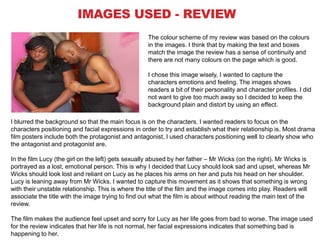
IMAGES USED - REVIEW
The colour scheme of my review was based on the colours
in the images. I think that by making the text and boxes
match the image the review has a sense of continuity and
there are not many colours on the page which is good.
I chose this image wisely, I wanted to capture the
characters emotions and feeling. The images shows
readers a bit of their personality and character profiles. I did
not want to give too much away so I decided to keep the
background plain and distort by using an effect.
I blurred the background so that the main focus is on the characters. I wanted readers to focus on the
characters positioning and facial expressions in order to try and establish what their relationship is. Most drama
film posters include both the protagonist and antagonist, I used characters positioning well to clearly show who
the antagonist and protagonist are.
In the film Lucy (the girl on the left) gets sexually abused by her father – Mr Wicks (on the right). Mr Wicks is
portrayed as a lost, emotional person. This is why I decided that Lucy should look sad and upset, whereas Mr
Wicks should look lost and reliant on Lucy as he places his arms on her and puts his head on her shoulder.
Lucy is leaning away from Mr Wicks, I wanted to capture this movement as it shows that something is wrong
with their unstable relationship. This is where the title of the film and the image comes into play. Readers will
associate the title with the image trying to find out what the film is about without reading the main text of the
review.
The film makes the audience feel upset and sorry for Lucy as her life goes from bad to worse. The image used
for the review indicates that her life is not normal, her facial expressions indicates that something bad is
happening to her.
IMAGES USED - POSTER
I decided to make the two images on the right and left (showing
Lucy and her deceased mother) dark. I saturated the images in
order to make them black and white and made them fade in with
the background. The image on the right – the deceased mother is
faded in more than the image of Lucy on the left because she is
dead. This indicated her significance in the film as she does not
appear in the film however the storyline is based around her, which
is why I chose to include an image of her in my poster.
In the film Lucy has to face living without her mother and her father
sexually abusing her. I positioned the image of her in the top left
corner behind Mr Wicks to show how he is superior to her in the
film, and how she cannot do anything to change her situation.
The image of Lucy makes people feel sorry for her, even without knowing her situation or why she looks so
sad. By looking at the images the audience can tell who the protagonist and antagonist is. I decided that the
image of Mr Wicks should be in colour as this shows that he is an important figure in the film. His posture and
stature indicates to the audience that he is a powerful man, the image also indicates a bit about his
personality, how he looks ruthless and effortless. I added a shadow to his image and also edited the colouring
to make him stand out. The use of the colour red on his face brings out his anger, I also decided to use the
colour red as it is normally associated with bad things, death and agony. These are a few elements that I
incorporated in my film. The two main characters look serious, this indicates to the audience that the film is
also going to be serious and that it is most likely going to be a drama.
The characters have the same costumes for the images used in the poster and review, this was done to
maintain continuity and not to confuse the viewers. The dark clothing corresponds with the conventions of a
drama film, the clothing also shows that the storyline (film) is dark and serious.
LOGOS AND WEBSITES
While researching film posters, I realised that most posters included
website addresses (Twitter, Facebook and the productions website). This
is an effective way to promote the film and also gain supporters through
social networking and increasing the awareness of the film.
As a convention of a film poster, I decided to include the web address for
my film and also the Twitter web address. I decided to use the Twitter
web address because Twitter is becoming more popular with my target
audience (15-55).

The Twitter web address for
my film.

The web address for my
film, this includes information
about the film, promotions
and spoilers etc.
SUMMARY
The images used in my film review gives the audience hints as to what the
short film is about. However the main text also has significant relevance
without giving too much away in regards to how the film ends. The text in
the review informs people a bit about the characters, the acting, the
storyline and how the film is executed (editing and filming).
My film poster signifies the genre of my short film, by looking at the images
used, the audience immediately get a feel for the film, they start to think
about the storyline and how the characters could progress.
I strongly think that my two ancillary tasks combine well with the final
product. They both give off the same impression, with the colour scheme of
the poster matching the dark colour correction used for the film. The main
text of the review corresponds with the storyline/narrative of the film. Both
ancillary tasks and final film posses a sense of seriousness which indicate
the genre and storyline of the film. This was accomplished through the use
of images, colouring and text of the ancillary tasks and editing, shots and
acting in the film.

Q2

  • 1.
    Q2. HOW EFFECTIVEIS THE COMBINATION OF YOUR MAIN PRODUCT AND YOUR ANCILLARY TEXTS? SUNRAJ BOLINA
  • 2.
    THE BRIEF FOROUR ASSIGNMENT o The main task for our coursework was to create a short film, roughly about 5 minutes long. o We then had to create a film poster and review based on our short film for our ancillary task. The point of the ancillary task was to promote our short film. o A film poster is a simple but yet effective way of promoting a film. When placed around key areas, the film poster increases the awareness of new film releases in the hope of increasing popularity and ticket sales. o The film review is based on a critiques opinion on the film, reviews for (short) films are likely to be in media/film magazines such as Empire magazine. Directors hope that reviews of their films are good, in order to increase the popularity of the film, to make it a success in cinemas and later stages of the cycle (e.g. exhibition and distribution).
  • 3.
    HOW DOES MYPOSTER MEET THE (TRAGEDY) DRAMA GENRE? The (tragedy) drama genre is not uplifting, bright and humorous as other genres. It includes elements of darkness, suspense and emotion. Tragedy dramas always end bad, the antagonist always gets their way. Drama films focus on how actions and dilemmas affect the main characters life's, there is usually more emphasis on the characters feeling and thoughts. My short film – ‘Behind Closed Doors’ shows how the actions of the antagonist directly affects the protagonist as her life goes from bad to worse. In my poster I chose to include a image of the deceased mother because in (tragedy) drama films and my short film someone's death usually impacts the main characters life and the storyline revolves around this. The images are not uplifting, the characters look serious, upset and emotional. I think that the images correspond well with the genre because you can see the pain in the characters facial expressions, indicating that the genre is a (dark/tragedy) drama. The tagline – ‘not everything is what it seems’ indicates that there is a twist in the film. It adds suspense, which makes the audience think, what the storyline could be? What the relationships are between the characters? I made the background black because it adds a sense of darkness and hints that there is a hidden element (normally the conventions of drama films). The black also work well, with fading the images and text. The colours are very gloomy, the gold/yellow in the title adds a bit of colour to the poster. This represents a bit of hope, drama films don’t always include dark, sad scenes. The bit of colour not only makes the title stand out but symbolises the protagonists good side.
  • 4.
    USE OF FONT- POSTER For the text in the green box I used the font – ‘Impact’. Impact makes the written text bold, with thick outlines. I chose this font because it makes the text stand out and viewable from a long distance. I chose the colours white and grey as this was my colour scheme and it blends in well with the black background and selected images. I added effects on my tagline – ‘NOT EVERYTHING IS WHAT IT SEEMS’, a simple shadow and outline makes the tagline stand out. I wanted the name of the film and tagline to stand out the most which is my I used effects on them. I used the font – ‘BankGothic MB for the title of the film. I used a different font for this because I wanted the title to stand out as it is the most important text on the poster. The title along with the use of images and colour scheme is what attracts people to the poster and makes them want to watch the film. This is the main reason why I made the title bigger, 3-D and bolder than other text. I added a hint of gold/yellow for the outline to make the title stand out. The use of a bright colour against the other dark text represents a bit of hope and the good side of the protagonist. The bold, 3-D title makes the poster powerful, it draws your attention to the images which are placed above the title. The powerful text of the title relates to the powerful stature of the antagonist who has been purposely placed above the title. I aimed to make the images and text all link. I decided to use Arial for the Twitter URL and website name. I wanted to make this as clear as possible because when people see this on the poster they may use the links to support the film by following the account or going onto the actual website. The text is fairly small because it is not as important as the other text, however it is still readable. I used the font ‘SteelTongs’ for the billing because this is the font that are actually used for some film posters. SteelTongs made the billing look professional. I chose the font because it goes well with the poster and is clear and easy to read. I put an outline effect on this text in order for it to stand out, this was important because each crew member will be able to get credit for what they done. Some of the text overlaps other text, I did this to follow the pattern of how billings are created, this is also used in some professional film posters.
  • 5.
    FILM REVIEW I chosea purple and black colour scheme in order to the text and boxes to match the image. The colour is inviting and attracts people to the review. I did not want to use dull colours because people tend to flick through pages if the first sight of the page puts them off. My aim was to create a professional looking review, I did not want many boxes or images as the main focus is the actual written review. I chose to use a variety of fonts in order to make the review stand out from other reviews in the magazine. I carefully aligned the main text in order for it to be easily readable.
  • 6.
    USE OF FONT- REVIEW I used Berlin Sans FB Demi for this text because I wanted it to be different to the other text. The text is very important as it shows key dates and the fact that the film is in cinemas. I wanted this to be easy to read so that it effectively promotes the film and makes people aware that the film is now out. I chose to use the font Bebas Neue for the title and tagline. This font was only used for the title of the film and tagline because it is one of the main important text on the review. The font is bold, clear and fairly large so it stands out amongst the other text. I also chose this font because it sort of indicates that the film is a drama. The font is not uplifting, it is plain and bold, this corresponds with the (tragedy) drama genre.. I used the font Bell MT for the main text of the review because it is clear and simple which makes it easy to read. The whole point of a film review is for people to read what critiques say about a new release, therefore it was important that I chose a simple font for the main text, which is easy to read. The verdict is the overall summary of the film based on the critiques opinion. I used the font Century Schoolbook for this text because the verdict is one of the most important things on the review. I wanted the text to stand out but not to be as bold as the title and tagline. I chose to use the font Berlin Sans FB because it is clear and simple which makes the main text easy to read. The main reason I chose to use this font is because it is bold, this makes the text stand out. The text next to the bullet point is situated on the left of the image, therefore the font needed to be clear in order for it to be visible on top of the purple background. The website address also needed to be clear in order to effectively promote the site to gain new customers. The black and white text on top of the purple background (boxes) adds to the continuity of the review.
  • 7.
    IMAGES USED -REVIEW The colour scheme of my review was based on the colours in the images. I think that by making the text and boxes match the image the review has a sense of continuity and there are not many colours on the page which is good. I chose this image wisely, I wanted to capture the characters emotions and feeling. The images shows readers a bit of their personality and character profiles. I did not want to give too much away so I decided to keep the background plain and distort by using an effect. I blurred the background so that the main focus is on the characters. I wanted readers to focus on the characters positioning and facial expressions in order to try and establish what their relationship is. Most drama film posters include both the protagonist and antagonist, I used characters positioning well to clearly show who the antagonist and protagonist are. In the film Lucy (the girl on the left) gets sexually abused by her father – Mr Wicks (on the right). Mr Wicks is portrayed as a lost, emotional person. This is why I decided that Lucy should look sad and upset, whereas Mr Wicks should look lost and reliant on Lucy as he places his arms on her and puts his head on her shoulder. Lucy is leaning away from Mr Wicks, I wanted to capture this movement as it shows that something is wrong with their unstable relationship. This is where the title of the film and the image comes into play. Readers will associate the title with the image trying to find out what the film is about without reading the main text of the review. The film makes the audience feel upset and sorry for Lucy as her life goes from bad to worse. The image used for the review indicates that her life is not normal, her facial expressions indicates that something bad is happening to her.
  • 8.
    IMAGES USED -POSTER I decided to make the two images on the right and left (showing Lucy and her deceased mother) dark. I saturated the images in order to make them black and white and made them fade in with the background. The image on the right – the deceased mother is faded in more than the image of Lucy on the left because she is dead. This indicated her significance in the film as she does not appear in the film however the storyline is based around her, which is why I chose to include an image of her in my poster. In the film Lucy has to face living without her mother and her father sexually abusing her. I positioned the image of her in the top left corner behind Mr Wicks to show how he is superior to her in the film, and how she cannot do anything to change her situation. The image of Lucy makes people feel sorry for her, even without knowing her situation or why she looks so sad. By looking at the images the audience can tell who the protagonist and antagonist is. I decided that the image of Mr Wicks should be in colour as this shows that he is an important figure in the film. His posture and stature indicates to the audience that he is a powerful man, the image also indicates a bit about his personality, how he looks ruthless and effortless. I added a shadow to his image and also edited the colouring to make him stand out. The use of the colour red on his face brings out his anger, I also decided to use the colour red as it is normally associated with bad things, death and agony. These are a few elements that I incorporated in my film. The two main characters look serious, this indicates to the audience that the film is also going to be serious and that it is most likely going to be a drama. The characters have the same costumes for the images used in the poster and review, this was done to maintain continuity and not to confuse the viewers. The dark clothing corresponds with the conventions of a drama film, the clothing also shows that the storyline (film) is dark and serious.
  • 9.
    LOGOS AND WEBSITES Whileresearching film posters, I realised that most posters included website addresses (Twitter, Facebook and the productions website). This is an effective way to promote the film and also gain supporters through social networking and increasing the awareness of the film. As a convention of a film poster, I decided to include the web address for my film and also the Twitter web address. I decided to use the Twitter web address because Twitter is becoming more popular with my target audience (15-55). The Twitter web address for my film. The web address for my film, this includes information about the film, promotions and spoilers etc.
  • 10.
    SUMMARY The images usedin my film review gives the audience hints as to what the short film is about. However the main text also has significant relevance without giving too much away in regards to how the film ends. The text in the review informs people a bit about the characters, the acting, the storyline and how the film is executed (editing and filming). My film poster signifies the genre of my short film, by looking at the images used, the audience immediately get a feel for the film, they start to think about the storyline and how the characters could progress. I strongly think that my two ancillary tasks combine well with the final product. They both give off the same impression, with the colour scheme of the poster matching the dark colour correction used for the film. The main text of the review corresponds with the storyline/narrative of the film. Both ancillary tasks and final film posses a sense of seriousness which indicate the genre and storyline of the film. This was accomplished through the use of images, colouring and text of the ancillary tasks and editing, shots and acting in the film.