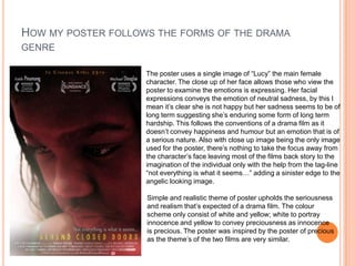
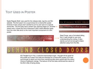
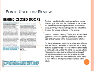
The document discusses the effectiveness of combining a short film with ancillary tasks of a poster and film review magazine page. It describes how the poster uses a close-up image of the main character to convey neutral sadness and intrigue without revealing details, following drama genre conventions. Fonts, colors, and comparisons to successful posters are also discussed. The film review aims for simplicity with a black-blue color scheme, plot summary box, and fonts that stand out subtly. Images provide context between characters. Both poster and review effectively promote the film in different ways and complete each other.

