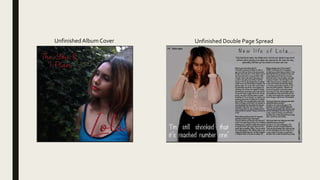
The feedback provided suggestions to improve the album cover and double page spread. For the album cover, making the text brighter was suggested to make it stand out more from the dark background. For the double page spread, adding images or graphics was proposed to fill empty space and make it more eye catching. Both pieces were said to look professional due to the colors and images used. Overall, the double page spread was preferred but improvements could be made by addressing the darkness of the text and simplicity of the backgrounds.
2137ad Merindol Colony Interiors where refugee try to build a seemengly norm...luforfor
This are the interiors of the Merindol Colony in 2137ad after the Climate Change Collapse and the Apocalipse Wars. Merindol is a small Colony in the Italian Alps where there are around 4000 humans. The Colony values mainly around meritocracy and selection by effort.
2137ad - Characters that live in Merindol and are at the center of main storiesluforfor
Kurgan is a russian expatriate that is secretly in love with Sonia Contado. Henry is a british soldier that took refuge in Merindol Colony in 2137ad. He is the lover of Sonia Contado.
The perfect Sundabet Slot mudah menang Promo new member Animated PDF for your conversation. Discover and Share the best GIFs on Tenor
Admin Ramah Cantik Aktif 24 Jam Nonstop siap melayani pemain member Sundabet login via apk sundabet rtp daftar slot gacor daftar
Explore the multifaceted world of Muntadher Saleh, an Iraqi polymath renowned for his expertise in visual art, writing, design, and pharmacy. This SlideShare delves into his innovative contributions across various disciplines, showcasing his unique ability to blend traditional themes with modern aesthetics. Learn about his impactful artworks, thought-provoking literary pieces, and his vision as a Neo-Pop artist dedicated to raising awareness about Iraq's cultural heritage. Discover why Muntadher Saleh is celebrated as "The Last Polymath" and how his multidisciplinary talents continue to inspire and influence.
The Legacy of Breton In A New Age by Master Terrance LindallBBaez1
Brave Destiny 2003 for the Future for Technocratic Surrealmageddon Destiny for Andre Breton Legacy in Agenda 21 Technocratic Great Reset for Prison Planet Earth Galactica! The Prophecy of the Surreal Blasphemous Desires from the Paradise Lost Governments!
thGAP - BAbyss in Moderno!! Transgenic Human Germline Alternatives ProjectMarc Dusseiller Dusjagr
thGAP - Transgenic Human Germline Alternatives Project, presents an evening of input lectures, discussions and a performative workshop on artistic interventions for future scenarios of human genetic and inheritable modifications.
To begin our lecturers, Marc Dusseiller aka "dusjagr" and Rodrigo Martin Iglesias, will give an overview of their transdisciplinary practices, including the history of hackteria, a global network for sharing knowledge to involve artists in hands-on and Do-It-With-Others (DIWO) working with the lifesciences, and reflections on future scenarios from the 8-bit computer games of the 80ies to current real-world endeavous of genetically modifiying the human species.
We will then follow up with discussions and hands-on experiments on working with embryos, ovums, gametes, genetic materials from code to slime, in a creative and playful workshop setup, where all paticipant can collaborate on artistic interventions into the germline of a post-human future.
2. Feedback 1
What do you think of the font colours on the album cover?
I think the font itself is good and could work well with certain things, but I don’t think it fits well with the
background of the cover, although the red works well with the lips, but other parts of the cover, such as the blue
top, don’t fit the font colour.
On the double page spread, I still need to change the masthead font, however what do you think of it?
I think it needs to stand out a bit more but I think the style of the font works well with the design of the page, just
need something to make it stand out.
On both pieces of work, what do you like best?
I like the double page spread, I think the picture in the background works well with the page and the way the
page is laid out is done well, with the photo on one side and the text the other. Also the quote works well with
the rest of the page.
3. Feedback 2
What do you think of the font colours on the album cover?
I think they are okay but it could maybe be slightly brighter as I think it is too dark and it’s readability would be
improved with a slightly brighter red.
On the double page spread, I still need to change the masthead font, however what do you think of it?
I think it is quite good as it is not just a basic style of font and the letters are spaced out well to cover the article
underneath it. It could potentially be resized to a slightly bigger font to cover more space.
On both pieces of work, what do you like best?
On the album cover I quite like the simplicity of it and how it is not overcrowded. On the DPS I think that the left
side of the two looks good as there is a lot of space and the white text works well on top of it.
4. Feedback 3
What do you think of the font colours on the album cover?
Could be brighter and more eye catching.There needs to be more detail added to the colours so stand out more
such as a drop shadow or an inner shadow. I really like the red contrasting with the blue but make it brighter so
they stand out more.
On the double page spread, I still need to change the masthead font, however what do you think of it?
The background is very simple and needs more detail.You could try a brighter colour and adding some images or
graphics so that it is more eye catching and makes you want to read it. I like the large image on the page
however you could include smaller images surrounding it so that some empty space is filled. I think the mast
head and the body text needs to be bolder and more clear- perhaps a different font that is more basic and easy
such as a sans serif font.
On both pieces of work, what do you like best?
I really like the photographs because they look professional and stand out.The colours work well together on the
page which makes it look professional and realistic. However there needs to be more detail such as graphics or
more images.
5. Summary
Some improvements that was mentioned was:
AlbumCover:
Overall, it was to change the text colour so it was brighter and made it stand out more as the background was too dark.
Double Page Spread:
They thought it was good, however it needed needed something to stand out and resize the text so it spreads out more. The third feedback was
where I got more inspiration out of as they said that the background was ‘very simple’ and gave me different options to add to it, such as, images
and change the font so it was more bold.
Conclusion:
The double page spread won out of both pieces of work, but they liked the images that were used as they looked professional and realistic.
I have taken this feedback on board and changed my work to what they have suggested. However, I have not changed the darkness of the font or
the background because after I moved the name, it looked better. On the album cover, I have now moved ‘Lola’ to the top left corner and enlarged it
so it stands out more, then I have placed the album title underneath in a smaller size. Also, I have now added a back cover which has a red graffiti
brick wall with ’Lola’ and flowers as the graffiti.
From the feedback, I have changed the colour of the masthead and the quotation into the same red as her name.This was so I could move the
quote underneath the article so then I could add in Polaroid's with images of the model so it didn’t look blank there which was in the feedback. Also,
I have done a graffiti background on here too and added in ‘Lola’ and the flowers. I have also changed the questions into bold and changed the rest
of the text not in bold so then you could see a clear difference from each response.