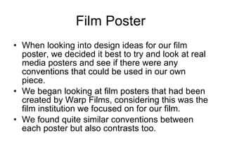
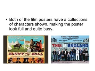
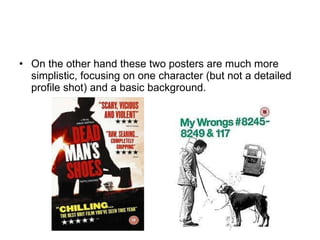
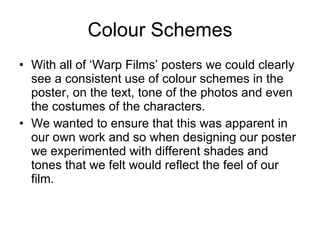
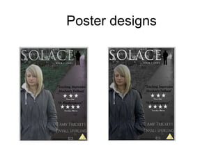
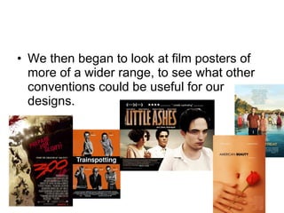
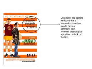
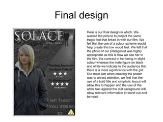
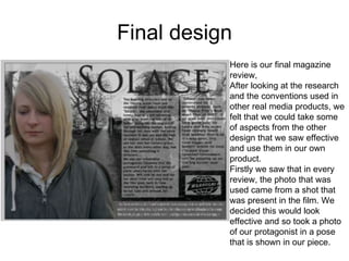
The document discusses the design process for a film poster and magazine review created to promote a student film. Research was conducted on real film marketing materials to identify conventions. The poster features the protagonist in color against a black and white background to convey mood. Continuity was maintained between the poster and review through matching font, color scheme, and feel. Feedback suggests the photos could be of higher quality and the review text could be more advanced.


![Photos for our_contents_page[1]](https://cdn.slidesharecdn.com/ss_thumbnails/photosforourcontentspage1-110111142543-phpapp01-thumbnail.jpg?width=640&height=640&fit=bounds)


