Principles of visual perception
•Download as PPTX, PDF•
1 like•1,245 views

The document discusses principles of visual perception that can be applied to dashboard design. It explains that vision is our most powerful sense and that understanding visual perception is important for effective data display. The key points covered include the four categories of preattentive attributes (color, form, position, motion), and best practices for dashboard design such as organizing information well, providing summaries and exceptions, customizing for the intended audience, and using concise visuals to clearly communicate data and messages.

More Related Content
What's hot
What's hot (20)
Viewers also liked
Viewers also liked (20)
Similar to Principles of visual perception
Similar to Principles of visual perception (20)
Recently uploaded
Recently uploaded (20)
Principles of visual perception
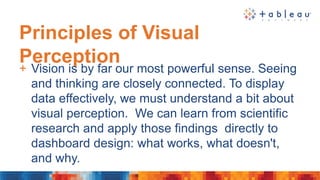
- 1. Principles of Visual Perception + Vision is by far our most powerful sense. Seeing and thinking are closely connected. To display data effectively, we must understand a bit about visual perception. We can learn from scientific research and apply those findings directly to dashboard design: what works, what doesn't, and why.
- 2. Principles of Visual Perception Try to determine as quickly as you can the number of times the number 5 appears in the list.
- 3. Principles of Visual Perception Try again…
- 4. Principles of Visual Perception + Four Categories of Preattentive Attributes • Color • Form • Position • Motion
- 5. Principles of Visual Perception Color… Hue Intensity
- 6. Principles of Visual Perception
- 7. Principles of Visual Perception Position… 2-D Location
- 8. Principles of Visual Perception Motion… Flicker - A visual attribute of an object, such as color, continuously changes back and forth between two values, or the entire object it‐self repeatedly appears and then disappears.
- 9. Design Best Practices + Well designed dashboards deliver information that Is … • Well organized – They FLOW • Condensed – Summaries and exceptions • Specific to and customized for the dashboard’s audience and objectives • Displayed using concise and often small media that communicate the data and its message clearly and directly
- 10. Design Best Practices Organize your information • Organize groups according to business functions, entities, and use • Ex: order entry, shipping, or budget planning, with entities (departments, projects, systems, etc.) • Co‐locate items that belong to the same group • Delineate groups using the least visible means • Support meaningful comparisons • Combining items in a single graph, use color to link items, place items close to one another • Discourage meaningless comparisons
Editor's Notes
- Let’s take advantage of all the rich, scientific research on this topic and applying the learnings to dashboard design.
- The process took you a while because it involved attentive processing. The list of numbers did not exhibit any preattentive attributes that you could use to distinguish the fives from the other numbers. Preattentive processing occurs at an extraordinarily high speed, which results in certain things standing out and particular sets of objects being grouped together, all without conscious thought. Attentive processing is sequential, and therefore much slower.
- The fives could easily be distinguished from the other numbers, due to their differing color intensity. Why couldn't we easily distinguish the fives in the first set of numbers based purely on their unique shape? Because the complex shapes of the numbers are not attributes that we perceive preattentively. Shapes like circles, triangles and squares can be easily perceived preattentively, but numbers are too complex. We’ll talk about preattentive attributes next.
- The fives could easily be distinguished from the other numbers, due to their differing color intensity. Why couldn't we easily distinguish the fives in the first set of numbers based purely on their unique shape? Because the complex shapes of the numbers are not attributes that we perceive preattentively. Shapes like circles, triangles and squares can be easily perceived preattentively, but numbers are too complex. We’ll talk about preattentive attributes next.
- Hue and Intensity are attributes of color Hue: Hue is a more precise term for what we normally think of as color (red, green, blue, purple, etc.). Intensity: Intensity refers to both saturation and lightness. Not a different Hue, but a lighter version of the same hue (color).
- Orientation, line length, line width, size, shape and enclosure are attributes of form
- 2-D location is a attribute of position
- Flicker is an attribute of motion
- Dashboards tell people what's happening and should help them immediately recognize what needs their attention. Just like the dashboard of a car, which provides easily monitored measures of speed, remaining fuel, oil level, battery strength, engine trouble, and so on, a business information dashboard provides an overview that can be assimilated quickly, but doesn't necessarily give you all the information you might need to thoroughly respond to any problems or opportunities that are revealed.
- You really need to put some thought into organizing the information displayed on your dashboard. It will pay off in the end result. How the pieces are arranged in relation to one another can make the difference between a db that works and one that ends up being ignored. Use paper and pencil before building it if you have to!