The document discusses the development of a logo for an independent film production company. It begins by explaining that independent film companies would be more likely to produce the author's film due to its genre and niche audience. It then presents research on existing production logos, noting characteristics like simple designs, memorable names, and iconic sounds/images. Examples include Film4, Warp Films, Deadbeat Productions, and DarkRoom. Font, color, images, and layout elements are analyzed. Potential logo concepts are presented before two final ideas - featuring a camera shutter image, film reel, and the name "Possible Ideas" - that effectively convey the company's focus on film production in a clear and memorable way.
Logo Design and Development: From Start to Finish & a Case StudySandra Bekhor
This past February, I spoke about about law firm logos at the TLA (Toronto Lawyers Association). This event was an initiative of 'Keeping it Social: Practice development for lawyers TORONTO', a LinkedIn group collaboration between Bekhor Management and TLA. Practising lawyers and articling students in Toronto are welcome to join: https://lnkd.in/eTDaTcX
These are my presentation slides.
A really short introduction to the basic elements of a corporate design / graphic logo design. 49 pages with minimal text and a lots of examples of big and famous brands.
palestra realizada durante workshop do projeto Embonecando São Bento, na cidade de São Bento do Sapucaí, em 09 de setembro de 2016. A proposta foi apresentar aos participantes [artesãos, agentes, animadores e gestores culturais] o que vem a ser empreendedorismo, como podemos aplicar em nossa vida profissional, pessoal e com vistas a empreender ações voltadas ao desenvolvimento turístico local.
Concern is growing about the rising exposure to loud sounds in recreational settings such as nightclubs, discotheques, pubs, bars, cinemas, concerts, sporting events and even fitness classes. With the popularization of technology, devices such as music players are often listened to at unsafe volumes and for prolonged periods of time. Regular participation in such activities poses a serious threat of irreversible hearing loss.
Dette er et videregående kurs i vurdering for læring som jeg har holdt for spesielt interesserte grunnskolelærere i Trondheim kommune. OBS: Det siste lysbildet (Å veilede kolleger) handler om mulige misforståelser og delforståelser om vurdering!).
A logo is often a company's first impression, one that can impact a customer's brand perception, purchase decisions and overall attitude towards a product.
The French Revolution, which began in 1789, was a period of radical social and political upheaval in France. It marked the decline of absolute monarchies, the rise of secular and democratic republics, and the eventual rise of Napoleon Bonaparte. This revolutionary period is crucial in understanding the transition from feudalism to modernity in Europe.
For more information, visit-www.vavaclasses.com
The Indian economy is classified into different sectors to simplify the analysis and understanding of economic activities. For Class 10, it's essential to grasp the sectors of the Indian economy, understand their characteristics, and recognize their importance. This guide will provide detailed notes on the Sectors of the Indian Economy Class 10, using specific long-tail keywords to enhance comprehension.
For more information, visit-www.vavaclasses.com
Model Attribute Check Company Auto PropertyCeline George
In Odoo, the multi-company feature allows you to manage multiple companies within a single Odoo database instance. Each company can have its own configurations while still sharing common resources such as products, customers, and suppliers.
Welcome to TechSoup New Member Orientation and Q&A (May 2024).pdfTechSoup
In this webinar you will learn how your organization can access TechSoup's wide variety of product discount and donation programs. From hardware to software, we'll give you a tour of the tools available to help your nonprofit with productivity, collaboration, financial management, donor tracking, security, and more.
The Art Pastor's Guide to Sabbath | Steve ThomasonSteve Thomason
What is the purpose of the Sabbath Law in the Torah. It is interesting to compare how the context of the law shifts from Exodus to Deuteronomy. Who gets to rest, and why?
Home assignment II on Spectroscopy 2024 Answers.pdf
Presentationlogo
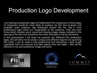
1. Production Logo Development
I am looking at production logos of independent film companies as these types
of companies would be more likely to produce my film due to genre and
probable niche audience. Big Hollywood studios like the ‘big 6’ have
professional logos which are recognizable to the audience. They also have
intros which includes iconic sound and moving images always included in the
opening of the film and sometimes the trailer although it may be shortened.
In this presentation I will show my research into different film production
logos, this will allow me to create a unique and effective logo for my upcoming
film trailer. I aim to make it look professional and interesting. I want to get
inspiration from my research and take aspects from the logos I feel will be
effective in my own production image and name.
2. Film 4
Social Realism Film, Production company
Film4 was started in 1982 as Film4
Productions, a film production company
owned by Channel Four Television
Corporation and has been responsible for
backing a large number of films made in
the United Kingdom, and around the
world. Film 4 support many independent
films many focusing on Drama genre and
social realism. Examples: Submarine
Whilst looking at other company logos,
we found that production companies that
produce social realism films using more
interesting colours ( such as reds) and
more intriguing and clever designs.
Warp
Warp Films is an independent film and
television production company based in
Sheffield & London, UK. It was initially
created with financial support from
NESTA and had a remit to produce a
number of short films and have
continued to produce social realism
classics such as This is England and four
lions. The company pride themselves
with exciting directors and films, and I
think this is reflected in the edgy design
of the logo.
Independent film companies:
3. Deadbeat Productions
This artistic logo is very different from other logos I have seen
before, however I think that is what makes it effective. The
tonal use of black, greys and whites is simple and classic.
Whilst the drawing suggests individuality and creative
inspiration at the company, Which is true as this production
company predominantly produce independent film.
The logo’s font is clearly laid out across the middle section and
is the first thing the audience is drawn to. The font is
completely in capitals which makes the title bold and obvious.
The use of ‘films’ in the title is different, and I think it makes
the company name feel less professional. However overall it
grabs the audiences attention and eye catching for the
audience.
This logo for the independent film company ‘DarkRoom’ is simple
yet effective, The name is short and punchy whilst the layout
makes this logo work as an urban, edgy and exciting production
label. It is striking to the viewer, I feel the plain backgrounds are
most effective for a logo and many contain simplistic designs. This
makes them effective and memorable to the audience
What makes this logo successful is the layout, colour and
individuality.
4. The way that the designer has integrated film roll into the production logo is effective and
popular, this is a common theme with many other production companies as well as many
play on words. The logo is modern and simple and the use of colour creates a strong
contrast from the plain background, This production logo displays a simple image whilst
still being incredibly effective towards the target audience. The capital letters draw the
focus towards the lettering, however the image is still unique and eye catching. The title
and image stand out against the white background.
In Conclusion, From analyzing these production logos I have found that I really like clean,
dark backgrounds and that simple and recognizable images are effective in creating a eye
catching logo. I also want to make my logo exciting and fun. Whilst also having a
memorable production name.
5. Importance of Font
Font of production logos are vital as the audience need to be able to quickly read the text/
name of the company in order to remember it. As well as clearly visible the font needs to
be the correct size, this is important as the audience need to be able to read it easily
however if a companies name was too large is may look messy and unprofessional.
I have decided to chose the last font used above which is caller ‘vanadine’ I
feel this font fits the style of an independent company, as it is different but
still follows the general conventions of production logos, as it is easy to read
and uses capitals to make it clear and eye catching to the audience.
I am undecided on the colour however it will most likely be black or white as
this is the most popular amongst production logos.
6. Company Logo: Possible
Ideas
This logo isn't effective for a film production
company, as it looks more like an eco
company due the inclusion of ‘Green’ in the
title.
This is more effective as a film
production logo however there is
something not quite right about the
image and font type.
This is a different logo and inspired by Banksy
dismalland exhibition, however I feel the name
isn't as professional as I would like.
These logo’s were
created by me using
Photoshop, I used
images of my own to
create exciting logo
images and then add
text to complete the
logo. I was
undecided on the
name of my company
so made a few to
chose from and
develop.
7. Final Ideas idea’s I have decided on these designs as my final
logo, the image I have created follows
conventions by linking with the name of the
company. The main image is a camera shutter,
and the inclusion of a film reel suggest that
my company produce films.
The colours black and white I feel are the
most powerful colours to use for a logo, as
they stand out and contrast each other well.
The name of my production company
is short and easy to remember which
is vital to any company name as you
want your audience to remember
you.
The font used is clear and the capitals
make it catch the audiences
attention.