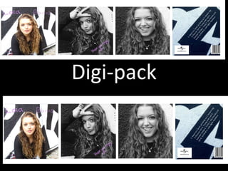
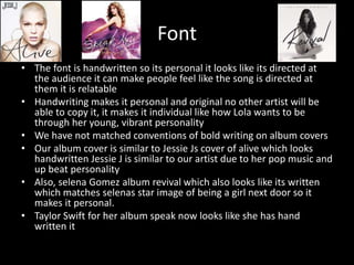
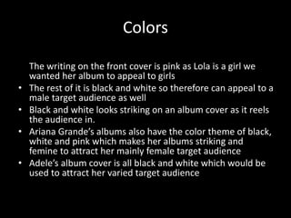
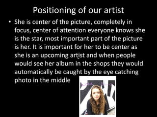
Digi-pack
Layout and Design of Digi-Pak
• The layout of a CD digi-pak helps the audience understand what the
music content will consist of it is therefore essential to create an
album cover which will successfully appeal to our target audience
• Similar artists to Lola banks avril lavigne , pink usually have a close
up picture of themselves to make it clear who the artist is
• In regards to the back cover similar artists genuinely have a long
shot of them besides the track list and an appeal to their album.
Such as Tori Kelly the back ground of her album is a long shot of her
as if it is introducing her before the viewers see more about her
through her music
• The design has a black and white wall behind her shows her
punk/cool side but the pattern is quite simple which shows her
synthetic side
Choice of images
• On the front cover we used the picture of Lola
kneeling down as it showed her whole face and
what she’s wearing due to it being a wide/mid
shot u get to see the whole Lola her outfit brings
out her personality
• The inside covers are of her face close up so that
when her fans open the album they know who
she is an what she looks like and make her move
obvious to her fans. Furthermore to emphasize
her as a new upcoming artist and for her fans to
know her
Font
• The font is handwritten so its personal it looks like its directed at
the audience it can make people feel like the song is directed at
them it is relatable
• Handwriting makes it personal and original no other artist will be
able to copy it, it makes it individual like how Lola wants to be
through her young, vibrant personality
• We have not matched conventions of bold writing on album covers
• Our album cover is similar to Jessie Js cover of alive which looks
handwritten Jessie J is similar to our artist due to her pop music and
up beat personality
• Also, selena Gomez album revival which also looks like its written
which matches selenas star image of being a girl next door so it
makes it personal.
• Taylor Swift for her album speak now looks like she has hand
written it
Colors
• Our font is in pink so it give a feminine look to our album
The writing on the front cover is pink as Lola is a girl we
wanted her album to appeal to girls
• The rest of it is black and white so therefore can appeal to a
male target audience as well
• Black and white looks striking on an album cover as it reels
the audience in.
• Ariana Grande’s albums also have the color theme of black,
white and pink which makes her albums striking and
femine to attract her mainly female target audience
• Adele’s album cover is all black and white which would be
used to attract her varied target audience
Positioning of our artist
• She is center of the picture, completely in
focus, center of attention everyone knows she
is the star, most important part of the picture
is her. It is important for her to be center as
she is an upcoming artist and when people
would see her album in the shops they would
automatically be caught by the eye catching
photo in the middle
Mise en Scene
• The make up on Lola’s album is thick black eye makeup this is
because it is eye- catching for the audience it automatically
attracts them to her face therefore reeling them into the
album, it also emphasizes her punk star image, her hair is
natural to emphasize her organic star image as well . This is
similar to the artists PINKS album cover, she is similar to Lola
due to her rebellious, young attitude and her pop music
• Her outfit in the front cover is not revealing therefore does
not give a sense of voyeurism nor objectify her as an artist
therefore she will not be sold by her body but by her music

Digi pack evaluation task 1

  • 1.
  • 2.
    Layout and Designof Digi-Pak • The layout of a CD digi-pak helps the audience understand what the music content will consist of it is therefore essential to create an album cover which will successfully appeal to our target audience • Similar artists to Lola banks avril lavigne , pink usually have a close up picture of themselves to make it clear who the artist is • In regards to the back cover similar artists genuinely have a long shot of them besides the track list and an appeal to their album. Such as Tori Kelly the back ground of her album is a long shot of her as if it is introducing her before the viewers see more about her through her music • The design has a black and white wall behind her shows her punk/cool side but the pattern is quite simple which shows her synthetic side
  • 3.
    Choice of images •On the front cover we used the picture of Lola kneeling down as it showed her whole face and what she’s wearing due to it being a wide/mid shot u get to see the whole Lola her outfit brings out her personality • The inside covers are of her face close up so that when her fans open the album they know who she is an what she looks like and make her move obvious to her fans. Furthermore to emphasize her as a new upcoming artist and for her fans to know her
  • 4.
    Font • The fontis handwritten so its personal it looks like its directed at the audience it can make people feel like the song is directed at them it is relatable • Handwriting makes it personal and original no other artist will be able to copy it, it makes it individual like how Lola wants to be through her young, vibrant personality • We have not matched conventions of bold writing on album covers • Our album cover is similar to Jessie Js cover of alive which looks handwritten Jessie J is similar to our artist due to her pop music and up beat personality • Also, selena Gomez album revival which also looks like its written which matches selenas star image of being a girl next door so it makes it personal. • Taylor Swift for her album speak now looks like she has hand written it
  • 5.
    Colors • Our fontis in pink so it give a feminine look to our album The writing on the front cover is pink as Lola is a girl we wanted her album to appeal to girls • The rest of it is black and white so therefore can appeal to a male target audience as well • Black and white looks striking on an album cover as it reels the audience in. • Ariana Grande’s albums also have the color theme of black, white and pink which makes her albums striking and femine to attract her mainly female target audience • Adele’s album cover is all black and white which would be used to attract her varied target audience
  • 6.
    Positioning of ourartist • She is center of the picture, completely in focus, center of attention everyone knows she is the star, most important part of the picture is her. It is important for her to be center as she is an upcoming artist and when people would see her album in the shops they would automatically be caught by the eye catching photo in the middle
  • 7.
    Mise en Scene •The make up on Lola’s album is thick black eye makeup this is because it is eye- catching for the audience it automatically attracts them to her face therefore reeling them into the album, it also emphasizes her punk star image, her hair is natural to emphasize her organic star image as well . This is similar to the artists PINKS album cover, she is similar to Lola due to her rebellious, young attitude and her pop music • Her outfit in the front cover is not revealing therefore does not give a sense of voyeurism nor objectify her as an artist therefore she will not be sold by her body but by her music