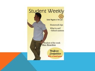
The document provides an evaluation of the design elements of a school magazine cover and contents page. It notes that the masthead font is basic but creates a professional tone. The feature photo quality is good but could be better cut out. The "School magazine of the year" puff uses small, squished font that does not stand out. The plugs are not well aligned and make the magazine seem less professional. The filler uses a handwriting font that can be hard to read and includes red text that does not fit the house style. The contents page photos are low quality, not aligned, and irrelevant to articles. The sells and font also do not match the house style and there is a lot of negative space. Photoshop