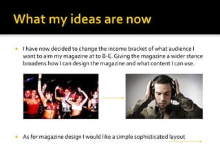
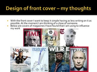
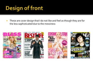
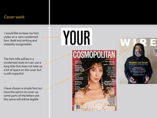
 My initial thoughts where to create a magazine aimed at the class of C1- 
D as the underground scene is associated with clubbers however after 
further analysis of other magazines I realised that due to the genre being 
a niche product the people that follow the underground scene will be an 
active audience adding a level of sophistication to the magazine. The 
sleek design I want to recreate would also portray a level of 
sophistication.
 I have now decided to change the income bracket of what audience I 
want to aim my magazine at to B-E. Giving the magazine a wider stance 
broadens how I can design the magazine and what content I can use. 
 As for magazine design I would like a simple sophisticated layout
 With the front cover I want to keep it simple having as less writing on it as 
possible. At the moment I am thinking of a close of someone. 
 Below are covers of magazines I have found that I am using to influence 
my work
 These are cover design that I do not like and feel as though they are for 
the less sophisticated due to the messiness
Cover work 
I would like to base my font 
styles on a sans condensed 
font. Bold and striking and 
instantly recognisable. 
The font title will be in a 
condensed style so I can use a 
long title that does not take up 
a lot of space on the cover but 
is still impactful. 
I have chosen a simple font so I 
have the option to cover up 
some parts of the letters yet 
the name will still be legible

Progress report

  • 2.
     My initialthoughts where to create a magazine aimed at the class of C1- D as the underground scene is associated with clubbers however after further analysis of other magazines I realised that due to the genre being a niche product the people that follow the underground scene will be an active audience adding a level of sophistication to the magazine. The sleek design I want to recreate would also portray a level of sophistication.
  • 3.
     I havenow decided to change the income bracket of what audience I want to aim my magazine at to B-E. Giving the magazine a wider stance broadens how I can design the magazine and what content I can use.  As for magazine design I would like a simple sophisticated layout
  • 4.
     With thefront cover I want to keep it simple having as less writing on it as possible. At the moment I am thinking of a close of someone.  Below are covers of magazines I have found that I am using to influence my work
  • 5.
     These arecover design that I do not like and feel as though they are for the less sophisticated due to the messiness
  • 6.
    Cover work Iwould like to base my font styles on a sans condensed font. Bold and striking and instantly recognisable. The font title will be in a condensed style so I can use a long title that does not take up a lot of space on the cover but is still impactful. I have chosen a simple font so I have the option to cover up some parts of the letters yet the name will still be legible