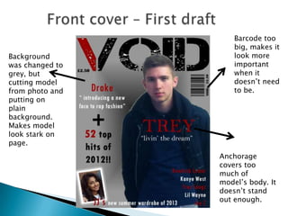
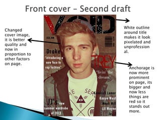
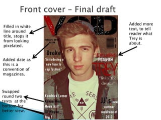
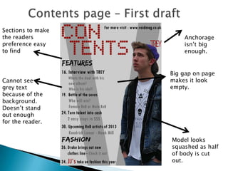
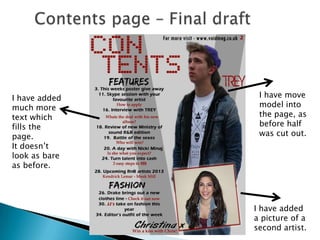
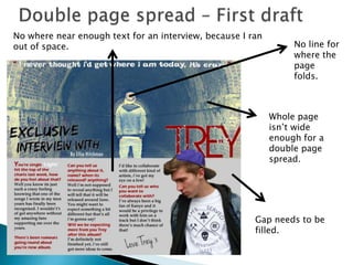
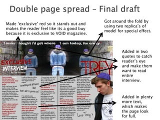
Barcode too
                     big, makes it
Background           look more
was changed to       important
grey, but            when it
cutting model        doesn’t need
from photo and       to be.
putting on
plain
background.
Makes model
look stark on
page.
                 Anchorage
                 covers too
                 much of
                 model’s body. It
                 doesn’t stand
                 out enough.
White outline
Changed
                around title
cover image,
                makes it look
it is better
                pixelated and
quality and
                unprofession
now in
                al.
proportion to
other factors
on page.
                  Anchorage is
                  now more
                  prominent
                  on page, its
                  bigger and
                  now less
                  things are
                  red so it
                  stands out
                  more.
Added more
Filled in white
                  text, to tell
line around
                  reader what
title, stops it
                  Trey is
from looking
                  about.
pixelated.


Added date as
this is a
convention of
magazines.


Swapped
round two
texts at the
bottom for
better view.
Sections to make
the readers            Anchorage
preference easy        isn’t big
to find                enough.


                   Big gap on page
Cannot see         makes it look
grey text          empty.
because of the
background.
Doesn’t stand
out enough
for the reader.


                   Model looks
                   squashed as half
                   of body is cut
                   out.
I have added    I have move
much more       model into
text which      the page, as
fills the       before half
page.           was cut out.
It doesn’t
look as bare
as before.


               I have added
               a picture of a
               second artist.
No where near enough text for an interview, because I ran
out of space.                                                    No line for
                                                                 where the
                                                                 page
                                                                 folds.


                                                            Whole page
                                                            isn’t wide
                                                            enough for a
                                                            double page
                                                            spread.


                                                       Gap needs to be
                                                       filled.
Got around the fold by
Made ‘exclusive’ red so it stands out and
                                            using two replica’s of
makes the reader feel like its a good buy
                                            model for special effect.
because it is exclusive to VOID magazine.


                                                     Added in two
                                                     quotes to catch
                                                     reader’s eye
                                                     and make them
                                                     want to read
                                                     entire
                                                     interview.


                                                     Added in plenty
                                                     more text,
                                                     which makes
                                                     the page look
                                                     for full.

Production Process

  • 2.
    Barcode too big, makes it Background look more was changed to important grey, but when it cutting model doesn’t need from photo and to be. putting on plain background. Makes model look stark on page. Anchorage covers too much of model’s body. It doesn’t stand out enough.
  • 3.
    White outline Changed around title cover image, makes it look it is better pixelated and quality and unprofession now in al. proportion to other factors on page. Anchorage is now more prominent on page, its bigger and now less things are red so it stands out more.
  • 4.
    Added more Filled inwhite text, to tell line around reader what title, stops it Trey is from looking about. pixelated. Added date as this is a convention of magazines. Swapped round two texts at the bottom for better view.
  • 5.
    Sections to make thereaders Anchorage preference easy isn’t big to find enough. Big gap on page Cannot see makes it look grey text empty. because of the background. Doesn’t stand out enough for the reader. Model looks squashed as half of body is cut out.
  • 6.
    I have added I have move much more model into text which the page, as fills the before half page. was cut out. It doesn’t look as bare as before. I have added a picture of a second artist.
  • 7.
    No where nearenough text for an interview, because I ran out of space. No line for where the page folds. Whole page isn’t wide enough for a double page spread. Gap needs to be filled.
  • 8.
    Got around thefold by Made ‘exclusive’ red so it stands out and using two replica’s of makes the reader feel like its a good buy model for special effect. because it is exclusive to VOID magazine. Added in two quotes to catch reader’s eye and make them want to read entire interview. Added in plenty more text, which makes the page look for full.