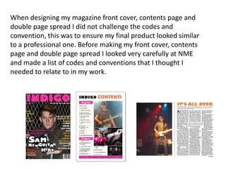
When designing my magazine front cover, contents page and
double page spread I did not challenge the codes and
convention, this was to ensure my final product looked similar
to a professional one. Before making my front cover, contents
page and double page spread I looked very carefully at NME
and made a list of codes and conventions that I thought I
needed to relate to in my work.
For my main image, i made sure the model represented
indie and that the readers would know exactly what
genre of music my magazine was just by looking at my
main image. I know that looking at real magazine front
covers the main model is always making vivid eye
contact with the reader to create a bond and ensure a
relationship. Taking the colours into account i made
sure I used no more than 3 colours and represented the
colours in a strong and important way to connote
passion with music. I used red because i know it stands
out and NME use the colour red effectively to ensure
their magazine is getting sold, i also used a fusia pink to
attract the audience and show that my magazine is
aimed at both genders, not just males. Along the side
of my front cover i kept to using 3/7 main cover lines as
i know that is the correct code and convention for a
magazine front cover, relating to the cover lines i
ensured my main storyline was relevant to my main
image. Every magazine front cover i looked at had a
barcode situated on the bottom right hand corner, this
gave me the idea to not challenge this and follow the
trend. I stuck the price and issue date under my
masthead with the positioning statement to the right of
this as when looked at Q and NME they had done
similar.
For my contents page i looked closely at the
photographs i used and made sure they
were all relevant to my features. I know that
one of the codes and conventions of a
magazine contents page is to put page
numbers either on or along side the image, i
left challenging this and inserted the correct
page number with the correct image. Every
contents page i looked at had a specific
layout and was split into 3 or 4 columns, to
relate to this i split my contents page up into
3 even columns and made sure everything
looked professional, i also took a close look
at a specific NME issue and based my layout
around that. To also keep to the codes and
conventions i placed the title of my
magazine at the top and clearly stated that
it was the contents page.
Moving on to my double page spread the
codes and conventions were very simple to
stick to as many of the professional layouts
consisted of a pictures on one side and the
writing on the other. I made sure i used a
drop capital to start my article off and a drop
quote was used to emphasise what the
artillery were saying. This made my article
look more like a professional which was what
i was aiming for as i didn't want to challenge
the codes and conventions.

Presentation1

  • 1.
    When designing mymagazine front cover, contents page and double page spread I did not challenge the codes and convention, this was to ensure my final product looked similar to a professional one. Before making my front cover, contents page and double page spread I looked very carefully at NME and made a list of codes and conventions that I thought I needed to relate to in my work.
  • 2.
    For my mainimage, i made sure the model represented indie and that the readers would know exactly what genre of music my magazine was just by looking at my main image. I know that looking at real magazine front covers the main model is always making vivid eye contact with the reader to create a bond and ensure a relationship. Taking the colours into account i made sure I used no more than 3 colours and represented the colours in a strong and important way to connote passion with music. I used red because i know it stands out and NME use the colour red effectively to ensure their magazine is getting sold, i also used a fusia pink to attract the audience and show that my magazine is aimed at both genders, not just males. Along the side of my front cover i kept to using 3/7 main cover lines as i know that is the correct code and convention for a magazine front cover, relating to the cover lines i ensured my main storyline was relevant to my main image. Every magazine front cover i looked at had a barcode situated on the bottom right hand corner, this gave me the idea to not challenge this and follow the trend. I stuck the price and issue date under my masthead with the positioning statement to the right of this as when looked at Q and NME they had done similar.
  • 3.
    For my contentspage i looked closely at the photographs i used and made sure they were all relevant to my features. I know that one of the codes and conventions of a magazine contents page is to put page numbers either on or along side the image, i left challenging this and inserted the correct page number with the correct image. Every contents page i looked at had a specific layout and was split into 3 or 4 columns, to relate to this i split my contents page up into 3 even columns and made sure everything looked professional, i also took a close look at a specific NME issue and based my layout around that. To also keep to the codes and conventions i placed the title of my magazine at the top and clearly stated that it was the contents page.
  • 4.
    Moving on tomy double page spread the codes and conventions were very simple to stick to as many of the professional layouts consisted of a pictures on one side and the writing on the other. I made sure i used a drop capital to start my article off and a drop quote was used to emphasise what the artillery were saying. This made my article look more like a professional which was what i was aiming for as i didn't want to challenge the codes and conventions.