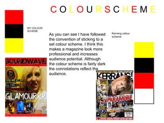
The document discusses how the media product, a magazine, uses and develops conventions from real magazines. It analyzes several elements of magazines like mastheads, fonts, photographs, and color schemes. For most elements, the media product follows conventions from magazines like Kerrang and Rocksound but also challenges some conventions. The masthead is similar in style to other magazines but in a different position. A variety of fonts are used for headings and articles to make the magazine unique while still using readable fonts. Live photographs are used to connect with audiences as in other magazines. The color scheme sticks to a set of colors like other magazines to look professional.