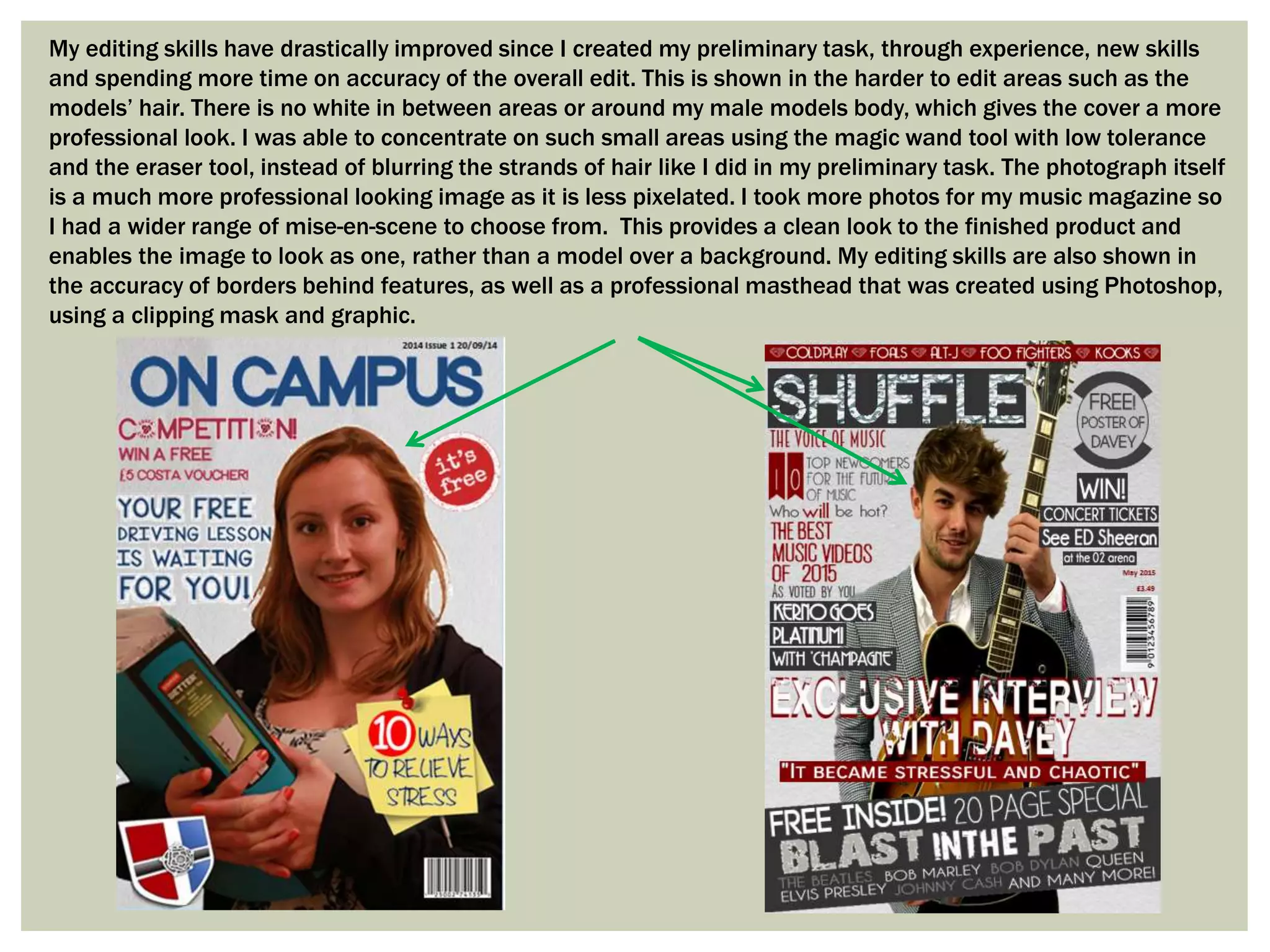
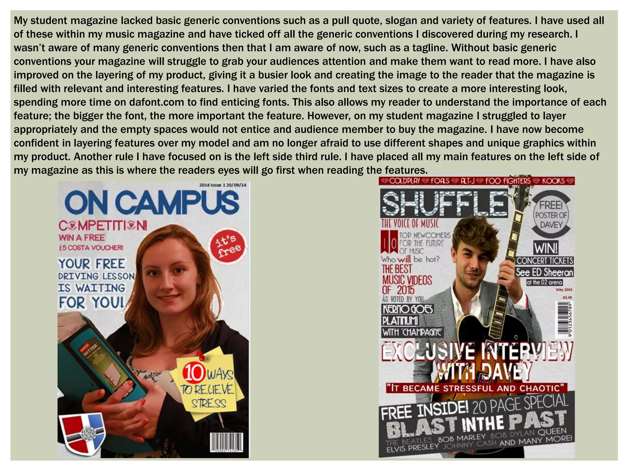
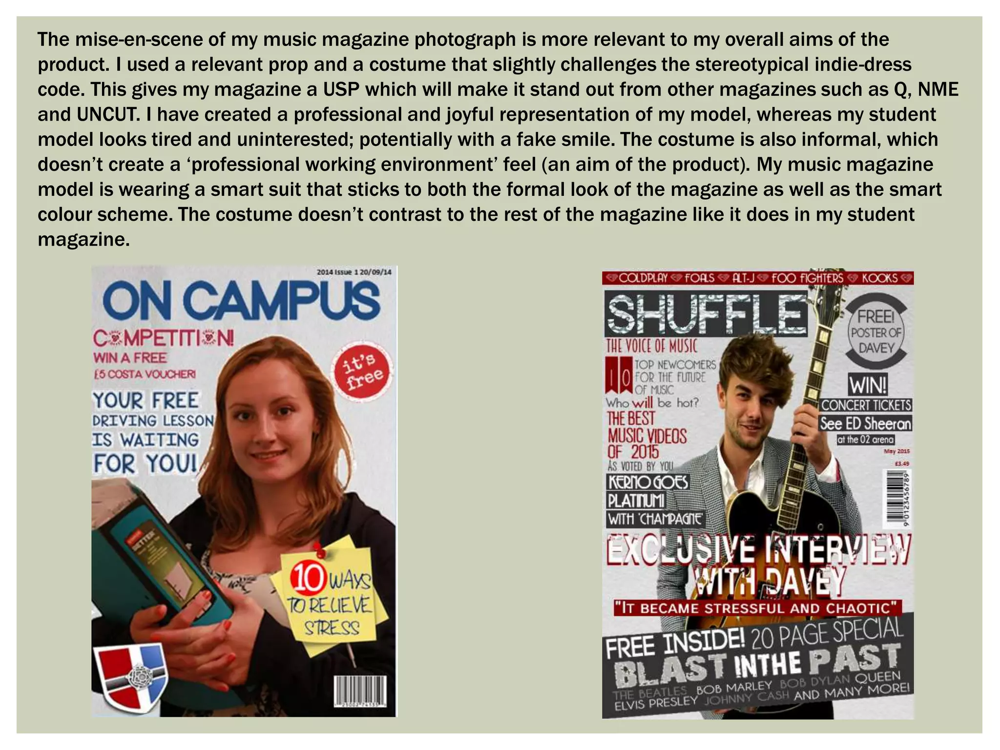
QUESTION 7) LOOKING
BACK AT YOUR
PRELIMINARY TASK,
WHAT DO YOU FEEL
YOU HAVE LEARNT IN
THE PROGRESSION
FROM IT TO THE FULL
PRODUCT?
My editing skills have drastically improved since I created my preliminary task, through experience, new skills
and spending more time on accuracy of the overall edit. This is shown in the harder to edit areas such as the
models’ hair. There is no white in between areas or around my male models body, which gives the cover a more
professional look. I was able to concentrate on such small areas using the magic wand tool with low tolerance
and the eraser tool, instead of blurring the strands of hair like I did in my preliminary task. The photograph itself
is a much more professional looking image as it is less pixelated. I took more photos for my music magazine so
I had a wider range of mise-en-scene to choose from. This provides a clean look to the finished product and
enables the image to look as one, rather than a model over a background. My editing skills are also shown in
the accuracy of borders behind features, as well as a professional masthead that was created using Photoshop,
using a clipping mask and graphic.
My student magazine lacked basic generic conventions such as a pull quote, slogan and variety of features. I have used all
of these within my music magazine and have ticked off all the generic conventions I discovered during my research. I
wasn’t aware of many generic conventions then that I am aware of now, such as a tagline. Without basic generic
conventions your magazine will struggle to grab your audiences attention and make them want to read more. I have also
improved on the layering of my product, giving it a busier look and creating the image to the reader that the magazine is
filled with relevant and interesting features. I have varied the fonts and text sizes to create a more interesting look,
spending more time on dafont.com to find enticing fonts. This also allows my reader to understand the importance of each
feature; the bigger the font, the more important the feature. However, on my student magazine I struggled to layer
appropriately and the empty spaces would not entice and audience member to buy the magazine. I have now become
confident in layering features over my model and am no longer afraid to use different shapes and unique graphics within
my product. Another rule I have focused on is the left side third rule. I have placed all my main features on the left side of
my magazine as this is where the readers eyes will go first when reading the features.
The mise-en-scene of my music magazine photograph is more relevant to my overall aims of the
product. I used a relevant prop and a costume that slightly challenges the stereotypical indie-dress
code. This gives my magazine a USP which will make it stand out from other magazines such as Q, NME
and UNCUT. I have created a professional and joyful representation of my model, whereas my student
model looks tired and uninterested; potentially with a fake smile. The costume is also informal, which
doesn’t create a ‘professional working environment’ feel (an aim of the product). My music magazine
model is wearing a smart suit that sticks to both the formal look of the magazine as well as the smart
colour scheme. The costume doesn’t contrast to the rest of the magazine like it does in my student
magazine.
My music magazine contents page uses a professional colour scheme and a clear and structured layout. I have used two
columns instead of one, allowing there to be more features included on the page. I have also used more images, as I feel
these will attract customers that prefer looking at pictures to reading. I have related these images to the relevant features
using page numbers on the bottom right of each image. I have also included branding on my contents page, such as my
magazine name and different social media websites linked with the magazine. I have used more interesting fonts and have
again varied the text sizes based on importance. On my student magazine I didn’t include a brief summary of each feature.
This fails to connect the reader to the feature and will not interest them, therefore they will not read on. I have used brief
summary’s on every feature in my music magazine, which makes the reader feel connected to the features and have a better
understanding of what to expect. Again I feel that I left too many blank spaces on my student magazine, making it feel like
there is little content within the magazine itself. By using more images on my music magazine to fill space, I have created a
busier look and created the image that there are more features within the magazine. You may notice that all of my images on
my music magazine are photographs that I have taken myself, whereas the student magazine includes images from the
internet. This boosts the evidence that I have increased my confidence when it comes to editing and photography.

Question 7)

  • 1.
    QUESTION 7) LOOKING BACKAT YOUR PRELIMINARY TASK, WHAT DO YOU FEEL YOU HAVE LEARNT IN THE PROGRESSION FROM IT TO THE FULL PRODUCT?
  • 2.
    My editing skillshave drastically improved since I created my preliminary task, through experience, new skills and spending more time on accuracy of the overall edit. This is shown in the harder to edit areas such as the models’ hair. There is no white in between areas or around my male models body, which gives the cover a more professional look. I was able to concentrate on such small areas using the magic wand tool with low tolerance and the eraser tool, instead of blurring the strands of hair like I did in my preliminary task. The photograph itself is a much more professional looking image as it is less pixelated. I took more photos for my music magazine so I had a wider range of mise-en-scene to choose from. This provides a clean look to the finished product and enables the image to look as one, rather than a model over a background. My editing skills are also shown in the accuracy of borders behind features, as well as a professional masthead that was created using Photoshop, using a clipping mask and graphic.
  • 3.
    My student magazinelacked basic generic conventions such as a pull quote, slogan and variety of features. I have used all of these within my music magazine and have ticked off all the generic conventions I discovered during my research. I wasn’t aware of many generic conventions then that I am aware of now, such as a tagline. Without basic generic conventions your magazine will struggle to grab your audiences attention and make them want to read more. I have also improved on the layering of my product, giving it a busier look and creating the image to the reader that the magazine is filled with relevant and interesting features. I have varied the fonts and text sizes to create a more interesting look, spending more time on dafont.com to find enticing fonts. This also allows my reader to understand the importance of each feature; the bigger the font, the more important the feature. However, on my student magazine I struggled to layer appropriately and the empty spaces would not entice and audience member to buy the magazine. I have now become confident in layering features over my model and am no longer afraid to use different shapes and unique graphics within my product. Another rule I have focused on is the left side third rule. I have placed all my main features on the left side of my magazine as this is where the readers eyes will go first when reading the features.
  • 4.
    The mise-en-scene ofmy music magazine photograph is more relevant to my overall aims of the product. I used a relevant prop and a costume that slightly challenges the stereotypical indie-dress code. This gives my magazine a USP which will make it stand out from other magazines such as Q, NME and UNCUT. I have created a professional and joyful representation of my model, whereas my student model looks tired and uninterested; potentially with a fake smile. The costume is also informal, which doesn’t create a ‘professional working environment’ feel (an aim of the product). My music magazine model is wearing a smart suit that sticks to both the formal look of the magazine as well as the smart colour scheme. The costume doesn’t contrast to the rest of the magazine like it does in my student magazine.
  • 5.
    My music magazinecontents page uses a professional colour scheme and a clear and structured layout. I have used two columns instead of one, allowing there to be more features included on the page. I have also used more images, as I feel these will attract customers that prefer looking at pictures to reading. I have related these images to the relevant features using page numbers on the bottom right of each image. I have also included branding on my contents page, such as my magazine name and different social media websites linked with the magazine. I have used more interesting fonts and have again varied the text sizes based on importance. On my student magazine I didn’t include a brief summary of each feature. This fails to connect the reader to the feature and will not interest them, therefore they will not read on. I have used brief summary’s on every feature in my music magazine, which makes the reader feel connected to the features and have a better understanding of what to expect. Again I feel that I left too many blank spaces on my student magazine, making it feel like there is little content within the magazine itself. By using more images on my music magazine to fill space, I have created a busier look and created the image that there are more features within the magazine. You may notice that all of my images on my music magazine are photographs that I have taken myself, whereas the student magazine includes images from the internet. This boosts the evidence that I have increased my confidence when it comes to editing and photography.