
Recommended
More Related Content
Similar to Double page spread 2
Similar to Double page spread 2 (20)
More from asmediae13
More from asmediae13 (20)
Recently uploaded
Recently uploaded (20)
Double page spread 2
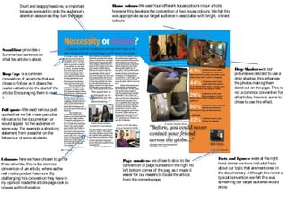
- 1. Page numbers- wechoseto stick to thisconvention asit made it easy for our readersto locate thearticlefrom thecontentspage Page numbers- wechoseto stick to the convention of pagenumbersin theright nd left bottom corner of thepag, asit madeit easier for our readersto locatethearticle from thecontentspage. Columns- herewehavechosen to go for threecolumbs, thisisthecommon convention of an article, whereasthe real mediaproduct hasmore. By challenging thisconvention they havein my opinion madethearticlepagelook to crowed with infomation Short and snappy headline, isimportant becausewewant to grab theaudience’s attention assoon asthey turn thepage. Stand first- providesa Summarised sentenceon what thearticleisabout. Pull quote- Weused variouspull quotesthat wefelt madeparicular relivanceto thedocumentary or would appeal to theaudiencein someway. For exampleashocking statement from ateacher on the behaviour of somestudents. Drop Cap- isacommon convention of an articlethat we choseto follow asit drawsthe readersattention to thestart of the article. Encouraging them to read it. House colours-Weused four idfferent housecoloursin our article, however thisdevelopsthe convention of two housecolours. Wefelt this wasappropriateasour target audienceisassociated with bright, vibrant colours Drop Shadows-on our pictureswedecided to usea drop shadow, thisenhances thephotosmaking them stand out on thepage. Thisis not acommon convention for all articles, however someto choseto usethiseffect. Facts and figures- wereat theright hand corner wehaveincluded facts about our topic that arementioned in thedocumentary. Although thisisnot a typical convention wefelt thiswas something our target audiencewould enjoy.