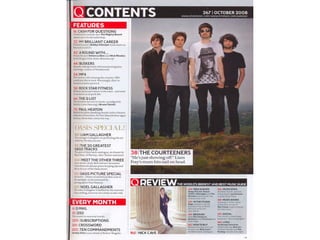
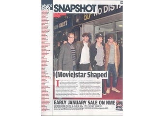
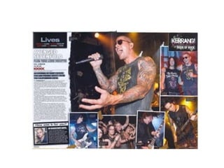
My deconstructions
•   Even though the lead singer James Hetfield isn’t at the front of the
    image, your eyes are still attracted to him because he has his arms up
    in the air and is shouting out. James’ hands in the air in the ‘devil horns’
    formation to tell people, who don’t already know, that this band are
    rock/metal. Apart from the magazine name and the picture, one of the
    first things you see is “ON THE ROAD!” this will make the reader
    understand that Metallica are on the magazine because they’re going
    on tour again. Also James’ hands in the ‘devils horn’ shape look as if
    they are acting as speech marks which makes the reader think this may
    be a song or a famous quote by a member of Metallica. All the band
    members are staring straight out at the audience which will interact the
    audience with the magazine. The necklace that James Hetfield is
    wearing of Jesus’ cross stands out on his chest because the light
    reflects off it. This will make the magazine appeal to people who like
    Christian rock as well. The target audience would probably mainly be
    men because of the genre of music and the colour scheme and it would
    probably appeal to the older generation because Metallica are old
    school and people from the 80s will know them better than the modern
    generation.
•   Immediately when looking at this image you see Corey Taylor at the
    front of the image wearing a mask and then you slowly look back on
    other Slipknot band members wearing scary looking masks. This is
    meant to catch the audience’s eye straight away. Also you could say
    Corey's face is being framed by the other members of his band to show
    he is the main person. The mask of Corey Taylor is very plain so the
    think your eyes are mainly attracted to is his eyes, they are meant to
    look scary and strike fear into the audience. Taking all the other mask
    into account it is quite clear what genre of music is meant to be
    associated with this magazine because the masks look very scary and
    sinister. Also in the top left hand corner, the first place an English
    reading person would start to read, is the competition. The big red “win”
    will attract the readers eye straight away and they will read about the
    competition. If they like the prize it will give them more incentive to buy
    the magazine. Also, the title of the magazine “KERRANG” is covered
    mostly by the picture on the front, but also the font makes it looked
    crack and chipped as if it was glass. This emphasises the genre of
    music because Slipknot play very loud music and loud music is known
    to smash glass. The target audience for this magazine would be more
    men because of the men on the front of the magazine but also because
    of the dark colours. This will also attract more the teenage and early
    20s age group, maybe around 15-25 because this music is very loud
    and energetic which is more associated with this age group.
•   This magazine is clearly been aimed at younger the younger
    audience because all the people on the front cover are young and
    produce modern music. Jared Leto, the lead singer from ’30
    seconds to mars’ is standing in the middle with a very determined
    face. Also he is standing in a powerful stance but clutching his fist
    and putting it on the other palm. This links in to the quote below that
    says “I could be your worst enemy.” This gives the impression that
    he is set out to do something and if you get in his way he ‘could be
    your worst enemy.’ The shapes on this picture are very sharp which
    would represent the life some of these people live and it would also
    appeal to younger people as well. Another thing that would appeal
    to the youth is the minimalistic colour scheme because it’s the type
    of colours your associate with bands nowadays. The title to the
    magazine is all cracked as if it were glass. However it is not as
    cracked as the Slipknot image to show that this isn’t as heavy
    music and it’s not as loud. As I’ve said this magazine would appeal
    more to younger people around 14-25 because the music isn’t too
    heavy also it would appeal to both genders because however it’s a
    male dominated front page, there is Hayley Williams of Paramore
    on one side and also there is Alex Gaskarth and both of these will
    appeal to women because Hayley is a girl and Alex is an icon for
    being attractive.
•   Kerrang contents pages are very similar to their front covers because
    they’re very busy and mainly photo dominated. Also they always have
    large image which shows what their main story is to do with in this
    edition. This time it’s Oli Sykes from Bring me the Horizon and his
    picture take up the top half of the contents page to show that he is a
    very important character in this magazine. The rest of the images are
    smaller to tell people they’re in the magazine but they’re not as
    important. The colour schemes are very bright because of the yellow
    and the white. “Contents” in the top left corner is very eye catching
    because of the dark blue colours of Oli Sykes’ image compared to the
    luminous yellow colour which makes it easy to spot. On the bottom half
    the title is “KERRANG! THIS WEEK” In the same font that it is on the
    front page to make the link between the music type because of the
    shattered glass effect. Also all of the sub-headings to the contents of
    the magazine are all in bright yellow as well so they are easily readable
    but also linked into the overall colour scheme. These sub-headings are
    there to tell the reader about what page of the magazine some things
    will be in, such as feedback, news… etc. This should interest the reader
    further so they want to read on more. In the bottom right hand corner of
    the page there are 3 Kerrang magazines which have details of ways to
    get them delivered to your door. On the other side (the bottom left
    corner) there is an article about Kerrang written by one of the editors of
    the magazine.
• This is a very typical contents page because of the
  big image about the main article of the magazine and
  then all the other stories around them. The second
  thing I saw when I looked at this contents page was
  the big banner title up the top that says “contents”
  with the little red big with the white “Q” in it. The
  colour scheme proceeds throughout the whole page
  because the ‘Features’ and the ‘Every month’
  headings are both written in a white with a red both
  surrounding it this will catch the readers eye. There is
  only 1 more image on this contents page which is just
  below the picture of The Courteeners. The picture of
  Nick Cave has been placed in the ‘Review’ section
  which points out he is either involved in one of the
  songs being reviewed or he is reviewing them. This
  section also follows the same colour scheme. The
  Courteeners are an indie rock band whose main
  audience are teenagers which suits Q Magazines
  mainly male dominant market of teenage indie rock.
•   This NME contents page is very minimalized because the
    picture of Blur is taking up almost the entire page. On the image
    of Blur there is a column about them titled “(Movie)star Shaped”
    because, to those who like blur, will know Starshaped is one of
    their singles. Also it has two meanings because it’s there song
    but also they’re on a red carpet which could also mean they
    might be in a movie. Also there is a little article about them
    which isn’t usually found on the contents page so it’s probably a
    teaser so it makes the reader want to read more about the story.
    On the left hand side of the page there is all the things going on
    in the magazine in very small writing with what page number
    they are on. These are so small because Blur is clearly the main
    part of this magazine and will take up a lot of space. On the
    bottom there is an advertisement for a sale which also will
    attract readers because the people that read this magazine will
    probably like what is on sale so they might want to buy the stuff.
    Blur are quite and old band so this magazine will probably be
    aimed at the older generation and people who like Blur’s music.
    Also Blur usually have male supporters but also this magazine
    could be aimed at women too.
• This double page spread is mainly taken up by the image
  of the band ‘Paramore.’ The members of the band are all
  in black and white except the lead singer Hayley Williams
  who stands out because of her brightly coloured hair and
  her white shirt. This is to emphasise that she is the most
  important member and the others are just faded into the
  background behind her. Another very eye catching thing
  about this double page spread is the diagonal
  “PARAMORE” on the left hand side because it is in bright
  yellow and in contrast to the black and white background it
  stands out a lot. There is very little writing on this page
  which gives the read an insight of the interview the
  reporter had with the band which will make the reader
  want to read on about the rest of the interview. They are
  all staring out at the reader and also they’re looking down
  on them which makes the reader feel as if they are
  possibly worshiping the band but also they look up to them
  because they might want to be them. This magazine
  appeals to the section of the teenage age group that like
  punk rock and alternative rock. Also it would be a male
  dominated magazine but because Hayley Williams is in it,
  it might appeal more to girls.
• The All American Rejects lead singer Tyson Ritter stands
  out against the rest of his band because he is in very
  bright colours whereas the rest of the band are dressed
  quite blandly so you don’t seem to see them as much.
  Also Tyson is in the middle of the image so your eyes go
  straight to look at him anyway and also he is in front of the
  rest of his band members to show he is the front man. All
  the other images on this page are in black and white
  which links to the colour scheme used for the rest of the
  page which are also black and the writing is white. Also
  Tyson Ritters hat links into the title because the ‘secrets’
  part of ‘dirty little secrets’ is in is the same colour red and
  also so it all the sub-headings throughout the text. Also
  having the word ‘secrets’ in a different colour and font to
  the rest of the title will tell the reader that the interview
  might bring out secrets in the band and this will interest
  them to read on. With all the bright colours and the young
  people in the band I'd say this will appeal to teenagers
  more than anything else. Also it will stand out to both
  genders because the music is soft rock which can be
  associated with both genders.
•   The very scattered layout looks as if this page was just randomly
    put together and it’s disorganised. The page is mainly full of images
    of Avenged Sevenfold (A7X) playing live gigs. This will make reader
    be able to capture energy from the images and if they’re a fan of
    the band it will give them more incentive to go and see them live.
    Also the biggest picture is of M Shadows who is the lead singer of
    A7X, this might tell the readers that he does most of the talking
    because he is the most important person. Also it will hint to the
    genre because of all the dark colours and the tattoos on M
    Shadows arms. On the top right hand side there is a picture of M
    Shadows standing with his arm around Matt Tuck from Bullet for my
    Valentine. This image is of the two lead singer of maybe the two
    biggest metal core bands around at this time and this will make the
    audience want to read on about what they are doing together.
    There is very little writing on the left hand side of the page because
    most of the page is taken up by the images so this means the
    journalist thinks the reader can get enough information about the
    band from the images shown on the right of the page. The dark
    colours and the little amount of writing would mean that this DPS is
    more for the younger population, around 15-25. Also because of all
    the guitars and all the music will be for that age group because lots
    of youths try and make it in a band and they would like to read
    about how A7X did it. Also it would probably be for males however
    A7X have a large female support so it would appeal to both
    genders.

Deconstructions

  • 1.
  • 3.
    Even though the lead singer James Hetfield isn’t at the front of the image, your eyes are still attracted to him because he has his arms up in the air and is shouting out. James’ hands in the air in the ‘devil horns’ formation to tell people, who don’t already know, that this band are rock/metal. Apart from the magazine name and the picture, one of the first things you see is “ON THE ROAD!” this will make the reader understand that Metallica are on the magazine because they’re going on tour again. Also James’ hands in the ‘devils horn’ shape look as if they are acting as speech marks which makes the reader think this may be a song or a famous quote by a member of Metallica. All the band members are staring straight out at the audience which will interact the audience with the magazine. The necklace that James Hetfield is wearing of Jesus’ cross stands out on his chest because the light reflects off it. This will make the magazine appeal to people who like Christian rock as well. The target audience would probably mainly be men because of the genre of music and the colour scheme and it would probably appeal to the older generation because Metallica are old school and people from the 80s will know them better than the modern generation.
  • 5.
    Immediately when looking at this image you see Corey Taylor at the front of the image wearing a mask and then you slowly look back on other Slipknot band members wearing scary looking masks. This is meant to catch the audience’s eye straight away. Also you could say Corey's face is being framed by the other members of his band to show he is the main person. The mask of Corey Taylor is very plain so the think your eyes are mainly attracted to is his eyes, they are meant to look scary and strike fear into the audience. Taking all the other mask into account it is quite clear what genre of music is meant to be associated with this magazine because the masks look very scary and sinister. Also in the top left hand corner, the first place an English reading person would start to read, is the competition. The big red “win” will attract the readers eye straight away and they will read about the competition. If they like the prize it will give them more incentive to buy the magazine. Also, the title of the magazine “KERRANG” is covered mostly by the picture on the front, but also the font makes it looked crack and chipped as if it was glass. This emphasises the genre of music because Slipknot play very loud music and loud music is known to smash glass. The target audience for this magazine would be more men because of the men on the front of the magazine but also because of the dark colours. This will also attract more the teenage and early 20s age group, maybe around 15-25 because this music is very loud and energetic which is more associated with this age group.
  • 7.
    This magazine is clearly been aimed at younger the younger audience because all the people on the front cover are young and produce modern music. Jared Leto, the lead singer from ’30 seconds to mars’ is standing in the middle with a very determined face. Also he is standing in a powerful stance but clutching his fist and putting it on the other palm. This links in to the quote below that says “I could be your worst enemy.” This gives the impression that he is set out to do something and if you get in his way he ‘could be your worst enemy.’ The shapes on this picture are very sharp which would represent the life some of these people live and it would also appeal to younger people as well. Another thing that would appeal to the youth is the minimalistic colour scheme because it’s the type of colours your associate with bands nowadays. The title to the magazine is all cracked as if it were glass. However it is not as cracked as the Slipknot image to show that this isn’t as heavy music and it’s not as loud. As I’ve said this magazine would appeal more to younger people around 14-25 because the music isn’t too heavy also it would appeal to both genders because however it’s a male dominated front page, there is Hayley Williams of Paramore on one side and also there is Alex Gaskarth and both of these will appeal to women because Hayley is a girl and Alex is an icon for being attractive.
  • 9.
    Kerrang contents pages are very similar to their front covers because they’re very busy and mainly photo dominated. Also they always have large image which shows what their main story is to do with in this edition. This time it’s Oli Sykes from Bring me the Horizon and his picture take up the top half of the contents page to show that he is a very important character in this magazine. The rest of the images are smaller to tell people they’re in the magazine but they’re not as important. The colour schemes are very bright because of the yellow and the white. “Contents” in the top left corner is very eye catching because of the dark blue colours of Oli Sykes’ image compared to the luminous yellow colour which makes it easy to spot. On the bottom half the title is “KERRANG! THIS WEEK” In the same font that it is on the front page to make the link between the music type because of the shattered glass effect. Also all of the sub-headings to the contents of the magazine are all in bright yellow as well so they are easily readable but also linked into the overall colour scheme. These sub-headings are there to tell the reader about what page of the magazine some things will be in, such as feedback, news… etc. This should interest the reader further so they want to read on more. In the bottom right hand corner of the page there are 3 Kerrang magazines which have details of ways to get them delivered to your door. On the other side (the bottom left corner) there is an article about Kerrang written by one of the editors of the magazine.
  • 11.
    • This isa very typical contents page because of the big image about the main article of the magazine and then all the other stories around them. The second thing I saw when I looked at this contents page was the big banner title up the top that says “contents” with the little red big with the white “Q” in it. The colour scheme proceeds throughout the whole page because the ‘Features’ and the ‘Every month’ headings are both written in a white with a red both surrounding it this will catch the readers eye. There is only 1 more image on this contents page which is just below the picture of The Courteeners. The picture of Nick Cave has been placed in the ‘Review’ section which points out he is either involved in one of the songs being reviewed or he is reviewing them. This section also follows the same colour scheme. The Courteeners are an indie rock band whose main audience are teenagers which suits Q Magazines mainly male dominant market of teenage indie rock.
  • 13.
    This NME contents page is very minimalized because the picture of Blur is taking up almost the entire page. On the image of Blur there is a column about them titled “(Movie)star Shaped” because, to those who like blur, will know Starshaped is one of their singles. Also it has two meanings because it’s there song but also they’re on a red carpet which could also mean they might be in a movie. Also there is a little article about them which isn’t usually found on the contents page so it’s probably a teaser so it makes the reader want to read more about the story. On the left hand side of the page there is all the things going on in the magazine in very small writing with what page number they are on. These are so small because Blur is clearly the main part of this magazine and will take up a lot of space. On the bottom there is an advertisement for a sale which also will attract readers because the people that read this magazine will probably like what is on sale so they might want to buy the stuff. Blur are quite and old band so this magazine will probably be aimed at the older generation and people who like Blur’s music. Also Blur usually have male supporters but also this magazine could be aimed at women too.
  • 15.
    • This doublepage spread is mainly taken up by the image of the band ‘Paramore.’ The members of the band are all in black and white except the lead singer Hayley Williams who stands out because of her brightly coloured hair and her white shirt. This is to emphasise that she is the most important member and the others are just faded into the background behind her. Another very eye catching thing about this double page spread is the diagonal “PARAMORE” on the left hand side because it is in bright yellow and in contrast to the black and white background it stands out a lot. There is very little writing on this page which gives the read an insight of the interview the reporter had with the band which will make the reader want to read on about the rest of the interview. They are all staring out at the reader and also they’re looking down on them which makes the reader feel as if they are possibly worshiping the band but also they look up to them because they might want to be them. This magazine appeals to the section of the teenage age group that like punk rock and alternative rock. Also it would be a male dominated magazine but because Hayley Williams is in it, it might appeal more to girls.
  • 17.
    • The AllAmerican Rejects lead singer Tyson Ritter stands out against the rest of his band because he is in very bright colours whereas the rest of the band are dressed quite blandly so you don’t seem to see them as much. Also Tyson is in the middle of the image so your eyes go straight to look at him anyway and also he is in front of the rest of his band members to show he is the front man. All the other images on this page are in black and white which links to the colour scheme used for the rest of the page which are also black and the writing is white. Also Tyson Ritters hat links into the title because the ‘secrets’ part of ‘dirty little secrets’ is in is the same colour red and also so it all the sub-headings throughout the text. Also having the word ‘secrets’ in a different colour and font to the rest of the title will tell the reader that the interview might bring out secrets in the band and this will interest them to read on. With all the bright colours and the young people in the band I'd say this will appeal to teenagers more than anything else. Also it will stand out to both genders because the music is soft rock which can be associated with both genders.
  • 19.
    The very scattered layout looks as if this page was just randomly put together and it’s disorganised. The page is mainly full of images of Avenged Sevenfold (A7X) playing live gigs. This will make reader be able to capture energy from the images and if they’re a fan of the band it will give them more incentive to go and see them live. Also the biggest picture is of M Shadows who is the lead singer of A7X, this might tell the readers that he does most of the talking because he is the most important person. Also it will hint to the genre because of all the dark colours and the tattoos on M Shadows arms. On the top right hand side there is a picture of M Shadows standing with his arm around Matt Tuck from Bullet for my Valentine. This image is of the two lead singer of maybe the two biggest metal core bands around at this time and this will make the audience want to read on about what they are doing together. There is very little writing on the left hand side of the page because most of the page is taken up by the images so this means the journalist thinks the reader can get enough information about the band from the images shown on the right of the page. The dark colours and the little amount of writing would mean that this DPS is more for the younger population, around 15-25. Also because of all the guitars and all the music will be for that age group because lots of youths try and make it in a band and they would like to read about how A7X did it. Also it would probably be for males however A7X have a large female support so it would appeal to both genders.