- The document discusses how the media product represents social groups through camerawork, images, mise-en-scene, colors, typography, and language on the front page, contents page, and double page spread.
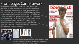
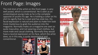
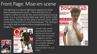
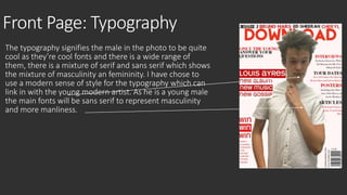
- The front page represents the main artist, a young male, atypically through his mature dress and expression in order to subvert stereotypes of youth.
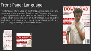
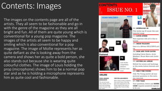
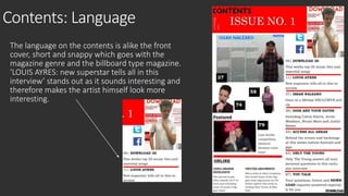
- The contents page similarly aims to represent the artists, both male and female, as fashionable yet unconventional through their poses, attire, and use of bright colors.
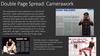
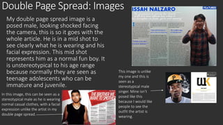
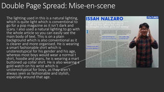
- The double page spread again features the main artist in atypical ways, through his mid-shot pose, smart clothing, and shocked expression to match


![Music Mag Mood Board =]](https://cdn.slidesharecdn.com/ss_thumbnails/musicmagmoodboard-091119153226-phpapp02-thumbnail.jpg?width=640&height=640&fit=bounds)


