Unit 51 Page Layout and Design
Production Commentary
Slide 1: Design Programmes
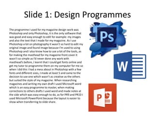
The programme I used for my magazine design work was
Photoshop and only Photoshop, it is the only software that
was good and easy enough to edit for example: my images
and also the text that I made for my magazine. As I use
Photoshop a lot on photography it wasn’t so hard to edit my
original image and found image because I’m used to using
Photoshop and I also know how to use a lot of the tools, as
for making the masthead for my magazine front cover it
wasn’t so simple as I’d never done any work with
masthead’s before, I learnt that I could get fonts online and
get my tutor to programme them on my computer for me so
when I did this I had a mess about in Photoshop with a few
fonts and different sizes, I made at least 5 and came to the
decision to use one which wasn’t as creative as the others
but suited the style of my magazine. When researching
magazines and writing my own draft I used Microsoft word
which is an easy programme to master, when making
corrections to others drafts I used word and made notes at
the side which was easy enough to do, as for PR9 and PR10 I
used Microsoft PowerPoint because the layout is easier to
show when transferring to slide share.
Slide 2: Formats
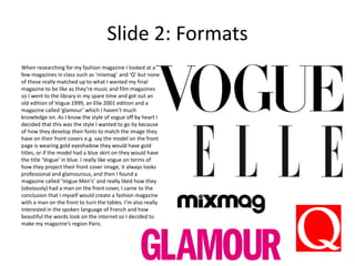
When researching for my fashion magazine I looked at a
few magazines in class such as ‘mixmag’ and ‘Q’ but none
of these really matched up to what I wanted my final
magazine to be like as they’re music and film magazines
so I went to the library in my spare time and got out an
old edition of Vogue 1999, an Elle 2001 edition and a
magazine called ‘glamour’ which I haven’t much
knowledge on. As I know the style of vogue off by heart I
decided that this was the style I wanted to go by because
of how they develop their fonts to match the image they
have on their front covers e.g. say the model on the front
page is wearing gold eyeshadow they would have gold
titles, or if the model had a blue skirt on they would have
the title ‘Vogue’ in blue. I really like vogue on terms of
how they project their front cover image, it always looks
professional and glamourous, and then I found a
magazine called ‘Vogue Men's’ and really liked how they
(obviously) had a man on the front cover, I came to the
conclusion that I myself would create a fashion magazine
with a man on the front to turn the tables. I’m also really
interested in the spoken language of French and how
beautiful the words look on the internet so I decided to
make my magazine’s region Paris.
Slide 3: Conventions & Visual Language
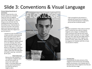
Primary Optical Area & Axis of
Orientation
Because I know that this is the
primary optical area I decided to
make sure that my magazine
masthead and slogan went in this
area so that ‘florige paris’ is the first
thing you see and read, then the
reading gravity takes you down to
the terminal area. I like that there’s
more than one title in the primary
optical area because you get more
information about the magazine as
you first look at it.
Reading Gravity
Terminal Area
I purposely put the date and price of the
magazine in the terminal area and reading
gravity area because a lot of people want to
know the price of the magazine once they see
the title and front image.
Weak Fallow Area
Because the main purpose of
my magazine is Angelina Jolie I
put the article about my
cousin, the model ‘Lewis
Doyle’ in the weak fallow area
so eyes wont be attracted to
his article but will be to
Angelina Jolie's.
Genre
The genre conventions I have used on my front
cover is mainly the ones used on a fashion
magazine such as Vogue, I’ve followed the
same conventions like how the fonts match
what the model is wearing, I’ve used a slogan
that says ‘Paris’ after the main slogan which is
what Vogue would do if their magazine was
located in France, Japan, Korea etc. Because
my magazine isn’t situation with film or music
my only Genre is fashion.
I wanted my cover line fonts to be
in black and white mainly because
black represents power which I
want this magazine to have, and
white represents purity which is
what my magazine revolves around
as it’s not criticizing. Also white
contrasts well with black, not only
that my images are in black and
white so it fits better as I said when
I was researching magazines how
‘Vogue’ match their font with what
the model is wearing, I wanted to
do the same.
I feel as though the only emotion or
attitude that comes from my slogan is
cool and reserved because it represents
purity and has an ethereal quality.
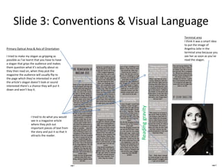
Slide 3: Conventions & Visual Language
Primary Optical Area & Axis of Orientation
I tried to make my slogan as gripping as
possible as I’ve learnt that you have to have
a slogan that grips the audience and makes
them question what it’s actually about so
they then read on, when they pick the
magazine the audience will usually flip to
the page which they’re interested in and if
the article’s slogan doesn’t look or sound
interested there’s a chance they will put it
down and won’t buy it.
Readinggravity
Terminal area
I think it was a smart idea
to put the image of
Angelina Jolie in the
terminal area because you
see her as soon as you’ve
read the slogan.
I tried to do what you would
see in a magazine article
where they pick out
important pieces of text from
the story and put it so that it
attracts the reader.
Slide 4: Audience
My target audience is pretty much the same as Vogue Magazine,
if I were to categorize it it would look like this:
GENDER
Male — 53%
Female — 86%
AGE
16-34 years — 70%
35-54 years — 28%
55+ years — 6%
EDUCATION:
Higher — 72%
SOCIAL STATUS:
Business owners, managers, specialists, white-collars - 39%
Women who work in the fashion industry – 60%
Teenagers who follow fashion – 49%
70% of readers travel 1-3 times a year
77% of readers have a car
33% of readers own their own home
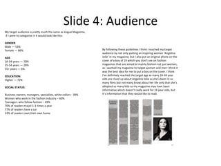
By following these guidelines I think I reached my target
audience by not only putting an inspiring woman ‘Angelina
Jolie’ in my magazine, but I also put an original photo on the
cover of a boy of 19 which you don’t see on fashion
magazines that are aimed at mainly fashion not just women,
as I wanted my magazine to target women and men I think it
was the best idea for me to put a boy on the cover. I think
I’ve definitely reached the target age as many 16-34 year
olds are clued up about Angelina Jolie as she’s been in so
many films but not many know about her life only that she’s
adopted so many kids so my magazine may have been
informative which doesn’t really work for 16 year olds, but
it’s information that they would like to read.

Production comentary

  • 1.
    Unit 51 PageLayout and Design Production Commentary
  • 2.
    Slide 1: DesignProgrammes The programme I used for my magazine design work was Photoshop and only Photoshop, it is the only software that was good and easy enough to edit for example: my images and also the text that I made for my magazine. As I use Photoshop a lot on photography it wasn’t so hard to edit my original image and found image because I’m used to using Photoshop and I also know how to use a lot of the tools, as for making the masthead for my magazine front cover it wasn’t so simple as I’d never done any work with masthead’s before, I learnt that I could get fonts online and get my tutor to programme them on my computer for me so when I did this I had a mess about in Photoshop with a few fonts and different sizes, I made at least 5 and came to the decision to use one which wasn’t as creative as the others but suited the style of my magazine. When researching magazines and writing my own draft I used Microsoft word which is an easy programme to master, when making corrections to others drafts I used word and made notes at the side which was easy enough to do, as for PR9 and PR10 I used Microsoft PowerPoint because the layout is easier to show when transferring to slide share.
  • 3.
    Slide 2: Formats Whenresearching for my fashion magazine I looked at a few magazines in class such as ‘mixmag’ and ‘Q’ but none of these really matched up to what I wanted my final magazine to be like as they’re music and film magazines so I went to the library in my spare time and got out an old edition of Vogue 1999, an Elle 2001 edition and a magazine called ‘glamour’ which I haven’t much knowledge on. As I know the style of vogue off by heart I decided that this was the style I wanted to go by because of how they develop their fonts to match the image they have on their front covers e.g. say the model on the front page is wearing gold eyeshadow they would have gold titles, or if the model had a blue skirt on they would have the title ‘Vogue’ in blue. I really like vogue on terms of how they project their front cover image, it always looks professional and glamourous, and then I found a magazine called ‘Vogue Men's’ and really liked how they (obviously) had a man on the front cover, I came to the conclusion that I myself would create a fashion magazine with a man on the front to turn the tables. I’m also really interested in the spoken language of French and how beautiful the words look on the internet so I decided to make my magazine’s region Paris.
  • 4.
    Slide 3: Conventions& Visual Language Primary Optical Area & Axis of Orientation Because I know that this is the primary optical area I decided to make sure that my magazine masthead and slogan went in this area so that ‘florige paris’ is the first thing you see and read, then the reading gravity takes you down to the terminal area. I like that there’s more than one title in the primary optical area because you get more information about the magazine as you first look at it. Reading Gravity Terminal Area I purposely put the date and price of the magazine in the terminal area and reading gravity area because a lot of people want to know the price of the magazine once they see the title and front image. Weak Fallow Area Because the main purpose of my magazine is Angelina Jolie I put the article about my cousin, the model ‘Lewis Doyle’ in the weak fallow area so eyes wont be attracted to his article but will be to Angelina Jolie's. Genre The genre conventions I have used on my front cover is mainly the ones used on a fashion magazine such as Vogue, I’ve followed the same conventions like how the fonts match what the model is wearing, I’ve used a slogan that says ‘Paris’ after the main slogan which is what Vogue would do if their magazine was located in France, Japan, Korea etc. Because my magazine isn’t situation with film or music my only Genre is fashion. I wanted my cover line fonts to be in black and white mainly because black represents power which I want this magazine to have, and white represents purity which is what my magazine revolves around as it’s not criticizing. Also white contrasts well with black, not only that my images are in black and white so it fits better as I said when I was researching magazines how ‘Vogue’ match their font with what the model is wearing, I wanted to do the same. I feel as though the only emotion or attitude that comes from my slogan is cool and reserved because it represents purity and has an ethereal quality.
  • 5.
    Slide 3: Conventions& Visual Language Primary Optical Area & Axis of Orientation I tried to make my slogan as gripping as possible as I’ve learnt that you have to have a slogan that grips the audience and makes them question what it’s actually about so they then read on, when they pick the magazine the audience will usually flip to the page which they’re interested in and if the article’s slogan doesn’t look or sound interested there’s a chance they will put it down and won’t buy it. Readinggravity Terminal area I think it was a smart idea to put the image of Angelina Jolie in the terminal area because you see her as soon as you’ve read the slogan. I tried to do what you would see in a magazine article where they pick out important pieces of text from the story and put it so that it attracts the reader.
  • 6.
    Slide 4: Audience Mytarget audience is pretty much the same as Vogue Magazine, if I were to categorize it it would look like this: GENDER Male — 53% Female — 86% AGE 16-34 years — 70% 35-54 years — 28% 55+ years — 6% EDUCATION: Higher — 72% SOCIAL STATUS: Business owners, managers, specialists, white-collars - 39% Women who work in the fashion industry – 60% Teenagers who follow fashion – 49% 70% of readers travel 1-3 times a year 77% of readers have a car 33% of readers own their own home By following these guidelines I think I reached my target audience by not only putting an inspiring woman ‘Angelina Jolie’ in my magazine, but I also put an original photo on the cover of a boy of 19 which you don’t see on fashion magazines that are aimed at mainly fashion not just women, as I wanted my magazine to target women and men I think it was the best idea for me to put a boy on the cover. I think I’ve definitely reached the target age as many 16-34 year olds are clued up about Angelina Jolie as she’s been in so many films but not many know about her life only that she’s adopted so many kids so my magazine may have been informative which doesn’t really work for 16 year olds, but it’s information that they would like to read.