- The document profiles the target audience for a proposed music magazine as 14-19 year olds, with a slightly more feminine slant.
- Initially, the creator planned a digital magazine but switched to print due to issues with interactive elements and the importance of posters for identity construction among teens.
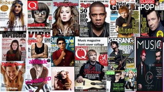
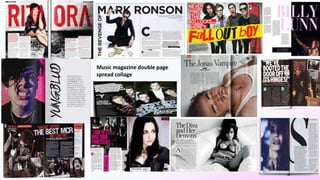
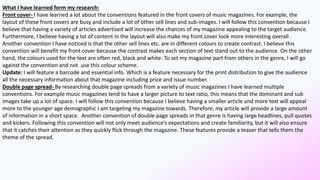
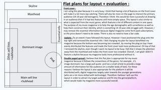
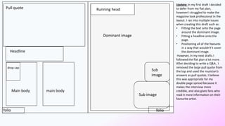
- Research on conventions from other music magazines informed the layout plans, including busy front covers with many elements and image-dominant spreads with large headlines and quotes.