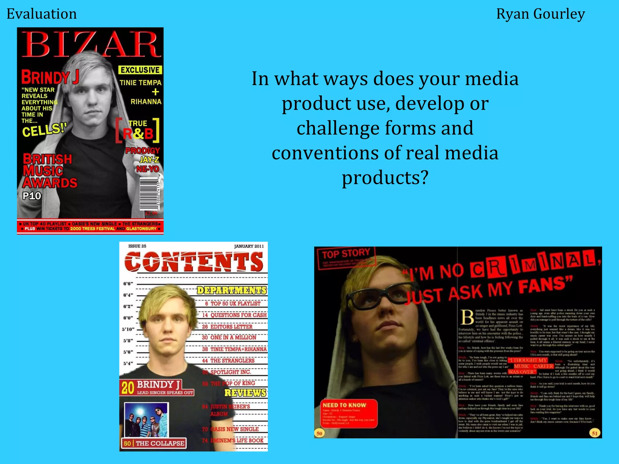
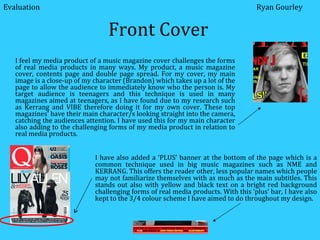
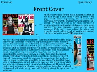
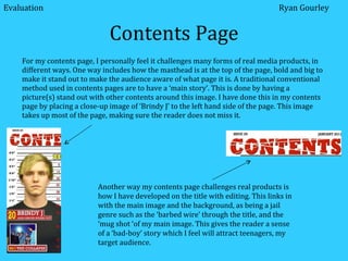
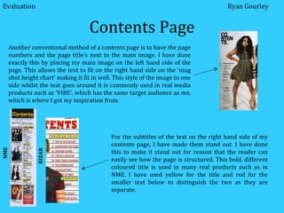
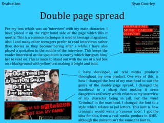
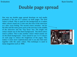
SlideShare a Scribd company logo
1 of 10
In what ways does your media product use, develop or challenge forms and conventions of real media products? Ryan Gourley Evaluation
Front Cover ,[object Object],Evaluation Ryan Gourley I have also added a ‘PLUS’ banner at the bottom of the page which is a common technique used in big music magazines such as NME and KERRANG. This offers the reader other, less popular names which people may not familiarize themselves with as much as the main subtitles. This stands out also with yellow and black text on a bright red background challenging forms of real media products. With this ‘plus’ bar, I have also kept to the 3/4 colour scheme I have aimed to do throughout my design.
Front Cover Another convention for my music magazine is that for my main image, I have made it take up most of the page which shows supremacy. The close-up shot shows exactly what the character is wearing (mise-en-scene). My mise-en-scene is my main character is wearing a hoodie which relates to teenagers, my target market. This also challenges forms of real media products. With this I have edited the photo and created a negative effect which allows the text to stand out, this is shown in many  VIBE  magazines.  VIBE BIZAR  Evaluation Ryan Gourley Another  challenging form includes the subtitles and text around the image, but overlaps the image. My aim was to put enough cover lines as I could around the main image without making my magazine looked packed. With this aim of lots of subtitles and text, it gives the audience a lot of variety and choice of what the magazine offers. From a lot of my research such as VIBE, they have famous singers as subtitles but in different fonts making them stand out. Another way of making the singer’s names stand out is presenting the subtitles, e.g. the way in which I have placed a bracket around ‘TRUE R&B’ which challenges conventional magazines. This will hopefully draw more people to purchase the magazine as they perhaps notice a singer they like and would like to read about. The text that I have used is easily readable as well as I used a clear font and bright colours (red and yellow) which contrasted with the black background. This challenges the forms of real media products as in shops, colours like yellow on a black background which is in on my cover, will definitely attract the eye of my audience.
Front Cover I have also laid out my magazine cover in a similar way to conventional music magazines such as NME and VIBE. One of these ways is the way in which I have placed the masthead behind the main image. This technique is used to show the main image is overpowering the magazine and possibly because the masthead will not need to be shown if the reader already knows who i. For the masthead title, I have named it ‘BIZAR’, this is challenging the conventions of magazine as it is very catchy in they way it is spelt and how it is pronounced. This I feel will attract my target market of teenagers as it is memorable.  A less important conventional method used in real media products are the use of barcodes, dates and cost of the magazine. Barcodes are usually placed lower down the magazine, out of the way from the main subtitles and image. This is because it is less important. For the cost of the magazine, it is usually placed under the bar code, this is because the price of the magazine could possibly put the reader off buying the magazine, therefore it is placed out of the way under the bar-code with the date. Ryan Gourley Evaluation
Contents Page ,[object Object],Another way my contents page challenges real products is how I have developed on the title with editing. This links in with the main image and the background, as being a jail genre such as the ‘barbed wire’ through the title, and the ‘mug shot ‘of my main image. This gives the reader a sense of a ‘bad-boy’ story which I feel will attract teenagers, my target audience. Evaluation Ryan Gourley
Contents Page Another conventional method of a contents page is to have the page numbers and the page title’s next to the main image. I have done exactly this by placing my main image on the left hand side of the page. This allows the text to fit on the right hand side on the ‘mug shot height chart’ making it fit in well. This style of the image to one side whilst the text goes around it is commonly used in real media products such as ‘VIBE’, which has the same target audience as me, which is where I got my inspiration from.  For the subtitles of the text on the right hand side of my contents page, I have made them stand out. I have done this to make it stand out for reason that the reader can easily see how the page is structured. This bold, different coloured title is used in many real products such as in NME. I have used yellow for the title and red for the smaller text below to distinguish the two as they are separate.  NME BIZAR Evaluation Ryan Gourley
Contents Page I have added a text box which includes the characters name, what page the story is on and a caption of what the story is about over my main image which is much larger than the other text box below allowing the audience to see this straight away. This is used in many magazine covers such as in ‘Q’ magazine. Below this main text box linked in with the main image is another text box which has the same format and colours and a picture attached/ above it. This challenges forms of real products as it gives the audience another ‘big’, more popular story as it is easily spotted. The colours for the filling of the text box are the same colour for the title and the text. This is an aim I used throughout my media product. This is because the use of a limited amount of colours, maybe 3 or 4 spread across the cover, contents and double page spread is used in real media products. This makes the magazine have sophistication, producing a less vibrant and less bright colour scheme. A smaller, less important conventional method used in real media products placing the ‘issue’ number and the date of the magazine on top of the contents page. This is usually very small in most magazines as it is less important and placed above the title, which I have done. Ryan Gourley Evaluation
Double page spread Like for my cover and contents there are many different ways I have challenged real media products. The first way I challenged the conventional ways of real media products for my double page spread is having a main image one of the two pages. This use of a big picture shows immediately who the page is about and for the other page, I have wrote my ‘interview’ with my character. This style is used in many magazines aimed at teenagers such as because they prefer to read less and have more pictures or else they will become bored. For my main image, I have used a close-up image showing the expressions on my characters face. This is important for my story as he is shown to be cocky from his ‘time in the cells’. With the use of the hoodie and stylish glasses, it only adds to the cocky effect. Another important conventional method used in real media products is to have the masthead crossing both pages such as in NME. This allows the reader to make a link between the two pages and for my double page spread. For example in mine, my masthead crosses the two pages. The masthead is a quotation from my main character covering both pages and covering the him slightly also.  It is obviously a quotation because of the speech marks  around the masthead. Evaluation Ryan Gourley
Double page spread I have developed on real media products throughout my own product. One way of this, is how I changed the font of my masthead to suit the genre of the double page spread. I changed the masthead to a sharp font making it seem dangerous and scary which relates to my interview of my character being in jail. For the word ‘Criminal’ in the masthead, I changed the font to a style which relates to jail letters. This font is how criminals would write a ‘ransom note’. I got the idea for this, from a real media product in NME,  although the content isn’t the same, the font is. Evaluation Ryan Gourley For my text which was an ‘interview’ with my main character, I have placed it on the right hand side of the page which fills it mostly. This is a common technique is used in teenage magazines. Also I and many other teenagers prefer to read interviews rather than stories as they become boring after a while. I have also placed a quotation in the middle of the interview. This keeps the reader interested as the quotation is catchy which intrigues him/ her to read on. This is made to stand out with the use of a red box on a blackground with yellow text making it bright and bold.
Double page spread Evaluation Ryan Gourley One way my double page spread develops on real media products is the use of 3 colours on both pages. The first colour is black. This is used for the background as it makes other colours stand out. It also sets the tone of the interview as a dim, scary feeling. The second colour includes  red for the title and the main parts such as the text box in the middle of the interview and the ‘Top Story’ box. The bright red colour stands out on the black background.  The third colour used is yellow. This is also another colour which stands out on the black background.  I have aimed to use 3 or 4 colours on each page to reduce the brightness of the pages. This makes it seem more sophisticated and it can also link texts together with the same colour. This technique is used in many magazines such as  NME.

More Related Content

What's hot

evaluation question 1
evaluation question 1evaluation question 1
evaluation question 1BethDoesMedia
 
Evaluation of my magazine1
Evaluation of my magazine1Evaluation of my magazine1
Evaluation of my magazine1abidack
 
A2 media studies evaluation
A2 media studies evaluationA2 media studies evaluation
A2 media studies evaluationThierry_Preston
 
Unit 14 lo1 new 20th nov
Unit 14 lo1 new 20th novUnit 14 lo1 new 20th nov
Unit 14 lo1 new 20th novharrymyerswest
 
Evaluation h – skills development
Evaluation h – skills developmentEvaluation h – skills development
Evaluation h – skills developmentRyan Tarran
 
A2 Media Coursework Evaluation
A2 Media Coursework EvaluationA2 Media Coursework Evaluation
A2 Media Coursework Evaluationguestc3ea29
 
Media A2 Final Evaluation
Media A2 Final EvaluationMedia A2 Final Evaluation
Media A2 Final Evaluationguestc3ea29
 
Evaluation Of My Music Magazine
Evaluation Of My Music MagazineEvaluation Of My Music Magazine
Evaluation Of My Music MagazineYasminLalala
 
Evaluation of magazine task
Evaluation of magazine taskEvaluation of magazine task
Evaluation of magazine taskJessWhiteMEDIA
 
Magazine Planning
Magazine PlanningMagazine Planning
Magazine Planning2033x
 
Evaluation 1
Evaluation 1Evaluation 1
Evaluation 1JayFranks
 
Evaluation 1
Evaluation 1Evaluation 1
Evaluation 1JayFranks
 
Evaluation 1
Evaluation 1Evaluation 1
Evaluation 1JayFranks
 

What's hot (20)

evaluation question 1
evaluation question 1evaluation question 1
evaluation question 1
 
Evaluation
EvaluationEvaluation
Evaluation
 
Evaluation of my magazine1
Evaluation of my magazine1Evaluation of my magazine1
Evaluation of my magazine1
 
Evaluation Final
Evaluation FinalEvaluation Final
Evaluation Final
 
Evaluation
EvaluationEvaluation
Evaluation
 
A2 media studies evaluation
A2 media studies evaluationA2 media studies evaluation
A2 media studies evaluation
 
Unit 14 lo1 new 20th nov
Unit 14 lo1 new 20th novUnit 14 lo1 new 20th nov
Unit 14 lo1 new 20th nov
 
Evaluation
EvaluationEvaluation
Evaluation
 
Evaluation h – skills development
Evaluation h – skills developmentEvaluation h – skills development
Evaluation h – skills development
 
A2 Media Coursework Evaluation
A2 Media Coursework EvaluationA2 Media Coursework Evaluation
A2 Media Coursework Evaluation
 
Media A2 Final Evaluation
Media A2 Final EvaluationMedia A2 Final Evaluation
Media A2 Final Evaluation
 
Evaluation
EvaluationEvaluation
Evaluation
 
Q1
Q1Q1
Q1
 
Evaluation Of My Music Magazine
Evaluation Of My Music MagazineEvaluation Of My Music Magazine
Evaluation Of My Music Magazine
 
Evaluation of magazine task
Evaluation of magazine taskEvaluation of magazine task
Evaluation of magazine task
 
Question 1
Question 1Question 1
Question 1
 
Magazine Planning
Magazine PlanningMagazine Planning
Magazine Planning
 
Evaluation 1
Evaluation 1Evaluation 1
Evaluation 1
 
Evaluation 1
Evaluation 1Evaluation 1
Evaluation 1
 
Evaluation 1
Evaluation 1Evaluation 1
Evaluation 1
 

Viewers also liked

Star chart
Star chartStar chart
Star chartjwinman
 
Furniture Design with Autodesk Solutions
Furniture Design with Autodesk SolutionsFurniture Design with Autodesk Solutions
Furniture Design with Autodesk SolutionsMCAD HCM
 
Star power point_presentations1
Star power point_presentations1Star power point_presentations1
Star power point_presentations1lesliegvasquez
 
森のIT化20110308
森のIT化20110308森のIT化20110308
森のIT化20110308Takeshi Narisako
 
5 mejores grupos de rock segun la revista rolling stones
5 mejores grupos de rock segun la revista rolling stones5 mejores grupos de rock segun la revista rolling stones
5 mejores grupos de rock segun la revista rolling stonescarlosasencio93
 
Star power point_presentations[1]
Star power point_presentations[1]Star power point_presentations[1]
Star power point_presentations[1]lesliegvasquez
 
Awesome things
Awesome thingsAwesome things
Awesome thingswcedward
 
How to escape from a Google penalty
How to escape from a Google penaltyHow to escape from a Google penalty
How to escape from a Google penaltyWoptimo
 
In what ways does your media product use eval
In what ways does your media product use evalIn what ways does your media product use eval
In what ways does your media product use evalRyanGourley
 
The value of mail: what planners and marketers need to know
The value of mail: what planners and marketers need to knowThe value of mail: what planners and marketers need to know
The value of mail: what planners and marketers need to knowRachel Aldighieri
 

Viewers also liked (20)

완성...
완성...완성...
완성...
 
Star chart
Star chartStar chart
Star chart
 
Furniture Design with Autodesk Solutions
Furniture Design with Autodesk SolutionsFurniture Design with Autodesk Solutions
Furniture Design with Autodesk Solutions
 
Renaissance
RenaissanceRenaissance
Renaissance
 
MO:MOs | the processes
MO:MOs | the processesMO:MOs | the processes
MO:MOs | the processes
 
Senw prgm1[1]
Senw prgm1[1]Senw prgm1[1]
Senw prgm1[1]
 
Star power point_presentations1
Star power point_presentations1Star power point_presentations1
Star power point_presentations1
 
森のIT化20110308
森のIT化20110308森のIT化20110308
森のIT化20110308
 
Legal update
Legal updateLegal update
Legal update
 
5 mejores grupos de rock segun la revista rolling stones
5 mejores grupos de rock segun la revista rolling stones5 mejores grupos de rock segun la revista rolling stones
5 mejores grupos de rock segun la revista rolling stones
 
Avant-garde Example
Avant-garde ExampleAvant-garde Example
Avant-garde Example
 
Star power point_presentations[1]
Star power point_presentations[1]Star power point_presentations[1]
Star power point_presentations[1]
 
Awesome things
Awesome thingsAwesome things
Awesome things
 
Who am i (1)
Who am i (1)Who am i (1)
Who am i (1)
 
Who am i (1)
Who am i (1)Who am i (1)
Who am i (1)
 
How to escape from a Google penalty
How to escape from a Google penaltyHow to escape from a Google penalty
How to escape from a Google penalty
 
In what ways does your media product use eval
In what ways does your media product use evalIn what ways does your media product use eval
In what ways does your media product use eval
 
1 elliot muscant
1 elliot muscant1 elliot muscant
1 elliot muscant
 
The value of mail: what planners and marketers need to know
The value of mail: what planners and marketers need to knowThe value of mail: what planners and marketers need to know
The value of mail: what planners and marketers need to know
 
CIO State of Mind
CIO State of MindCIO State of Mind
CIO State of Mind
 

Similar to 1st question powerpoint[1]

Evaluation question 1
Evaluation question 1Evaluation question 1
Evaluation question 1elliepuopolo
 
Media question 1 edited
Media question 1 editedMedia question 1 edited
Media question 1 editedFayeVictoria
 
Music magazine evaluation
Music magazine evaluationMusic magazine evaluation
Music magazine evaluationHannah Patrick
 
Evaluation question 1
Evaluation question 1Evaluation question 1
Evaluation question 1shofialamin
 
Evaluation question 1
Evaluation question 1Evaluation question 1
Evaluation question 1shofialamin
 
Evaluation question 1
Evaluation question 1Evaluation question 1
Evaluation question 1shofialamin
 
Media Evaluation
Media EvaluationMedia Evaluation
Media EvaluationBen9
 
Evaluation
EvaluationEvaluation
Evaluationbhwatson
 
R&b magazine evaluation
R&b magazine evaluationR&b magazine evaluation
R&b magazine evaluationMiz_A
 
Question 1 - Media Evaluation
Question 1 - Media EvaluationQuestion 1 - Media Evaluation
Question 1 - Media Evaluationbeckiemcconnell
 
Evalutaion mag
Evalutaion magEvalutaion mag
Evalutaion maglallen92
 
Evaluation Of Music Magazine
Evaluation Of Music MagazineEvaluation Of Music Magazine
Evaluation Of Music Magazinekelsea66
 
My musicmagevaluation
My musicmagevaluationMy musicmagevaluation
My musicmagevaluationtafi_94
 
Evaluation media
Evaluation mediaEvaluation media
Evaluation mediachirstohper
 

Similar to 1st question powerpoint[1] (20)

Evaluation question 1
Evaluation question 1Evaluation question 1
Evaluation question 1
 
As media evaluation
As media   evaluationAs media   evaluation
As media evaluation
 
Media question 1 edited
Media question 1 editedMedia question 1 edited
Media question 1 edited
 
Music magazine evaluation
Music magazine evaluationMusic magazine evaluation
Music magazine evaluation
 
Evaluation
Evaluation Evaluation
Evaluation
 
Evaluation question 1
Evaluation question 1Evaluation question 1
Evaluation question 1
 
Evaluation question 1
Evaluation question 1Evaluation question 1
Evaluation question 1
 
Evaluation question 1
Evaluation question 1Evaluation question 1
Evaluation question 1
 
Media Evaluation
Media EvaluationMedia Evaluation
Media Evaluation
 
Evaluation
Evaluation Evaluation
Evaluation
 
Katys Evaluation
Katys EvaluationKatys Evaluation
Katys Evaluation
 
Question 1
Question 1Question 1
Question 1
 
Evaluation
EvaluationEvaluation
Evaluation
 
Evaluation
EvaluationEvaluation
Evaluation
 
R&b magazine evaluation
R&b magazine evaluationR&b magazine evaluation
R&b magazine evaluation
 
Question 1 - Media Evaluation
Question 1 - Media EvaluationQuestion 1 - Media Evaluation
Question 1 - Media Evaluation
 
Evalutaion mag
Evalutaion magEvalutaion mag
Evalutaion mag
 
Evaluation Of Music Magazine
Evaluation Of Music MagazineEvaluation Of Music Magazine
Evaluation Of Music Magazine
 
My musicmagevaluation
My musicmagevaluationMy musicmagevaluation
My musicmagevaluation
 
Evaluation media
Evaluation mediaEvaluation media
Evaluation media
 

More from RyanGourley

More from RyanGourley (10)

Film poster
Film posterFilm poster
Film poster
 
Trailer
TrailerTrailer
Trailer
 
Magazine
MagazineMagazine
Magazine
 
In what ways does your media product use
In what ways does your media product useIn what ways does your media product use
In what ways does your media product use
 
Question 1
Question 1Question 1
Question 1
 
Evaluation Q1
Evaluation Q1Evaluation Q1
Evaluation Q1
 
Evaluation Q1
Evaluation Q1Evaluation Q1
Evaluation Q1
 
Evaluation Q1
Evaluation Q1Evaluation Q1
Evaluation Q1
 
Evaluation Q1
Evaluation Q1Evaluation Q1
Evaluation Q1
 
Indiaaaaaaa
IndiaaaaaaaIndiaaaaaaa
Indiaaaaaaa
 

1st question powerpoint[1]

  • 1. In what ways does your media product use, develop or challenge forms and conventions of real media products? Ryan Gourley Evaluation
  • 2.
  • 3. Front Cover Another convention for my music magazine is that for my main image, I have made it take up most of the page which shows supremacy. The close-up shot shows exactly what the character is wearing (mise-en-scene). My mise-en-scene is my main character is wearing a hoodie which relates to teenagers, my target market. This also challenges forms of real media products. With this I have edited the photo and created a negative effect which allows the text to stand out, this is shown in many VIBE magazines. VIBE BIZAR Evaluation Ryan Gourley Another challenging form includes the subtitles and text around the image, but overlaps the image. My aim was to put enough cover lines as I could around the main image without making my magazine looked packed. With this aim of lots of subtitles and text, it gives the audience a lot of variety and choice of what the magazine offers. From a lot of my research such as VIBE, they have famous singers as subtitles but in different fonts making them stand out. Another way of making the singer’s names stand out is presenting the subtitles, e.g. the way in which I have placed a bracket around ‘TRUE R&B’ which challenges conventional magazines. This will hopefully draw more people to purchase the magazine as they perhaps notice a singer they like and would like to read about. The text that I have used is easily readable as well as I used a clear font and bright colours (red and yellow) which contrasted with the black background. This challenges the forms of real media products as in shops, colours like yellow on a black background which is in on my cover, will definitely attract the eye of my audience.
  • 4. Front Cover I have also laid out my magazine cover in a similar way to conventional music magazines such as NME and VIBE. One of these ways is the way in which I have placed the masthead behind the main image. This technique is used to show the main image is overpowering the magazine and possibly because the masthead will not need to be shown if the reader already knows who i. For the masthead title, I have named it ‘BIZAR’, this is challenging the conventions of magazine as it is very catchy in they way it is spelt and how it is pronounced. This I feel will attract my target market of teenagers as it is memorable. A less important conventional method used in real media products are the use of barcodes, dates and cost of the magazine. Barcodes are usually placed lower down the magazine, out of the way from the main subtitles and image. This is because it is less important. For the cost of the magazine, it is usually placed under the bar code, this is because the price of the magazine could possibly put the reader off buying the magazine, therefore it is placed out of the way under the bar-code with the date. Ryan Gourley Evaluation
  • 5.
  • 6. Contents Page Another conventional method of a contents page is to have the page numbers and the page title’s next to the main image. I have done exactly this by placing my main image on the left hand side of the page. This allows the text to fit on the right hand side on the ‘mug shot height chart’ making it fit in well. This style of the image to one side whilst the text goes around it is commonly used in real media products such as ‘VIBE’, which has the same target audience as me, which is where I got my inspiration from. For the subtitles of the text on the right hand side of my contents page, I have made them stand out. I have done this to make it stand out for reason that the reader can easily see how the page is structured. This bold, different coloured title is used in many real products such as in NME. I have used yellow for the title and red for the smaller text below to distinguish the two as they are separate. NME BIZAR Evaluation Ryan Gourley
  • 7. Contents Page I have added a text box which includes the characters name, what page the story is on and a caption of what the story is about over my main image which is much larger than the other text box below allowing the audience to see this straight away. This is used in many magazine covers such as in ‘Q’ magazine. Below this main text box linked in with the main image is another text box which has the same format and colours and a picture attached/ above it. This challenges forms of real products as it gives the audience another ‘big’, more popular story as it is easily spotted. The colours for the filling of the text box are the same colour for the title and the text. This is an aim I used throughout my media product. This is because the use of a limited amount of colours, maybe 3 or 4 spread across the cover, contents and double page spread is used in real media products. This makes the magazine have sophistication, producing a less vibrant and less bright colour scheme. A smaller, less important conventional method used in real media products placing the ‘issue’ number and the date of the magazine on top of the contents page. This is usually very small in most magazines as it is less important and placed above the title, which I have done. Ryan Gourley Evaluation
  • 8. Double page spread Like for my cover and contents there are many different ways I have challenged real media products. The first way I challenged the conventional ways of real media products for my double page spread is having a main image one of the two pages. This use of a big picture shows immediately who the page is about and for the other page, I have wrote my ‘interview’ with my character. This style is used in many magazines aimed at teenagers such as because they prefer to read less and have more pictures or else they will become bored. For my main image, I have used a close-up image showing the expressions on my characters face. This is important for my story as he is shown to be cocky from his ‘time in the cells’. With the use of the hoodie and stylish glasses, it only adds to the cocky effect. Another important conventional method used in real media products is to have the masthead crossing both pages such as in NME. This allows the reader to make a link between the two pages and for my double page spread. For example in mine, my masthead crosses the two pages. The masthead is a quotation from my main character covering both pages and covering the him slightly also. It is obviously a quotation because of the speech marks around the masthead. Evaluation Ryan Gourley
  • 9. Double page spread I have developed on real media products throughout my own product. One way of this, is how I changed the font of my masthead to suit the genre of the double page spread. I changed the masthead to a sharp font making it seem dangerous and scary which relates to my interview of my character being in jail. For the word ‘Criminal’ in the masthead, I changed the font to a style which relates to jail letters. This font is how criminals would write a ‘ransom note’. I got the idea for this, from a real media product in NME, although the content isn’t the same, the font is. Evaluation Ryan Gourley For my text which was an ‘interview’ with my main character, I have placed it on the right hand side of the page which fills it mostly. This is a common technique is used in teenage magazines. Also I and many other teenagers prefer to read interviews rather than stories as they become boring after a while. I have also placed a quotation in the middle of the interview. This keeps the reader interested as the quotation is catchy which intrigues him/ her to read on. This is made to stand out with the use of a red box on a blackground with yellow text making it bright and bold.
  • 10. Double page spread Evaluation Ryan Gourley One way my double page spread develops on real media products is the use of 3 colours on both pages. The first colour is black. This is used for the background as it makes other colours stand out. It also sets the tone of the interview as a dim, scary feeling. The second colour includes red for the title and the main parts such as the text box in the middle of the interview and the ‘Top Story’ box. The bright red colour stands out on the black background. The third colour used is yellow. This is also another colour which stands out on the black background. I have aimed to use 3 or 4 colours on each page to reduce the brightness of the pages. This makes it seem more sophisticated and it can also link texts together with the same colour. This technique is used in many magazines such as NME.