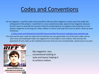
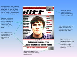
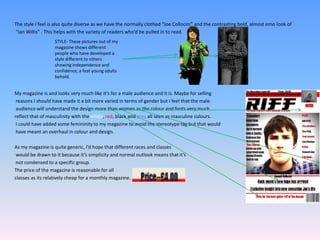
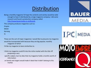
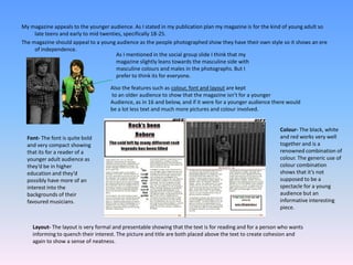
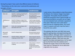
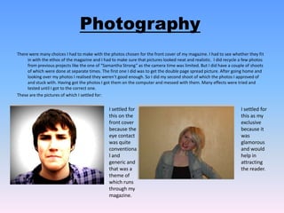
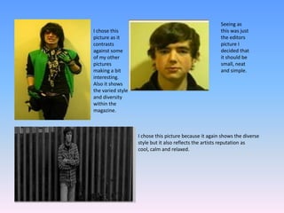
The document discusses the student's magazine project. They used conventions like mastheads, cover lines and image placement typical of magazines like Kerrang. The layout and style was intentionally very conventional to make the magazine seem realistic. The language, fonts and colors used were also conventional to attract a general male audience aged 18-25. During the project, the student learned to use software like Paint.net, Word, Blogspot and 1001fonts to design the magazine covers, layouts and track their progress. Overall, the software was relatively easy to use and helped the student produce their magazine.