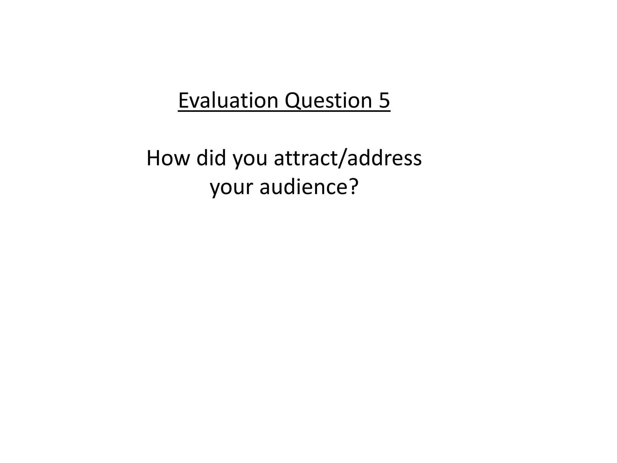
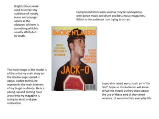
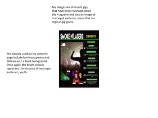
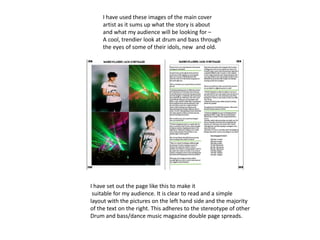
Evaluation Question 5
How did you attract/address
your audience?
The main image of the model is
of the artist my main story on
the double page spread is
about. Added to this, he
represents the main element
of my target audience. He is a
young, up and coming male
artist who my magazine is
trying to assist and give
motivation.
Bright colours were
used to attract my
audience of mostly
teens and younger
adults as the
vibrancy of them is
something which is
usually attributed
to youth.
I used shortened words such an ‘n’ for
‘and’ because my audience will know
What this means as they know about
the use of these sort of shortened
versions of words in their everyday life.
Compressed fonts were used as they’re synonymous
with dance music and drum and bass music magazines,
Which is the audience I am trying to attract.
My images are of recent gigs
that have been reviewed inside
the magazine and also an image of
my target audience, teens that are
regular gig-goers.
The colours used on my contents
page include luminous greens and
Yellows with a black background.
Once again, the bright colours
represent the vibrancy of my target
audience, youth.
I have used these images of the main cover
artist as it sums up what the story is about
and what my audience will be looking for –
A cool, trendier look at drum and bass through
the eyes of some of their idols, new and old.
I have set out the page like this to make it
suitable for my audience. It is clear to read and a simple
layout with the pictures on the left hand side and the majority
of the text on the right. This adheres to the stereotype of other
Drum and bass/dance music magazine double page spreads.

Evaluation question 5

  • 1.
    Evaluation Question 5 Howdid you attract/address your audience?
  • 2.
    The main imageof the model is of the artist my main story on the double page spread is about. Added to this, he represents the main element of my target audience. He is a young, up and coming male artist who my magazine is trying to assist and give motivation. Bright colours were used to attract my audience of mostly teens and younger adults as the vibrancy of them is something which is usually attributed to youth. I used shortened words such an ‘n’ for ‘and’ because my audience will know What this means as they know about the use of these sort of shortened versions of words in their everyday life. Compressed fonts were used as they’re synonymous with dance music and drum and bass music magazines, Which is the audience I am trying to attract.
  • 3.
    My images areof recent gigs that have been reviewed inside the magazine and also an image of my target audience, teens that are regular gig-goers. The colours used on my contents page include luminous greens and Yellows with a black background. Once again, the bright colours represent the vibrancy of my target audience, youth.
  • 4.
    I have usedthese images of the main cover artist as it sums up what the story is about and what my audience will be looking for – A cool, trendier look at drum and bass through the eyes of some of their idols, new and old. I have set out the page like this to make it suitable for my audience. It is clear to read and a simple layout with the pictures on the left hand side and the majority of the text on the right. This adheres to the stereotype of other Drum and bass/dance music magazine double page spreads.