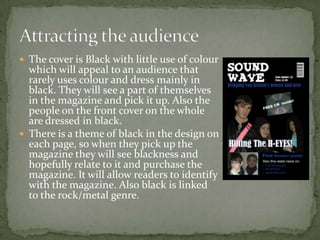
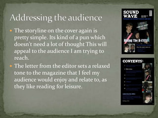
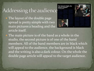
How did you attract/ address your audience?Question 5
The cover is Black with little use of colour which will appeal to an audience that rarely uses colour and dress mainly in black. They will see a part of themselves in the magazine and pick it up. Also the people on the front cover on the whole are dressed in black.There is a theme of black in the design on each page, so when they pick up the magazine they will see blackness and hopefully relate to it and purchase the magazine. It will allow readers to identify with the magazine. Also black is linked to the rock/metal genre.Attracting the audience
The title addresses the audience as its fairly simple to understand. The audience my magazine targets isn’t too interested in witty puns, they just want something basic and to the point.They key image on the front has the artists looking happy and a bit rebellious. This will appeal to the target audience as they may see themselves as rebellious.Addressing the audience
The storyline on the cover again is pretty simple. Its kind of a pun which doesn't need a lot of thought This will appeal to the audience I am trying to reach.The letter from the editor sets a relaxed tone to the magazine that I feel my audience would enjoy and relate to, as they like reading for leisure.Addressing the audience
The articles in the contents page are pretty simple and things that the target audience will enjoy reading.New up and coming bands, exclusive interviews, more artists to look out for, guide to big music, free posters, and a list of gigs. This will appeal to my target audience as they obviously like music, and information about new bands and gigs is exactly what they will want to know, and will be packed with things that are worth the cover price.Addressing the audience
Addressing the audienceThe layout of the double page spread is pretty simple with twomain pictures a heading and the article itself.The main picture is of the band as a whole in the studio, the second picture is of one of the band members. All of the band members are in black which will appeal to the audience, the background is black and the writing is also a dark colour. On the whole the double page article will appeal to the target audience.

Question 5 Eval(Media 1D)

  • 1.
    How did youattract/ address your audience?Question 5
  • 2.
    The cover isBlack with little use of colour which will appeal to an audience that rarely uses colour and dress mainly in black. They will see a part of themselves in the magazine and pick it up. Also the people on the front cover on the whole are dressed in black.There is a theme of black in the design on each page, so when they pick up the magazine they will see blackness and hopefully relate to it and purchase the magazine. It will allow readers to identify with the magazine. Also black is linked to the rock/metal genre.Attracting the audience
  • 3.
    The title addressesthe audience as its fairly simple to understand. The audience my magazine targets isn’t too interested in witty puns, they just want something basic and to the point.They key image on the front has the artists looking happy and a bit rebellious. This will appeal to the target audience as they may see themselves as rebellious.Addressing the audience
  • 4.
    The storyline onthe cover again is pretty simple. Its kind of a pun which doesn't need a lot of thought This will appeal to the audience I am trying to reach.The letter from the editor sets a relaxed tone to the magazine that I feel my audience would enjoy and relate to, as they like reading for leisure.Addressing the audience
  • 5.
    The articles inthe contents page are pretty simple and things that the target audience will enjoy reading.New up and coming bands, exclusive interviews, more artists to look out for, guide to big music, free posters, and a list of gigs. This will appeal to my target audience as they obviously like music, and information about new bands and gigs is exactly what they will want to know, and will be packed with things that are worth the cover price.Addressing the audience
  • 6.
    Addressing the audienceThelayout of the double page spread is pretty simple with twomain pictures a heading and the article itself.The main picture is of the band as a whole in the studio, the second picture is of one of the band members. All of the band members are in black which will appeal to the audience, the background is black and the writing is also a dark colour. On the whole the double page article will appeal to the target audience.