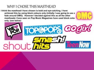
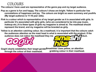
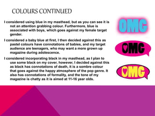
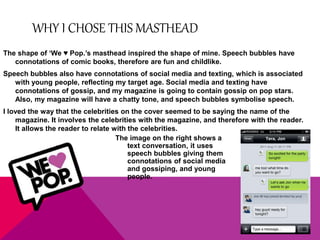
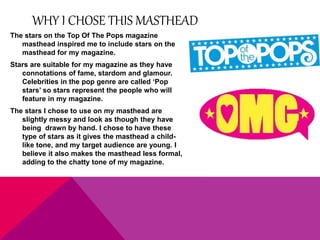
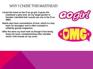
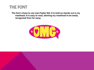
WHY I CHOSE THIS MASTHEAD 
I think the masthead I have chosen is bold and eye-catching. I have 
achieved this by using block colours only (initially I was going to use a 
fade around OMG). However I decided against this as all the other 
mastheads I have seen on Pop Music Magazines have used block colour 
only. (see below)
COLOURS 
The colours I have used are representative of the genre pop and my target audience. 
Pop as a genre is fun and happy. The colours I chose are bright. Yellow in particular has 
connotations of happiness and joy. The colours are bright so seem summery and youthful 
(My target audience is 11-16 year olds). 
Pink is a colour which is representative of my target gender as it is associated with girls. In 
particular it’s associated with girly girls, (who are considered to be into pop music, 
makeup etc.) It is these types of girls my magazine is aimed at. The masthead should 
represent the brand, and my magazine will be branded as girly. 
Yellow is an attention catching colour. As a masthead, it is important that the colours catch 
the audiences attention as the mast head is what is associated with the product. If the 
audience does not notice the masthead they may not recognise / buy the product. 
Smashhits! Uses yellow, an attention 
grabbing colour in their masthead. 
Gogirl clearly establishes their target gender 
through the colour of their masthead.
COLOURS CONTINUED 
I considered using blue in my masthead, but as you can see it is 
not an attention grabbing colour. Furthermore, blue is 
associated with boys, which goes against my female target 
gender. 
I considered a baby blue at first, I then decided against this as 
pastel colours have connotations of babies, and my target 
audience are teenagers, who may want a more grown up 
magazine during adolescence. 
I considered incorporating black in my masthead, as I plan to 
use some black on my cover, however, I decided against this 
as black has connotations of death, it is a sombre colour 
that goes against the happy atmosphere of the pop genre. It 
also has connotations of formality, and the tone of my 
magazine is chatty as it is aimed at 11-16 year olds.
WHY I CHOSE THIS MASTHEAD 
The shape of ‘We ♥ Pop.’s masthead inspired the shape of mine. Speech bubbles have 
connotations of comic books, therefore are fun and childlike. 
Speech bubbles also have connotations of social media and texting, which is associated 
with young people, reflecting my target age. Social media and texting have 
connotations of gossip, and my magazine is going to contain gossip on pop stars. 
Also, my magazine will have a chatty tone, and speech bubbles symbolise speech. 
I loved the way that the celebrities on the cover seemed to be saying the name of the 
magazine. It involves the celebrities with the magazine, and therefore with the reader. 
It allows the reader to relate with the celebrities. 
The image on the right shows a 
text conversation, it uses 
speech bubbles giving them 
connotations of social media 
and gossiping, and young 
people.
WHY I CHOSE THIS MASTHEAD 
The stars on the Top Of The Pops magazine 
masthead inspired me to include stars on the 
masthead for my magazine. 
Stars are suitable for my magazine as they have 
connotations of fame, stardom and glamour. 
Celebrities in the pop genre are called ‘Pop 
stars’ so stars represent the people who will 
feature in my magazine. 
The stars I chose to use on my masthead are 
slightly messy and look as though they have 
being drawn by hand. I chose to have these 
type of stars as it gives the masthead a child-like 
tone, and my target audience are young. I 
believe it also makes the masthead less formal, 
adding to the chatty tone of my magazine.
WHY I CHOSE THIS MASTHEAD 
I loved the heart on the O on go girl. It gives the 
masthead a girly tone. As my target gender is 
females I decided that I would use one in the O on 
OMG. 
Hearts also have connotations of love, which is a key 
topic for teenagers and is often included in 
celebrity gossip magazines. 
Alike the stars my heart look as though it has being 
drawn by hand, complementing other doodles 
which I will include on my cover.
THE FONT 
The font I chose to use was Poplar Std. It is bold so stands out in my 
masthead. It is easy to read, allowing my masthead to be easily 
recognised from far away.

My Masthead

  • 3.
    WHY I CHOSETHIS MASTHEAD I think the masthead I have chosen is bold and eye-catching. I have achieved this by using block colours only (initially I was going to use a fade around OMG). However I decided against this as all the other mastheads I have seen on Pop Music Magazines have used block colour only. (see below)
  • 4.
    COLOURS The coloursI have used are representative of the genre pop and my target audience. Pop as a genre is fun and happy. The colours I chose are bright. Yellow in particular has connotations of happiness and joy. The colours are bright so seem summery and youthful (My target audience is 11-16 year olds). Pink is a colour which is representative of my target gender as it is associated with girls. In particular it’s associated with girly girls, (who are considered to be into pop music, makeup etc.) It is these types of girls my magazine is aimed at. The masthead should represent the brand, and my magazine will be branded as girly. Yellow is an attention catching colour. As a masthead, it is important that the colours catch the audiences attention as the mast head is what is associated with the product. If the audience does not notice the masthead they may not recognise / buy the product. Smashhits! Uses yellow, an attention grabbing colour in their masthead. Gogirl clearly establishes their target gender through the colour of their masthead.
  • 5.
    COLOURS CONTINUED Iconsidered using blue in my masthead, but as you can see it is not an attention grabbing colour. Furthermore, blue is associated with boys, which goes against my female target gender. I considered a baby blue at first, I then decided against this as pastel colours have connotations of babies, and my target audience are teenagers, who may want a more grown up magazine during adolescence. I considered incorporating black in my masthead, as I plan to use some black on my cover, however, I decided against this as black has connotations of death, it is a sombre colour that goes against the happy atmosphere of the pop genre. It also has connotations of formality, and the tone of my magazine is chatty as it is aimed at 11-16 year olds.
  • 6.
    WHY I CHOSETHIS MASTHEAD The shape of ‘We ♥ Pop.’s masthead inspired the shape of mine. Speech bubbles have connotations of comic books, therefore are fun and childlike. Speech bubbles also have connotations of social media and texting, which is associated with young people, reflecting my target age. Social media and texting have connotations of gossip, and my magazine is going to contain gossip on pop stars. Also, my magazine will have a chatty tone, and speech bubbles symbolise speech. I loved the way that the celebrities on the cover seemed to be saying the name of the magazine. It involves the celebrities with the magazine, and therefore with the reader. It allows the reader to relate with the celebrities. The image on the right shows a text conversation, it uses speech bubbles giving them connotations of social media and gossiping, and young people.
  • 7.
    WHY I CHOSETHIS MASTHEAD The stars on the Top Of The Pops magazine masthead inspired me to include stars on the masthead for my magazine. Stars are suitable for my magazine as they have connotations of fame, stardom and glamour. Celebrities in the pop genre are called ‘Pop stars’ so stars represent the people who will feature in my magazine. The stars I chose to use on my masthead are slightly messy and look as though they have being drawn by hand. I chose to have these type of stars as it gives the masthead a child-like tone, and my target audience are young. I believe it also makes the masthead less formal, adding to the chatty tone of my magazine.
  • 8.
    WHY I CHOSETHIS MASTHEAD I loved the heart on the O on go girl. It gives the masthead a girly tone. As my target gender is females I decided that I would use one in the O on OMG. Hearts also have connotations of love, which is a key topic for teenagers and is often included in celebrity gossip magazines. Alike the stars my heart look as though it has being drawn by hand, complementing other doodles which I will include on my cover.
  • 9.
    THE FONT Thefont I chose to use was Poplar Std. It is bold so stands out in my masthead. It is easy to read, allowing my masthead to be easily recognised from far away.