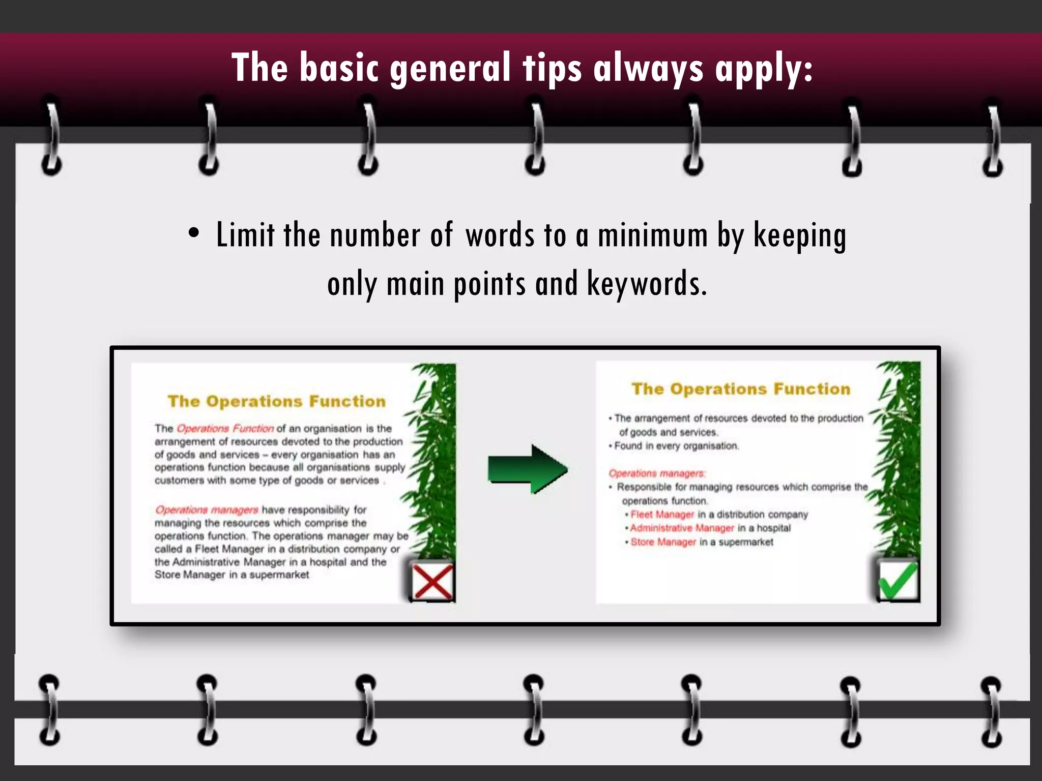
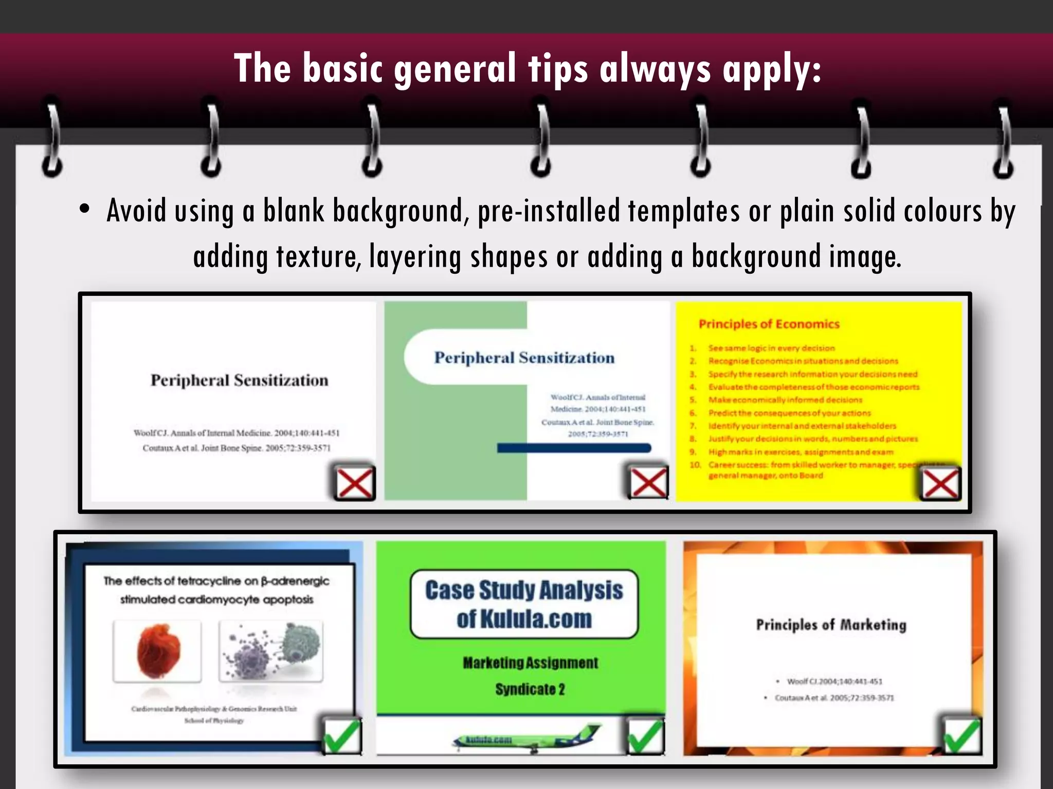
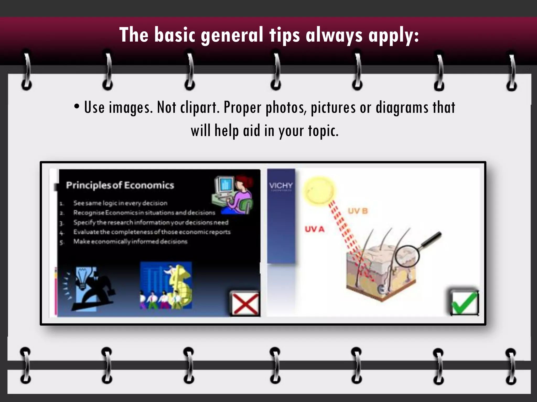
PowerPoint design tips to keep the student audience awake
The basic general tips always apply:


• Limit the number of words to a minimum by keeping
            only main points and keywords.
The basic general tips always apply:

• Avoid using a blank background, pre-installed templates or plain solid colours by
         adding texture, layering shapes or adding a background image.
The basic general tips always apply:

• Use images. Not clipart. Proper photos, pictures or diagrams that
                    will help aid in your topic.
For the business student:

  • Always keep a ‘clean space’ in the major part of the slides ie. Use a solid colour
background where your text and information is placed. Avoid placing lightened images
                                     behind text.
For the business student:


• Use SmartArt where appropriate.
For the science student:


• Avoid using busy templates or designs that will distract from your research.
For the science student:


• Use images and arrows rather than words to explain complicated processes.
For the science student:


• Avoid using complicated tables by making pie charts and graphs instead.
For the science student:


• When using graphs, the simpler the better. Don't add unnecessary 3D graphics, redundant
                 information or colours that may confuse the audience.
For the lecturer:

• Avoid using slides as a dumping zone for information by rather using animated diagrams,
                                 pictures and flow charts
For the lecturer:


• Students can’t multitask during lectures. Don’t expect them to take notes, read off of the
                         slides and listen to what you are saying.
  • Avoid providing handouts. Use slides as a graphic aid rather than a crutch for study
                                       material.
A design tip to remember:


If there are elements in another person's PowerPoint
presentation that put you to sleep or cause you to roll
    your eyes, DON'T add the same styles in your
                    presentation.
Visit my website at www.slideright.co.za to see more indepth
      • If there are elements in another person's PowerPoint presentation
    tips and tutorials on PowerPoint design for students.
      that put you to sleep or cause you to roll your eyes, DON'T add the
                       same styles in your presentation.

PowerPoint slide design tips for students and lecturers

  • 1.
    PowerPoint design tipsto keep the student audience awake
  • 2.
    The basic generaltips always apply: • Limit the number of words to a minimum by keeping only main points and keywords.
  • 3.
    The basic generaltips always apply: • Avoid using a blank background, pre-installed templates or plain solid colours by adding texture, layering shapes or adding a background image.
  • 4.
    The basic generaltips always apply: • Use images. Not clipart. Proper photos, pictures or diagrams that will help aid in your topic.
  • 5.
    For the businessstudent: • Always keep a ‘clean space’ in the major part of the slides ie. Use a solid colour background where your text and information is placed. Avoid placing lightened images behind text.
  • 6.
    For the businessstudent: • Use SmartArt where appropriate.
  • 7.
    For the sciencestudent: • Avoid using busy templates or designs that will distract from your research.
  • 8.
    For the sciencestudent: • Use images and arrows rather than words to explain complicated processes.
  • 9.
    For the sciencestudent: • Avoid using complicated tables by making pie charts and graphs instead.
  • 10.
    For the sciencestudent: • When using graphs, the simpler the better. Don't add unnecessary 3D graphics, redundant information or colours that may confuse the audience.
  • 11.
    For the lecturer: •Avoid using slides as a dumping zone for information by rather using animated diagrams, pictures and flow charts
  • 12.
    For the lecturer: •Students can’t multitask during lectures. Don’t expect them to take notes, read off of the slides and listen to what you are saying. • Avoid providing handouts. Use slides as a graphic aid rather than a crutch for study material.
  • 13.
    A design tipto remember: If there are elements in another person's PowerPoint presentation that put you to sleep or cause you to roll your eyes, DON'T add the same styles in your presentation.
  • 14.
    Visit my websiteat www.slideright.co.za to see more indepth • If there are elements in another person's PowerPoint presentation tips and tutorials on PowerPoint design for students. that put you to sleep or cause you to roll your eyes, DON'T add the same styles in your presentation.