SlideShare a Scribd company logo
Posters As can be seen around the outside, there are numerous music posters either just advertising the artist or advertising the artist and the latest album (e.g. Celine Dion, Killers).  Generally there is the use of the artist’s album cover used, and stretched, then the details written over it.  Other poster ideas include similar images to the album covers, so that it is even more recognised by the public, for instance, in the Kings of Leon poster, the way it has been edited with the four faces is similar to the album cover, as is the image of Madonna, where the disco ball is in every image with her to do with that album.  In this presentation you will be able to see my ideas on how I presented my poster and whether or not they fit the conventions. Followed by a survey of 100 people.
Attempt 1 Despite using Fireworks in my digipack, there were obviously some avenues I never explored, and at first I had no ideas as to what I could do for my poster design.  The first picture on the left shows an image of the female off the internet, as at that stage I did not have my own pictures.  With the outside of the first two images, I thought could be like a picture frame kind of feel, and then the colours used in the background I felt were relatively neutral.  The spotlight effect idea then originated from my digipack with the image used in the background of my front and back cover (treble clef kind of symbol).  I basically blurred this even more and began to mess with the saturation and thought that for my inside cover I might use two of the shapes, crossing over each other and each piece a different colour which created a flower kind of effect by just showing the tops of the shapes.  I thought because of using it in my inside cover, the link with the poster would be quite nice, however I felt that the star looked ‘plonked’ on there so I originated back to the navy blue background of the symbol that is on my front and back covers, which I actually thought in the end would be b a better idea as this would be seen by more people and so the link would be more evident.
Lighting swapped places. Attempt 2 The reason for the first image being on this slide, than the one before, despite it being the same design (bar the dots around the edge and a little more information), is that this enabled me to carry on with the idea of the colour scheme.  These ideas were made a while ago and carried a lot of thought throughout the development.  As can be seen already I was trying to design a more unconventional design to attract the audiences view that way and this lead me to the second image.  Where before I was trying to link my backgrounds to make the unconscious link to the album, this time I decided to connect the images, however, this was again to the inside cover where most people wouldn’t know the link, but due to Pixie Lott being famous, they should recognise the faces, despite only half being shown.  The middle part was then to write in bold the artist’s name and the tour dates, I also added two more ‘spotlights’ to brighten the navy up a little.  The navy was only used to link the colour used in the music symbol in the album covers, however after an attempt with her whole body split, I felt it did not reach what I had imagined and that she still looked ‘plonked’ onto the posters and would look ‘wishy washy’ against other posters.
Attempt 3 After the disaster with all the other mock ups, I began rethinking my ideas slightly as I still wanted the intertextuality to be seen and evident rather than a hidden link.  I then began to link all my ideas so far together, for instance, the smaller images featured in an L shape were the pictures where they had been cut, so only half of her face had been showing in two of the previous designs.  First I developed the images on the left, where there isn’t much difference between them bother, just the fact that there is more of a clear gap between the l-shaped images and the main one and that there is a background to the top image.  I thought as it looked so busy, that it would attract the audiences attention, and bombards the target audience with images of ‘Pixie Lott’ so could not notice who it was representing (as on some you can’t tell.)  Additionally, after reviewing more conventional ideas, I thought the box of details rather than just details floating around looked better, and also gave an indication of where it would possible to download/buy the song.  Moreover, to complete this I added a background to the main design and not just a plain colour as I thought it would be more eye catching if there was a pattern or difference, and the maroon colour used is the same as the colour font for my front cover. Also, instead of being completely conventional with my poster and just adding the image of the album cover as the top part of the poster, leaving out the smaller pictures, I decided to add more to the poster as can be seen and blurred all the images.  Moreover, the font used in the box at the bottom is the same as the front cover of the album, but then changes into an easier to read font but makes a bigger statement this way. The two posters on the right, though, are the same as the ones they are opposite to, on the left, but with no background which I felt did it more justice.  (The pink dotted outline on the posters on the right are just to show that there is a background, as evidently most of the outside of the poster wouldn’t show up on the top right.)
Box Nothing Box + background Attempt 4 In these next three posters you will see that there is some link to the last slide what with the bottom parts of the poster. The main reason for changing the layout of my poster (again) was because I felt that although it was unconventional and might be seen over others, there is some doubt as to whether this wouldn’t go the opposite way and people completely bypass it as it is too busy. One of the images that was used on the last lot of posters (in the l-shape) is now the main image, the only issue with this is that there is red eye that Fireworks will not cover up for some reason has it has on other occasions.  Overall though, I finally felt as though these designs fit the genre better and although there is only a slight difference between these three, there is a difference.  As they are labelled, it shows that the very top image has an outlined box with the information in, and also has a slight background to it.  The very bottom, however, has just the outline of the information box and the middle one has no background nor outline. Once again the dotted pink lines around the images are only there to prove there is a background to them. One major issue I had with these designs though, is that with ‘Cry Me Out’ being the album title and this poster is meant to be promoting it, I thought the image could confuse people as if there is a different image used to the album cover, then it usually has some link.  For example, on the front page of this slide, Madonna’s shows that there is the disco ball link, like in all of her music to do with a certain album.
Attempt 5 Due to my criticisms of the last three designs I then changed the main image over to the album cover to see how well that fitted, and found that I still liked these designs, the only issue I would have with these, is that on the middle one where there is a background and outline to the box, that there is too much of a similar design background as to the main image and makes you want to look away than closer.  It is now in the audience’s hands to decide the poster’s fates though as you can see on the next slide. Box Nothing Box + background
Poster 1 =  lllll lll = 8 Poster 2 = lllll lllll ll =12 Poster 3 =  lllll lll =8 Poster 4 =  lllll lllll lllll llll =19 Poster 5 = lllll lllll lllll lllll lllll lllll lllll ll = 37 Poster 6 lllll lllll lllll l =16 Survey of 100 Winner  Box Box + background Nothing Box Nothing Box + background

More Related Content

What's hot

Analyse magazine adverts or digipak
Analyse magazine adverts or digipakAnalyse magazine adverts or digipak
Analyse magazine adverts or digipak
shayward99
 
Photography planning
Photography planningPhotography planning
Photography planning
tashaay27
 
Inital digipak planning
Inital digipak planningInital digipak planning
Inital digipak planning
tashaay27
 
Digipak and magazine advert analysis
Digipak and magazine advert analysis Digipak and magazine advert analysis
Digipak and magazine advert analysis
godsell1999
 
Media A2 Coursework Q1
Media A2 Coursework Q1Media A2 Coursework Q1
Media A2 Coursework Q1
0118999
 
Digipack analysis1
Digipack analysis1Digipack analysis1
Digipack analysis1
pete_
 
Digipak analysis 1
Digipak analysis 1Digipak analysis 1
Digipak analysis 1
Dom Collins
 
How effective is the combination of your main product and acillary texts
How effective is the combination of your main product and acillary textsHow effective is the combination of your main product and acillary texts
How effective is the combination of your main product and acillary texts
tashaay27
 
Ancillary
Ancillary Ancillary
Ancillary
Chloe G
 
Evaluation 1.2
Evaluation 1.2Evaluation 1.2
Evaluation 1.2
Sophie Ratcliffe
 
Digipak analysis- florence and the machine
Digipak analysis- florence and the machineDigipak analysis- florence and the machine
Digipak analysis- florence and the machine
sammieharris
 
3. research(1)
3. research(1)3. research(1)
3. research(1)
Josh Brownsword
 
Step by step costruction of media products
Step by step costruction of media products Step by step costruction of media products
Step by step costruction of media products
godsell1999
 
Digipak and Magazine Advert improvments
Digipak and Magazine Advert improvments Digipak and Magazine Advert improvments
Digipak and Magazine Advert improvments
godsell1999
 
Magazine Advert Analysis
Magazine Advert AnalysisMagazine Advert Analysis
Magazine Advert Analysis
Tom Ibbott
 
Textual Analysis of Magazine Adverts
Textual Analysis of Magazine AdvertsTextual Analysis of Magazine Adverts
Textual Analysis of Magazine Adverts
Rob Glover
 
How effective is the combination of your main
How effective is the combination of your mainHow effective is the combination of your main
How effective is the combination of your main
LukeTiplady1998
 
Digipack analysis no1 improved
Digipack analysis no1 improvedDigipack analysis no1 improved
Digipack analysis no1 improved
DrSips
 
Digipak Analysis
Digipak Analysis Digipak Analysis
Digipak Analysis
Rob Glover
 
Eval 2
Eval 2Eval 2

What's hot (20)

Analyse magazine adverts or digipak
Analyse magazine adverts or digipakAnalyse magazine adverts or digipak
Analyse magazine adverts or digipak
 
Photography planning
Photography planningPhotography planning
Photography planning
 
Inital digipak planning
Inital digipak planningInital digipak planning
Inital digipak planning
 
Digipak and magazine advert analysis
Digipak and magazine advert analysis Digipak and magazine advert analysis
Digipak and magazine advert analysis
 
Media A2 Coursework Q1
Media A2 Coursework Q1Media A2 Coursework Q1
Media A2 Coursework Q1
 
Digipack analysis1
Digipack analysis1Digipack analysis1
Digipack analysis1
 
Digipak analysis 1
Digipak analysis 1Digipak analysis 1
Digipak analysis 1
 
How effective is the combination of your main product and acillary texts
How effective is the combination of your main product and acillary textsHow effective is the combination of your main product and acillary texts
How effective is the combination of your main product and acillary texts
 
Ancillary
Ancillary Ancillary
Ancillary
 
Evaluation 1.2
Evaluation 1.2Evaluation 1.2
Evaluation 1.2
 
Digipak analysis- florence and the machine
Digipak analysis- florence and the machineDigipak analysis- florence and the machine
Digipak analysis- florence and the machine
 
3. research(1)
3. research(1)3. research(1)
3. research(1)
 
Step by step costruction of media products
Step by step costruction of media products Step by step costruction of media products
Step by step costruction of media products
 
Digipak and Magazine Advert improvments
Digipak and Magazine Advert improvments Digipak and Magazine Advert improvments
Digipak and Magazine Advert improvments
 
Magazine Advert Analysis
Magazine Advert AnalysisMagazine Advert Analysis
Magazine Advert Analysis
 
Textual Analysis of Magazine Adverts
Textual Analysis of Magazine AdvertsTextual Analysis of Magazine Adverts
Textual Analysis of Magazine Adverts
 
How effective is the combination of your main
How effective is the combination of your mainHow effective is the combination of your main
How effective is the combination of your main
 
Digipack analysis no1 improved
Digipack analysis no1 improvedDigipack analysis no1 improved
Digipack analysis no1 improved
 
Digipak Analysis
Digipak Analysis Digipak Analysis
Digipak Analysis
 
Eval 2
Eval 2Eval 2
Eval 2
 

Similar to Mock Up Posters and Final!

Presentation of mock up and final cover
Presentation of mock up and final coverPresentation of mock up and final cover
Presentation of mock up and final cover
Lauz_xOx
 
6. fmp production reflection
6. fmp production reflection6. fmp production reflection
6. fmp production reflection
chrislaw34
 
Digipak ideas
Digipak ideasDigipak ideas
Digipak ideas
TonishaMedia
 
Fanzine- Research
Fanzine- ResearchFanzine- Research
Fanzine- Research
aliceleeman
 
Digipak ideas
Digipak ideasDigipak ideas
Digipak ideas
TonishaMedia
 
Print production analysis
Print production analysisPrint production analysis
Print production analysis
Harry Ames
 
Print production analysis
Print production analysisPrint production analysis
Print production analysis
Harry Ames
 
Digipack presentation
Digipack presentationDigipack presentation
Digipack presentation
ABM06
 
How effective is the combination of your main product and ancillary texts?
How effective is the combination of your main product and ancillary texts?How effective is the combination of your main product and ancillary texts?
How effective is the combination of your main product and ancillary texts?
adamcunliffe
 
Digipack presentation
Digipack presentation Digipack presentation
Digipack presentation
Nikachu
 
In what ways does your media product use, develop or challenge forms and conv...
In what ways does your media product use, develop or challenge forms and conv...In what ways does your media product use, develop or challenge forms and conv...
In what ways does your media product use, develop or challenge forms and conv...
Josh Brett
 
Album cover evaluation
Album cover evaluationAlbum cover evaluation
Album cover evaluation
JamesGamesStudios
 
Album cover final evaluation
Album cover final evaluationAlbum cover final evaluation
Album cover final evaluation
JamesGamesStudios
 
Front cover Production Log
Front cover Production LogFront cover Production Log
Front cover Production Log
tessfizzy
 
Production log 1 [repaired]
Production log 1 [repaired]Production log 1 [repaired]
Production log 1 [repaired]
tessfizzy
 
Front Cover Production Log
Front Cover Production LogFront Cover Production Log
Front Cover Production Log
tessfizzy
 
Evaluation: Question 2
Evaluation: Question 2Evaluation: Question 2
Evaluation: Question 2
LouiseJHudson
 
Digipak research + planning
Digipak research + planningDigipak research + planning
Digipak research + planning
TonishaMedia
 
Section 10 evaluation
Section 10 evaluationSection 10 evaluation
Section 10 evaluation
joshuacalver118
 
Magazine adverts research
Magazine adverts researchMagazine adverts research
Magazine adverts research
george2v
 

Similar to Mock Up Posters and Final! (20)

Presentation of mock up and final cover
Presentation of mock up and final coverPresentation of mock up and final cover
Presentation of mock up and final cover
 
6. fmp production reflection
6. fmp production reflection6. fmp production reflection
6. fmp production reflection
 
Digipak ideas
Digipak ideasDigipak ideas
Digipak ideas
 
Fanzine- Research
Fanzine- ResearchFanzine- Research
Fanzine- Research
 
Digipak ideas
Digipak ideasDigipak ideas
Digipak ideas
 
Print production analysis
Print production analysisPrint production analysis
Print production analysis
 
Print production analysis
Print production analysisPrint production analysis
Print production analysis
 
Digipack presentation
Digipack presentationDigipack presentation
Digipack presentation
 
How effective is the combination of your main product and ancillary texts?
How effective is the combination of your main product and ancillary texts?How effective is the combination of your main product and ancillary texts?
How effective is the combination of your main product and ancillary texts?
 
Digipack presentation
Digipack presentation Digipack presentation
Digipack presentation
 
In what ways does your media product use, develop or challenge forms and conv...
In what ways does your media product use, develop or challenge forms and conv...In what ways does your media product use, develop or challenge forms and conv...
In what ways does your media product use, develop or challenge forms and conv...
 
Album cover evaluation
Album cover evaluationAlbum cover evaluation
Album cover evaluation
 
Album cover final evaluation
Album cover final evaluationAlbum cover final evaluation
Album cover final evaluation
 
Front cover Production Log
Front cover Production LogFront cover Production Log
Front cover Production Log
 
Production log 1 [repaired]
Production log 1 [repaired]Production log 1 [repaired]
Production log 1 [repaired]
 
Front Cover Production Log
Front Cover Production LogFront Cover Production Log
Front Cover Production Log
 
Evaluation: Question 2
Evaluation: Question 2Evaluation: Question 2
Evaluation: Question 2
 
Digipak research + planning
Digipak research + planningDigipak research + planning
Digipak research + planning
 
Section 10 evaluation
Section 10 evaluationSection 10 evaluation
Section 10 evaluation
 
Magazine adverts research
Magazine adverts researchMagazine adverts research
Magazine adverts research
 

More from Lauz_xOx

Evaluation and final products
Evaluation and final productsEvaluation and final products
Evaluation and final products
Lauz_xOx
 
Powerpoint (1)
Powerpoint (1)Powerpoint (1)
Powerpoint (1)
Lauz_xOx
 
Storyboard - handdrawn
Storyboard - handdrawnStoryboard - handdrawn
Storyboard - handdrawn
Lauz_xOx
 
Storyboard
StoryboardStoryboard
Storyboard
Lauz_xOx
 
Albums[1]
Albums[1]Albums[1]
Albums[1]
Lauz_xOx
 
Posters
PostersPosters
Posters
Lauz_xOx
 
Alphabeat Digipack
Alphabeat DigipackAlphabeat Digipack
Alphabeat Digipack
Lauz_xOx
 
Christina Aguilera Digipack
Christina Aguilera DigipackChristina Aguilera Digipack
Christina Aguilera Digipack
Lauz_xOx
 
Lily Allen
Lily AllenLily Allen
Lily Allen
Lauz_xOx
 
Lily Allen
Lily AllenLily Allen
Lily Allen
Lauz_xOx
 
Green Day
Green DayGreen Day
Green Day
Lauz_xOx
 
Mika
MikaMika
Mika
Lauz_xOx
 
Mika
MikaMika
Mika
Lauz_xOx
 
Schedule
ScheduleSchedule
Schedule
Lauz_xOx
 
Green Day
Green DayGreen Day
Green Day
Lauz_xOx
 
Schedule
ScheduleSchedule
Schedule
Lauz_xOx
 

More from Lauz_xOx (16)

Evaluation and final products
Evaluation and final productsEvaluation and final products
Evaluation and final products
 
Powerpoint (1)
Powerpoint (1)Powerpoint (1)
Powerpoint (1)
 
Storyboard - handdrawn
Storyboard - handdrawnStoryboard - handdrawn
Storyboard - handdrawn
 
Storyboard
StoryboardStoryboard
Storyboard
 
Albums[1]
Albums[1]Albums[1]
Albums[1]
 
Posters
PostersPosters
Posters
 
Alphabeat Digipack
Alphabeat DigipackAlphabeat Digipack
Alphabeat Digipack
 
Christina Aguilera Digipack
Christina Aguilera DigipackChristina Aguilera Digipack
Christina Aguilera Digipack
 
Lily Allen
Lily AllenLily Allen
Lily Allen
 
Lily Allen
Lily AllenLily Allen
Lily Allen
 
Green Day
Green DayGreen Day
Green Day
 
Mika
MikaMika
Mika
 
Mika
MikaMika
Mika
 
Schedule
ScheduleSchedule
Schedule
 
Green Day
Green DayGreen Day
Green Day
 
Schedule
ScheduleSchedule
Schedule
 

Recently uploaded

定制(mu毕业证书)美国迈阿密大学牛津分校毕业证学历证书原版一模一样
定制(mu毕业证书)美国迈阿密大学牛津分校毕业证学历证书原版一模一样定制(mu毕业证书)美国迈阿密大学牛津分校毕业证学历证书原版一模一样
定制(mu毕业证书)美国迈阿密大学牛津分校毕业证学历证书原版一模一样
x0l4b5ho
 
The Enigma of the Midnight Canvas, In the heart of Paris
The Enigma of the Midnight Canvas, In the heart of ParisThe Enigma of the Midnight Canvas, In the heart of Paris
The Enigma of the Midnight Canvas, In the heart of Paris
John Emmett
 
定制(uow毕业证书)卧龙岗大学毕业证文凭学位证书原版一模一样
定制(uow毕业证书)卧龙岗大学毕业证文凭学位证书原版一模一样定制(uow毕业证书)卧龙岗大学毕业证文凭学位证书原版一模一样
定制(uow毕业证书)卧龙岗大学毕业证文凭学位证书原版一模一样
0md20cgg
 
原版制作(MUN毕业证书)纽芬兰纪念大学毕业证PDF成绩单一模一样
原版制作(MUN毕业证书)纽芬兰纪念大学毕业证PDF成绩单一模一样原版制作(MUN毕业证书)纽芬兰纪念大学毕业证PDF成绩单一模一样
原版制作(MUN毕业证书)纽芬兰纪念大学毕业证PDF成绩单一模一样
sh8tjqt6
 
Anasuya Sengupta Cannes 2024 Award Winner
Anasuya Sengupta Cannes 2024 Award WinnerAnasuya Sengupta Cannes 2024 Award Winner
Anasuya Sengupta Cannes 2024 Award Winner
Diwitya Bajwa
 
The Gallery of Shadows, In the heart of a bustling city
The Gallery of Shadows, In the heart of a bustling cityThe Gallery of Shadows, In the heart of a bustling city
The Gallery of Shadows, In the heart of a bustling city
John Emmett
 
The Enigmatic Portrait, In the heart of a sleepy town
The Enigmatic Portrait, In the heart of a sleepy townThe Enigmatic Portrait, In the heart of a sleepy town
The Enigmatic Portrait, In the heart of a sleepy town
John Emmett
 
Leonardo DiCaprio Super Bowl: Hollywood Meets America’s Favorite Game
Leonardo DiCaprio Super Bowl: Hollywood Meets America’s Favorite GameLeonardo DiCaprio Super Bowl: Hollywood Meets America’s Favorite Game
Leonardo DiCaprio Super Bowl: Hollywood Meets America’s Favorite Game
greendigital
 
Leonardo DiCaprio House: A Journey Through His Extravagant Real Estate Portfolio
Leonardo DiCaprio House: A Journey Through His Extravagant Real Estate PortfolioLeonardo DiCaprio House: A Journey Through His Extravagant Real Estate Portfolio
Leonardo DiCaprio House: A Journey Through His Extravagant Real Estate Portfolio
greendigital
 
The Future of Independent Filmmaking Trends and Job Opportunities
The Future of Independent Filmmaking Trends and Job OpportunitiesThe Future of Independent Filmmaking Trends and Job Opportunities
The Future of Independent Filmmaking Trends and Job Opportunities
LetsFAME
 
Divertidamente SLIDE muito lindo e criativo, pptx
Divertidamente SLIDE muito lindo e criativo, pptxDivertidamente SLIDE muito lindo e criativo, pptx
Divertidamente SLIDE muito lindo e criativo, pptx
lunaemel03
 
原版制作(Mercer毕业证书)摩斯大学毕业证在读证明一模一样
原版制作(Mercer毕业证书)摩斯大学毕业证在读证明一模一样原版制作(Mercer毕业证书)摩斯大学毕业证在读证明一模一样
原版制作(Mercer毕业证书)摩斯大学毕业证在读证明一模一样
mul1kv5w
 
Odia New Web Series at your fingerprint.
Odia New Web Series at your fingerprint.Odia New Web Series at your fingerprint.
Odia New Web Series at your fingerprint.
mikedanoffice
 
From Teacher to OnlyFans: Brianna Coppage's Story at 28
From Teacher to OnlyFans: Brianna Coppage's Story at 28From Teacher to OnlyFans: Brianna Coppage's Story at 28
From Teacher to OnlyFans: Brianna Coppage's Story at 28
get joys
 
From Swing Music to Big Band Fame_ 5 Iconic Artists.pptx
From Swing Music to Big Band Fame_ 5 Iconic Artists.pptxFrom Swing Music to Big Band Fame_ 5 Iconic Artists.pptx
From Swing Music to Big Band Fame_ 5 Iconic Artists.pptx
Swing Street Radio
 
一比一原版(UCSF毕业证)旧金山分校毕业证如何办理
一比一原版(UCSF毕业证)旧金山分校毕业证如何办理一比一原版(UCSF毕业证)旧金山分校毕业证如何办理
一比一原版(UCSF毕业证)旧金山分校毕业证如何办理
ytunuq
 
The Evolution of the Leonardo DiCaprio Haircut: A Journey Through Style and C...
The Evolution of the Leonardo DiCaprio Haircut: A Journey Through Style and C...The Evolution of the Leonardo DiCaprio Haircut: A Journey Through Style and C...
The Evolution of the Leonardo DiCaprio Haircut: A Journey Through Style and C...
greendigital
 
University of Western Sydney degree offer diploma Transcript
University of Western Sydney degree offer diploma TranscriptUniversity of Western Sydney degree offer diploma Transcript
University of Western Sydney degree offer diploma Transcript
soxrziqu
 
一比一原版(AUT毕业证)奥克兰理工大学毕业证如何办理
一比一原版(AUT毕业证)奥克兰理工大学毕业证如何办理一比一原版(AUT毕业证)奥克兰理工大学毕业证如何办理
一比一原版(AUT毕业证)奥克兰理工大学毕业证如何办理
etycev
 
Abraham Laboriel Records ‘The Bass Walk’ at Evergreen Stage
Abraham Laboriel Records ‘The Bass Walk’ at Evergreen StageAbraham Laboriel Records ‘The Bass Walk’ at Evergreen Stage
Abraham Laboriel Records ‘The Bass Walk’ at Evergreen Stage
DiaDan Holdings Ltd
 

Recently uploaded (20)

定制(mu毕业证书)美国迈阿密大学牛津分校毕业证学历证书原版一模一样
定制(mu毕业证书)美国迈阿密大学牛津分校毕业证学历证书原版一模一样定制(mu毕业证书)美国迈阿密大学牛津分校毕业证学历证书原版一模一样
定制(mu毕业证书)美国迈阿密大学牛津分校毕业证学历证书原版一模一样
 
The Enigma of the Midnight Canvas, In the heart of Paris
The Enigma of the Midnight Canvas, In the heart of ParisThe Enigma of the Midnight Canvas, In the heart of Paris
The Enigma of the Midnight Canvas, In the heart of Paris
 
定制(uow毕业证书)卧龙岗大学毕业证文凭学位证书原版一模一样
定制(uow毕业证书)卧龙岗大学毕业证文凭学位证书原版一模一样定制(uow毕业证书)卧龙岗大学毕业证文凭学位证书原版一模一样
定制(uow毕业证书)卧龙岗大学毕业证文凭学位证书原版一模一样
 
原版制作(MUN毕业证书)纽芬兰纪念大学毕业证PDF成绩单一模一样
原版制作(MUN毕业证书)纽芬兰纪念大学毕业证PDF成绩单一模一样原版制作(MUN毕业证书)纽芬兰纪念大学毕业证PDF成绩单一模一样
原版制作(MUN毕业证书)纽芬兰纪念大学毕业证PDF成绩单一模一样
 
Anasuya Sengupta Cannes 2024 Award Winner
Anasuya Sengupta Cannes 2024 Award WinnerAnasuya Sengupta Cannes 2024 Award Winner
Anasuya Sengupta Cannes 2024 Award Winner
 
The Gallery of Shadows, In the heart of a bustling city
The Gallery of Shadows, In the heart of a bustling cityThe Gallery of Shadows, In the heart of a bustling city
The Gallery of Shadows, In the heart of a bustling city
 
The Enigmatic Portrait, In the heart of a sleepy town
The Enigmatic Portrait, In the heart of a sleepy townThe Enigmatic Portrait, In the heart of a sleepy town
The Enigmatic Portrait, In the heart of a sleepy town
 
Leonardo DiCaprio Super Bowl: Hollywood Meets America’s Favorite Game
Leonardo DiCaprio Super Bowl: Hollywood Meets America’s Favorite GameLeonardo DiCaprio Super Bowl: Hollywood Meets America’s Favorite Game
Leonardo DiCaprio Super Bowl: Hollywood Meets America’s Favorite Game
 
Leonardo DiCaprio House: A Journey Through His Extravagant Real Estate Portfolio
Leonardo DiCaprio House: A Journey Through His Extravagant Real Estate PortfolioLeonardo DiCaprio House: A Journey Through His Extravagant Real Estate Portfolio
Leonardo DiCaprio House: A Journey Through His Extravagant Real Estate Portfolio
 
The Future of Independent Filmmaking Trends and Job Opportunities
The Future of Independent Filmmaking Trends and Job OpportunitiesThe Future of Independent Filmmaking Trends and Job Opportunities
The Future of Independent Filmmaking Trends and Job Opportunities
 
Divertidamente SLIDE muito lindo e criativo, pptx
Divertidamente SLIDE muito lindo e criativo, pptxDivertidamente SLIDE muito lindo e criativo, pptx
Divertidamente SLIDE muito lindo e criativo, pptx
 
原版制作(Mercer毕业证书)摩斯大学毕业证在读证明一模一样
原版制作(Mercer毕业证书)摩斯大学毕业证在读证明一模一样原版制作(Mercer毕业证书)摩斯大学毕业证在读证明一模一样
原版制作(Mercer毕业证书)摩斯大学毕业证在读证明一模一样
 
Odia New Web Series at your fingerprint.
Odia New Web Series at your fingerprint.Odia New Web Series at your fingerprint.
Odia New Web Series at your fingerprint.
 
From Teacher to OnlyFans: Brianna Coppage's Story at 28
From Teacher to OnlyFans: Brianna Coppage's Story at 28From Teacher to OnlyFans: Brianna Coppage's Story at 28
From Teacher to OnlyFans: Brianna Coppage's Story at 28
 
From Swing Music to Big Band Fame_ 5 Iconic Artists.pptx
From Swing Music to Big Band Fame_ 5 Iconic Artists.pptxFrom Swing Music to Big Band Fame_ 5 Iconic Artists.pptx
From Swing Music to Big Band Fame_ 5 Iconic Artists.pptx
 
一比一原版(UCSF毕业证)旧金山分校毕业证如何办理
一比一原版(UCSF毕业证)旧金山分校毕业证如何办理一比一原版(UCSF毕业证)旧金山分校毕业证如何办理
一比一原版(UCSF毕业证)旧金山分校毕业证如何办理
 
The Evolution of the Leonardo DiCaprio Haircut: A Journey Through Style and C...
The Evolution of the Leonardo DiCaprio Haircut: A Journey Through Style and C...The Evolution of the Leonardo DiCaprio Haircut: A Journey Through Style and C...
The Evolution of the Leonardo DiCaprio Haircut: A Journey Through Style and C...
 
University of Western Sydney degree offer diploma Transcript
University of Western Sydney degree offer diploma TranscriptUniversity of Western Sydney degree offer diploma Transcript
University of Western Sydney degree offer diploma Transcript
 
一比一原版(AUT毕业证)奥克兰理工大学毕业证如何办理
一比一原版(AUT毕业证)奥克兰理工大学毕业证如何办理一比一原版(AUT毕业证)奥克兰理工大学毕业证如何办理
一比一原版(AUT毕业证)奥克兰理工大学毕业证如何办理
 
Abraham Laboriel Records ‘The Bass Walk’ at Evergreen Stage
Abraham Laboriel Records ‘The Bass Walk’ at Evergreen StageAbraham Laboriel Records ‘The Bass Walk’ at Evergreen Stage
Abraham Laboriel Records ‘The Bass Walk’ at Evergreen Stage
 

Mock Up Posters and Final!

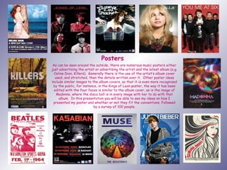
  • 1. Posters As can be seen around the outside, there are numerous music posters either just advertising the artist or advertising the artist and the latest album (e.g. Celine Dion, Killers). Generally there is the use of the artist’s album cover used, and stretched, then the details written over it. Other poster ideas include similar images to the album covers, so that it is even more recognised by the public, for instance, in the Kings of Leon poster, the way it has been edited with the four faces is similar to the album cover, as is the image of Madonna, where the disco ball is in every image with her to do with that album. In this presentation you will be able to see my ideas on how I presented my poster and whether or not they fit the conventions. Followed by a survey of 100 people.
  • 2. Attempt 1 Despite using Fireworks in my digipack, there were obviously some avenues I never explored, and at first I had no ideas as to what I could do for my poster design. The first picture on the left shows an image of the female off the internet, as at that stage I did not have my own pictures. With the outside of the first two images, I thought could be like a picture frame kind of feel, and then the colours used in the background I felt were relatively neutral. The spotlight effect idea then originated from my digipack with the image used in the background of my front and back cover (treble clef kind of symbol). I basically blurred this even more and began to mess with the saturation and thought that for my inside cover I might use two of the shapes, crossing over each other and each piece a different colour which created a flower kind of effect by just showing the tops of the shapes. I thought because of using it in my inside cover, the link with the poster would be quite nice, however I felt that the star looked ‘plonked’ on there so I originated back to the navy blue background of the symbol that is on my front and back covers, which I actually thought in the end would be b a better idea as this would be seen by more people and so the link would be more evident.
  • 3. Lighting swapped places. Attempt 2 The reason for the first image being on this slide, than the one before, despite it being the same design (bar the dots around the edge and a little more information), is that this enabled me to carry on with the idea of the colour scheme. These ideas were made a while ago and carried a lot of thought throughout the development. As can be seen already I was trying to design a more unconventional design to attract the audiences view that way and this lead me to the second image. Where before I was trying to link my backgrounds to make the unconscious link to the album, this time I decided to connect the images, however, this was again to the inside cover where most people wouldn’t know the link, but due to Pixie Lott being famous, they should recognise the faces, despite only half being shown. The middle part was then to write in bold the artist’s name and the tour dates, I also added two more ‘spotlights’ to brighten the navy up a little. The navy was only used to link the colour used in the music symbol in the album covers, however after an attempt with her whole body split, I felt it did not reach what I had imagined and that she still looked ‘plonked’ onto the posters and would look ‘wishy washy’ against other posters.
  • 4. Attempt 3 After the disaster with all the other mock ups, I began rethinking my ideas slightly as I still wanted the intertextuality to be seen and evident rather than a hidden link. I then began to link all my ideas so far together, for instance, the smaller images featured in an L shape were the pictures where they had been cut, so only half of her face had been showing in two of the previous designs. First I developed the images on the left, where there isn’t much difference between them bother, just the fact that there is more of a clear gap between the l-shaped images and the main one and that there is a background to the top image. I thought as it looked so busy, that it would attract the audiences attention, and bombards the target audience with images of ‘Pixie Lott’ so could not notice who it was representing (as on some you can’t tell.) Additionally, after reviewing more conventional ideas, I thought the box of details rather than just details floating around looked better, and also gave an indication of where it would possible to download/buy the song. Moreover, to complete this I added a background to the main design and not just a plain colour as I thought it would be more eye catching if there was a pattern or difference, and the maroon colour used is the same as the colour font for my front cover. Also, instead of being completely conventional with my poster and just adding the image of the album cover as the top part of the poster, leaving out the smaller pictures, I decided to add more to the poster as can be seen and blurred all the images. Moreover, the font used in the box at the bottom is the same as the front cover of the album, but then changes into an easier to read font but makes a bigger statement this way. The two posters on the right, though, are the same as the ones they are opposite to, on the left, but with no background which I felt did it more justice. (The pink dotted outline on the posters on the right are just to show that there is a background, as evidently most of the outside of the poster wouldn’t show up on the top right.)
  • 5. Box Nothing Box + background Attempt 4 In these next three posters you will see that there is some link to the last slide what with the bottom parts of the poster. The main reason for changing the layout of my poster (again) was because I felt that although it was unconventional and might be seen over others, there is some doubt as to whether this wouldn’t go the opposite way and people completely bypass it as it is too busy. One of the images that was used on the last lot of posters (in the l-shape) is now the main image, the only issue with this is that there is red eye that Fireworks will not cover up for some reason has it has on other occasions. Overall though, I finally felt as though these designs fit the genre better and although there is only a slight difference between these three, there is a difference. As they are labelled, it shows that the very top image has an outlined box with the information in, and also has a slight background to it. The very bottom, however, has just the outline of the information box and the middle one has no background nor outline. Once again the dotted pink lines around the images are only there to prove there is a background to them. One major issue I had with these designs though, is that with ‘Cry Me Out’ being the album title and this poster is meant to be promoting it, I thought the image could confuse people as if there is a different image used to the album cover, then it usually has some link. For example, on the front page of this slide, Madonna’s shows that there is the disco ball link, like in all of her music to do with a certain album.
  • 6. Attempt 5 Due to my criticisms of the last three designs I then changed the main image over to the album cover to see how well that fitted, and found that I still liked these designs, the only issue I would have with these, is that on the middle one where there is a background and outline to the box, that there is too much of a similar design background as to the main image and makes you want to look away than closer. It is now in the audience’s hands to decide the poster’s fates though as you can see on the next slide. Box Nothing Box + background
  • 7. Poster 1 = lllll lll = 8 Poster 2 = lllll lllll ll =12 Poster 3 = lllll lll =8 Poster 4 = lllll lllll lllll llll =19 Poster 5 = lllll lllll lllll lllll lllll lllll lllll ll = 37 Poster 6 lllll lllll lllll l =16 Survey of 100 Winner Box Box + background Nothing Box Nothing Box + background