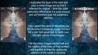
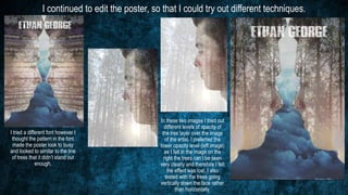
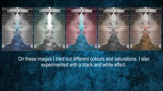
The document describes the process of creating a digipak poster in Photoshop. It discusses:
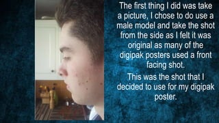
1) Taking a side profile photo of a male model to use as the base image.
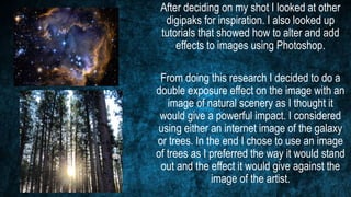
2) Researching other digipaks for inspiration and learning double exposure techniques in Photoshop.
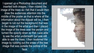
3) Creating a double exposure effect by overlaying an image of trees onto the model's photo at low opacity to see him underneath.
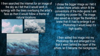
4) Adding a sky image as the background to create a natural theme that works with the overlaying trees.