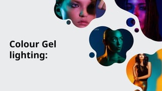
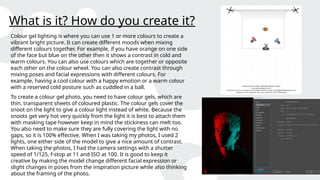
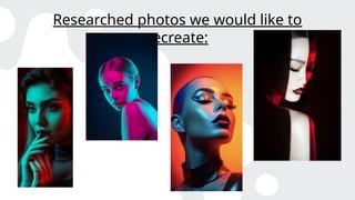
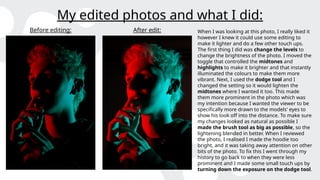
Colour Gel
lighting:
What is it? How do you create it?
Colour gel lighting is where you can use 1 or more colours to create a
vibrant bright picture. It can create different moods when mixing
different colours together. For example, if you have orange on one side
of the face but blue on the other then it shows a contrast in cold and
warm colours. You can also use colours which are together or opposite
each other on the colour wheel. You can also create contrast through
mixing poses and facial expressions with different colours. For
example, having a cool colour with a happy emotion or a warm colour
with a reserved cold posture such as cuddled in a ball.
To create a colour gel photo, you need to have colour gels, which are
thin, transparent sheets of coloured plastic. The colour gels cover the
snoot on the light to give a colour light instead of white. Because the
snoots get very hot very quickly from the light it is best to attach them
with masking tape however keep in mind the stickiness can melt too.
You also need to make sure they are fully covering the light with no
gaps, so it is 100% effective. When I was taking my photos, I used 2
lights, one either side of the model to give a nice amount of contrast.
When taking the photos, I had the camera settings with a shutter
speed of 1/125, f-stop at 11 and ISO at 100. It is good to keep it
creative by making the model change different facial expression or
slight changes in poses from the inspiration picture while also thinking
about the framing of the photo.
Research- Petra Collins:
When I was looking at different colour gel photographers work, Petra Collins
work really stood out to me. The first picture really appealed to me because of
the contrast between the warm lighting to the sad emotions on the models
face. The yellow and orange coming from both sides really illuminates the
models face however on the other hand it allows you to see tears in the models'
eyes making us persevere them as sad even amongst the warm colours. I also
like the fact that the model isn’t looking at the camera as it gives us the
perspective that the photographer isn’t there and it's just them and their
thoughts. I think this photo was taken with 2 different lights. One in front of the
model to the left of camera pointing towards the left side of the models face. I
think this light had yellow colour gels on it. The second light, having the orange
colour gels on it was to the right of the camera pointing just off the models face
so it doesn’t illuminate the left of the models face.
I really like this second photo because of the contrast of the pink and green. I
think what makes this photo stand out so much is the fact that pink and green
are on different sides of the colour wheel, so they contrast but also match
together really well. I also like the blank expression on the models face because
it makes you wonder what they are thinking, and the contrast makes you
question if they are having a conflict or contradicting thoughts. I think this
photo was created with 2 lights again with 1 light on the left side of the camera
with the pink colour gels, facing the side of the model but in front of them. The
second light which has the green colour gels on it may be a bit further forward
then the first as the model's head is tilted but in front facing towards them.
Research- Scott Bernard:
When I was researching Scott Bernard, I liked a lot of his colour gels however these
2 stood out the most to me. The first one stood out because of the cold blue tint on
most of the model but then the slight red colouring on the right-hand side. The
blue tint is very subtle almost hidden which indicates to me that there is a hidden
message in the photo like a hidden sadness within the model. I also like the red on
the side as it shows there may be a hidden anger within the model too. The yellow
background could also suggest a sense of happiness that is behind the model. I
interpret this as the yellow/happiness may be coming in the distant future. I think
this photo was created by having 2 lights behind the model which had yellow tints
on them to light up the background, a light with a blue tint relatively in front of the
model but to their right and then a light with a red tint to their left but directly to
the side so only the shoulder and the side of the face is lit up.
The second photo caught my eye because of how vibrant it is. I really like the way
the blue and the red contrast each other. I like that the red and blue is separated by
the shadow down the middle of the face. It shows how red and blue are not
together on the colour wheel and how they represent contrasting emotions. I also
like where they sit on the face with the red being hidden more into the background
and the blue catching my eye first. I think this was made with 2 different lights. One
being to the right of the model with the blue tint and the other being to the left of
the model with a red tint but is facing further behind the model to only show on a
bit of the face.
Researched photos we would like to
recreate:
Researched photos I recreated:
My unedited shots:
My edited photos and what I did:
Before editing: After edit:
When I was looking at all the photos that I
had taken, I really liked this one because
of how the colours and the background
contrasted each other so much. For
example, the cold blue on the left side of
his face could represent sadness or
resentment and the warm red could
indicate love or happiness and the dark
red in the background could mean anger
and hatred. I think the dark background
really allows the colours on the face to be
a lot more vibrant then if it was just a
white background. When I went to edit this
photo, I knew I didn’t want to change very
much however I moved the levels on the
white marker to make the colours a bit
more prominent. I also used the dodge
tool to lighten up around his eyes as I felt
they were starting to get a bit lost and I
used the burn tool to darken his hoodie
and get rid of the pattern so the eye wasn’t
My edited photos and what I did:
Before editing: After edit:
When I was reviewing this photo, I was
happy with the outcome of the shoot
because I feel like I got the colours the same
as the inspiration photo. I did not see much I
wanted to edit however I knew I wanted to
make some small changes. The first thing I
did was use the burn tool to darken the
background. I liked the sunset differences,
but I felt like it was to bright compared to the
orange on the model's face. I changed to the
brush to the biggest it could be and just
brushed around the figure of the model to
give it a darker tint. Next, I went in with the
dodge tool to lighten the hair on the left
side. I only made minimal changes as I did
not want to make it look unnatural. When I
was turning off the background layer to see
my differences, I noticed my eye kept being
drawn to the pattern on the hoodie instead
of the models face so I used the burn tool
again to darken it down. The last thing I did
was move the levels to make the purple a
bigger part of the photo.
My edited photos and what I did:
Before editing: After edit: When I was looking at this photo, I really liked it
however I knew it could use some editing to
make it lighter and do a few other touch ups.
The first thing I did was change the levels to
change the brightness of the photo. I moved the
toggle that controlled the midtones and
highlights to make it brighter and that instantly
illuminated the colours to make them more
vibrant. Next, I used the dodge tool and I
changed the setting so it would lighten the
midtones where I wanted it too. This made
them more prominent in the photo which was
my intention because I wanted the viewer to be
specifically more drawn to the models' eyes to
show his look off into the distance. To make sure
my changes looked as natural as possible I
made the brush tool as big as possible, so the
lightening blended in better. When I reviewed
the photo, I realised I made the hoodie too
bright, and it was taking away attention on other
bits of the photo. To fix this I went through my
history to go back to when they were less
prominent and I made some small touch ups by
turning down the exposure on the dodge tool.
Evaluation of my final edit:
When I evaluate all of my colour gel work, I am shocked about
how much progress I have made throughout and the skills I have
learnt. For example, before doing this unit I did not know how
colour gel photos were made however now I know that
photographer’s use coloured sheets of plastic and multiple
different lights to get the desired effect. With the lighting on this
photo in particular, I think the red and blue coloured lights are
placed perfectly and reflect where I wanted them too. For
example, the blue hitting the palm and outside of the hands as
well as the face. I also like the shadow across the face separating
the 2 as well. When I was taking the photo, I was thinking a lot
about the composition after I set up the lights. I knew I wanted
the face to be the main focus of the photo so I framed a mid-shot
angle so the photo only included the shoulders and the face to get
the desired effect. I also made sure not to leave too much room
around the face so it did not look too distant from the model.

Lighting- Colour gel.pptx...............

  • 1.
  • 2.
    What is it?How do you create it? Colour gel lighting is where you can use 1 or more colours to create a vibrant bright picture. It can create different moods when mixing different colours together. For example, if you have orange on one side of the face but blue on the other then it shows a contrast in cold and warm colours. You can also use colours which are together or opposite each other on the colour wheel. You can also create contrast through mixing poses and facial expressions with different colours. For example, having a cool colour with a happy emotion or a warm colour with a reserved cold posture such as cuddled in a ball. To create a colour gel photo, you need to have colour gels, which are thin, transparent sheets of coloured plastic. The colour gels cover the snoot on the light to give a colour light instead of white. Because the snoots get very hot very quickly from the light it is best to attach them with masking tape however keep in mind the stickiness can melt too. You also need to make sure they are fully covering the light with no gaps, so it is 100% effective. When I was taking my photos, I used 2 lights, one either side of the model to give a nice amount of contrast. When taking the photos, I had the camera settings with a shutter speed of 1/125, f-stop at 11 and ISO at 100. It is good to keep it creative by making the model change different facial expression or slight changes in poses from the inspiration picture while also thinking about the framing of the photo.
  • 3.
    Research- Petra Collins: WhenI was looking at different colour gel photographers work, Petra Collins work really stood out to me. The first picture really appealed to me because of the contrast between the warm lighting to the sad emotions on the models face. The yellow and orange coming from both sides really illuminates the models face however on the other hand it allows you to see tears in the models' eyes making us persevere them as sad even amongst the warm colours. I also like the fact that the model isn’t looking at the camera as it gives us the perspective that the photographer isn’t there and it's just them and their thoughts. I think this photo was taken with 2 different lights. One in front of the model to the left of camera pointing towards the left side of the models face. I think this light had yellow colour gels on it. The second light, having the orange colour gels on it was to the right of the camera pointing just off the models face so it doesn’t illuminate the left of the models face. I really like this second photo because of the contrast of the pink and green. I think what makes this photo stand out so much is the fact that pink and green are on different sides of the colour wheel, so they contrast but also match together really well. I also like the blank expression on the models face because it makes you wonder what they are thinking, and the contrast makes you question if they are having a conflict or contradicting thoughts. I think this photo was created with 2 lights again with 1 light on the left side of the camera with the pink colour gels, facing the side of the model but in front of them. The second light which has the green colour gels on it may be a bit further forward then the first as the model's head is tilted but in front facing towards them.
  • 4.
    Research- Scott Bernard: WhenI was researching Scott Bernard, I liked a lot of his colour gels however these 2 stood out the most to me. The first one stood out because of the cold blue tint on most of the model but then the slight red colouring on the right-hand side. The blue tint is very subtle almost hidden which indicates to me that there is a hidden message in the photo like a hidden sadness within the model. I also like the red on the side as it shows there may be a hidden anger within the model too. The yellow background could also suggest a sense of happiness that is behind the model. I interpret this as the yellow/happiness may be coming in the distant future. I think this photo was created by having 2 lights behind the model which had yellow tints on them to light up the background, a light with a blue tint relatively in front of the model but to their right and then a light with a red tint to their left but directly to the side so only the shoulder and the side of the face is lit up. The second photo caught my eye because of how vibrant it is. I really like the way the blue and the red contrast each other. I like that the red and blue is separated by the shadow down the middle of the face. It shows how red and blue are not together on the colour wheel and how they represent contrasting emotions. I also like where they sit on the face with the red being hidden more into the background and the blue catching my eye first. I think this was made with 2 different lights. One being to the right of the model with the blue tint and the other being to the left of the model with a red tint but is facing further behind the model to only show on a bit of the face.
  • 5.
    Researched photos wewould like to recreate:
  • 6.
  • 7.
  • 8.
    My edited photosand what I did: Before editing: After edit: When I was looking at all the photos that I had taken, I really liked this one because of how the colours and the background contrasted each other so much. For example, the cold blue on the left side of his face could represent sadness or resentment and the warm red could indicate love or happiness and the dark red in the background could mean anger and hatred. I think the dark background really allows the colours on the face to be a lot more vibrant then if it was just a white background. When I went to edit this photo, I knew I didn’t want to change very much however I moved the levels on the white marker to make the colours a bit more prominent. I also used the dodge tool to lighten up around his eyes as I felt they were starting to get a bit lost and I used the burn tool to darken his hoodie and get rid of the pattern so the eye wasn’t
  • 9.
    My edited photosand what I did: Before editing: After edit: When I was reviewing this photo, I was happy with the outcome of the shoot because I feel like I got the colours the same as the inspiration photo. I did not see much I wanted to edit however I knew I wanted to make some small changes. The first thing I did was use the burn tool to darken the background. I liked the sunset differences, but I felt like it was to bright compared to the orange on the model's face. I changed to the brush to the biggest it could be and just brushed around the figure of the model to give it a darker tint. Next, I went in with the dodge tool to lighten the hair on the left side. I only made minimal changes as I did not want to make it look unnatural. When I was turning off the background layer to see my differences, I noticed my eye kept being drawn to the pattern on the hoodie instead of the models face so I used the burn tool again to darken it down. The last thing I did was move the levels to make the purple a bigger part of the photo.
  • 10.
    My edited photosand what I did: Before editing: After edit: When I was looking at this photo, I really liked it however I knew it could use some editing to make it lighter and do a few other touch ups. The first thing I did was change the levels to change the brightness of the photo. I moved the toggle that controlled the midtones and highlights to make it brighter and that instantly illuminated the colours to make them more vibrant. Next, I used the dodge tool and I changed the setting so it would lighten the midtones where I wanted it too. This made them more prominent in the photo which was my intention because I wanted the viewer to be specifically more drawn to the models' eyes to show his look off into the distance. To make sure my changes looked as natural as possible I made the brush tool as big as possible, so the lightening blended in better. When I reviewed the photo, I realised I made the hoodie too bright, and it was taking away attention on other bits of the photo. To fix this I went through my history to go back to when they were less prominent and I made some small touch ups by turning down the exposure on the dodge tool.
  • 11.
    Evaluation of myfinal edit: When I evaluate all of my colour gel work, I am shocked about how much progress I have made throughout and the skills I have learnt. For example, before doing this unit I did not know how colour gel photos were made however now I know that photographer’s use coloured sheets of plastic and multiple different lights to get the desired effect. With the lighting on this photo in particular, I think the red and blue coloured lights are placed perfectly and reflect where I wanted them too. For example, the blue hitting the palm and outside of the hands as well as the face. I also like the shadow across the face separating the 2 as well. When I was taking the photo, I was thinking a lot about the composition after I set up the lights. I knew I wanted the face to be the main focus of the photo so I framed a mid-shot angle so the photo only included the shoulders and the face to get the desired effect. I also made sure not to leave too much room around the face so it did not look too distant from the model.