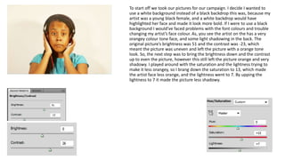
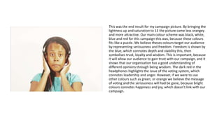
Steps 
Berfin Tunc
To start off we took our pictures for our campaign. I decide I wanted to 
use a white background instead of a black backdrop this was, because my 
artist was a young black female, and a white backdrop would have 
highlighted her face and made it look more bold. If I were to use a black 
background I would’ve faced problems with the font colours and trouble 
changing my artist’s face colour. As, you see the artist on the has a very 
orangey colour tone face, and some light shadowing in the back. The 
original picture’s brightness was 51 and the contrast was -23, which 
meant the picture was uneven and left the picture with a orange tone 
look. So, the next step was to bring the brightness down and the contrast 
up to even the picture, however this still left the picture orange and very 
shadowy. I played around with the saturation and the lightness trying to 
make it less orangey, so I brang down the saturation to 13, which made 
the artist face less orange, and the lightness went to 7. By upping the 
lightness to 7 it made the picture less shadowy.
This was the end result for my campaign picture. By bringing the 
lightness up and saturation to 13 the picture came less orangey 
and more attractive. Our main colour scheme was black, white, 
blue and red for this campaign this was, because these colours 
fits like a puzzle. We believe theses colours target our audience 
by representing seriousness and freedom. Freedom is shown by 
the blue, which connotes depth and stability this, then 
symbolises trust, loyalty and wisdom. This is important, because 
it will allow our audience to gain trust with our campaign, and it 
shows that our organisation has a good understanding of 
different opinions through being wisdom. The dark red in the 
headphones highlights the issue of the voting system, which 
connotes leadership and anger. However, if we were to use 
other colours such as green, or orange we believe the message 
of voting and the seriousness will had be gone, because bright 
colours connotes happiness and joy, which doesn’t link with our 
campaign.
The programme we use to design our words in high quality was Illustrator. This programme allowed 
us to play around with each wording and letters in detail, which then allowed us to have the 
imperfection lettering. Illustrator overall was easy to use, however I quite found the exporting and 
saving difficult as there were a lot of steps to save the final draft. The first step was to save as and 
turn the page into a PNJ, which gives the high definition focus. Once you have saved each wording 
into a PNJ you will then need to place each of them into Photoshop where you image will be. I think 
this is the best part of the designing section, because you see the whole campaign coming together 
and building up. The aftermath of this felt us, the team, very excited so we started to design our 
own logo, but after a lot of deleting and designing our logo didn’t look like we thought, so we just 
decide to leave it, and just keep the Vote Booster logo. However, the vote booster logo we got was 
in green, and it didn’t fit in our colour scheme, so we changed it into dark red like the headphone 
colour. Photoshop was the main programme we used to layout our campaign, and it was very easy 
to use as it simple and basic such as the pen tool was the pen tool. This made it so much easier for 
us as it wasn’t difficult.
Step for desgining

Step for desgining

  • 1.
  • 2.
    To start offwe took our pictures for our campaign. I decide I wanted to use a white background instead of a black backdrop this was, because my artist was a young black female, and a white backdrop would have highlighted her face and made it look more bold. If I were to use a black background I would’ve faced problems with the font colours and trouble changing my artist’s face colour. As, you see the artist on the has a very orangey colour tone face, and some light shadowing in the back. The original picture’s brightness was 51 and the contrast was -23, which meant the picture was uneven and left the picture with a orange tone look. So, the next step was to bring the brightness down and the contrast up to even the picture, however this still left the picture orange and very shadowy. I played around with the saturation and the lightness trying to make it less orangey, so I brang down the saturation to 13, which made the artist face less orange, and the lightness went to 7. By upping the lightness to 7 it made the picture less shadowy.
  • 3.
    This was theend result for my campaign picture. By bringing the lightness up and saturation to 13 the picture came less orangey and more attractive. Our main colour scheme was black, white, blue and red for this campaign this was, because these colours fits like a puzzle. We believe theses colours target our audience by representing seriousness and freedom. Freedom is shown by the blue, which connotes depth and stability this, then symbolises trust, loyalty and wisdom. This is important, because it will allow our audience to gain trust with our campaign, and it shows that our organisation has a good understanding of different opinions through being wisdom. The dark red in the headphones highlights the issue of the voting system, which connotes leadership and anger. However, if we were to use other colours such as green, or orange we believe the message of voting and the seriousness will had be gone, because bright colours connotes happiness and joy, which doesn’t link with our campaign.
  • 4.
    The programme weuse to design our words in high quality was Illustrator. This programme allowed us to play around with each wording and letters in detail, which then allowed us to have the imperfection lettering. Illustrator overall was easy to use, however I quite found the exporting and saving difficult as there were a lot of steps to save the final draft. The first step was to save as and turn the page into a PNJ, which gives the high definition focus. Once you have saved each wording into a PNJ you will then need to place each of them into Photoshop where you image will be. I think this is the best part of the designing section, because you see the whole campaign coming together and building up. The aftermath of this felt us, the team, very excited so we started to design our own logo, but after a lot of deleting and designing our logo didn’t look like we thought, so we just decide to leave it, and just keep the Vote Booster logo. However, the vote booster logo we got was in green, and it didn’t fit in our colour scheme, so we changed it into dark red like the headphone colour. Photoshop was the main programme we used to layout our campaign, and it was very easy to use as it simple and basic such as the pen tool was the pen tool. This made it so much easier for us as it wasn’t difficult.