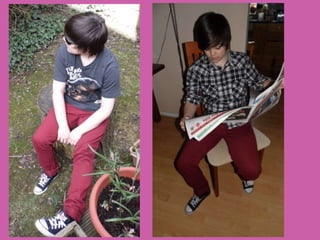
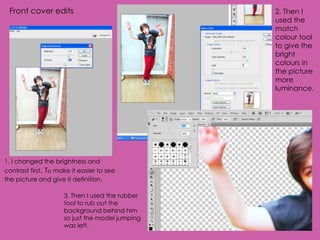
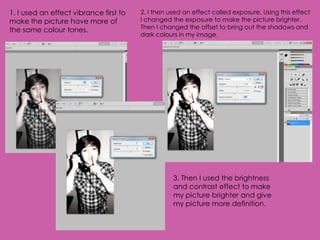
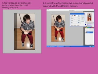
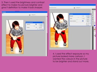
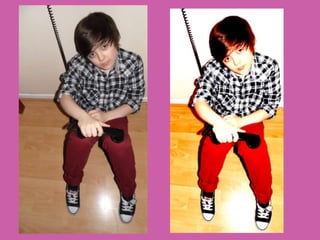
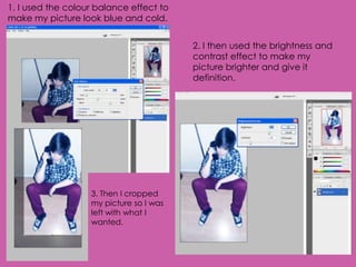
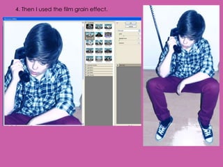
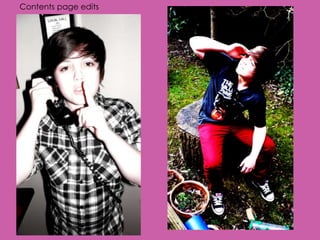
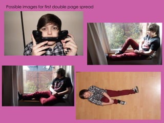
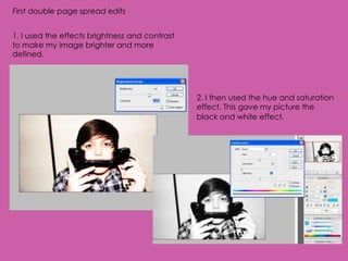
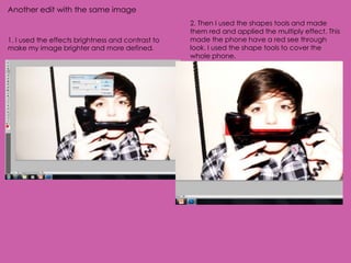
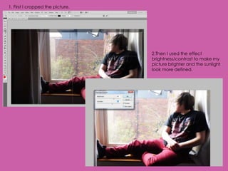
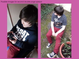
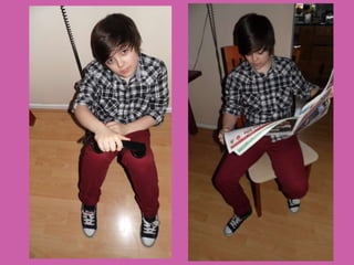
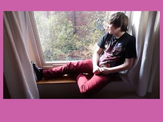
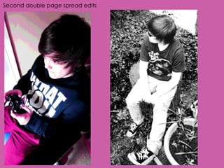
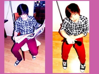
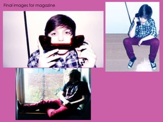
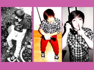
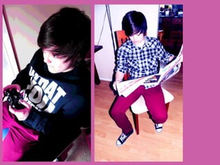
1. The document outlines various edits made to images for a magazine portrait shoot. Edits include adjusting brightness, contrast, exposure, selective color, cropping, adding effects like film grain, and removing backgrounds.
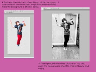
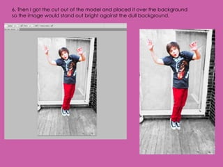
2. Specific edits are described, such as using match color to enhance luminance, rubber tool to remove backgrounds, destaturate effect to make images black and white, and placing cutouts over backgrounds.
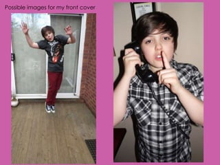
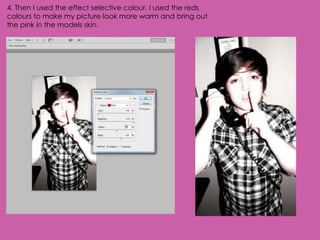
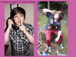
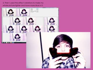
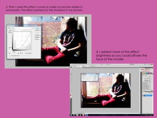
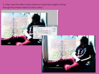
3. Additional edits involve adjusting vibrance, selective color, brightness, contrast, exposure, hue, saturation, color balance, and adding shapes with multiply effect to create see-through looks. Final images were selected for the front cover, contents page, and double page spreads.