Images edited in Photoshop K.Brett
•Download as DOC, PDF•
0 likes•214 views
These are images taken within school that I have edited in order to make them more dynamic; a brief description of what I did in order to achieve each effect.
Report
Share
Report
Share

Recommended
Evaluation q4
The document describes how the author used various technologies in their research, planning, construction, and evaluation stages of their project. Specifically, the author used:
- Keynote to create title cards and import/edit images and videos.
- iMovie to create trailers by importing videos and adding clips, music, and effects.
- Blogger, Slideshare, and YouTube to upload work and embed media for their blog.
- Twitter to contact teachers and peers for feedback.
- PowerPoint, Publisher and Photoshop to create and design work, providing feedback to peers.
- DSLR cameras to take photos for a front cover and billboard.
Portrait Shoot PowerPoint
1. The document outlines various edits made to images for a magazine portrait shoot. Edits include adjusting brightness, contrast, exposure, selective color, cropping, adding effects like film grain, and removing backgrounds.
2. Specific edits are described, such as using match color to enhance luminance, rubber tool to remove backgrounds, destaturate effect to make images black and white, and placing cutouts over backgrounds.
3. Additional edits involve adjusting vibrance, selective color, brightness, contrast, exposure, hue, saturation, color balance, and adding shapes with multiply effect to create see-through looks. Final images were selected for the front cover, contents page, and double page spreads.
Original images&edited images
The document describes edits made to several images, including:
1) Cutting out a flower within a skull image using selection tools and adding effects like black and white and vignetting.
2) Adjusting vibrance and color balance of another skull and flower image and adding lens correction effects.
3) Increasing brightness, changing hue and saturation of shoes in different colors, and adding lens correction effects.
4) Brightening a rose image and increasing contrast and saturation to make the rose stand out, and adding lens correction effects.
Jameel terminology
Unit 57 discusses various photographic terminology including:
Shutter speed which controls the brightness and movement in images. ISO which changes the light sensitivity of images. Aperture and depth of field which determine the distance of sharp focus. Automatic and manual exposures which control how the camera exposes images. Colour balance adjusts hues. Composition sets the framing. The rule of thirds positions subjects. Complementary colours contrast foreground and background. Analogous colours group similar hues. And macro photography provides close-up shots.
CSE Interpretive Design Portfolio
The goal of the interpretive sign project is to generate awareness and increase volunteers for CASA in Salem/Marion County, Oregon. The target audience includes all community members, especially those interested in philanthropy and helping children. The message is that anyone can support foster children even if they cannot foster or adopt. The designer went through multiple iterations, changing photos, text alignment, colors and spacing to create a dramatic final design that enhances the message.
Advert editing
The document describes revisions made to a magazine advertisement design. It summarizes changes made to improve readability of text using different colors and adding an outline. It also discusses cropping a photo to make space for text, converting it to black and white with a blue tint, and using Photoshop tools like actions, healing brush, and adjustment layers.
Presentation1
Charlotte Bracken edited a photograph for a final major project. She cropped the original image to focus on a more interesting composition. She increased the contrast and brightness to make the colors stand out more. She then applied a black and white effect to lighten and darken certain colors. Finally, she added a vignette to darken the edges and draw the eye to the center of the image. For all of her photographs, Charlotte's editing process generally included cropping, adjusting brightness and contrast, applying a black and white effect, and using lens correction and vignettes to focus the eye on the center.
Production log for my front cover
The production log summarizes the steps taken to design the front cover of a gospel magazine. It describes:
1) Constructing the masthead by individually highlighting letters and using effects like drop shadows.
2) Creating cover lines of varying fonts and sizes to attract attention while maintaining professionalism.
3) Choosing a central image of three models in choir robes to relate to the target audience in a non-traditional way.
Original images&edited images
The document describes edits made to several images. For a skull and flower image, the flower was cut out and put on a separate layer. The background was cropped and made black and white. A lens effect was added to darken the corners. For the final edit, the flower layer was placed back on top of the background. For a second skull and flower image, vibrance and lens effects were used, and the color balance was adjusted to give a vintage look. Shoes were edited by adjusting brightness/contrast and hue/saturation to change colors and make them stand out. A lens effect was used on each shoe image to darken the edges. The final edits show a range of shoe colors with the same editing style applied
Editing the Chosen Image
The document describes editing a photo to make the subject look more "professional" and "stereotypical" for magazines. Several editing techniques were used: the Quick Select and Eyedropper Tools to lighten the subject's legs; airbrushing the face with the Healing Brush Tool; enhancing the eyes by adding vibrance and glow; and adding shadow and smudging around the eyes with the Brush Tool. The overall lighting and colors were also adjusted to make the image brighter, clearer, and "more conventional."
How to use Photoshop
The document discusses various tools in Photoshop and how they were used to edit images for a magazine cover. It describes using the crop tool to trim backgrounds, the dodge tool to lighten highlights, and the blur tool to give images a more airbrushed effect. It also mentions experimenting with spotlight effects but deciding they overcomplicated the front cover image, and ultimately changing the image to black and white to make the text color stand out against the background.
Film Poster Editing
The group took some stills from their film shoot to use for a movie poster and magazine. They selected one image to edit in Photoshop. As the narrator was familiar with Photoshop, they sharpened the slightly blurry image and adjusted the brightness, contrast, and color levels to make the grass and diary stand out brighter and warmer without losing definition. They used selection tools and additional sharpening to make the diary imagery clearer after adjusting the blue color levels blurred it.
Second Recreation Editing Butlins Photo
The document describes the steps taken to recreate a photo from Butlins using various Photoshop editing tools and effects. The recreation involved adjusting brightness, contrast, color balance, selective color, cloning elements, adding texture and grain, and applying blur and vignetting to match the tones, colors, and visual qualities of the original photo. The final steps were to place the original photo above the recreated photo and rotate the recreation upside down to create a mirroring effect.
Project 2 Review: Graphic Design
The document provides instructions for designing a poster to raise awareness for an organization called Helping Hand Saigon. It describes using various graphic design tools to add images, text, and colors to create a simple yet impactful poster with a sepia-toned image of a child as the focal point, a slogan with a distressed text effect, and contact information in small type. The goal is to convey a message of helping impoverished children through visuals and balanced hierarchical composition.
Question 7
The document discusses the author's progression in using Photoshop skills for their magazine project. Specifically:
1) The author learned how to use effects like drop shadows and outer glows to make elements stand out more. They also improved at selecting parts of photos.
2) For the magazine cover, the author used drop shadows and embossing on the masthead to add depth and mystery. They duplicated and moved fonts to create a moving effect.
3) The author feels they applied more diverse techniques like quotes, freebies and more information in the main task compared to the preliminary task.
5 edited photos
The document describes edits made to a photograph including:
1) Increasing brightness and contrast to reduce pixilation and make the photo look cleaner and sharper.
2) Increasing exposure slightly and adding a darker tint to make the photo more vibrant.
3) Converting the photo to black and white with a blue tint using the luminosity layer.
4) Creating a second dissolved layer to make most of the background disappear, leaving only a bright red t-shirt.
Photoshop software evidence 2
The document summarizes the Photoshop tools used to edit an image. The author used the polygonal lasso tool to cut out two characters and place them on a new layer, zooming in to cut around the edges precisely. Hue/saturation was adjusted to enhance the red background by saturating the image. The blur tool softened the edges cut around the characters. Brightness/contrast was experimented with to identify the correct lighting to make the edited image look similar to the original reference image.
Image manipulation
The document discusses editing photos for a magazine using Photoshop. For the front cover photo of Sarah with a skateboard, the author adjusted brightness and contrast to make colors pop more, used the Vibrance tool to enhance lighter colors, and enlarged the photo to fit the magazine. For the double page spread of Sarah, the author similarly adjusted brightness and contrast to improve colors, darkened the image as it was overexposed, slightly adjusted exposure to darken light areas, and enlarged the photo to fit the spread.
What have you learnt about technologies from the process of constructing the ...
The document discusses using various color correction, masking, opacity, and effects tools in Final Cut and After Effects to create a title sequence and sniper scene for a thriller film project. Key steps included adjusting tones and saturation in Final Cut, masking out areas in After Effects, balancing opacity, and adding movement effects and blurring to titles. Organizing and rendering the multiple layers and effects in After Effects posed some challenges due to computer processing limitations.
Evaluation Q1
This document discusses the conventions used in magazine design and how the student's magazine production challenged some conventions while adhering to others. Specifically:
- The student used professional conventions like carefully chosen cover images, adjustment layers, mastheads, cover lines, and barcodes to make the magazine look authentic.
- However, the student challenged the convention of having models on the cover in direct address by instead using an image to convey the magazine's serious tone.
- Inside pages included article layout in columns, drop capitals, and a stretched title across a double-page spread, mimicking professional design.
Photo shoot edits
The document discusses the editing process for several photos. For the first photo, the photographer made it darker around the edges and added a blue cooling filter to give it a sinister, gloomy feel of the city. For the next photo, sharpness and vibrance were increased to make subjects and colors stand out more clearly. Another photo was cropped and had its hue, saturation, and contrast adjusted to make the image sharper and brighter. The final photo's brightness was lowered and contrast increased slightly to define sky and tree details while keeping the plain scene simple.
Light painting presentation
This document describes how a photo was taken of someone swinging Christmas lights to create light painting and then edited in Photoshop. The background was colored black, brightness and contrast were adjusted, and hue and saturation were modified to make the lights stand out against the dark background and match the color of the obscured subject. The edited image was then duplicated.
Development diary magazine advertisment
1) The document describes editing a photograph for a magazine advertisement. Key steps included opening the photo in Photoshop, duplicating the background layer, adjusting levels and curves, and resizing the photo to magazine dimensions.
2) An action was used to give the photo a vintage look, and opacity was adjusted to tone down the yellow tint added by the action. Text and design elements were added to the photo.
3) Final touches included adding drop shadows, including the album cover, and blending the edges with effects to create a polished advertisement.
Double page spread analysis 2
The double page spread in the magazine uses bright neon lights and strobe light images to create a retro, club-like atmosphere that matches the magazine's focus on dance music. Two large images advertise dance music shows while smaller pictures and bold subheadings highlight specific articles about popular artists like Deadmau5. The layout organizes the content into sections and uses colors and images to visually engage and guide readers through the spread.
Unit57terminology
This document defines key photography terminology including:
- Shutter speed, aperture, ISO, and depth of field which affect light and focus in photos.
- Automatic and manual exposure which determine if the camera or photographer sets lighting settings.
- Colour balance, composition, and the rule of thirds which relate to visual design principles.
- Complementary, analogous colours, and macro photography which involve using specific colour schemes or shooting close-ups.
Definitions.
This document provides definitions and examples for various photography terminology including:
- Shutter speed, which determines the length of time the camera's shutter is open and how movement is captured.
- ISO, which is the camera's light sensitivity setting, with higher numbers providing better image quality.
- Aperture and depth of field, which impact the area of the image that appears in focus.
- Automatic and manual exposure settings that control light levels.
- Composition, color balance, rule of thirds, and complementary/analogous colors which impact visual design elements.
- Macro photography which allows for extremely close-up shots of small subjects.
Definitions.
This document provides definitions and examples for various photography terminology including:
- Shutter speed, which determines the length of time the camera's shutter is open and how movement is shown. Slow shutter speeds blur movement while fast shutter speeds freeze it.
- ISO, which is adjusted to control the camera's sensitivity to light, with higher ISO numbers providing better image quality.
- Aperture and depth of field, which impact the area of the image that appears in focus.
- Automatic, manual, and color balance exposure settings, and how they control light levels and colors in photographs.
- Composition techniques like rule of thirds for arranging subjects.
- Complementary and analogous colors and how they relate on the color
Martin Parr K.Brett
This document provides background information on British photographer Martin Parr and analyzes some of his photos. It discusses Parr's focus on documenting modern consumerism, travel, and tourism. Several of Parr's photos are then described, noting how they use unusual perspectives, vibrant colors, and foreground subjects to draw attention. The document also contains photos submitted by a student aiming to emulate Parr's quirky style through their use of odd angles, simplified compositions, and colorful focal points.
Rules of composition K.Brett
This gives basic rules of how to create a good photograph; leading lines; framing; balance; rule of thirds and simplicity - all crutial guidelines in photography.
Analysing my first images K.Brett
This document discusses and analyzes several photographs based on composition rules and how they could be improved. It provides examples of good composition that follow rules like the rule of thirds and simplicity. Areas for improvement are identified, such as images being too cluttered, blurred, or not having a clear focal point. Cropping is suggested to simplify images and focus attention on the main subject.
More Related Content
What's hot
Original images&edited images
The document describes edits made to several images. For a skull and flower image, the flower was cut out and put on a separate layer. The background was cropped and made black and white. A lens effect was added to darken the corners. For the final edit, the flower layer was placed back on top of the background. For a second skull and flower image, vibrance and lens effects were used, and the color balance was adjusted to give a vintage look. Shoes were edited by adjusting brightness/contrast and hue/saturation to change colors and make them stand out. A lens effect was used on each shoe image to darken the edges. The final edits show a range of shoe colors with the same editing style applied
Editing the Chosen Image
The document describes editing a photo to make the subject look more "professional" and "stereotypical" for magazines. Several editing techniques were used: the Quick Select and Eyedropper Tools to lighten the subject's legs; airbrushing the face with the Healing Brush Tool; enhancing the eyes by adding vibrance and glow; and adding shadow and smudging around the eyes with the Brush Tool. The overall lighting and colors were also adjusted to make the image brighter, clearer, and "more conventional."
How to use Photoshop
The document discusses various tools in Photoshop and how they were used to edit images for a magazine cover. It describes using the crop tool to trim backgrounds, the dodge tool to lighten highlights, and the blur tool to give images a more airbrushed effect. It also mentions experimenting with spotlight effects but deciding they overcomplicated the front cover image, and ultimately changing the image to black and white to make the text color stand out against the background.
Film Poster Editing
The group took some stills from their film shoot to use for a movie poster and magazine. They selected one image to edit in Photoshop. As the narrator was familiar with Photoshop, they sharpened the slightly blurry image and adjusted the brightness, contrast, and color levels to make the grass and diary stand out brighter and warmer without losing definition. They used selection tools and additional sharpening to make the diary imagery clearer after adjusting the blue color levels blurred it.
Second Recreation Editing Butlins Photo
The document describes the steps taken to recreate a photo from Butlins using various Photoshop editing tools and effects. The recreation involved adjusting brightness, contrast, color balance, selective color, cloning elements, adding texture and grain, and applying blur and vignetting to match the tones, colors, and visual qualities of the original photo. The final steps were to place the original photo above the recreated photo and rotate the recreation upside down to create a mirroring effect.
Project 2 Review: Graphic Design
The document provides instructions for designing a poster to raise awareness for an organization called Helping Hand Saigon. It describes using various graphic design tools to add images, text, and colors to create a simple yet impactful poster with a sepia-toned image of a child as the focal point, a slogan with a distressed text effect, and contact information in small type. The goal is to convey a message of helping impoverished children through visuals and balanced hierarchical composition.
Question 7
The document discusses the author's progression in using Photoshop skills for their magazine project. Specifically:
1) The author learned how to use effects like drop shadows and outer glows to make elements stand out more. They also improved at selecting parts of photos.
2) For the magazine cover, the author used drop shadows and embossing on the masthead to add depth and mystery. They duplicated and moved fonts to create a moving effect.
3) The author feels they applied more diverse techniques like quotes, freebies and more information in the main task compared to the preliminary task.
5 edited photos
The document describes edits made to a photograph including:
1) Increasing brightness and contrast to reduce pixilation and make the photo look cleaner and sharper.
2) Increasing exposure slightly and adding a darker tint to make the photo more vibrant.
3) Converting the photo to black and white with a blue tint using the luminosity layer.
4) Creating a second dissolved layer to make most of the background disappear, leaving only a bright red t-shirt.
Photoshop software evidence 2
The document summarizes the Photoshop tools used to edit an image. The author used the polygonal lasso tool to cut out two characters and place them on a new layer, zooming in to cut around the edges precisely. Hue/saturation was adjusted to enhance the red background by saturating the image. The blur tool softened the edges cut around the characters. Brightness/contrast was experimented with to identify the correct lighting to make the edited image look similar to the original reference image.
Image manipulation
The document discusses editing photos for a magazine using Photoshop. For the front cover photo of Sarah with a skateboard, the author adjusted brightness and contrast to make colors pop more, used the Vibrance tool to enhance lighter colors, and enlarged the photo to fit the magazine. For the double page spread of Sarah, the author similarly adjusted brightness and contrast to improve colors, darkened the image as it was overexposed, slightly adjusted exposure to darken light areas, and enlarged the photo to fit the spread.
What have you learnt about technologies from the process of constructing the ...
The document discusses using various color correction, masking, opacity, and effects tools in Final Cut and After Effects to create a title sequence and sniper scene for a thriller film project. Key steps included adjusting tones and saturation in Final Cut, masking out areas in After Effects, balancing opacity, and adding movement effects and blurring to titles. Organizing and rendering the multiple layers and effects in After Effects posed some challenges due to computer processing limitations.
Evaluation Q1
This document discusses the conventions used in magazine design and how the student's magazine production challenged some conventions while adhering to others. Specifically:
- The student used professional conventions like carefully chosen cover images, adjustment layers, mastheads, cover lines, and barcodes to make the magazine look authentic.
- However, the student challenged the convention of having models on the cover in direct address by instead using an image to convey the magazine's serious tone.
- Inside pages included article layout in columns, drop capitals, and a stretched title across a double-page spread, mimicking professional design.
Photo shoot edits
The document discusses the editing process for several photos. For the first photo, the photographer made it darker around the edges and added a blue cooling filter to give it a sinister, gloomy feel of the city. For the next photo, sharpness and vibrance were increased to make subjects and colors stand out more clearly. Another photo was cropped and had its hue, saturation, and contrast adjusted to make the image sharper and brighter. The final photo's brightness was lowered and contrast increased slightly to define sky and tree details while keeping the plain scene simple.
Light painting presentation
This document describes how a photo was taken of someone swinging Christmas lights to create light painting and then edited in Photoshop. The background was colored black, brightness and contrast were adjusted, and hue and saturation were modified to make the lights stand out against the dark background and match the color of the obscured subject. The edited image was then duplicated.
Development diary magazine advertisment
1) The document describes editing a photograph for a magazine advertisement. Key steps included opening the photo in Photoshop, duplicating the background layer, adjusting levels and curves, and resizing the photo to magazine dimensions.
2) An action was used to give the photo a vintage look, and opacity was adjusted to tone down the yellow tint added by the action. Text and design elements were added to the photo.
3) Final touches included adding drop shadows, including the album cover, and blending the edges with effects to create a polished advertisement.
Double page spread analysis 2
The double page spread in the magazine uses bright neon lights and strobe light images to create a retro, club-like atmosphere that matches the magazine's focus on dance music. Two large images advertise dance music shows while smaller pictures and bold subheadings highlight specific articles about popular artists like Deadmau5. The layout organizes the content into sections and uses colors and images to visually engage and guide readers through the spread.
Unit57terminology
This document defines key photography terminology including:
- Shutter speed, aperture, ISO, and depth of field which affect light and focus in photos.
- Automatic and manual exposure which determine if the camera or photographer sets lighting settings.
- Colour balance, composition, and the rule of thirds which relate to visual design principles.
- Complementary, analogous colours, and macro photography which involve using specific colour schemes or shooting close-ups.
Definitions.
This document provides definitions and examples for various photography terminology including:
- Shutter speed, which determines the length of time the camera's shutter is open and how movement is captured.
- ISO, which is the camera's light sensitivity setting, with higher numbers providing better image quality.
- Aperture and depth of field, which impact the area of the image that appears in focus.
- Automatic and manual exposure settings that control light levels.
- Composition, color balance, rule of thirds, and complementary/analogous colors which impact visual design elements.
- Macro photography which allows for extremely close-up shots of small subjects.
Definitions.
This document provides definitions and examples for various photography terminology including:
- Shutter speed, which determines the length of time the camera's shutter is open and how movement is shown. Slow shutter speeds blur movement while fast shutter speeds freeze it.
- ISO, which is adjusted to control the camera's sensitivity to light, with higher ISO numbers providing better image quality.
- Aperture and depth of field, which impact the area of the image that appears in focus.
- Automatic, manual, and color balance exposure settings, and how they control light levels and colors in photographs.
- Composition techniques like rule of thirds for arranging subjects.
- Complementary and analogous colors and how they relate on the color
What's hot (19)
What have you learnt about technologies from the process of constructing the ...
What have you learnt about technologies from the process of constructing the ...
Viewers also liked
Martin Parr K.Brett
This document provides background information on British photographer Martin Parr and analyzes some of his photos. It discusses Parr's focus on documenting modern consumerism, travel, and tourism. Several of Parr's photos are then described, noting how they use unusual perspectives, vibrant colors, and foreground subjects to draw attention. The document also contains photos submitted by a student aiming to emulate Parr's quirky style through their use of odd angles, simplified compositions, and colorful focal points.
Rules of composition K.Brett
This gives basic rules of how to create a good photograph; leading lines; framing; balance; rule of thirds and simplicity - all crutial guidelines in photography.
Analysing my first images K.Brett
This document discusses and analyzes several photographs based on composition rules and how they could be improved. It provides examples of good composition that follow rules like the rule of thirds and simplicity. Areas for improvement are identified, such as images being too cluttered, blurred, or not having a clear focal point. Cropping is suggested to simplify images and focus attention on the main subject.
The School K.Brett
This document discusses photos taken at a school to illustrate various lessons and areas. It analyzes how each photo follows principles of photographic composition. Several photos show math and English lessons through equipment and books. Others depict the sports area, corridors familiar to students, and an old cracked wall suggesting needed improvements. The final photos focus on the school field, following rules of thirds, simplicity, and focal point to demonstrate this area.
Word Association Emotions K.Brett
Emotions captured depending on the type of words you give the subject to think about. An edited version of a person is included to imitate the work of Madame Yevonde.
Photographing people k.brett
Image analysis and research of famous portrait photographers; Rankin; Testino; Lise Safarti and Terry Richardson.
Madame Yevonde
An insight ito the work of Madame Yevonde; some example photos she has captured and a photo analysis of a chosen picture, along with a photo I took and edited in order to imitate the artist's work.
Word Association Emotions K.Brett
The document discusses the photographer's theme of capturing different emotions in photographs and how they are influenced by Madame Yevonde's style. The photographer aims to depict emotions through facial expressions similarly to Yevonde's work. To make their photos more like Yevonde's dramatic style, the photographer would need to alter colors and intensities and incorporate more props. An example image is included that was edited in Photoshop to resemble Yevonde's "Medusa" photo by highlighting features and adding a blurred background.
Viewers also liked (8)
Similar to Images edited in Photoshop K.Brett
Edited Images in Photoshop K.Brett
Photos taken within and around school and edited in photoshop to improve the overall effect and end result.
Formal Elements Presentation
This document discusses various photographs and the image editing techniques used to enhance them. It describes applying filters like warming, cooling, and violet filters to manipulate colors and draw attention to certain elements. High pass was frequently used to add more detail by duplicating layers and adjusting opacity. Other common edits included adjusting brightness, changing to black and white, and increasing contrast or density to focus on specific areas or textures within the images. The goal was to direct the viewer's eyes in a particular way or emphasize shapes, forms, lines, and spaces observed in the original photos.
Poster 1 analysis
The document describes the process of experimenting with and editing a poster design. In the first image, the designer placed the logo in the bottom center to draw immediate attention. In subsequent experiments, different text and logo placements were tested. The final design features a dark blue sky added to create mystery, brighter grass, and enhanced lighting on the lamppost to draw attention to the central logo and slogan.
3. FMP Production Experiments
The document describes experiments conducted in Photoshop to create a movie poster for Saw 2. Photographs were taken of the actor Jigsaw and a creepy doll using professional lighting and cameras in the college photography room. Various Photoshop tools like the exposure panel, blur tool, and levels were used to manipulate the images and add text elements. Test shots were taken of the author dressed as a nun to potentially include in posters, but the lighting was deemed too bright and dark, respectively. The experiments helped learn which Photoshop tools were most effective and how to properly use the lighting equipment.
Evaluation Question 4
1) The document discusses how the author used Photoshop to edit photos for a school project. They describe steps like duplicating layers, adjusting curves and levels, adding noise, and correcting lens distortion.
2) They also describe designing a poster by adding shapes and text over an image and adjusting logos to match the color scheme.
3) Finally, they discuss filming a music performance with DSLR cameras on tripods, focusing manually by zooming in fully and adjusting the lens for sharp focus when needed.
Editing process
The document discusses editing two images for a magazine cover.
For the first image, the background is removed and the image is darkened to make it stand out on different backgrounds. Tools like levels, curves, hue and saturation are used to mimic artificial lighting effects. Bevel and emboss and drop shadow effects are added.
The second image involves duplicating the layer, cutting out the subject on one layer, desaturating the background layer, and applying a red color filter gradient. Curves are used to make the subject stand out against the red background. Levels and hue/saturation are also used to brighten and desaturate the image slightly.
4. Production Experiments fmp
The document discusses the author's experiments with photography tutorials, lighting techniques, and photo editing in Photoshop. They found tutorials helpful for learning lighting positioning but struggled to replicate the exact setups. Through trial and error, they improved at creating shadows, depth, and different exposures. Photoshop experiments included adjusting lighting, converting images to black and white, adding gothic elements like bruising effects, and blending background elements. The author aims to apply these skills to create an effective horror-style final project involving a DVD cover and poster.
Film Poster Step By Step Process
The document describes the process of creating a movie poster in Photoshop. It involves selecting and adjusting elements like characters, cropping and positioning images, adding text, and blending layers. Multiple adjustment tools are used to darken and lighten sections, remove distractions, and ensure the focal person stands out against the background. The final poster includes credits, reviews, release details and logos positioned according to conventions.
Photography and Editing
The document discusses several photographs selected for a school project and the editing process. It describes three photos, including details about lighting, poses, and shadows. One photo works well for the contents page due to its clear image and relaxed atmosphere. Another photo effectively shows the subjects' expressions. The document also outlines steps for editing photos in Photoshop, including using the magic wand tool to cut out backgrounds, changing the background color, smoothing edges with brush and blur tools, and making edits less noticeable.
Process Of Contents Page - Image
The document describes editing two images for use on a contents page. For the first image, the model was cropped out of the background using a magnetic lasso tool. Colors and brightness were adjusted, and a blue strap was changed to black. However, the image did not fit well on the page. A second image underwent similar editing - cropping, changing the strap color, adjusting levels and using color balance. This final image with a added shadow fit better on the contents page.
6. fmp production reflection
Nathan took a photo at a bridge under a train station to capture an old-fashioned look. He added noise to make it look grainy and adjusted the saturation and exposure to give it a sepia tone. He used the clone stamp tool to remove modern elements from the scene. For precision editing, he used the clone stamp and noise tools in the raw camera filter. He adjusted the hue and saturation to achieve the sepia effect and washed out look that correlates with a dull color scheme preferred by 33% of his audience.
Task 11 Unaltered + Altered images in Magazine
The document describes various edits made to images in a music magazine using Photoshop. For the front cover image, the author cropped out shorts, dimmed shine on the face, and added red lips. Interior images were adjusted by changing lighting, exposure, adding effects like bevel and emboss. A group photo was edited to enhance colors in hue and saturation. Backgrounds were intensified or brightened for some images, while others required little editing due to suitable features.
Production Diary.pptx
The document summarizes a production diary for creating concert visuals and other print products for a music artist. Over several days, the creator worked on animations, an album cover, zine, and other items. For the album cover, they edited photos, added 3D and lighting effects to create curtains and eyes. They also worked on a zine, creating collage-style covers and articles about the artist's albums. The diary details the creative process and problem-solving for each project element.
Production: manipulation of original photography
The document discusses the manipulation of several original photographs for use in a magazine. The photographs were edited by [1] adjusting colors, brightness, contrast and cropping to make subjects stand out; [2] cutting out backgrounds around subjects using selection tools; and [3] using smudge tools to blend colors and remove unwanted elements like grass. The goal of the edits was to make the photographs more dramatic, professional-looking and well-sized for the intended magazine layouts.
Construction diary front cover
This document summarizes the process of designing the front cover of a construction diary. The designer selected an image of a model that had a plain background. They edited the image in Photoshop to adjust tones and colors and remove blemishes. The image was then cut out and placed on the cover page. Straplines were added along the top and side, and the logo, insert, and coverlines of text were positioned throughout the cover. Care was taken to balance the layout and ensure the main elements stood out clearly.
Editing photos
To edit photos in Serif Photo Plus, the user first inserts an image and uses tools like PhotoFix to adjust lighting and effects like filters to achieve different looks. They applied effects like glass and blur to focus on characters and experimented with comic and Gaussian effects. They also darkened images for depth, erased backgrounds and composited images onto new backgrounds, blurring the result. In the end, they produced two edited photos with adjusted lighting, effects and composited elements.
Development diary double page spread
The document summarizes the process of designing a double-page magazine spread. It describes altering the document dimensions to double the width, adding guidelines and consistency elements from other pages. An main image was created by combining two photos - a forest background and an edited model photo pasted on top. Text elements like the title, caption and article were then added. Minor tweaks were made to enhance the overall design.
3. fmp production experiments
In this document, the author describes experiments editing photos in Photoshop to alter colors, lighting, and add elements. In the first experiment, the author adjusted hue, saturation, and temperature to make pinks and purples stand out. In the second, the author darkened the photo and added a starry sky background to achieve a sunset look. The third used black and white, decreased saturation and lightness, and added a moon layer with mist and lens flare to simulate an eclipse. The author concludes they will apply layering, hue/saturation adjustment, and discovered techniques in their final project.
Editing picture 1
The document describes editing a photo for use on an A4-sized front cover. Specifically, it discusses:
1) Adjusting shadows, highlights, black levels, and brightness to avoid overexposure and improve color levels.
2) Cropping the image to fit on an A4 size page as required for the front page.
3) Sharpening the image to improve edges and clarity, and increase contrast to make edges more defined.
4) Adjusting brightness and contrast to improve color vibrancy and ensure correct contrast.
Photoshop stages
The document describes the process of designing magazine pages in Photoshop using images and text. For the front cover, a photo of a wall was turned grey and a model image was placed over it. Levels were used to make the cover black and white. For the contents page, a corridor railing photo was darkened and a model image was isolated using the Quick Selection tool. Effects were added to images and text was placed using tools. A chapel cross photo was the background for a double-page spread, with model images isolated and adjusted over top, and text added in different colors.
Similar to Images edited in Photoshop K.Brett (20)
More from bretkath07
Wanda wulz
I've research Wanda Wulz, a photographer I am interested in and analysed some of her photographs in order to understand the meaning behind her work. I will mimic her style of photography using my own subjects and photo manipulation in response to this artist.
Madame Yevonde - My interpretation
This powerpoint depicts the key points I'm going to explore in my own photography work. I will focus on capturing un-typical stereotypes in order to capture visually stimulating imagery.
Madame Yevonde - My interpretation
The document discusses an extension project interpreting the work of artist Madame Yevonde and creating responsive work. The key theme in Yevonde's work is seen as feminism and advocating female power through expression and roles. In response, the project will experiment with reversing gender roles in pictures, such as depicting males in female roles and females in male roles, to similarly achieve understanding of women's equal power and ability as men.
Madame Yevonde - My interpretation
The document discusses Madame Yevonde, a pioneering English photographer known for her use of color photography in the 1930s. It describes how Yevonde's photographs captured both realism and surrealism by juxtaposing everyday subjects with mythological themes. Notable works included portraits of subjects dressed as Greek gods and goddesses. The document also analyzes one of Yevonde's favorite images, a portrait of Viscountess Mary Ratendone as the muse Euterpe, praising its dramatic composition and use of color and symbolism to convey the subject's lonely or confused emotions.
My joiner image and analysis k.brett
This document provides a self-critique of an image created by positioning together approximately 50 different photos. The positioning of close-up facial expressions works well to show change over time from multiple perspectives simultaneously. However, with so many images compiled into a medium shot, the overall picture looks quite cluttered. This could be improved by simplifying the image through zooming in or altering colors and shapes to make the main subjects stand out against the cluttered background.
Lee Friedlander - Photo analysis K.Brett
This photo was taken from inside a stationary car at a traffic light in Las Vegas, showing buildings along the road reflected in the car's side mirror. The interior of the dark car contrasts with the bright exterior, framing the buildings in two focal points. Leading lines from traffic lights and the window direct the eye to the buildings in the reflection and foreground. The perspective captures a journey of moving forward while looking back, demonstrated by the passing bridge in the mirror.
Rumpelstiltskin Poster K.Brett
Rumpelstiltskin tells the story of a mother who chooses to save her own life by agreeing to give away her child, only to regret her decision later when it's too late. The classic folklore tale emphasizes that choices have consequences, as the mother realizes the mistake she has made in giving away her child to save herself.
Magazine Headline and Newspaper Analysis K.Brett
An overview of the differences between a tabloid and a broadsheet paper and also what a double page spread contains.
Rumpelstitskin Overview K.Brett
A girl was locked in a tower by the King and threatened with execution if she couldn't spin straw into gold. Rumpelstiltskin helped her in exchange for her possessions, and eventually her firstborn child. When the child was born, Rumpelstiltskin tried to claim it, but the girl's husband gave her three chances to guess his name. On the third night, a messenger overheard Rumpelstiltskin singing his own name by a campfire and told the girl, allowing her to keep her child.
My final photo joiner and analysis (round the table)
The document discusses a joiner image made up of 50 different positioned images, including close-ups of people's faces. The different facial expressions show change over time from multiple perspectives simultaneously. However, with so many images placed together in a medium shot, the overall picture looks quite cluttered. This could be improved by simplifying the image, such as zooming in or altering colors and shapes to highlight outlines and make the main subjects stand out more clearly.
Inspiration for photo joinery K.Brett
An overview of the roots of photo joinery (cubism) and a look at another contempory artist who focuses on this type of ph
Davic Hockney K.Brett
1) David Hockney is a British artist known for his contributions to pop art in the 1960s and for pioneering the technique of photo collage, where multiple photographs are arranged to form a composite image.
2) One of Hockney's earliest photo collages was a portrait of his mother made from photographs taken from different angles and perspectives.
3) Hockney's 1985 photo collage "Furstenberg Paris" depicts a street scene composed from approximately 100 photographs, allowing the viewer to feel immersed in the setting and movement over time.
Cowes community K.Brett
Photos taken around Cowes specifically in Northwood Park with analysis and some improvements made. A really good experience where photography can help the community become closer and more socialble.
My Life K.Brett
Images taken that reflect different aspects of my life; a brief description of what affect they have on me.
Lee Friedlander analysis K.Brett
Lee Friedlander took this photo in Las Vegas while stopped at a traffic light in his car. The interior of the car provides contrast to the bright exterior buildings. The photo has two focal points - the buildings outside framed by the car window, and the wing mirror reflection showing a bridge the photographer had just passed. Taken from inside the moving car, the photo represents a journey of moving forward while still looking back at the past.
K.Brett - Composing a picture
This document discusses various photography techniques for improving composition and perspective in images. It begins by explaining perspective and how camera angle can make photos more dynamic. Several of the photographer's own images are then analyzed, discussing how they demonstrate techniques like leading lines, rule of thirds, foreground interest, and focal point. Other topics covered include format, lines, patterns, and the five main rules of composition. The document serves to illustrate fundamental photographic concepts through real photo examples.
More from bretkath07 (16)
My final photo joiner and analysis (round the table)
My final photo joiner and analysis (round the table)
Recently uploaded
一比一原版加拿大多伦多大学毕业证(uoft毕业证书)如何办理
一模一样【微信:A575476】【加拿大多伦多大学毕业证(uoft毕业证书)成绩单Offer】【微信:A575476】(留信学历认证永久存档查询)采用学校原版纸张、特殊工艺完全按照原版一比一制作(包括:隐形水印,阴影底纹,钢印LOGO烫金烫银,LOGO烫金烫银复合重叠,文字图案浮雕,激光镭射,紫外荧光,温感,复印防伪)行业标杆!精益求精,诚心合作,真诚制作!多年品质 ,按需精细制作,24小时接单,全套进口原装设备,十五年致力于帮助留学生解决难题,业务范围有加拿大、英国、澳洲、韩国、美国、新加坡,新西兰等学历材料,包您满意。
【业务选择办理准则】
一、工作未确定,回国需先给父母、亲戚朋友看下文凭的情况,办理一份就读学校的毕业证【微信:A575476】文凭即可
二、回国进私企、外企、自己做生意的情况,这些单位是不查询毕业证真伪的,而且国内没有渠道去查询国外文凭的真假,也不需要提供真实教育部认证。鉴于此,办理一份毕业证【微信:A575476】即可
三、进国企,银行,事业单位,考公务员等等,这些单位是必需要提供真实教育部认证的,办理教育部认证所需资料众多且烦琐,所有材料您都必须提供原件,我们凭借丰富的经验,快捷的绿色通道帮您快速整合材料,让您少走弯路。
留信网认证的作用:
1:该专业认证可证明留学生真实身份
2:同时对留学生所学专业登记给予评定
3:国家专业人才认证中心颁发入库证书
4:这个认证书并且可以归档倒地方
5:凡事获得留信网入网的信息将会逐步更新到个人身份内,将在公安局网内查询个人身份证信息后,同步读取人才网入库信息
6:个人职称评审加20分
7:个人信誉贷款加10分
8:在国家人才网主办的国家网络招聘大会中纳入资料,供国家高端企业选择人才
→ 【关于价格问题(保证一手价格)
我们所定的价格是非常合理的,而且我们现在做得单子大多数都是代理和回头客户介绍的所以一般现在有新的单子 我给客户的都是第一手的代理价格,因为我想坦诚对待大家 不想跟大家在价格方面浪费时间
对于老客户或者被老客户介绍过来的朋友,我们都会适当给一些优惠。
选择实体注册公司办理,更放心,更安全!我们的承诺:可来公司面谈,可签订合同,会陪同客户一起到教育部认证窗口递交认证材料,客户在教育部官方认证查询网站查询到认证通过结果后付款,不成功不收费!
➒➌➎➏➑➐➋➑➐➐ Kalyan Matka Satta Matka Dpboss Matka Guessing Indian Matka
➒➌➎➏➑➐➋➑➐➐ Kalyan Matka Satta Matka Dpboss Matka Guessing Indian Matka➒➌➎➏➑➐➋➑➐➐Dpboss Matka Guessing Satta Matka Kalyan Chart Indian Matka
➒➌➎➏➑➐➋➑➐➐ Kalyan Matka Satta Matka Dpboss Matka Guessing Indian Matka❼❷⓿❺❻❷❽❷❼❽ Dpboss Kalyan Satta Matka Guessing Matka Result Main Bazar chart
❼❷⓿❺❻❷❽❷❼❽ Dpboss Kalyan Satta Matka Guessing Matka Result Main Bazar chart❼❷⓿❺❻❷❽❷❼❽ Dpboss Kalyan Satta Matka Guessing Matka Result Main Bazar chart
❼❷⓿❺❻❷❽❷❼❽ Dpboss Kalyan Satta Matka Guessing Matka Result Main Bazar chart Final Matka Satta Matta Matka 143 Kalyan Chart Satta fix Jodi Kalyan Final ank Matka Boss Satta 143 Matka 420 Golden Matka Final Satta Kalyan Penal Chart Dpboss 143 Guessing Kalyan Night Chart Matka Guessing Satta Matta Matka Kalyan Chart Indian Matka Dpboss
Matka Guessing Satta Matta Matka Kalyan Chart Indian Matka Dpboss➒➌➎➏➑➐➋➑➐➐Dpboss Matka Guessing Satta Matka Kalyan Chart Indian Matka
9356872877Sattamatka.satta.matka.satta matka.kalyan weekly chart.kalyan chart.kalyan jodi chart.kalyan penal chart.kalyan today.kalyan open.fix satta.fix fix fix Satta matka nambar. Dpboss Matka Guessing Satta Matta Matka Kalyan Chart Indian MatkaVTV FULL SCRIPT ------------------------
HERE IS THE FULL SCRIPT OF VINNAITHTHAANDI VARUVAAYA BY GAUTHAM VAASUDEV MENON
原版制作(UNITO毕业证书)都灵大学毕业证Offer一模一样
学校原件一模一样【微信:741003700 】《(UNITO毕业证书)都灵大学毕业证》【微信:741003700 】学位证,留信认证(真实可查,永久存档)原件一模一样纸张工艺/offer、雅思、外壳等材料/诚信可靠,可直接看成品样本,帮您解决无法毕业带来的各种难题!外壳,原版制作,诚信可靠,可直接看成品样本。行业标杆!精益求精,诚心合作,真诚制作!多年品质 ,按需精细制作,24小时接单,全套进口原装设备。十五年致力于帮助留学生解决难题,包您满意。
本公司拥有海外各大学样板无数,能完美还原。
1:1完美还原海外各大学毕业材料上的工艺:水印,阴影底纹,钢印LOGO烫金烫银,LOGO烫金烫银复合重叠。文字图案浮雕、激光镭射、紫外荧光、温感、复印防伪等防伪工艺。材料咨询办理、认证咨询办理请加学历顾问Q/微741003700
【主营项目】
一.毕业证【q微741003700】成绩单、使馆认证、教育部认证、雅思托福成绩单、学生卡等!
二.真实使馆公证(即留学回国人员证明,不成功不收费)
三.真实教育部学历学位认证(教育部存档!教育部留服网站永久可查)
四.办理各国各大学文凭(一对一专业服务,可全程监控跟踪进度)
如果您处于以下几种情况:
◇在校期间,因各种原因未能顺利毕业……拿不到官方毕业证【q/微741003700】
◇面对父母的压力,希望尽快拿到;
◇不清楚认证流程以及材料该如何准备;
◇回国时间很长,忘记办理;
◇回国马上就要找工作,办给用人单位看;
◇企事业单位必须要求办理的
◇需要报考公务员、购买免税车、落转户口
◇申请留学生创业基金
留信网认证的作用:
1:该专业认证可证明留学生真实身份
2:同时对留学生所学专业登记给予评定
3:国家专业人才认证中心颁发入库证书
4:这个认证书并且可以归档倒地方
5:凡事获得留信网入网的信息将会逐步更新到个人身份内,将在公安局网内查询个人身份证信息后,同步读取人才网入库信息
6:个人职称评审加20分
7:个人信誉贷款加10分
8:在国家人才网主办的国家网络招聘大会中纳入资料,供国家高端企业选择人才
❼❷⓿❺❻❷❽❷❼❽ Dpboss Matka ! Fix Satta Matka ! Matka Result ! Matka Guessing ! ...
❼❷⓿❺❻❷❽❷❼❽ Dpboss Matka ! Fix Satta Matka ! Matka Result ! Matka Guessing ! ...❼❷⓿❺❻❷❽❷❼❽ Dpboss Kalyan Satta Matka Guessing Matka Result Main Bazar chart
❼❷⓿❺❻❷❽❷❼❽ Dpboss Matka ! Fix Satta Matka ! Matka Result ! Matka Guessing ! Final Matka ! Matka Result ! Dpboss Matka ! Matka Guessing ! Satta Matta Matka 143 ! Kalyan Matka ! Satta Matka Fast Result ! Kalyan Matka Guessing ! Dpboss Matka Guessing ! Satta 143 ! Kalyan Chart ! Kalyan final ! Satta guessing ! Matka tips ! Matka 143 ! India Matka ! Matka 420 ! matka Mumbai ! Satta chart ! Indian Satta ! Satta King ! Satta 143 ! Satta batta ! Satta मटका ! Satta chart ! Matka 143 ! Matka Satta ! India Matka ! Indian Satta Matka ! Final ank➒➌➎➏➑➐➋➑➐➐ Kalyan Matka Satta Matka Dpboss Matka Guessing Indian Matka
➒➌➎➏➑➐➋➑➐➐ Kalyan Matka Satta Matka Dpboss Matka Guessing Indian Matka➒➌➎➏➑➐➋➑➐➐Dpboss Matka Guessing Satta Matka Kalyan Chart Indian Matka
➒➌➎➏➑➐➋➑➐➐KALYAN MATKA | MATKA RESULT | KALYAN MATKA TIPS | SATTA MATKA | MATKA.COM | MATKA PANA JODI TODAY | BATTA SATKA | MATKA PATTI JODI NUMBER | MATKA RESULTS | MATKA CHART | MATKA JODI | SATTA COM | FULL RATE GAME | MATKA GAME | MATKA WAPKA | ALL MATKA RESULT LIVE ONLINE | MATKA RESULT | KALYAN MATKA RESULT | DPBOSS MATKA 143 | MAIN MATKA➒➌➎➏➑➐➋➑➐➐ Dpboss Matka Guessing Satta Matka Kalyan panel Chart Indian Matka ...
➒➌➎➏➑➐➋➑➐➐ Dpboss Matka Guessing Satta Matka Kalyan panel Chart Indian Matka ...➒➌➎➏➑➐➋➑➐➐Dpboss Matka Guessing Satta Matka Kalyan Chart Indian Matka
KALYAN MATKA | MATKA RESULT | KALYAN MATKA TIPS | SATTA MATKA | MATKA.COM | MATKA PANA JODI TODAY | BATTA SATKA | MATKA PATTI JODI NUMBER | MATKA RESULTS | MATKA CHART | MATKA JODI | SATTA COM | FULL RATE GAME | MATKA GAME | MATKA WAPKA | ALL MATKA RESULT LIVE ONLINE | MATKA RESULT | KALYAN MATKA RESULT | DPBOSS MATKA 143 | MAIN MATKAMy storyboard for a sword fight scene with lightsabers
My storyboard for a sword fight scene with lightsabers
Heart Touching Romantic Love Shayari In English with Images
Explore our beautiful collection of Romantic Love Shayari in English to express your love. These heartfelt shayaris are perfect for sharing with your loved one. Get the best words to show your love and care.
一比一原版(BC毕业证)波士顿学院毕业证如何办理
BC毕业证学历书【微信95270640】办理波士顿学院毕业证成绩单(Q微信95270640)毕业证学历认证OFFER专卖国外文凭学历学位证书办理澳洲文凭|澳洲毕业证,澳洲学历认证,澳洲成绩单 澳洲offer,教育部学历认证及使馆认证永久可查 ,国外毕业证|国外学历认证,国外学历文凭证书 BC毕业证,BC毕业证,BC毕业证,BC毕业证,BC毕业证,BC毕业证,BC毕业证,专业为留学生办理毕业证、成绩单、使馆留学回国人员证明、教育部学历学位认证、录取通知书、Offer、
专业为留学生办理波士顿学院波士顿学院本科学位证成绩单【100%存档可查】留学全套申请材料办理。本公司承诺所有毕业证成绩单成品全部按照学校原版工艺对照一比一制作和学校一样的羊皮纸张保证您证书的质量!
如果你回国在学历认证方面有以下难题请联系我们我们将竭诚为你解决认证瓶颈
1所有材料真实但资料不全无法提供完全齐整的原件。【如:成绩单丶毕业证丶回国证明等材料中有遗失的。】
2获得真实的国外最终学历学位但国外本科学历就读经历存在问题或缺陷。【如:国外本科是教育部不承认的或者是联合办学项目教育部没有备案的或者外本科没有正常毕业的。】
3学分转移联合办学等情况复杂不知道怎么整理材料的。时间紧迫自己不清楚递交流程的。
如果你是以上情况之一请联系我们我们将在第一时间内给你免费咨询相关信息。我们将帮助你整理认证所需的各种材料.帮你解决国外学历认证难题。
国外波士顿学院波士顿学院本科学位证成绩单办理方法:
1客户提供办理信息:姓名生日专业学位毕业时间等(如信息不确定可以咨询顾问:我们有专业老师帮你查询波士顿学院波士顿学院本科学位证成绩单);
2开始安排制作波士顿学院毕业证成绩单电子图;
3波士顿学院毕业证成绩单电子版做好以后发送给您确认;
4波士顿学院毕业证成绩单电子版您确认信息无误之后安排制作成品;
5波士顿学院成品做好拍照或者视频给您确认;
6快递给客户(国内顺丰国外DHLUPS等快读邮寄)。疯一把山娃算了算这一次足足花了老爸元够他挣上半个月的山娃很不解一向节俭的父亲啥时变得如此阔绰大方大把大把掏钱时居然连眉头也不皱一下车票早买好了直达卧铺车得经过山娃老家门口山娃拒绝父亲送说往车上一躺就等着下车决无丢失的道理有手机在身联系也方便再说他都岁了还有大半车的小伙伴相伴他不怕在父亲千叮咛万嘱咐中山娃依依不舍地爬上车朝窗外不住地挥手别了父亲别了父亲的城别了我的暑假生活我的城市生活望着窗外挥舞的房
➒➌➎➏➑➐➋➑➐➐ Dpboss Matka Guessing Satta Matka Kalyan panel Chart Indian Matka ...
➒➌➎➏➑➐➋➑➐➐ Dpboss Matka Guessing Satta Matka Kalyan panel Chart Indian Matka ...➒➌➎➏➑➐➋➑➐➐Dpboss Matka Guessing Satta Matka Kalyan Chart Indian Matka
KALYAN MATKA | MATKA RESULT | KALYAN MATKA TIPS | SATTA MATKA | MATKA.COM | MATKA PANA JODI TODAY | BATTA SATKA | MATKA PATTI JODI NUMBER | MATKA RESULTS | MATKA CHART | MATKA JODI | SATTA COM | FULL RATE GAME | MATKA GAME | MATKA WAPKA | ALL MATKA RESULT LIVE ONLINE | MATKA RESULT | KALYAN MATKA RESULT | DPBOSS MATKA 143 | MAIN MATKAEaling London Independent Photography meeting - June 2024
Photographs from trip to American Deep South
Cherries 32 collection of colorful paintings
The cherry: beauty, softness, its heart-shaped plastic has inspired artists since Antiquity. Cherries and strawberries were considered the fruits of paradise and thus represented the souls of men.
Recently uploaded (20)
➒➌➎➏➑➐➋➑➐➐ Kalyan Matka Satta Matka Dpboss Matka Guessing Indian Matka
➒➌➎➏➑➐➋➑➐➐ Kalyan Matka Satta Matka Dpboss Matka Guessing Indian Matka
❼❷⓿❺❻❷❽❷❼❽ Dpboss Kalyan Satta Matka Guessing Matka Result Main Bazar chart
❼❷⓿❺❻❷❽❷❼❽ Dpboss Kalyan Satta Matka Guessing Matka Result Main Bazar chart
Matka Guessing Satta Matta Matka Kalyan Chart Indian Matka Dpboss
Matka Guessing Satta Matta Matka Kalyan Chart Indian Matka Dpboss
❼❷⓿❺❻❷❽❷❼❽ Dpboss Matka ! Fix Satta Matka ! Matka Result ! Matka Guessing ! ...
❼❷⓿❺❻❷❽❷❼❽ Dpboss Matka ! Fix Satta Matka ! Matka Result ! Matka Guessing ! ...
➒➌➎➏➑➐➋➑➐➐ Kalyan Matka Satta Matka Dpboss Matka Guessing Indian Matka
➒➌➎➏➑➐➋➑➐➐ Kalyan Matka Satta Matka Dpboss Matka Guessing Indian Matka
➒➌➎➏➑➐➋➑➐➐ Dpboss Matka Guessing Satta Matka Kalyan panel Chart Indian Matka ...
➒➌➎➏➑➐➋➑➐➐ Dpboss Matka Guessing Satta Matka Kalyan panel Chart Indian Matka ...
My storyboard for a sword fight scene with lightsabers
My storyboard for a sword fight scene with lightsabers
Heart Touching Romantic Love Shayari In English with Images
Heart Touching Romantic Love Shayari In English with Images
➒➌➎➏➑➐➋➑➐➐ Dpboss Matka Guessing Satta Matka Kalyan panel Chart Indian Matka ...
➒➌➎➏➑➐➋➑➐➐ Dpboss Matka Guessing Satta Matka Kalyan panel Chart Indian Matka ...
Ealing London Independent Photography meeting - June 2024
Ealing London Independent Photography meeting - June 2024
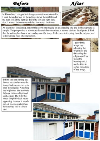
Images edited in Photoshop K.Brett
- 1. In Photoshop I cropped this image so that it was zoomed in. I used the dodge tool on the pebbles down the middle and the burn tool at the pebbles down the left and right hand side. I altered the contrast and also sharpened the image. As a result of the editing, the pebbles down the middle act as a leading line and the background is simple. The perspective is also more dynamic because there is a more obvious focal point. I think that the editing has been a success because the image looks more interesting than the original and follows more rules of composition. I edited this image my adjusting the brightness and darkening the edges (roof) by using the burning tool. I used a filter to soften the edges of the image. I think that the editing has been a success because the image looks more energetic than the original. Adjusting the brightness has made the balance between light and dark, equal. The filter has made the photo look more appealing because it stands out. A gloomy picture has been turned into a vibrant one!
- 2. In Photoshop I selected the steps using the magic-selection tool and adjusted the contrast to make them appear darker. I then used the inverse tab to select the people; I made them lighter and then in contrast with that I used the burn tool to darken the background. By changing the contrast and brightness of the foreground and the background, the main subjects stood out. I think this worked really well because the focal points are really dynamic and simpler to see.
- 3. To edit the picture I cropped it; blurred the background and using the magnetic-lasso tool By editing this picture the photograph selected the branch, and enhanced the contrast follows the rule of thirds. The blurred and brightness. I used the dodge and burn tool background allows you to focus on the main within Photoshop; the dodge tool on the branch subject and also makes the image less and the burn tool on the background. I especially cluttered and more simple. I think the editing focused on the swirly pattern inside the branch, has been effective as it has made the photo using the dodge tool to lighten it to make it look more visually stimulating. more vibrant. I firstly cropped this photo and selected the Cropping the image took the main subject main subject by using the quick-select tool; I off centre – following the rule of thirds specifically altered the brightness and contrast. within the rules of composition. Changing The burn tool allowed me to darken the the brightness and darkening the background background. made the focus point more clear and appealing. I think that the balance between light and dark works well however, editing and resizing it has caused it to blur, making for an unsuccessful edit.